Special edition ENGLISH
Responding to several requests, we make available the translation of the report in English. (Thanks to Cristian Garofalo for the review)
We would like to remind new readers that this report was created for our customers and friends in the Sassuolo ceramic district, the focus is on Italian companies: the tone is ironic. Some puns and allusions for insiders are sometimes not perfectly translatable.
Abstract
“It could have been worse… but it could have been better”. At the fair, you never say too much, but the resilience of Sassuolo ceramic tile district knows how to transform a problem into an opportunity: you end a relationship, you get pissed off, swear but get busy again. Cersaie sticks its nose out of its comfort zone, giving us a fair that looks ahead.
CHAPTER ZERO
Notice to navigators
Here is our Cersaie 2024 report. It is a very informal story that the ufo.adv staff has been dedicating to Cersaie Weeksince 2017 with “rustic” images, feelings and chats.Why do we do it? Our agency grew up on bread and ceramics, we try to inform ourselves as best as possible, studying how the product we have been feeded with is displayed and described. We are pleased that many people read it (or at least they say so) chasing for a new edition.
Five warnings and then we start.
One: The tone is ironic and light and we don’t need to be exhaustive and holders of the truth.
Two: We try very hard to be “neutral” with respect to the companies we collaborate with.
Three: We apologize if anyone feels offended or penalized, as well as for any inaccuracies.
Four: thanks from the bottom of our hearts to those who welcomed us, quenched our thirst, supported us and did a bit of storytelling with us .
Five: many of you asked us for t-shirts with memes, let’s see what we can do.
CHAPTER 1
CERSAIE BY DRONE.
WHAT IS SAYING, WHAT IS SEEN
CERSAIE BY DRONE.
WHAT IS SAYING, WHAT IS SEEN
THE FEELING
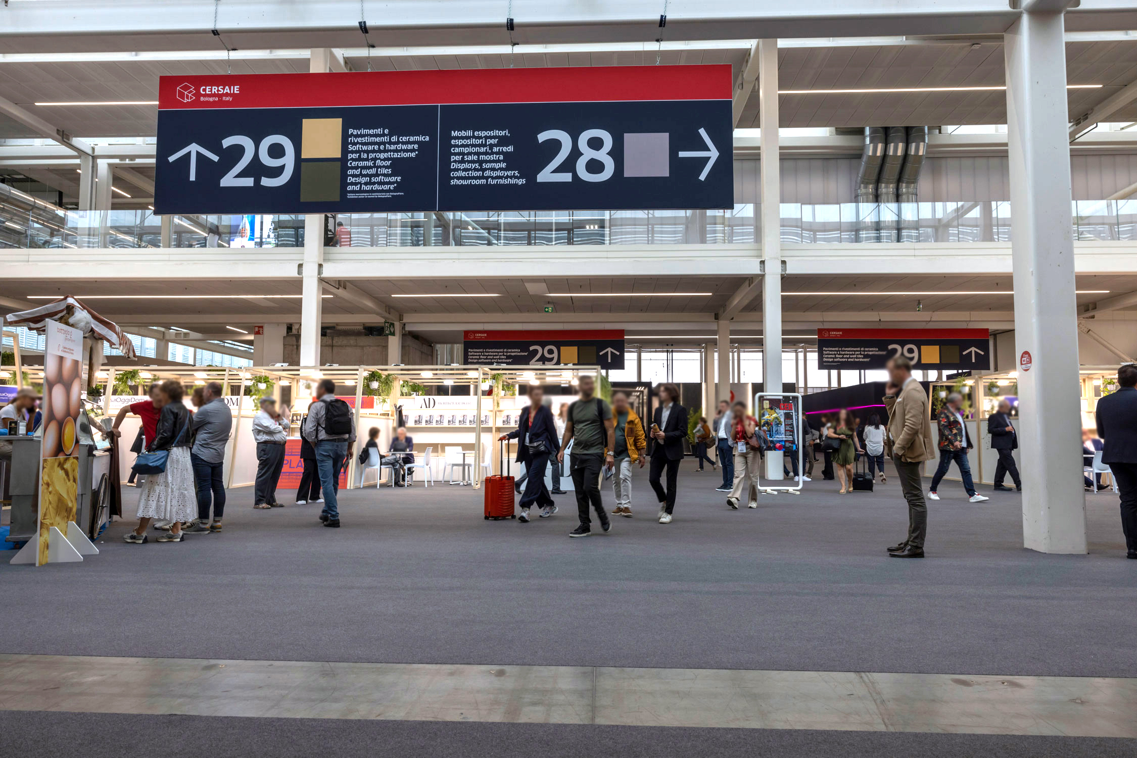
How is it going? At the fair, no one is going too far: on the commercial side, “it could have been worse… but it could also have been better”. Ok, thank you and thank you fella, that’s a redundant question.
On the marketing side, there is a certain optimism, the stands and products are being liked a lot/ really a lot.
The awards are being awaited in a fake disinterested way, with everyone agreeing (except one) on being in complete disagreement.
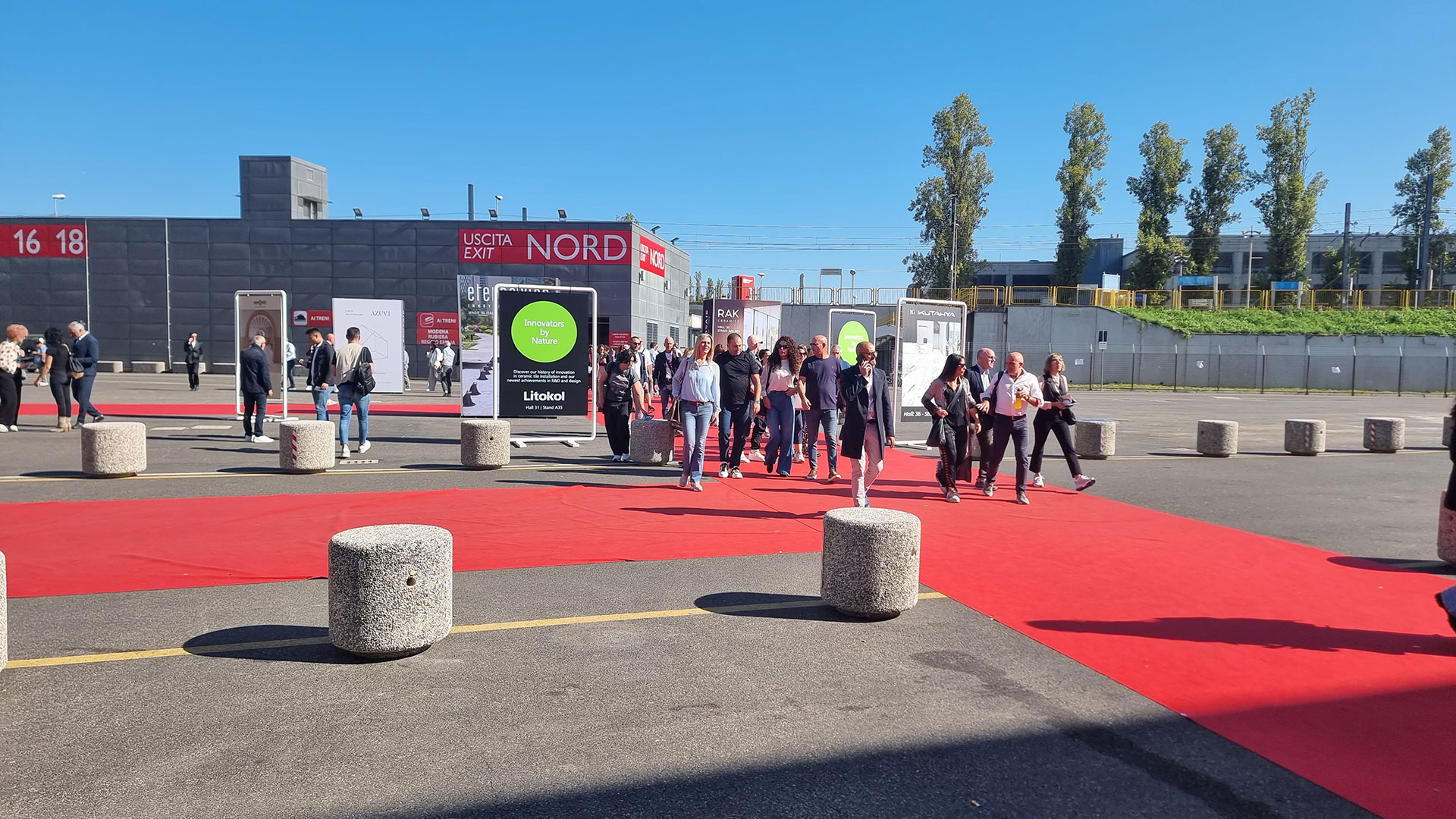
The official attendance data shows -5%: a drop in Italians, foreigners are holding up, but who knows how many are buyers and how many are competitors and/or cheaty watchers looking for inspiration.
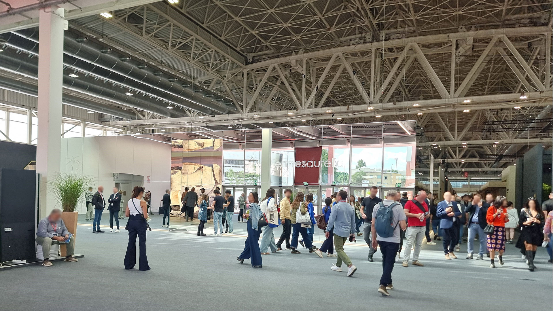
RESILIENTIA SAXOLENSIS, GOOD JOB
After the good times we have bad news, not for everyone, but for many. Experts point out that the context is not helping: Germany is deflated, America is waiting for elections, the italian super bonus for building renovations is dying , Russia and Israel are launching missiles/rockets instead of buying tiles. People are jostling around the world, Indian kilns are popping up like “porcini mushrooms” in the Apennines, in Africa Chinese gigafactories are evading anti-dumping duties. We are surrounded.
But during tough times we can count on resilientia saxolensis ready to transform problems into opportunities: end of a story, get pissed off about it but get busy again.
And here comes Cersaie moving on and sticking its nose out of the conservative comfort zone of recent years, offering us a proactive and varied fair.
RIGATO RIGATINO AND RIGATONE
Like the Chinese calendar, each Cersaie edition has its “sign”.
2023 was the year of travertine, 2024 the year of wood.
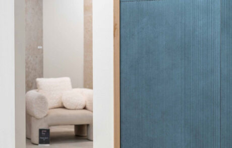
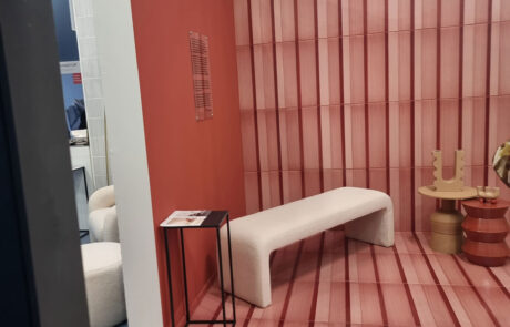
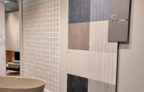
But this time a least common multiple is added, shown in every stand: the rigorously vertical décor “rigatini and rigatoni”. We all saw that rigato (striped) is on fire at the Milan fair, full of ribbed wood.
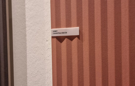
Ceramics has put the lines in the “bimby kitchen robot” and developed the ingredient in a thousand recipes, plating “rigatoni strips” of all types: strips or cannette wood effect (everywhere) in relief suegiù-zigzag (Piemme Homey); as a wall-floor color decoration (Abk-Italgraniti) in strips cut on solid-color resins (Fap); But also with handmade material reliefs in small-size colors (Tonalite).
Del Conca turns 90° with horizontal stripes throughout the stand, soft and organic like geological stratification. It will be a long trend: stripes are an ultra-versatile evergreen, they personalize while remaining sober, they are not demanding and divisive like a designed decoration.
THE SURFACE BECOMES MATTER (MATERIAL-SUBSTANCE)
2024 marks the definitive evolution towards the construction of materials that offer more complex and articulated experiences of tactility and feeling. It is a step forward (for humanity) compared to the mere digital printing on ceramic of this or that marble/stone/wood, with the accompanying refrain of perfect reproduction (i.e. imitation).
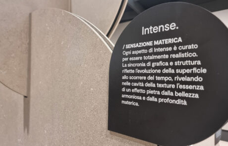
The majority of Made in Italy churns out authentically material “advanced surfaces”, which synchronize digital printing (a commodity) with fine work on the material and finish that distinguishes and enhances Sassuolo IGP ceramics.
The consumer is not just buying a tile but a material rich in tactile and visual sensations. And when creativity and technical ability are accompanied by an effective story that adds suggestion making the product special, the circle of a valuable and distinctive proposition is closed. And less easy to replicate/copy.
In addition to the “usual” typologies, the new generation also expresses itself in more varied creations in terms of design and technical solutions. This is also due to many collaborations with “operational” designers and artists (not star architects who simply sign) who bring stimuli (motivation) and new ideas, making growing the product culture of the Italian ceramic tile district.

KEYWORD: STRUCTURING
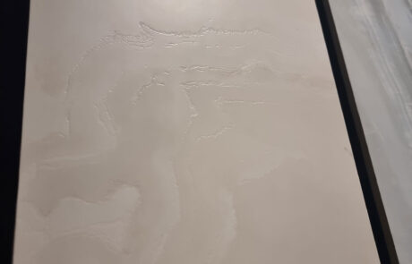
We are not talking about anti-wrinkle cosmetics or hair mousse but about reliefs and surface effects. Structuring, reserving, sinking: these are the new keywords of the sellers, and they draw the line between patricians and plebeians.
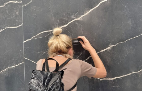
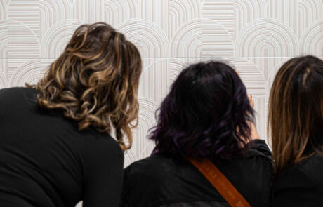
In the pavilions, very experienced visitors tenderly (soflty) approach the tile with their face (and smartphone) to scrutinize the surface effects, wide-eyed.
Attention is needed: it is no longer enough to look distractedly (absent-mindedly) but you have to touch, examine (to study) from different angles and lighting conditions.
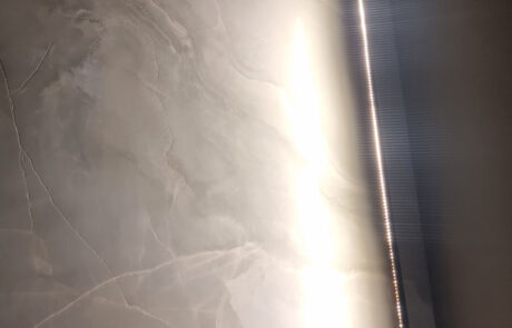
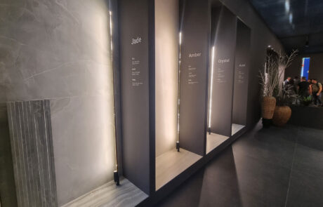
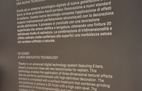
Lighting does not always help the public, some companies improve vision with ingenious tricks in grazing lighting (Cerdomus – Ascot -Del Conca). If not, you have to go cheek to cheek with the product and caress (cherish) it affectionately, it deserves it.
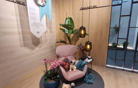
USER-FRIENDLY, THEMED AND CONCEPT STAND
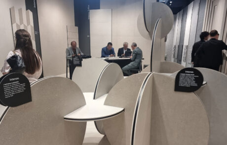
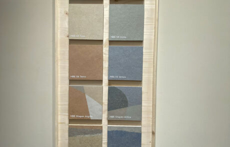
The virtuous practice of making products self-explaining is no longer a virtue of a few but the standard of many. A few lines on the collection, a nice summary of the range, even with the “rounds” of the different surfaces and everyone can get an idea. Neat, elegant, user friendly.
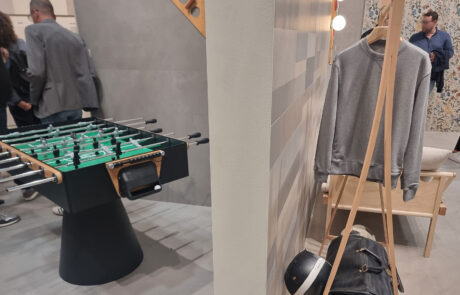
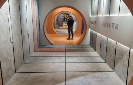
The most liked and pleasing stands usually add something, taking a further step: that of giving meaning to the entire stand, with a theme, an idea. Sometimes it is a concept that involves new products or conveys a corporate message of the company. Other times it is more of an expedient to make the exhibition pleasant and captivating. It is impossible (and dangerous) to mention them all, but there have been interesting ideas as reported by radio-cersaie since the first days.

CHAPTER 2
WALKING AMONG THE PRODUCTS
WALKING AMONG THE PRODUCTS
MARMI & ONYX: MATT STUFF
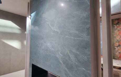
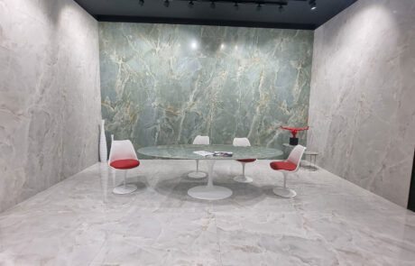
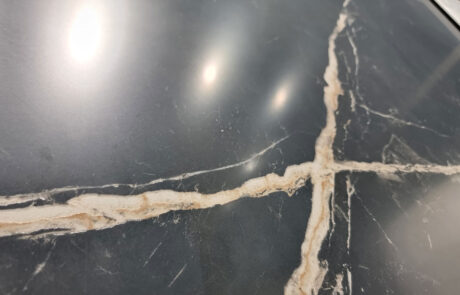
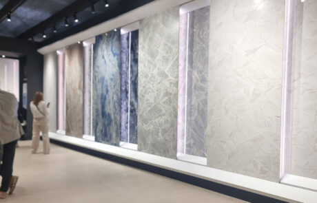
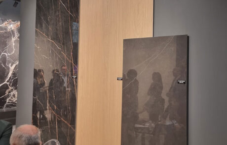
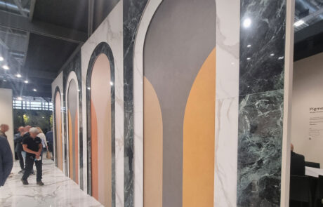
In the marble and luxury sector, the polychrome reviews of glossy marble-look slabs show some downgrades from the windows to the sequential summaries in the inside-stand. After the great feasts (parties), perhaps there is a bit of saturation, certainly a lot of competition. The explorations of unpublished, even imaginative, and some dark marbles are holding up.
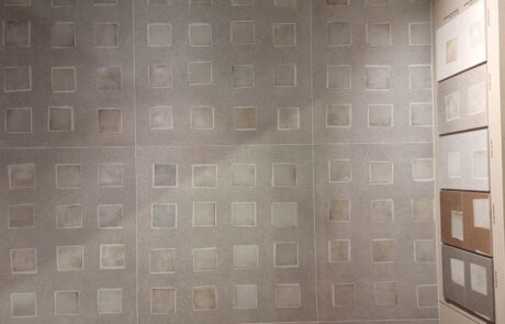
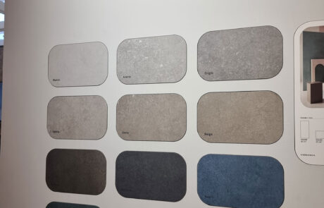
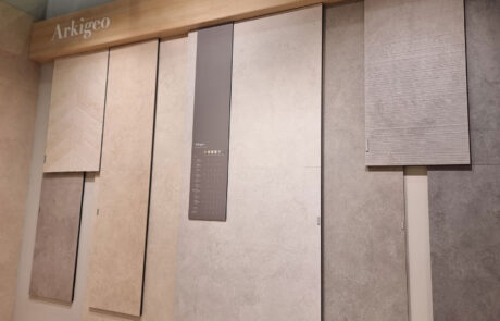
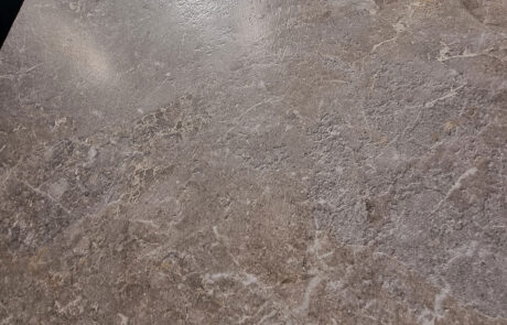
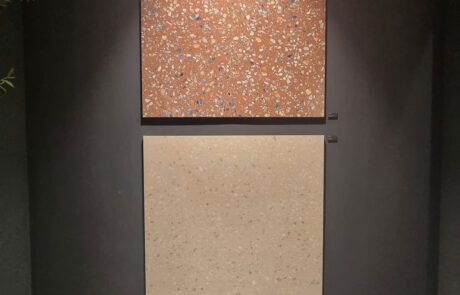
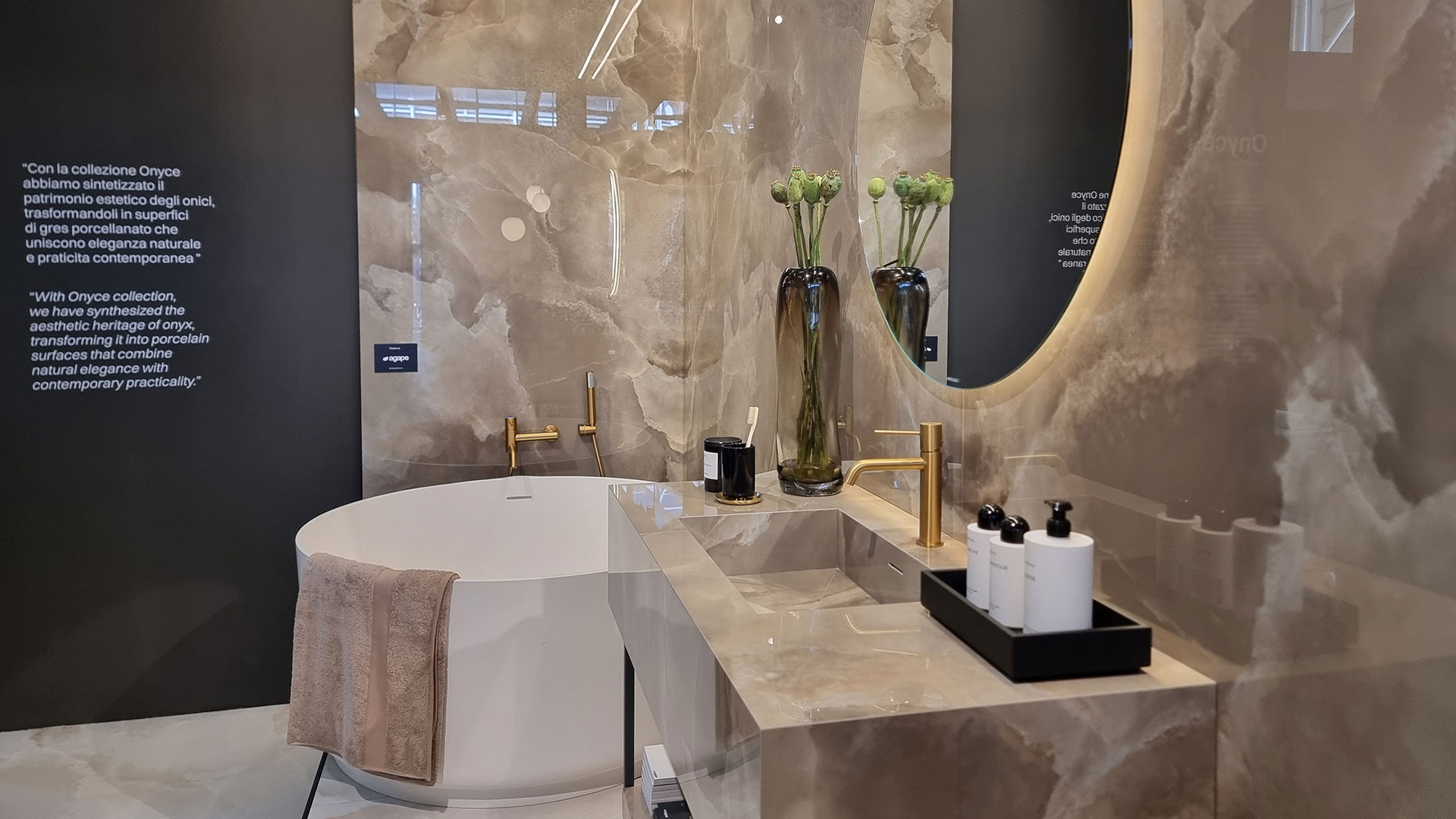
In the front row, many opaque (matt) surfaces, worked until obtaining a silky and velvety tactility that combined with shaded colors creates an effect of depth. The triggering factor of the matt fashion is that it enhances the digital material applications of sinking, structuring and other devilries with hollowed veins, reliefs and surface effects, the new R&D weapons used by the district to attack the markets.
In filigree we can also read an evolution of taste towards new audiences, these finishes raise the tone recalling a less brazen and ostentatious luxury, more refined and cultured, not far from the velvety stone or marble finishes of the SALVATORI “rooms”, an unrivaled style icon of the Fuorisalone in Brera.
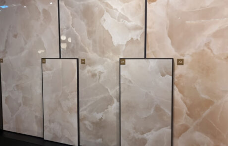
As for design, there is a certain hype towards more nuanced graphics such as soft onyx. Less gaudy and showy onyx, toned down in the veining and pastel colors, winking at users with more measured tastes. Often they are graphics declined in various colors and not only reproductions of individual natural stones (so we take the distance ourselves from the concept of direct imitation of a specific marble).
DON’T FORGET TRAVERTINO AND CARRARA
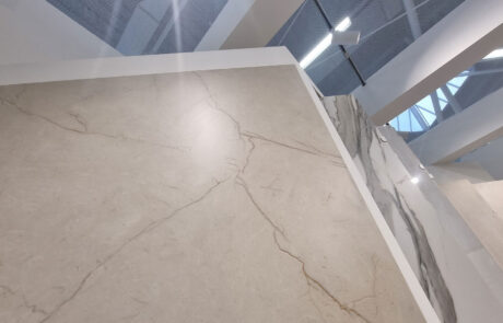
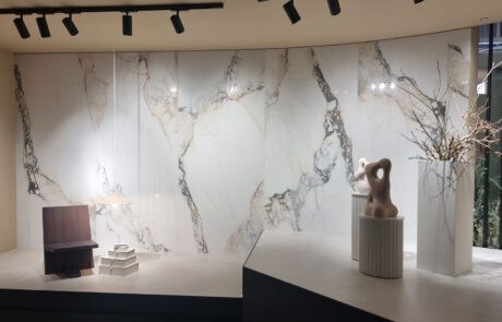
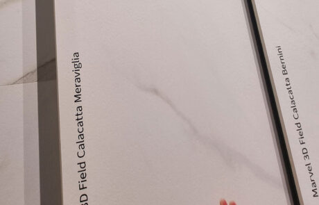
The white veins could not disappear, they are proposed again in a satin version with synchrony between structure and design, perhaps looking for less exploited expressions (Rondine, Panaria). The Calacatta-Barolo by ABK is courageous, well contextualized.
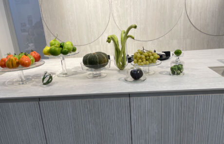
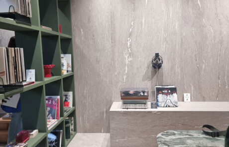
The travertines after the invasion of 2023 are in the rearguard, also useful as reception desks and kitchens.
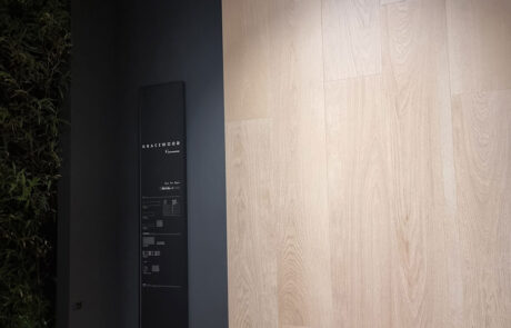
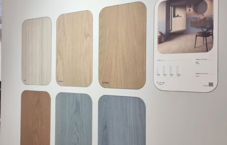
WOOD: RANGE OAK
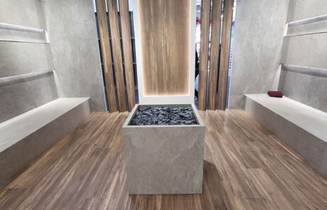
The horoscope said that 2024 is the year of wood: you can find it on the menu of all the stands, like bread and cutlery.
The dose is reinforced because it helps the displays, it is a fil rouge (but beige) that ties together all kinds of products.
With a hawk’s eye (and crow’s feet) it is clear that the graphics are always oak.
Oak with knots or jointed, veined or veinless, cracked or worn, planed or sawn, sometimes a tanned thread, but it is always the same.
Naively, we think that in ceramics you can reproduce any essence: cherry, wenge, olive or birch you can redo the floor of Versailles, instead you find yourself in Rovereto (a bush).
We ask an accredited Product Manager. Bitter smile: “we gave up… people have oak in mind, they want that and that’s it”.
The challenge is to differentiate (to be different to) the 2024 novelties (in oak) from the oaks of previous years. Climbing the mirrors, here are the vertical tasting paths (like wine) young-old or the knotted-jointed trunk, the variations on the finish, some decorations such as inlay and (it goes without saying) the vertical canes.
THE REST OF THE WOOD
Saving other types of trees, some daring ones venture outside the (oak) fence.
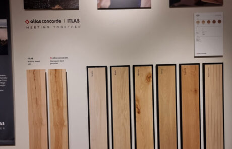
Isla (Legni d’Italia) explores mixed essences. Atlas Concorde proposes Cansei: not the bad girl from Games of Thrones but a D.o.p. beech from the Cansiglio forest, with specimens chosen by an authentic parquettista and comparison with the porcelain replica (a reference to the unforgettable “couple” real marble/porcelain marble). Rondine presents a hard and dark plank and also a mega-chevron (herringbone).
CEMENTO AUDERE SEMPER. THE SUPERGAMME (SUPER-RANGES)
You can dare with “cement” products, it’s a calculated risk. We’re talking about all those solid but nuanced textures, where laymen struggle to grasp the differences between cement, resin, clay and earth (raw and cooked).
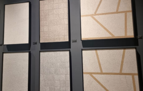
To these references we add gypsum, plaster and grainy textures (like Arketipo – Cotto d’Este) bordering to stone.
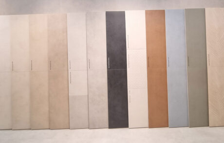
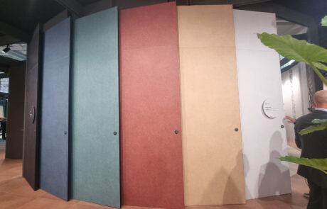
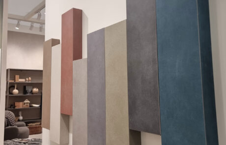
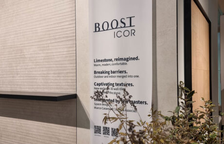
In any case, the supergamme (super ranges) have put down solid roots. Every year, ramifications grow from the central trunk. Of colors, textures and decorations (Atlas Boost, Caesar Join, Lea Pigmenti). Bright shades are added to the fixed base of neutral tones. And dry branches can be pruned without pain.
The extended families exceed 20 colors (Join is 22) if you go below 6-8 you’re out. In the general catalogues, it is that versatile “rest” crossover that helps and matches many richer products. The formats are all-round and range from the large slab to 120×120 and submultiples down to 30×60.

STONES: MATERIALIST MINIMALISM
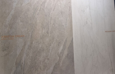
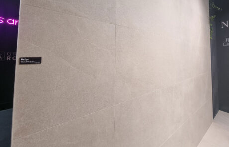
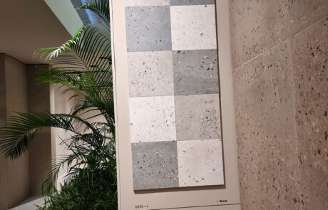
The range of stones with a very minimal aesthetic, faded limestones and other low-contrast graphics is very wide, sometimes rarefied to the point of bordering to the “concrete type”. The focus is on the finish with refined material effects, but also on the sets of elegant microstructures with a decorative and combination function (such as Atlas Boost Icor). The highly shaded stones (one in Novoceram) that in their heyday were never missing from the new products catalogue have almost died.
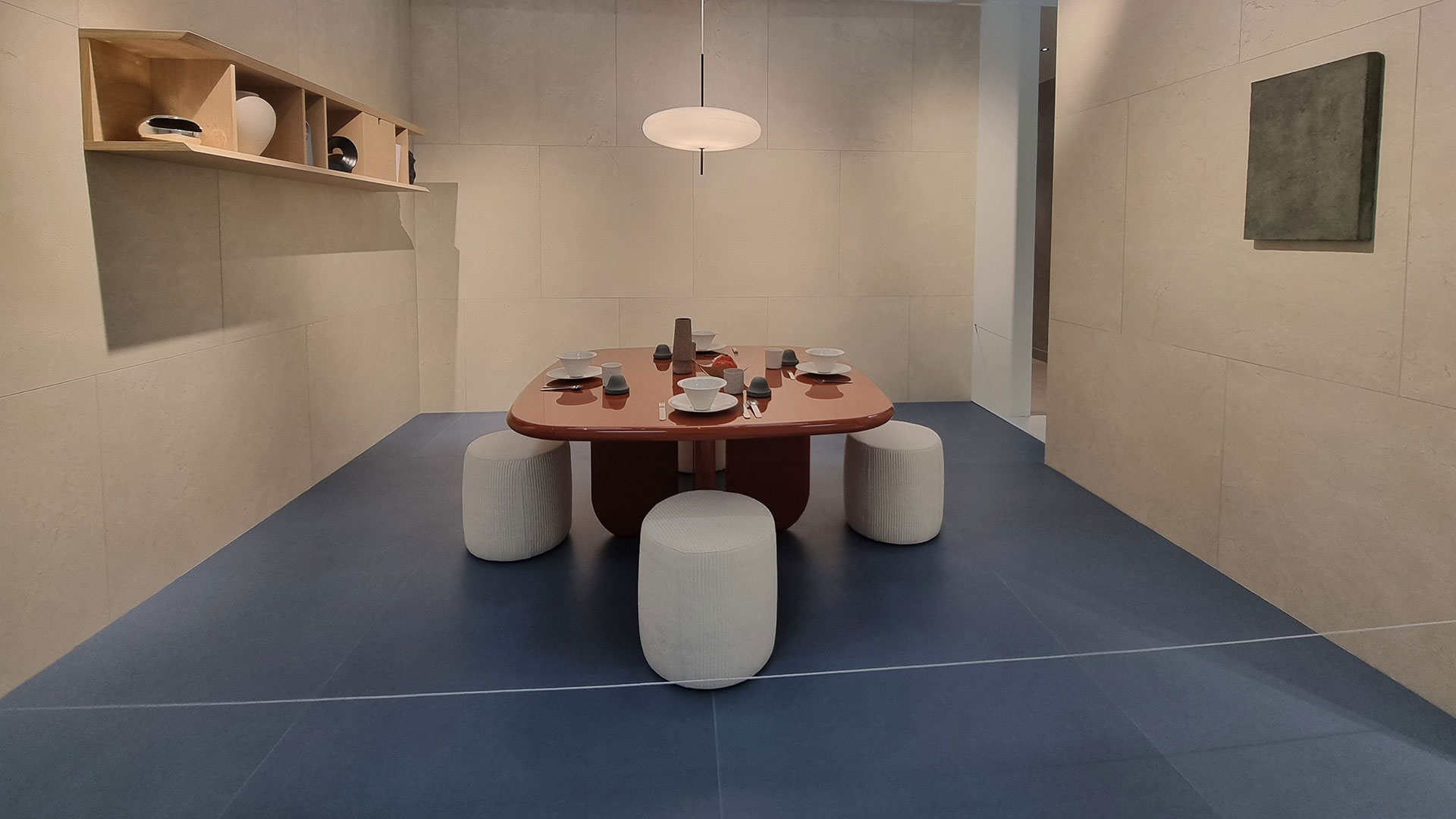
BRICK AND BRICKS
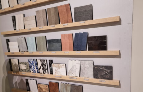
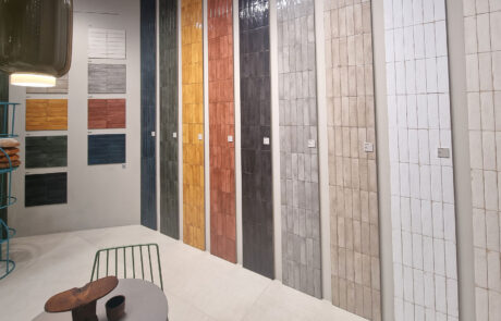
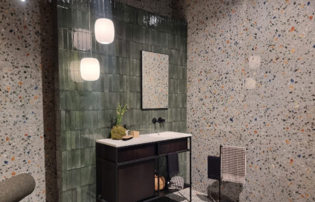
Since it left the brick laying ghetto (rustic effect) discovering the vertical laying and the solid color (design effect) the brick has become a multifunctional wildcard, omnipresent protagonist (ever-present leading actor) of mix & match. Here are the rectangles in many variations, elongated in slim size (Elios-Rondine) striped or sponge effect in size L-XL (Tonalite) opaque and shaded (Fap Still).

AS IS…. STOP (BEYOND “REPRODUCTION”)
Cersaie is not just a show like that. Creating products that do not imitate other materials is possible, (successful) experiments at Cersaie 24 have shown that there is life (ceramics) beyond reproduction.
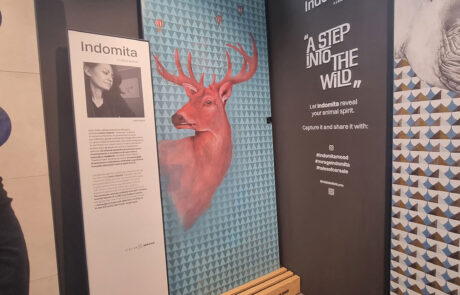
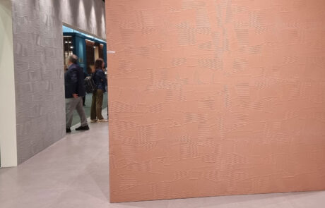
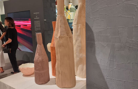
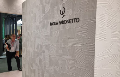
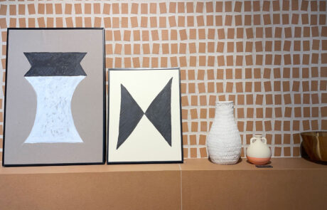
The original covering with spatula reliefs Homey Paper Clay – by Piemme with Paola Peronetto stands out, taking up the ceramic materiality of its design objects (vases and lamps) present on the stand to accompany (walk together with) the covering. Also highlighted is Nok, an articulated and original proposal by 41042, sizes from 120×120 and below, between 2 textured backgrounds, ethno-animalier graphics and disruptive mosaics.
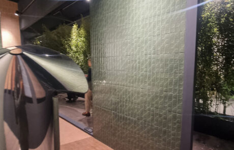
Various elaborations that transfigure terraces, agglomerates and strains (stumps / stocks) reinventing their look. Using relief technologies, new aesthetic expressions are born: Sant’Agostino-Glow, COEM Fioranese with Alchimie and I Ciottoli in the macro-micro stone/sand version, Cerdomus Neoclassica macro-medium.
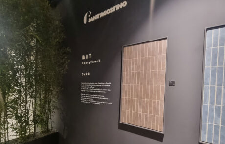
Sant’Agostino creatively reworks (re-launch) mosaic again (Novart)
DECO-LIGHT, POVER FLOWER
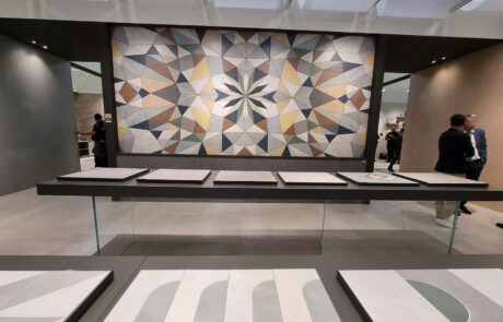
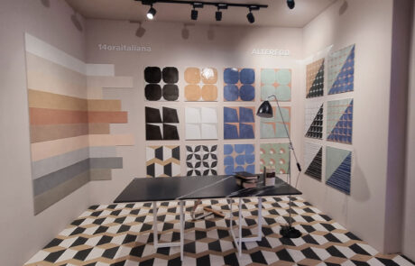
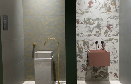
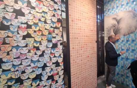
On the decorations front, weight is lost. The jungle of flowers and foliage has withered, the wallpapers are in some corners, the cement tiles are back in the attics to gather dust. More current signs and designs are blooming, like geometries and interweavings of materials. But above all, we play with composing sizes, colors and structures.
SMALL SIZE BIG IDEAS
If there is an area where you can unleash your imagination, it is the small format, from 20×20 and below. It is basically a sort of exercise area where product managers can let loose (run wild) without the reins and leashes imposed by Management (with a capital D).
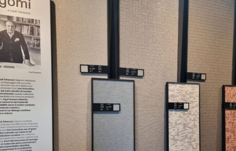
Between craftsmanship and industrial products, Nagomi by Mirage is very effective, a research on the material (awarded) with a set of stuccos and paints in the same color, as are the irregular mosaics of 41042.
CHAPTER 3
FAIR CHATTER
FAIR CHATTER
FAIR PLAY: THE CARAVAN (DOESN’T) MOVE ON BY ITSELF.
In the aisles we collected some slightly bitter and slightly worried reflections. Once again our beloved Cersaie has attracted thousands of people, giving the area resounding profits: Sold-out Hotels and guest houses within a radius of 150km at multiplied rates; Full restaurants, in-house events with catering for thousands of guests, visitors and customers for the district’s showrooms, including those who don’t exhibit (but take a little tour to look).
The trade fair caravan that rains down this manna from heaven for everyone is kept alive (for now) by the exhibiting companies, the only ones that feed the circus. Let’s hope they hold out.
The fear is that Cersaie will not be further emptied, if some other reference brand leaves the loss of attractiveness becomes significant, we risk the end of other dying or defunct fairs.
Why not doing it as Tecna? The word biennial is as unmentionable as Voldemort. But times change and perhaps it could encourage the return of some prodigal son. Regardless of the Padana fair that seasons 12 or 24 months, re-participating even with a symbolic presence would not be a bad idea, not only to “be there” (and hook some new buyers) but also as a gesture of fair play to stay in the game.
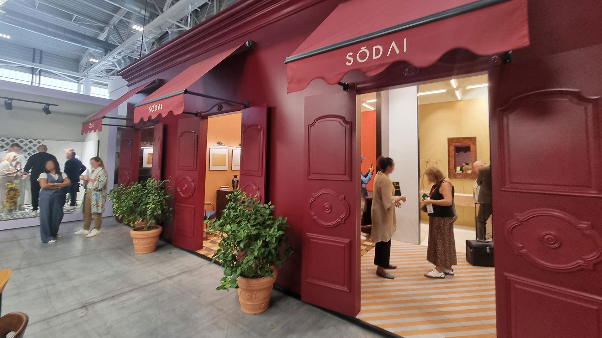
50 SHADES OF GREEN
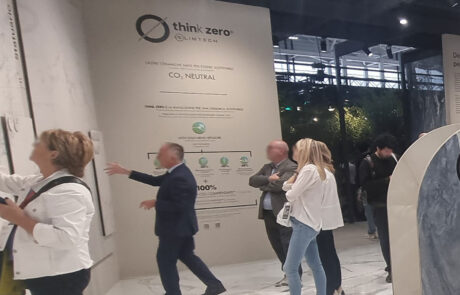
Sustainability, one of the super-pluses of ceramics, is always a hot topic, even now that we have learned that we are “energy-hungry” and the electric car will not save the world. As usual, some generic messages, some timid hints here and there, in random graphics placed to solve a “discharged” corner of the stand. But there is also concreteness, a little under the radar, in the district there are more and more companies that draw up a sustainability report (and that’s not a small thing) or a sustainability report (preparatory to the d.s. report).
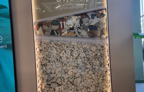
In the general calm, Mirage plays the heavy load: ReSource, with over 60% pre-consumer recycled material. Plenty of space in the stand for an important range with 8mm thickness. If the product gets going, it will be necessary to find enough waste to recycle.
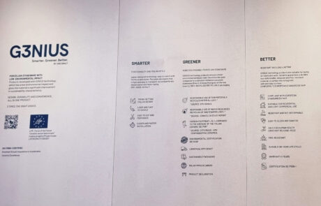
Panaria Group stands out for its quotas of compensated co2. The Gresmalt Group promotes the G3nius line with its own brands. Thin thickness and ultra-performing 5.0 factories determine a particularly low impact together with other advantages. In the meantime, Casalgrande Padana has re-greened the payoff: The Green Way To Pave.
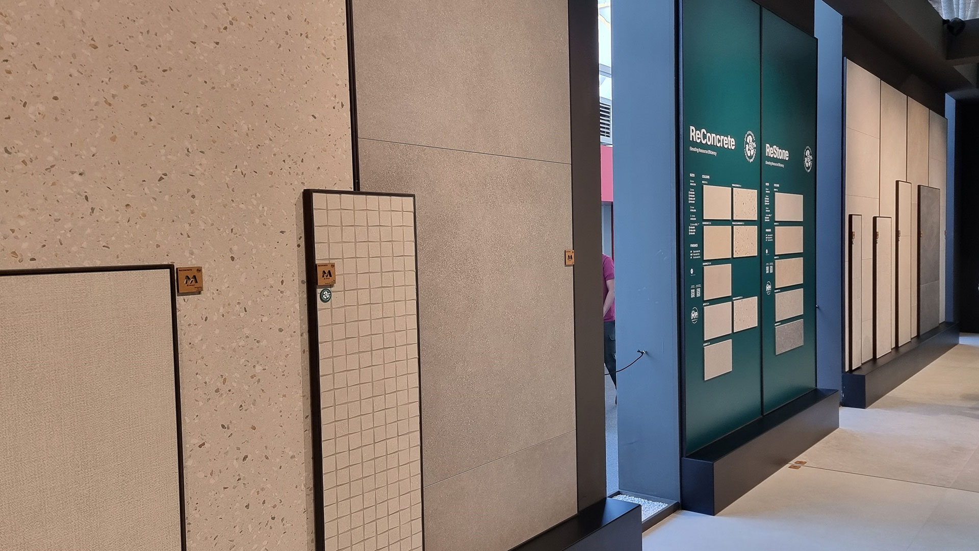
WINKING FINISHES
To improve the value proposition, the tactile allure (cit) of the product is enhanced with a proliferation of special finishes, obtained by pressing, with chemical alchemy or by brushing-lapping. Marketing cleverly enhances them through an anthology of names with a subtly allusive and winking sound (touch plus, sensitech, real-up).
The sophistication increases in degree when the tactile aspect (hand-foot test) is added to the anti-slip aspect (crash test with side B). And here we have gender fluid surfaces, smooth and cleanable, which when dry are errenove R9 but with water the grip starts and they become erreundici R11 and therefore are good inside and out (in-aut) thanks to the magical nanogranules (the same as in whitening toothpaste?).
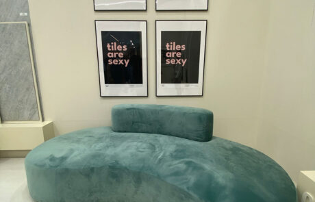
And then there is someone who raises an eyebrow when they hear that “tiles are sexy”. Of course they are!
SUSTAINABLE MOBILITY
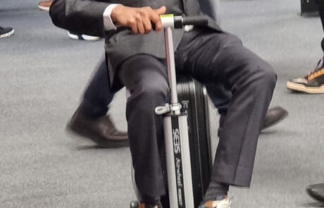
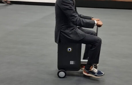
For us, the 2024 Cersaie Hero award goes to the self-propelled electric suitcase, simply amazing. Who knows if charging is done on Tesla columns or at smartphone charge points. The Disneyland train team incessantly circumnavigates the fair district, the carriages are packed with joyful commuters, like the Tokyo subway. Traffic is heavy, we witnessed a collision between the passenger train and the waste train.
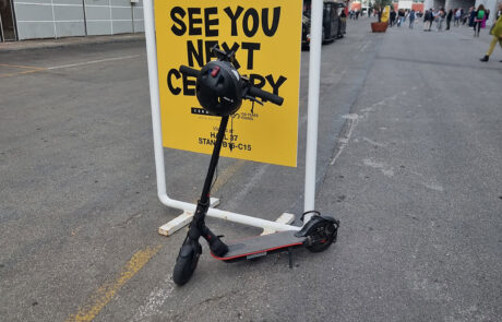
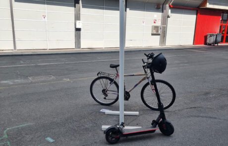
Bypassing some restrictions, in addition there is sustainable mobility that relies on scooters, bicycles and other orthopedic devices that allow all the “legs” to take the desired tour.
DRESS CODE ANTISTRESS
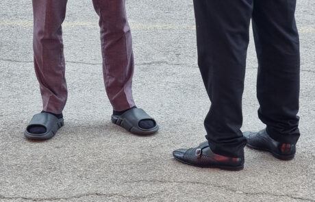
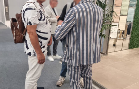
The general dress code has softened towards casual comfort. Those who don’t give up on heels organize an afternoon pit stop (a bag with sneakers in their handbag). The breaking news of 2024 is the arrival of the slipper with sock (a megatrend for teenagers) that saves from perspiration and blisters.
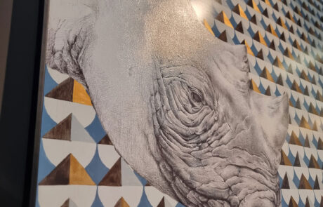
As for wildlife, the panthers at Cersaie are almost extinct, the turkeys with wolf eyes have aged and lost their boldness. Some fetishes of deer and rhinoceros have been spotted.
Luckily, you can still meet some mythical characters who deserve respect and protection: those who explore the stands dressed like Indiana Jones, those who wrap themselves in mystery in the cloak like Albus Dumbledore, those who carry a wardrobe in a refrigerator-like suitcase.
CHAPTER 4
APPENDIX: THE DISTRICT NATIONAL TEAM
APPENDIX: THE DISTRICT NATIONAL TEAM
THE DISTRICT NATIONAL TEAM: AN INVINCIBLE TEAM
When evening falls, the people of Cersaie put aside the noble arguments of architecture and design and the district’s national team takes to the field.
Here is the typical formation (TEAM), an invincible 4-3-3:

On the bench: Tataki, Burratina, coffee, nocino and Barozzi cake.
From Imola to Monte Cimone it is a flourish of aperitifs, dinners and parties with open bars, small orchestras and DJ sets that repeat throughout the “tile week” (the luckiest ones add the extra-time of the pre-post weeks).
The (non)paying public could be impressive: 500 people here, 200 there, every night in at least 20 or 30 locations: thousands of guests and hosts who drink, gorge themselves and let loose in reggaeton and retro-dance, toasting the Santo Gres.

Recommended uniform: Calacatta Azzurro Italy jersey
IRON (SALES) MEN
The sales & marketing team must face a grueling 24-hour, multi-day ultra-marathon that puts even the most hardened physiques to the test, because it extends with pre- and post-work beyond the 5 days of the fair.
Here is a summary of a typical day:
- Aurora: dressing, restoration with make-up and hair-building
- At dawn: departure for the stand (nap-free for not-drivers)
- Daytime: fair with non-stop sales-speech and architecture-talk
- Pre-dinner: aperi-cocktail (business-oriented)
- Dinner: standing (leave your seat for customers)
- Around dinner: cultured show with gypsy violin, bagpipes and Tibetan gongs
- Night: alcoholic dance with singing at the top of your lungs, karaoke and train.
- Late night: (for recovery-patrol members) search & rescue of guests in alcoholic coma.
the system seems to work because it repeats itself every year, increasing the number of evenings and budgets.
The big Hollywood wedding-style events are joined by the knock-on effect of medium-small companies, forced to enter the party carousel to keep customers hooked and not be left out.
It must be said that this widespread eventisation of the district is becoming one of the success factors of Made in Sassuolo, alongside design and technology. And no one will be able to copy this, Emilian hospitality is unbeatable.
LET’S TALK AFTER THE FAIR
The end, thanks for getting this far (without scrolling). As you may know, the report is a volunteer activity, our thanks to mommy tile. Our real job as UFO.ADV is to create images and communication media, if you don’t know us you can take a look at our website and maybe follow us on social media.
And since we’ve just had our fill (full tank) of ideas and suggestions, it would be the right time to have a chat and study something for the future.
Let us hear from you, it will be a pleasure for us!
