
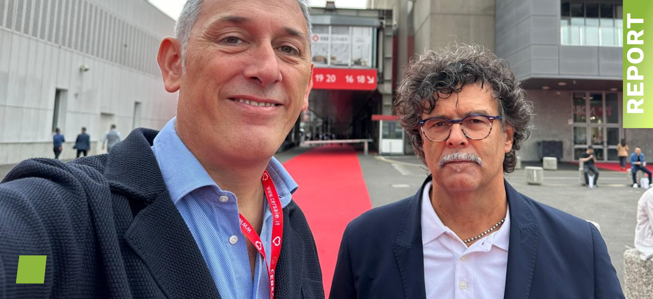
REPORT CERSAIE 2025
As promised, here’s our traditional ufo.report dedicated to Cersaie 2025.
Chapter Zero
WHAT, WHY, WHO, AND ANXIETY.
WHAT IS IT? It’s an informal story told “our way” about what we saw and heard wandering around the fair and its tribe of exhibitors. The tone is affectionately ironic, the photos are 100% homemade (no deepfakes), and the opinions are 100% subjective. We try to stay independent and neutral, without favoring friends or clients—otherwise, this report would lose its meaning.
WHY DO WE DO IT? It’s part of our job to look around, study trends, and keep our design radar on. This report is born by what we have observed It’s basically a volunteer project we offer as a thank-you to the ceramic world that gives us bread and work.
We started for fun with a few lines written for four client-friends (at the bar). Thanks to word of mouth, those friends multiplied in both length and height—sometimes without us even knowing—but we’re happy to have new ones.
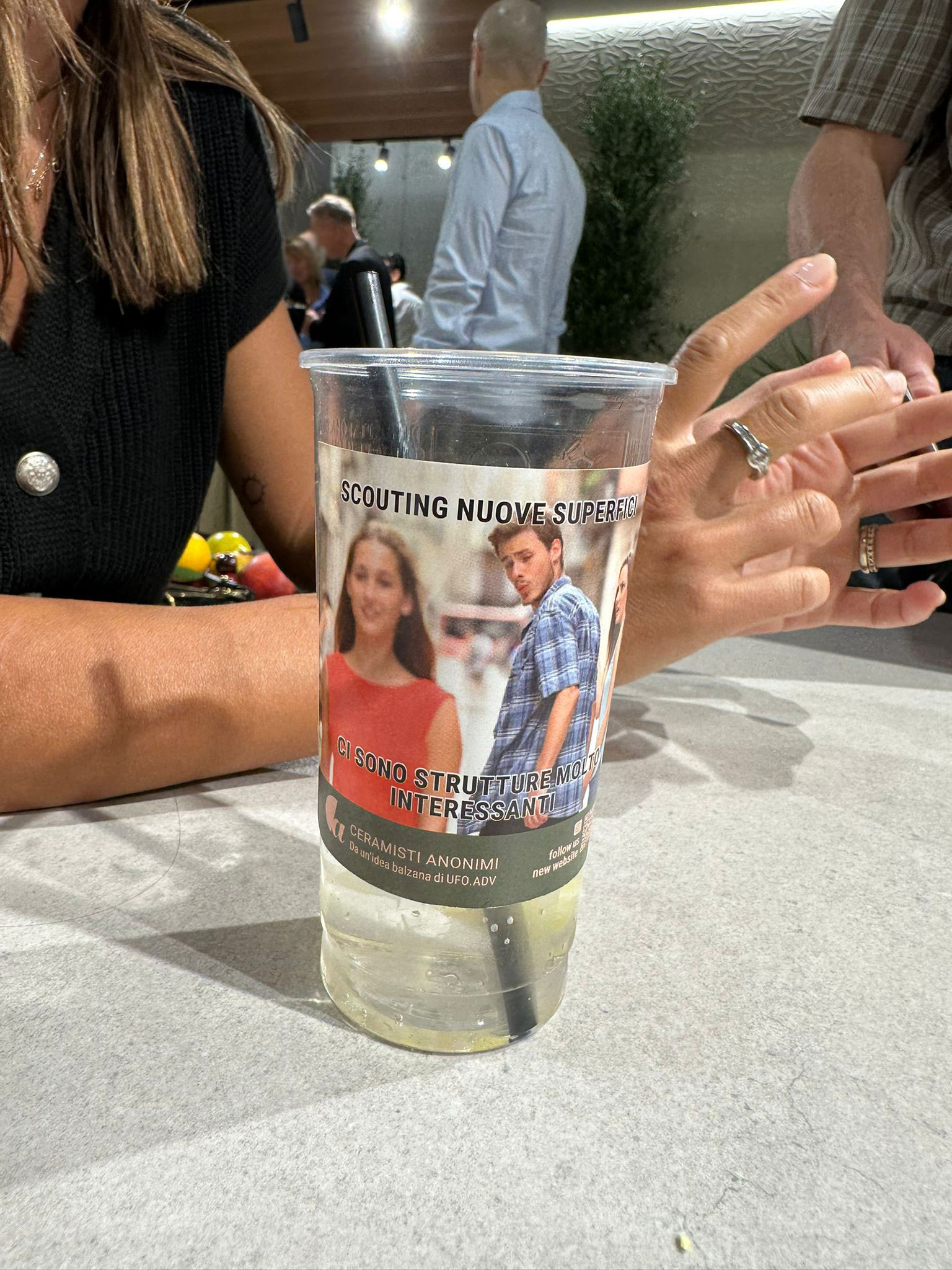
Spoiler: to comfort the chronically ceramic-addicted, we’ve “sintered” the non-profit website ceramistianonimi.com and its Instagram page.
WHO WE ARE. Ufo.adv is an agency specialized in communication for ceramics and interior design. We develop in-house everything needed to communicate well: 3D environments, graphics, photos, videos, web, merchandising, strategies, and texts. You can check out what we do at ufoadv.it—actually, you should.
Performance Anxiety. A big thanks to the many (really many!) people who greeted us in the halls saying, “We’re waiting for the report!”—feeding our performance anxiety. And thanks to all the authoritative insiders who shared their time, ideas, and impressions with us (on condition of anonymity). We’re honored.

ce-luce-in-fondo-al-funnel

Delegazione-ufo
Momenti-di-Cersaie-(1)

Momenti-di-Cersaie-(2)
Momenti-di-Cersaie-(3)

no-foto

Si-foto

Tempo-di-Cersaie
Chapter 1
A DRONE (AND SANDRONE) VIEW
A DRONE (AND SANDRONE) VIEW
BACKSTORY: SAFARI AMONG THE BIG FIVE
In Africa, every morning tourists go on safari hoping to spot the big five (lion, rhino, elephant, leopard, and buffalo).
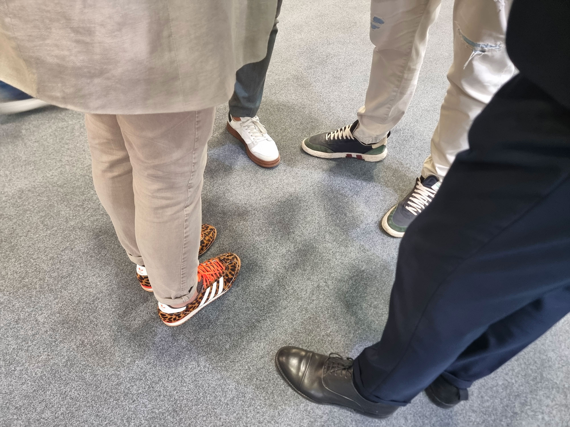
At Cersaie, every morning visitors start their safari hoping to find some new idea that goes beyond the usual big five: marble, wood, stone, terrazzo, and cement effects.
The 2025 question: Is there life beyond the five effects that dominate porcelain stoneware? The answer is “kinda”.

Cersaie-talk

effetto-cemento

incolonnato

inizia-la-manovra-di-atterraggio

italian-lifestyle

palla-appassita-da-fine-giornata
pedonale-sulle-striscie

siamo-a-cavallo
VENDING, BRANDING, PETTING.
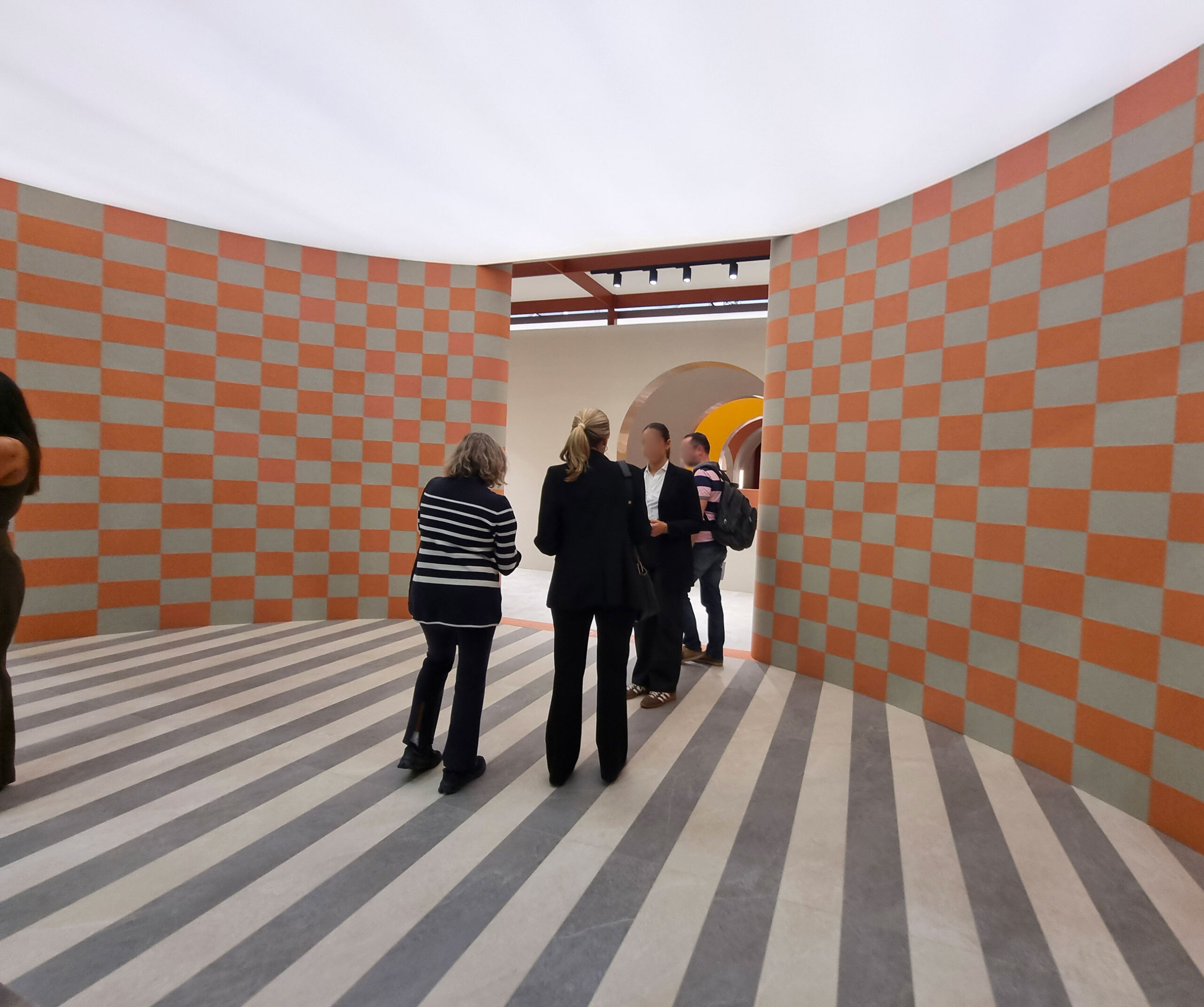
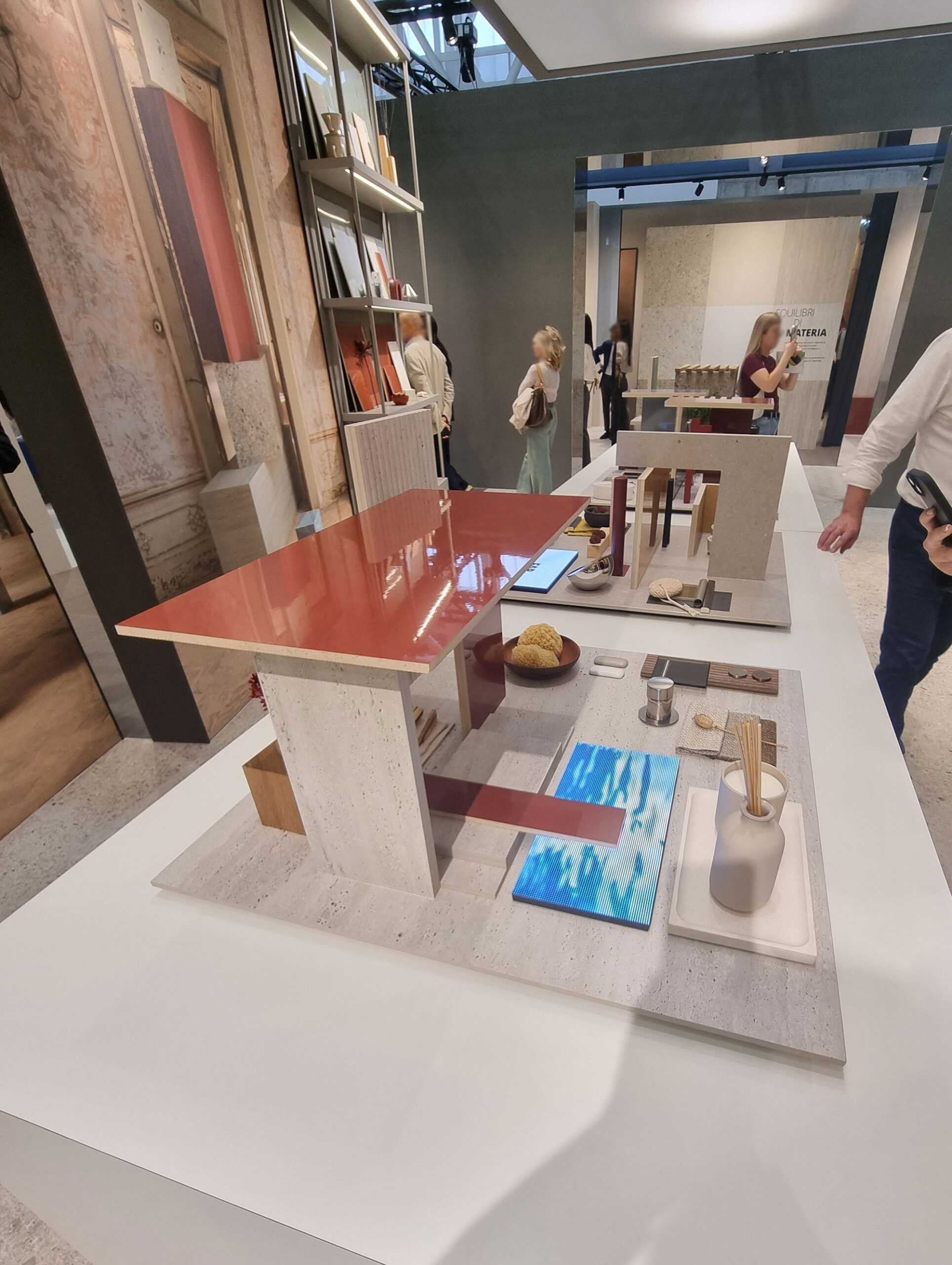
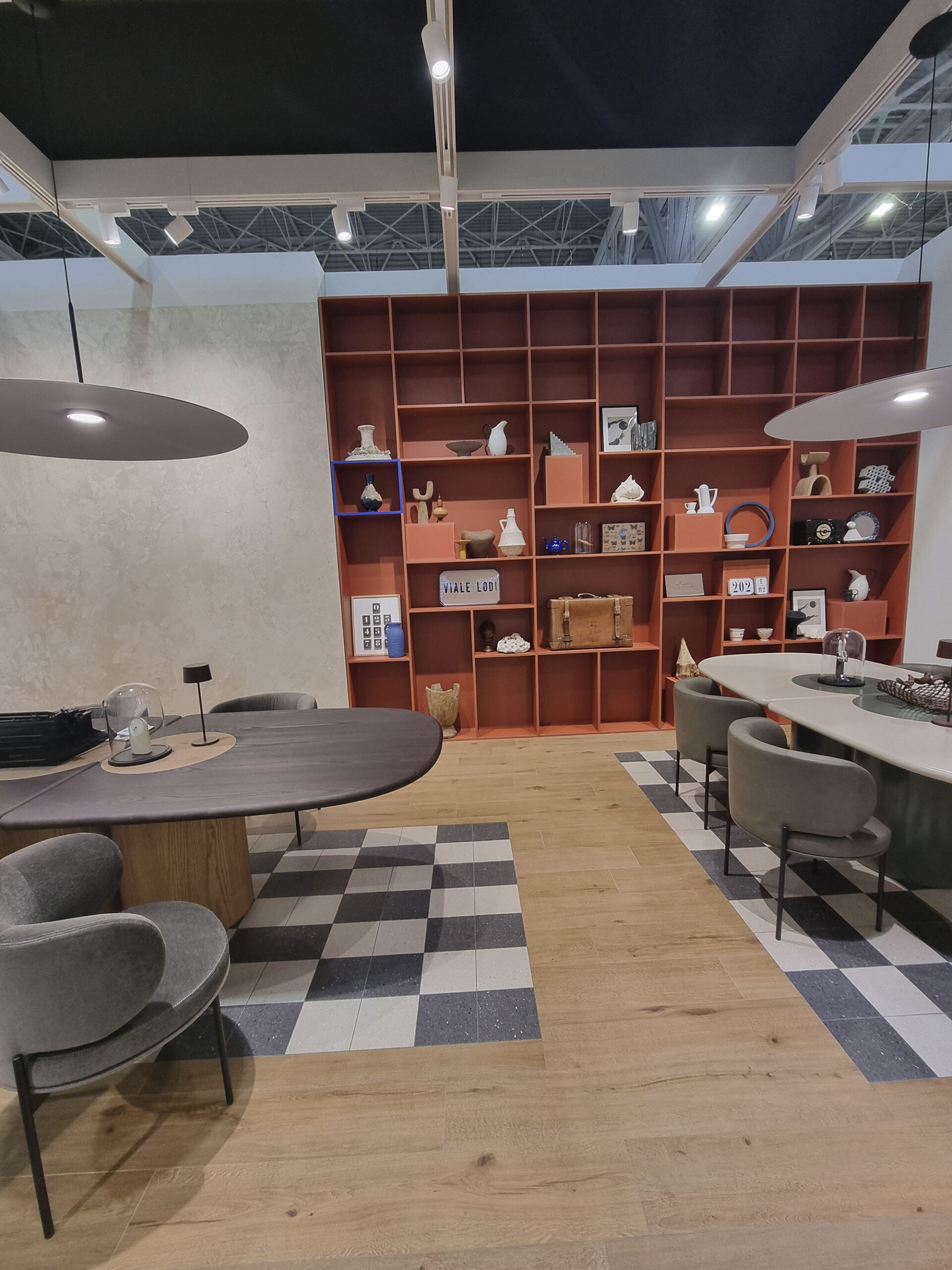
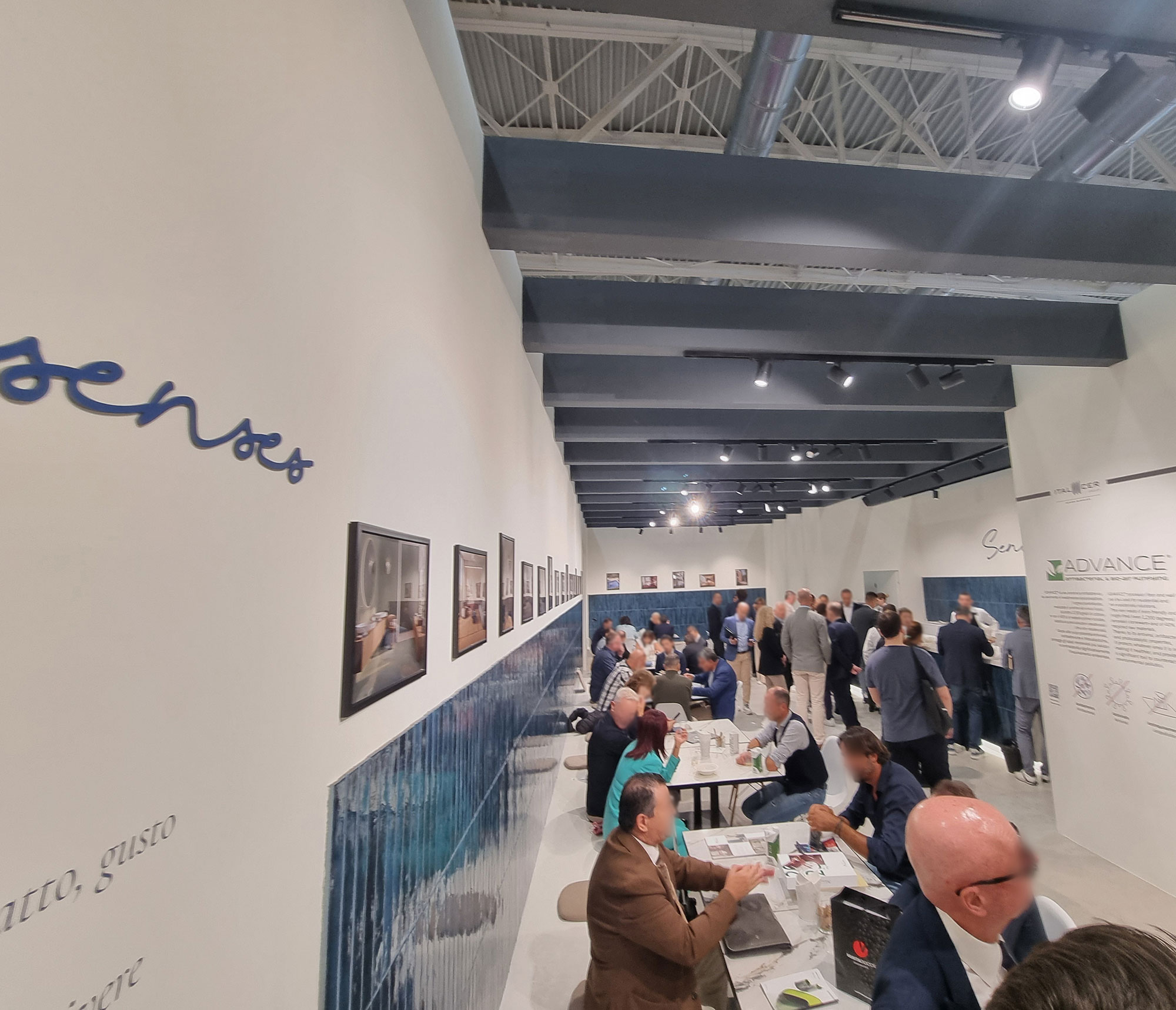
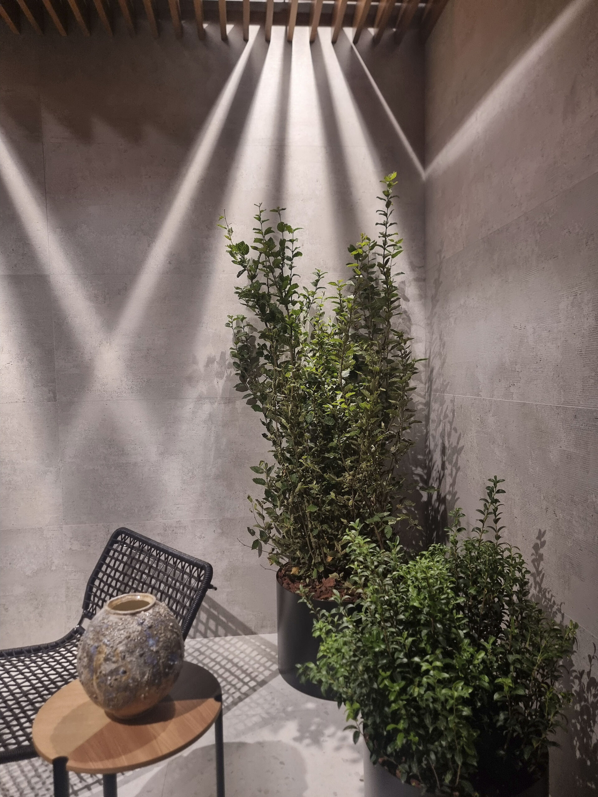
One of the most repeated phrases this year: “We need to rethink the concept of the fair.”
But in reality, it already has changed. The Cersaie roaring-years —where the absolute imperative was to sell full pallets through the legendary “fair offer”—is retiring along with the last heroic gladiators of the “purchase order note pad.”
Producing tiles in Italy it means staying in the upper market range. The average price of Made in Italy tiles is 4–5 times higher than Asian products. It’s hard to harvest if you haven’t sowed, watered (with prosecco), and fertilized (with lasagna).
In the high-end segment, the product’s material quality is just a fraction of the intangible value built around the brand—prestige, design, emotion, service, reliability, credibility, and yes, sustainability and ethics.
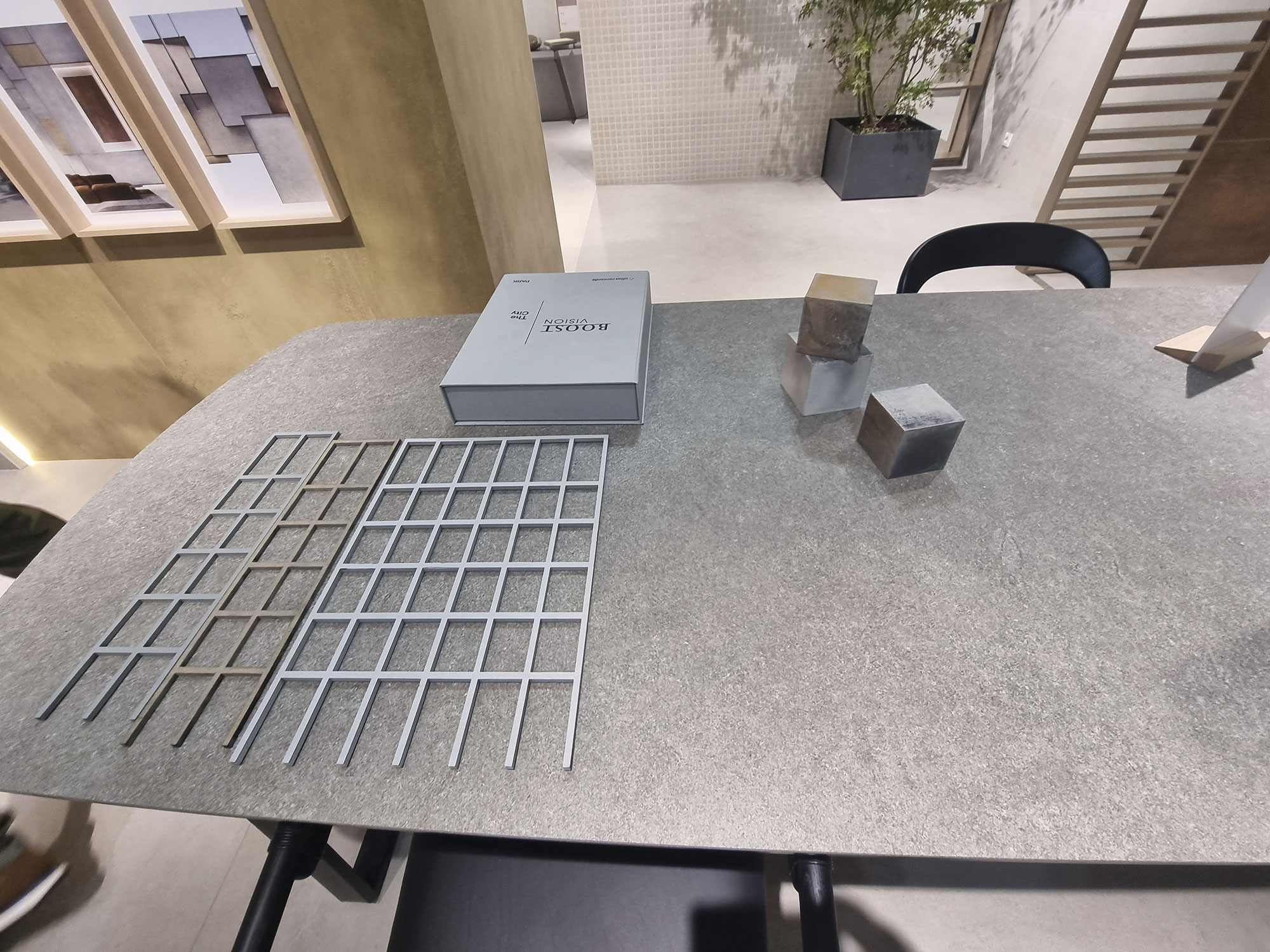
Premium brands engage all year long with designers, builders, and retailers to become true partners, sharing a vision and a path.
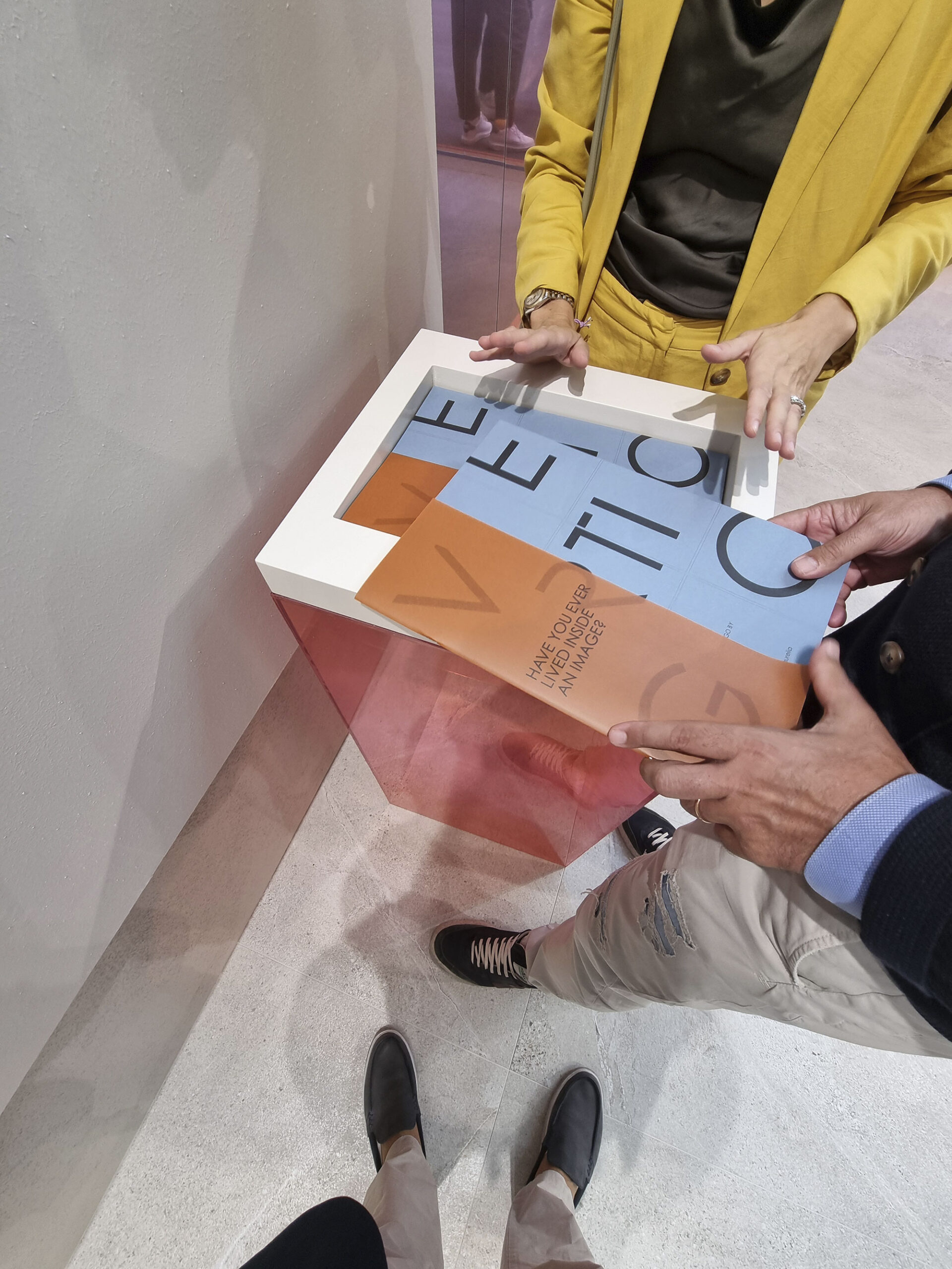
As several key players confirmed, human relationships and visual sensations remain crucial. It’s still important to meet in person at the fair (or nearby, if fairs still exist) to discuss and fully convey a brand’s philosophy—something that’s nearly impossible to materialize effectively overseas.

Atlas-Concorde-(15)
Atlas-Concorde-(16)

Atlas-Concorde-(17)

Cersaie-2025-shots-(36)
Cersaie-talk
Fap-Ceramiche-(6)
Marca-Corona-(20)

Marca-Corona-(22)
Rondine-(3)

Sant’Agostino-(1)

Sant’Agostino-(19)
Sant’Agostino-(29)
LESS FAT, MORE FIT.
In recent years, there’s been a gradual “constipation” of new collections—perhaps a sign of natural evolution. The past obsession with launching many new series at every fair is deflating.
Now, the trend is to consolidate a coherent offer that defines the brand over time: more muscle, less fat.
Many companies are reorganizing their collections into structured “families,” crossovers, and product systems that express identity—just like timeless furniture brands that thrive on their classics.
If the fair will ever becomes biennial, products might have longer lifespans, and company wallets could regain some precious oxygen—lifesaving for those running out of breath.
Breaking news 2025: the top argument against the biennial model was that another fair could take its place during the gap year. Now that Cevisama has self-destructed, could this be the miracle moment?
Alfalux-(1)
Del-Conca-timeline
EnergieKer-(3)

EnergieKer-(4)
Gruppo-Romani-Cercom-Verde-(7)
Gruppo-Romani-Cercom-Verde-(9)
LE CIRQUE DU SASUEIL
True to the motto “lastrem et circenses”, even in 2025 creativity and investment in entertainment reached dazzling heights—from Cirque du Soleil to Folies Bergère.
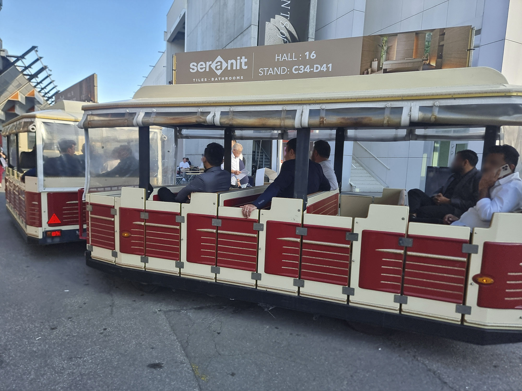
DJ sets and dance bands are no longer enough to unleash reggaeton and conga lines (“train dance”) (“A far l’amore comincia tu”!). Now there are fire-breathing acrobats, dance troupes, videomapping shows, and light installations.
Even fireworks lit up the Sassuolo skies every evening during the tile week, setting off alarmed social media debates. If Paris has the Moulin Rouge, Sassuolo now replies with the Crogiol Blanc.
Not everything was circus-style glamour though—some brands opted for elegant understatement with refined food experiences and cultured entertainment (think truffled quail eggs and harp music).
P.S. There are no pictures of these divine evenings—they’re top secret, reserved for Only Fans.
MIX & MAH
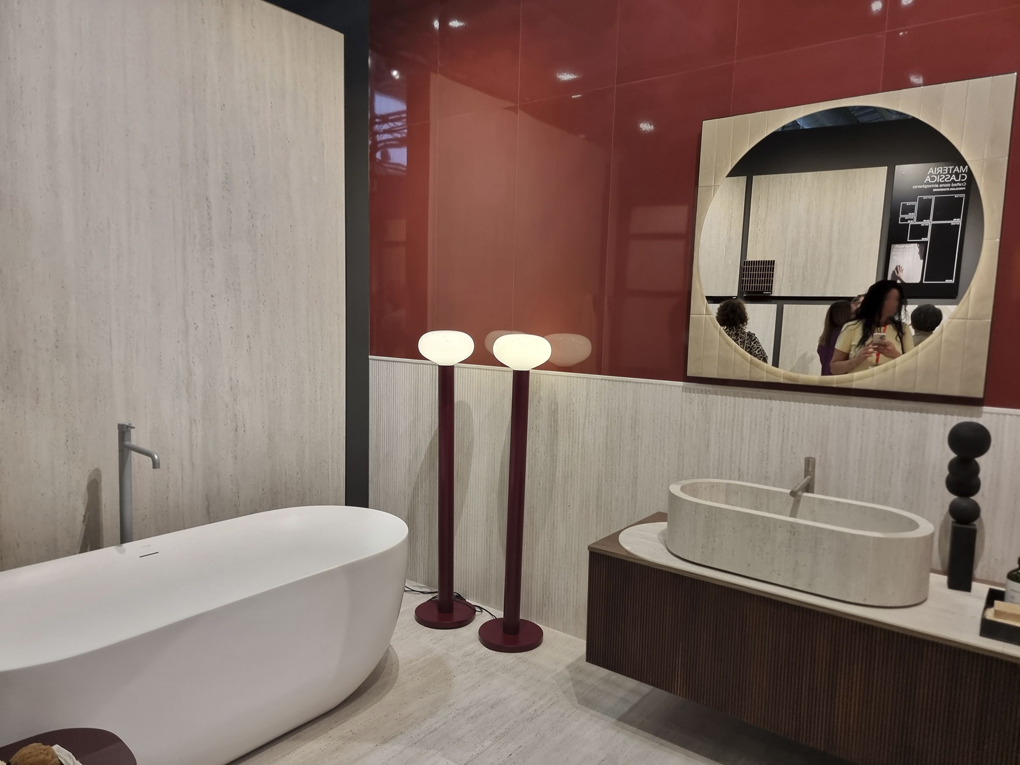
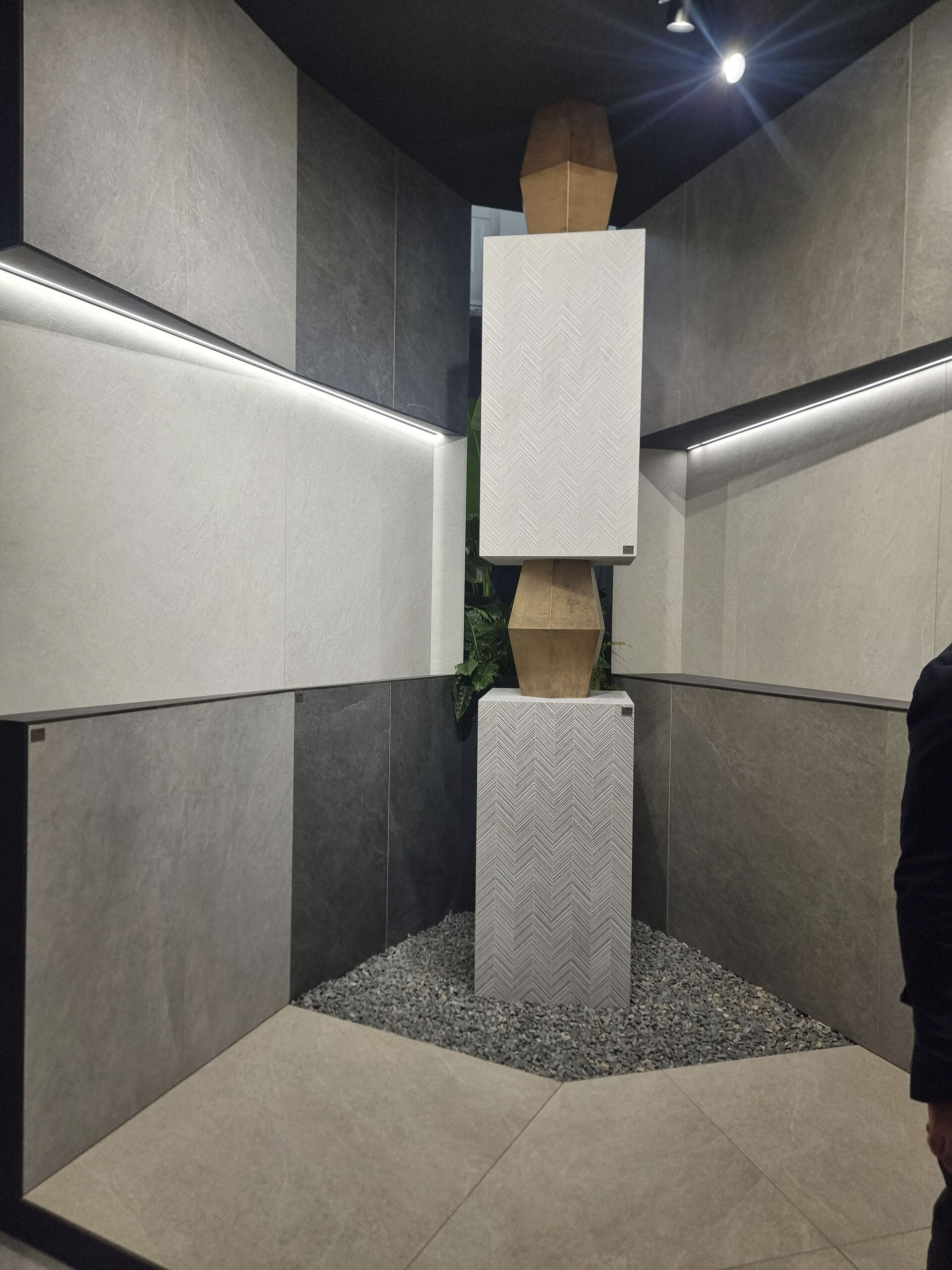
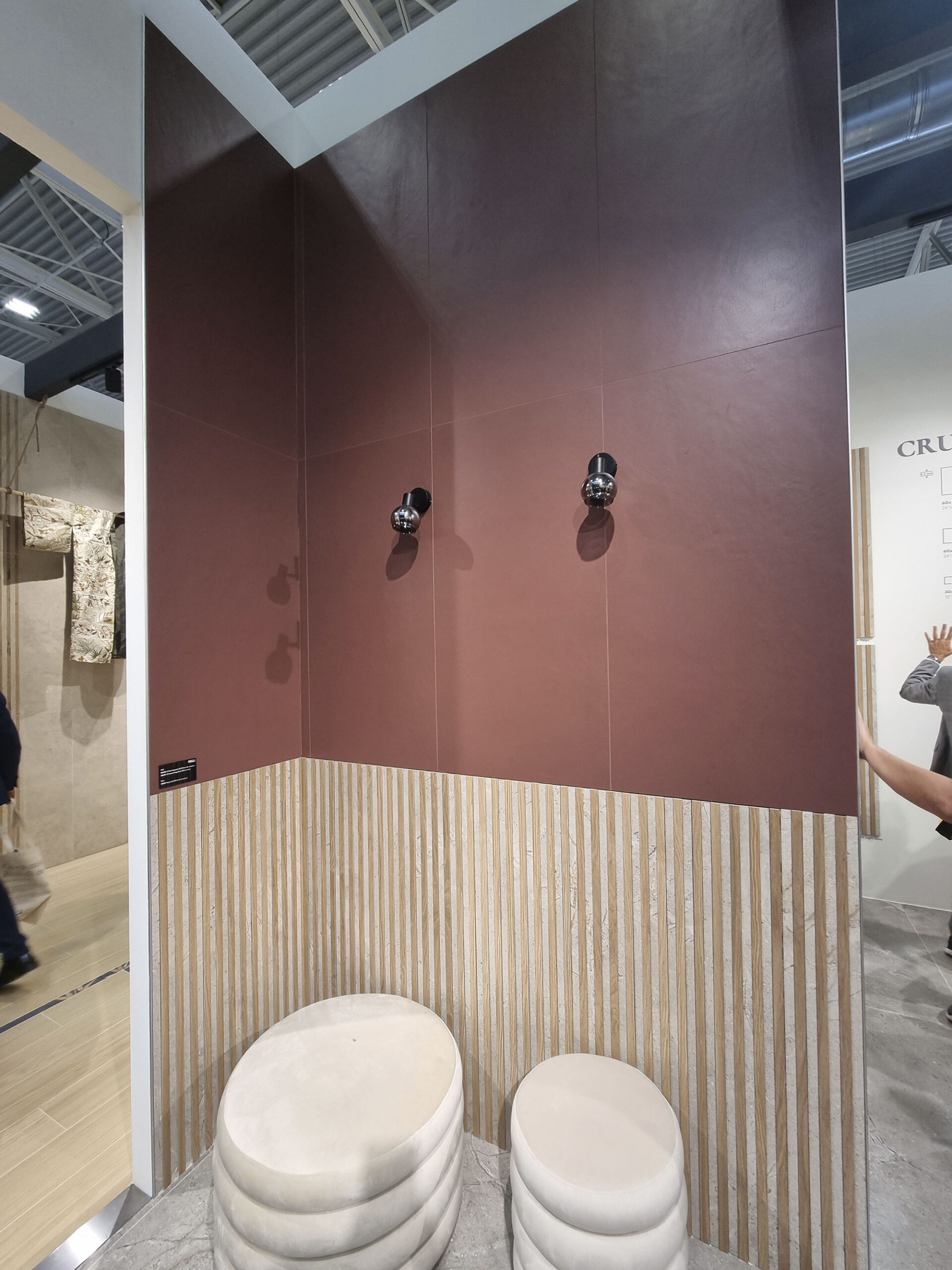
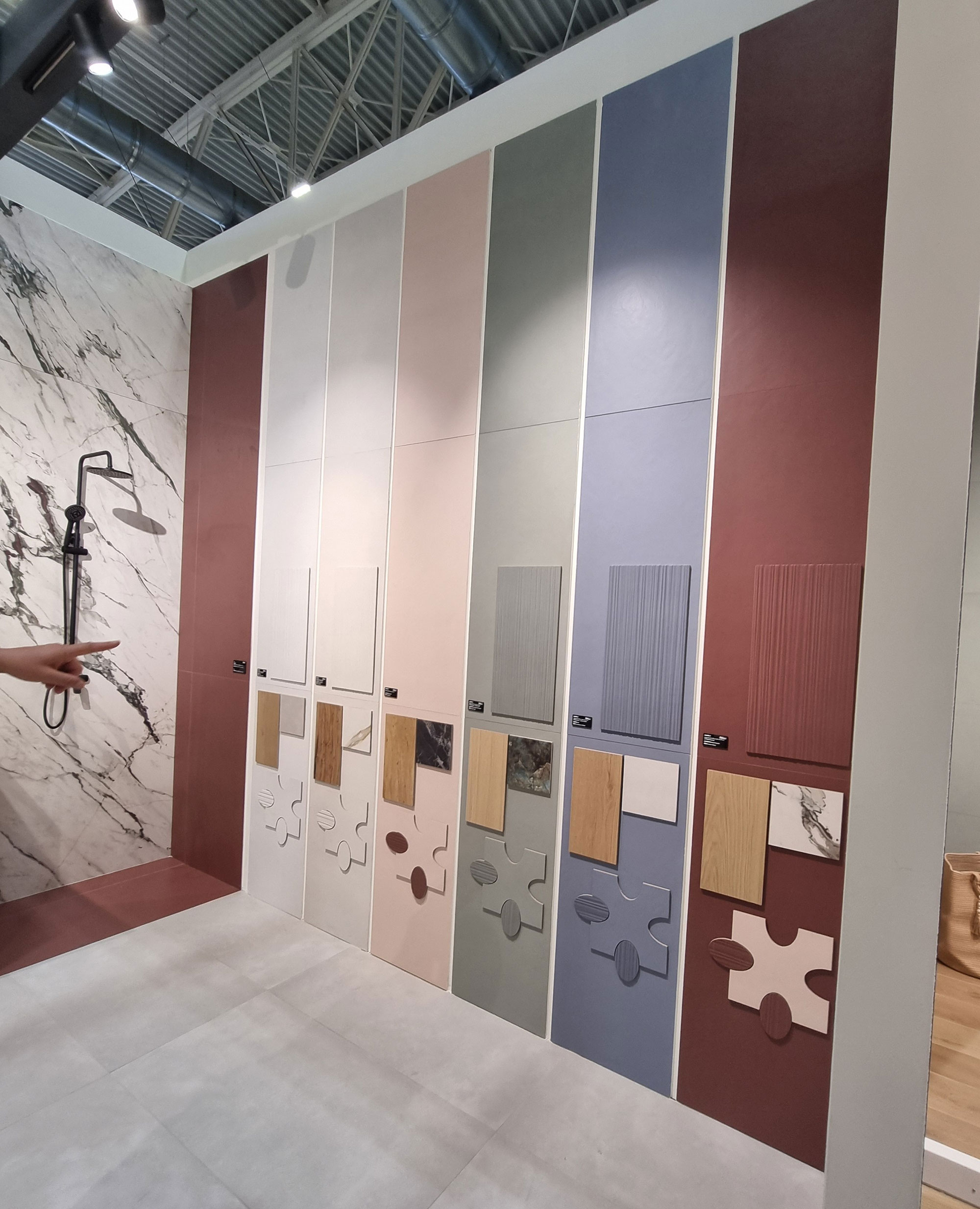
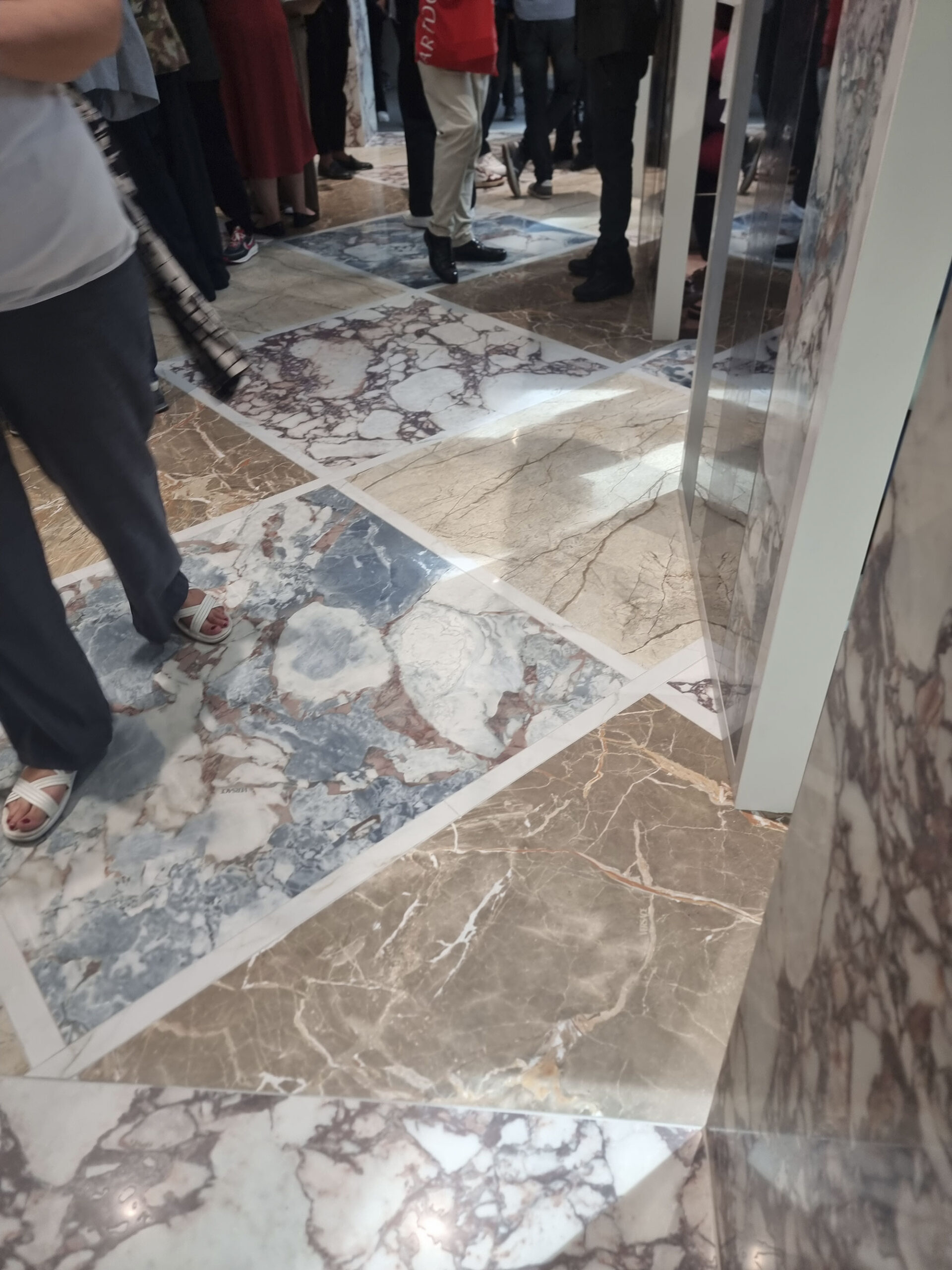
When genuine novelties are gasping for air, the solution is to play with combinations.
Many collections are born paired (or “supposedly” so), but some look like spontaneous gang bangs of textures.
The recipe: mix 2–3 textures (sisters, cousins, or twins) that relate by color or design.
In other cases, completely different series are grouped to describe a shared lifestyle.
It’s a win-win strategy where 1 + 1 = 3—but showing off the endless pairing options intuitively and clearly isn’t easy. Visitors are dazed and zip through stands in seconds.
Complexity doesn’t always pay off: we’re not at less-is-more yet, but those who opted for poc-ma-bel (just a little bit but beautiful) and showcased their best combos hit the “love at first sight” button.

Casalgrande-padana-Elements

Cerdomus-(6)
Fap-Ceramiche-(3)

Fap-Ceramiche-(5)

Fap-Ceramiche-(7)

Fap-Ceramiche-(12)
Mirage-Linea
Refin-(7)

Refin-(10)

Refin-(11)
Rondine-(17)
Rondine-(27)

Rondine-(39)
Versace-Abk-(1)

Versace-Abk-(3)

Versace-Abk-(4)
THE THRONE OF BARS
In the Ceramic Circus Maximus, the competition is eternal: who has the longest format, the most powerful press, the biggest showroom—and the biggest SUV at the pub (electric, of course).
When it comes to large formats, we’re at a standstill: size isn’t everything.
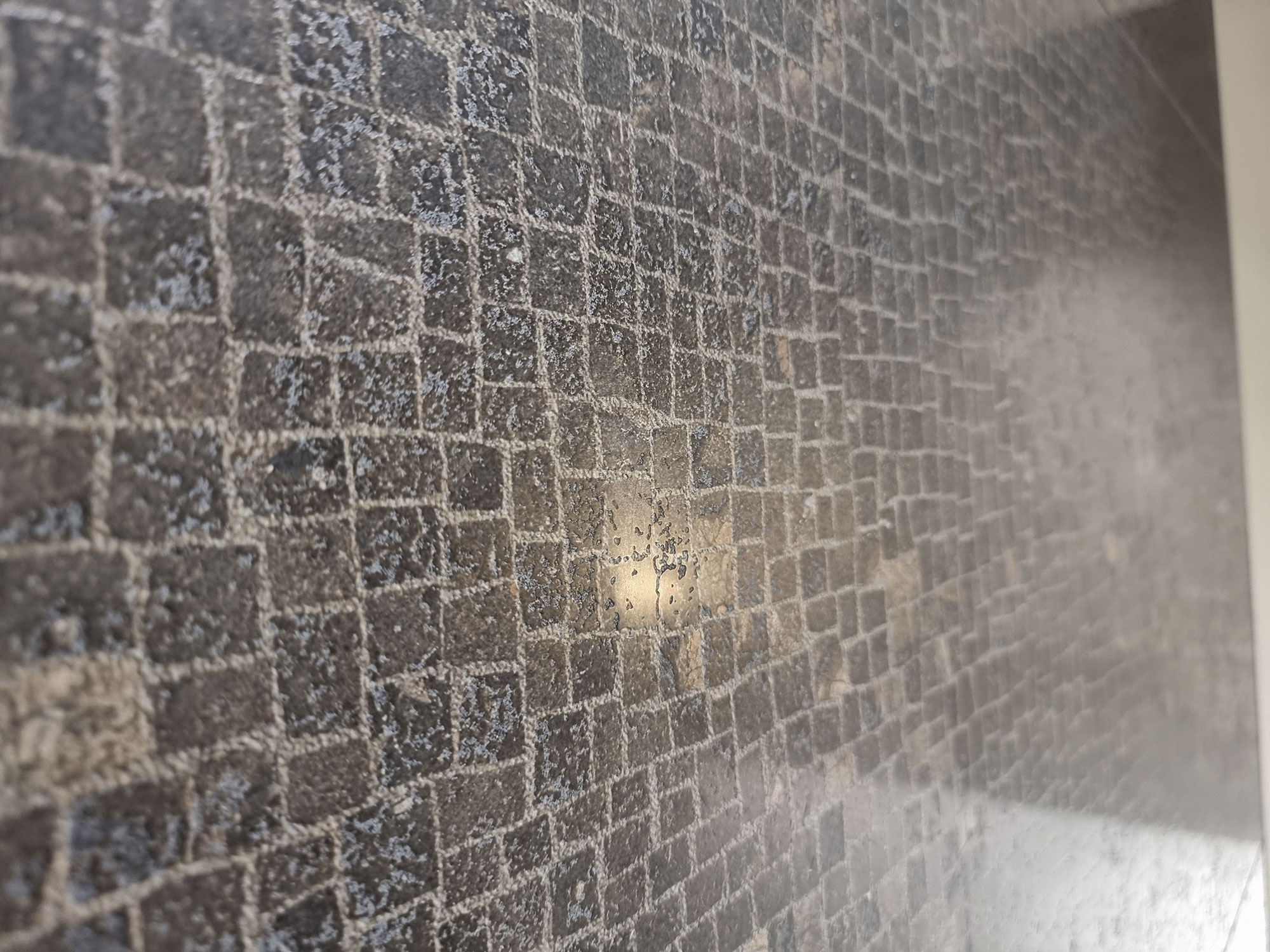
But with Digital Revolution 8.0, a new battlefield opens—the race for the Throne of Bars (digital bars, that is).
For non-technicians: these are devices installed along tile decoration lines for digitally controlled and synchronized effects.
In short, the more bars you have, the cooler you are.
But the truth is—you need to know how to use them (no locker-room metaphors intended).
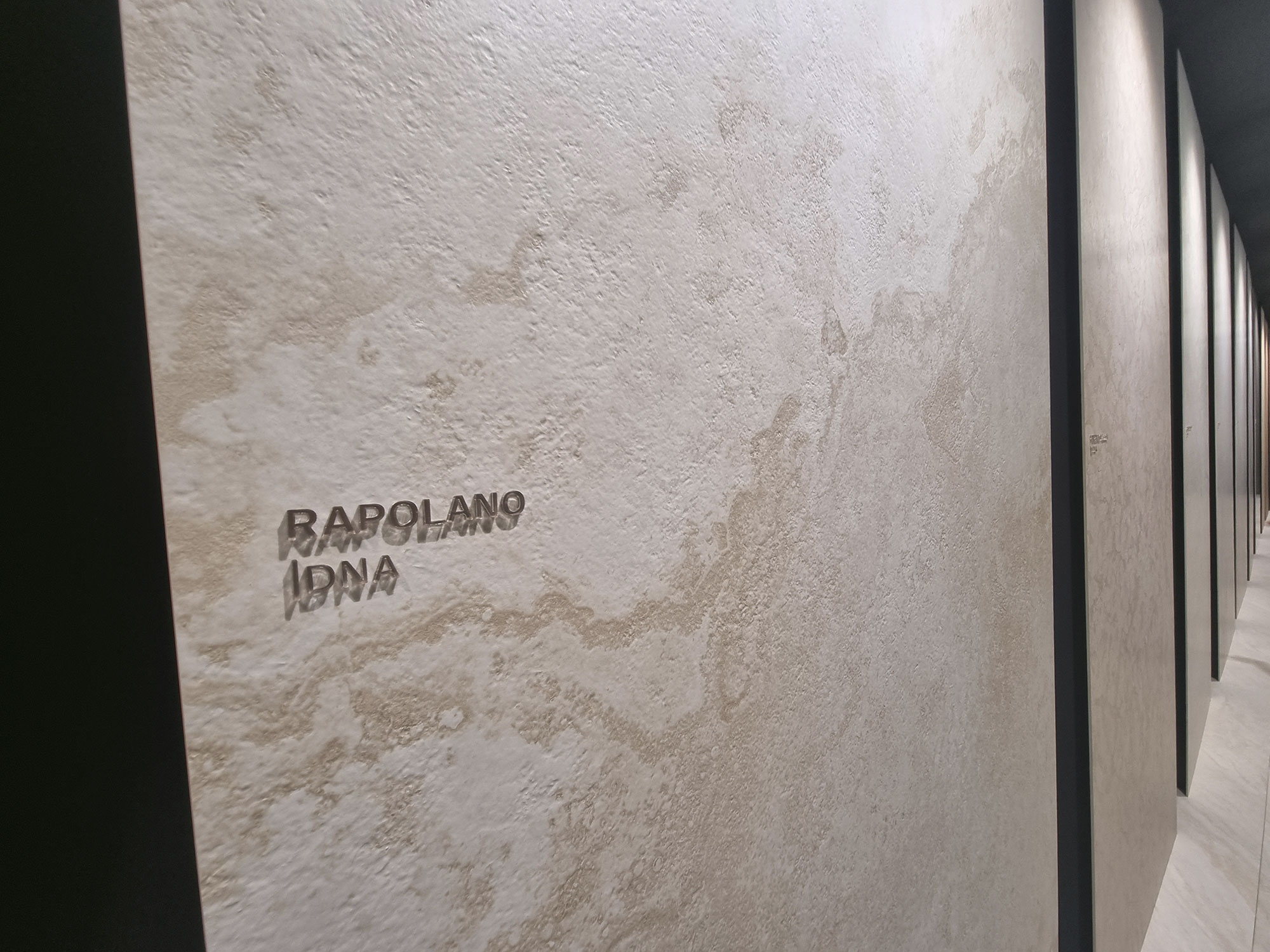
At the dawn of the digital era, 4 bars made you king of the world.
Then came the seductive whispers of the Sassuolo (and Spanish) supply chain:
“Come on… don’t you want the glossy bar, the glue, and the grit?”
Soon the starter pack went from 4 to 8 bars… then 12 (double glue and double grit).
Competition spiraled out of control. If you upgrade your plant, how could you not add a few more bars to boost your market smart tone?
Now we’ve got bars for reserving, sinking, botox, stardust, probiotics, and tanning hormones—some lines hit 24 bars, breaking the sound barrier.
Obviously, multi-bar products are cooler, and sales reps puff their chests:
“Your travertine’s weak—it’s only 8-bar barricaded. Mine’s 18-bar barricaded. Vamolà!”
All with single-vineyard pure grit, lapped on its natural yeasts.

Cerdomus-(21)

Cerdomus-(22)

Coem-(22)
Coem-(23)

Coem-(31)

La-Fabbrica-Ava-(10)
Laminam-(6)
GREEN POWER & FAST FASHION
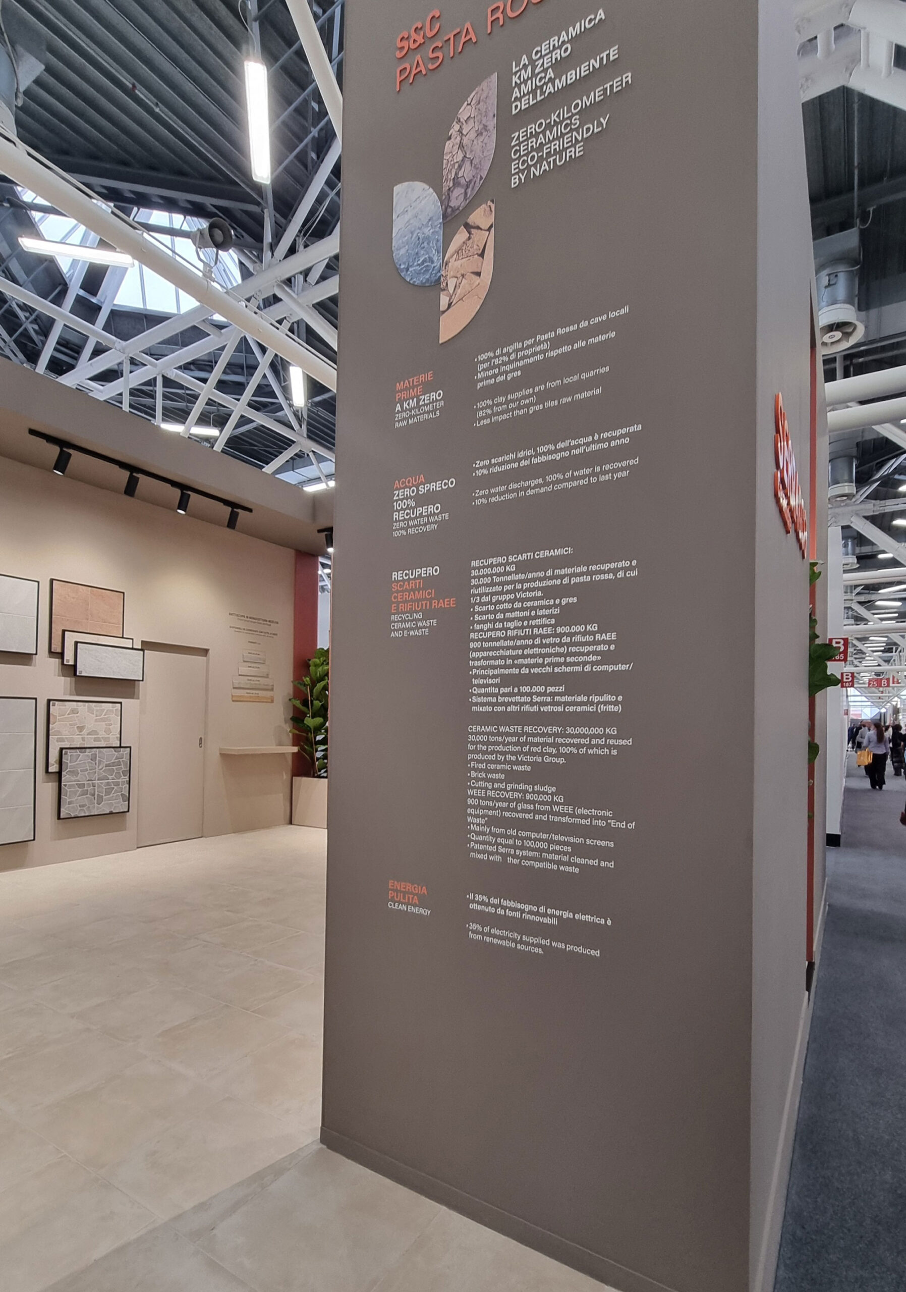
The hard, ongoing work that Made in Italy brands are doing to be ahead in the ESG (Environmental, Social, and Governance) kingdom is both ethically right and strategically smart (confirmed by many insiders).
If green commitment doesn’t always shine through in the booths (except for a few glowing exceptions like Frassinoro–Gresmalt), it’s because sustainability alone doesn’t “sell.”
But without those certifications, you’re out of major projects and large distribution networks.
This applies across markets—from luxury real estate to cash and carry shops. The empathy between brands, designers, distributors (and yes, conscious consumers) passes through shared values.
Sure, there’s a fast-fashion segment in ceramics too, but that’s not our kind of bread.

Frassinoro

Cotto-d’este-Think-Zero

Mirage-(12)

Sant’agostino
Serra-and-co-(1)

Serra-and-co-(2)
Capitolo 2
JUMPING ZIG-ZAG THROUGH THE ZERAMICHE
JUMPING ZIG-ZAG THROUGH THE ZERAMICHE
50 SHADES OF BEIGE
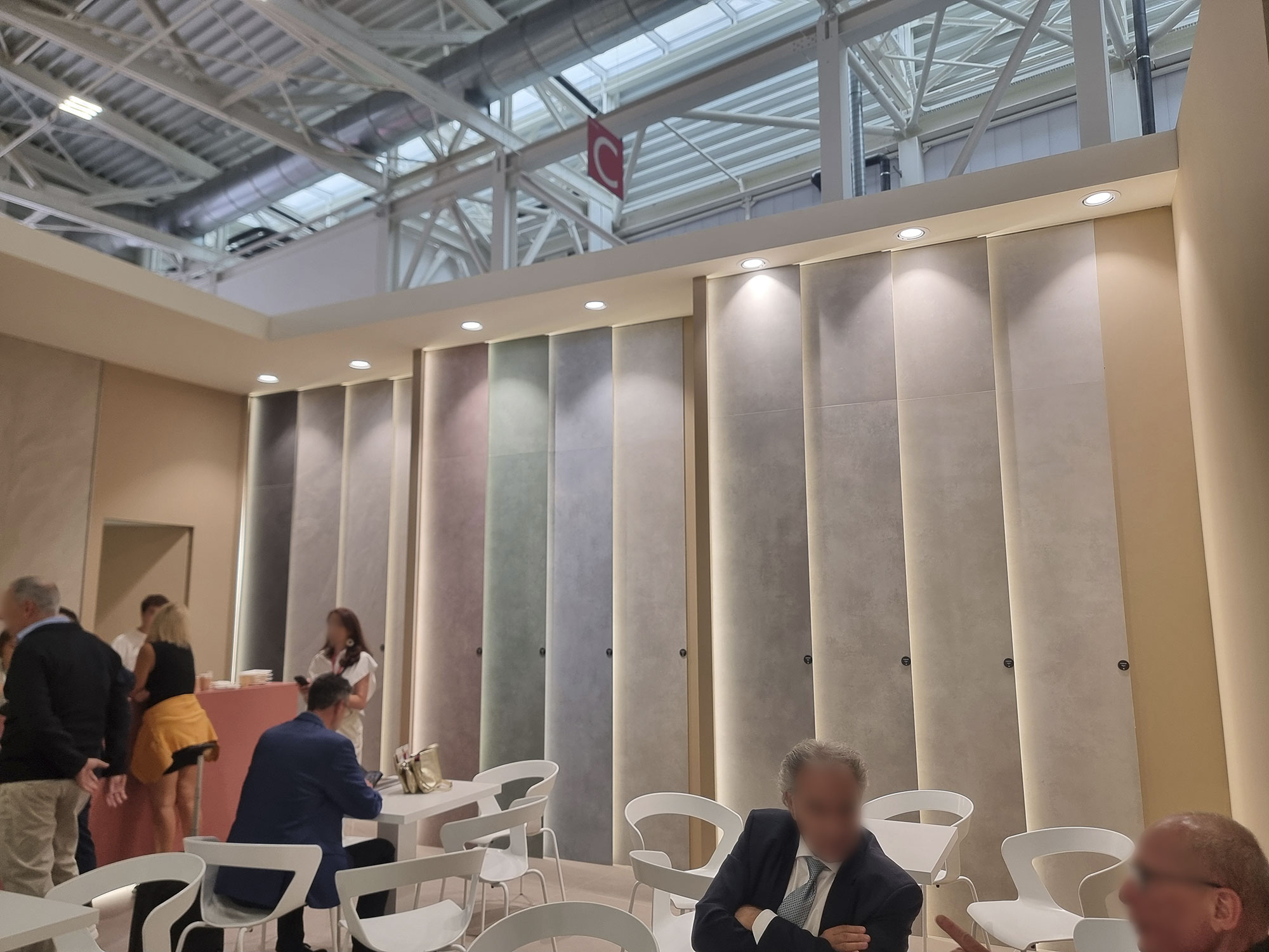
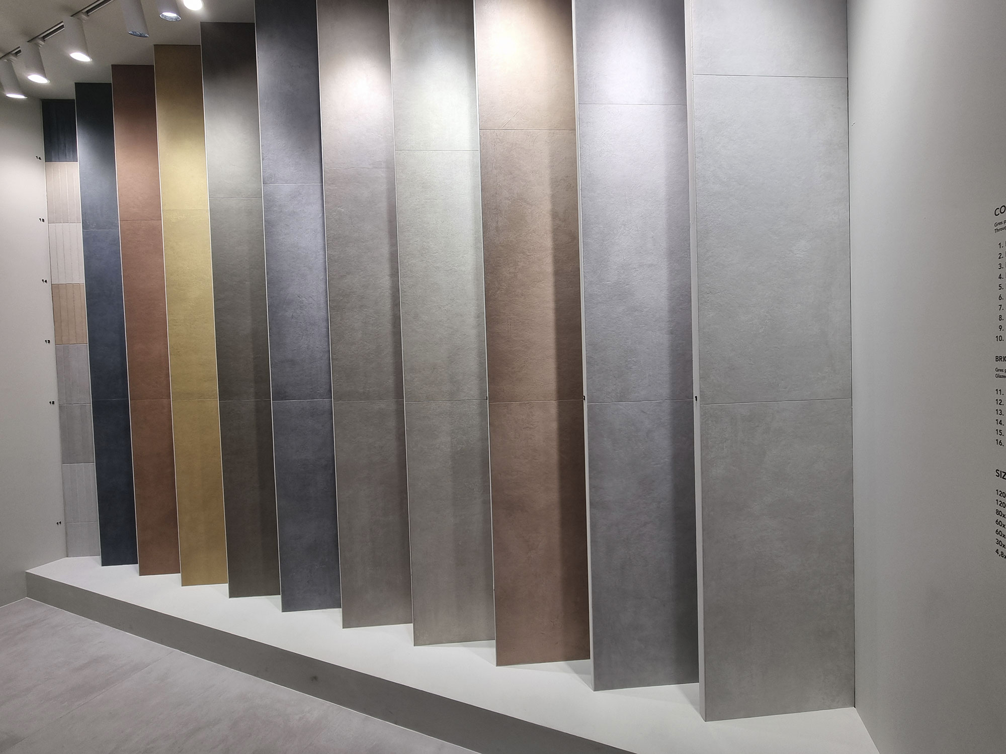
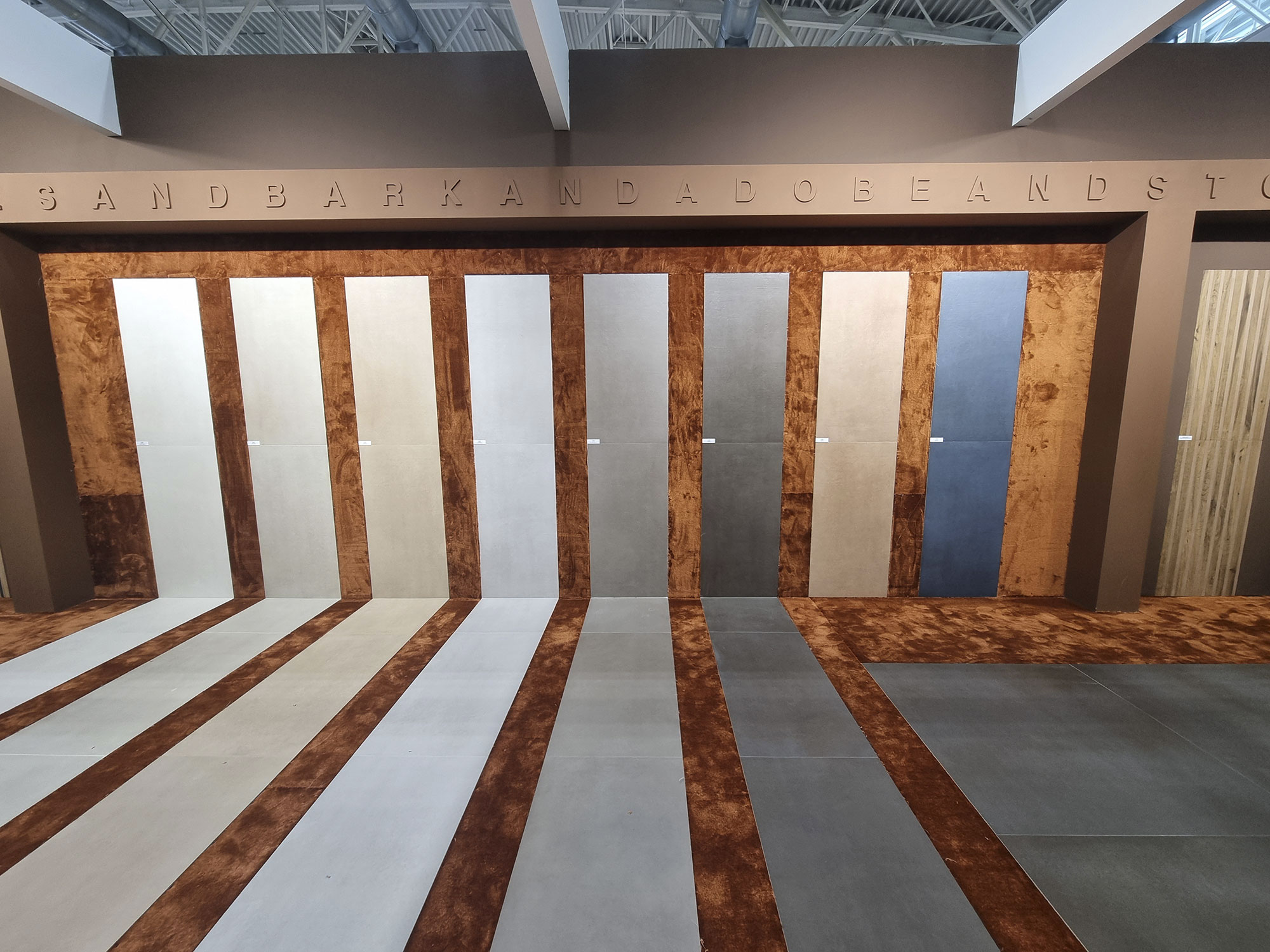
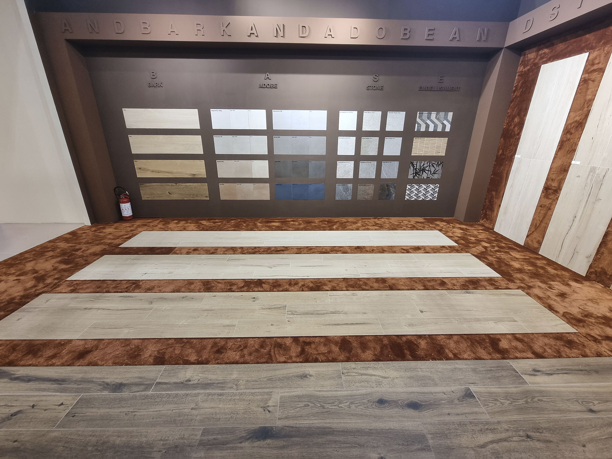
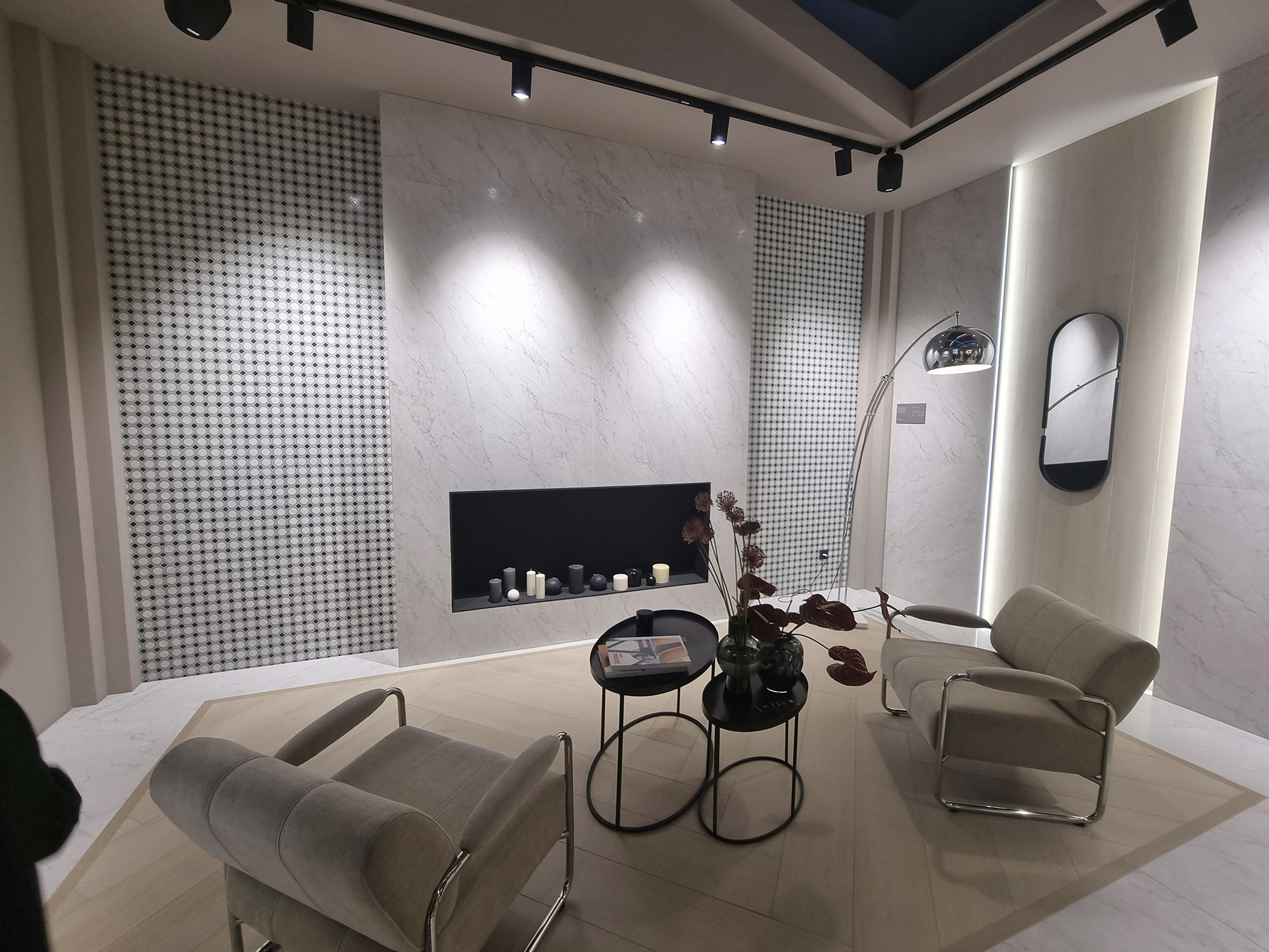
The overall feeling: a soft landing into calm, natural tones—beige, warm white, taupe, greige, and pearl gray—creating reassuring atmospheres (see Bon-ton Gardenia–ABK).
Others lean toward natural moods with warm, earthy nuances—even a few peach tones revived from the ’80s.
Maybe it’s a cyclical reaction after seasons of loud graphics—or simply a search for harmony and serenity amid global uncertainty.
Mainstream stoneware formats favor soft shades and natural surfaces, but bright colors pop up in bricks and small formats, completing the color-driven backbones of many product ranges.
White marble makes a comeback—but honestly, it never really left.


Casalgrande-padana-(3)
Gardenia-Abk-(1)

Gardenia-Abk-(2)

Gardenia-Abk-(4)

Gardenia-Abk-(10)

La-Fabbrica-Ava-(16)
MUMBLE MUMBLE: CRUMBLE!
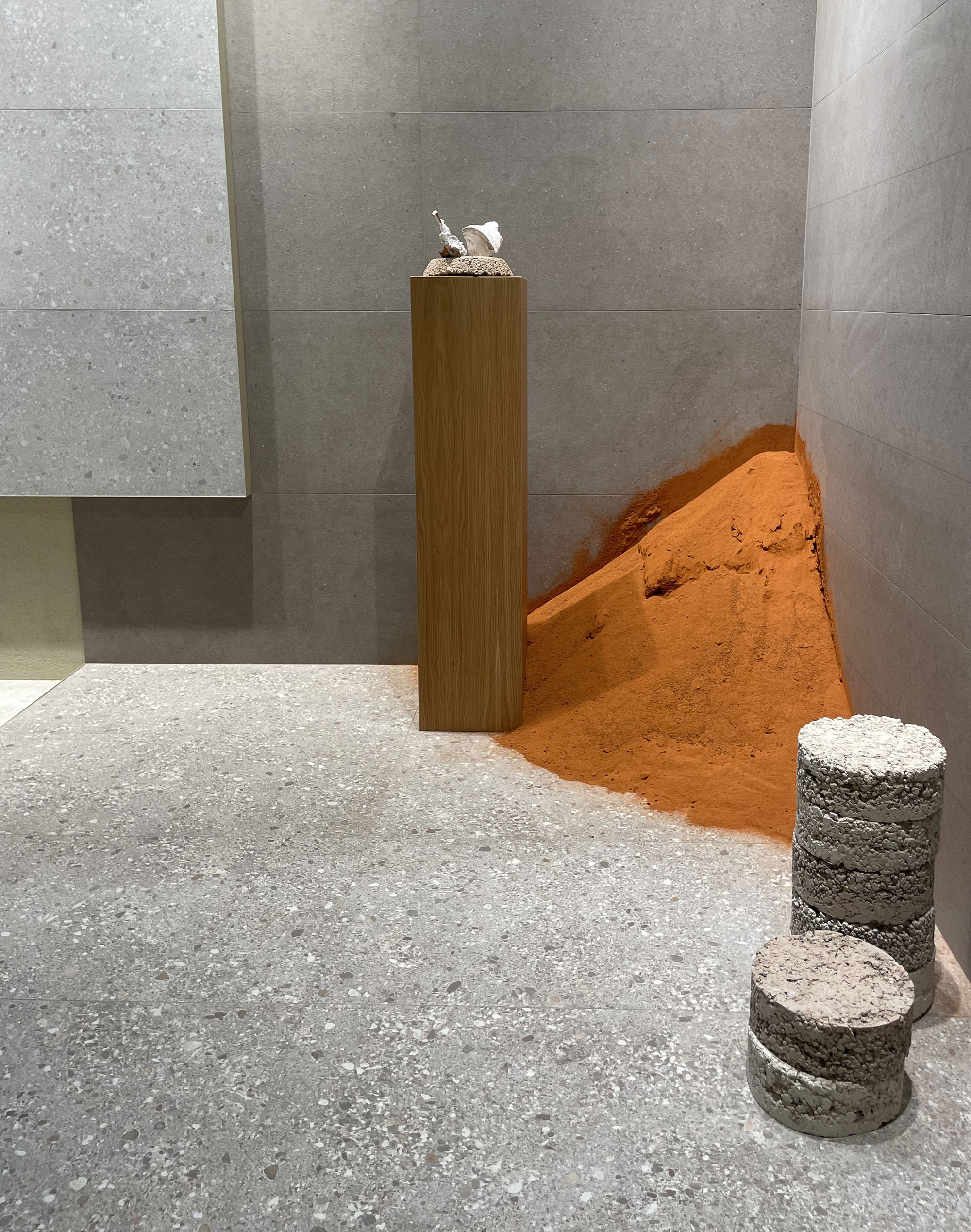
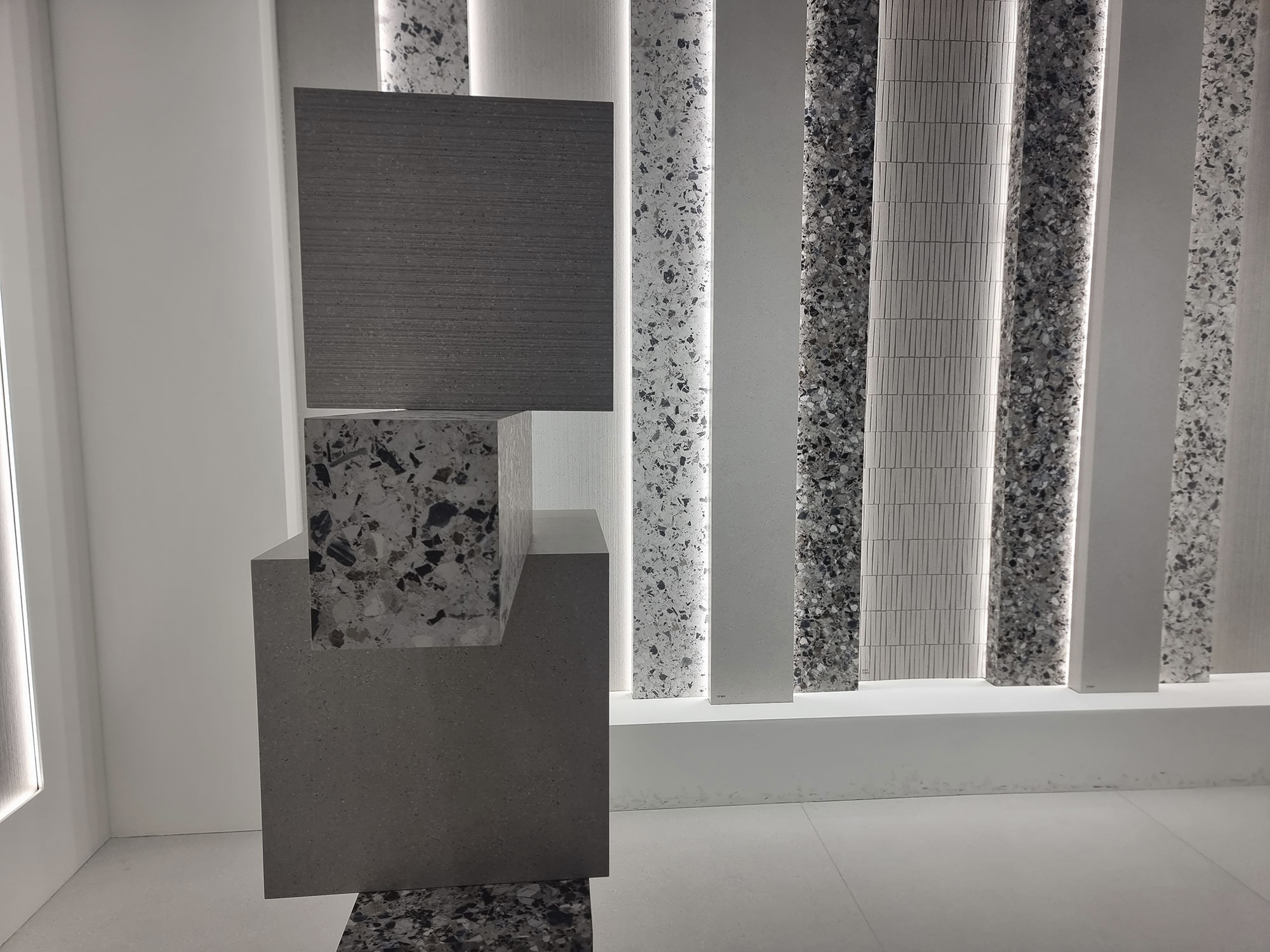
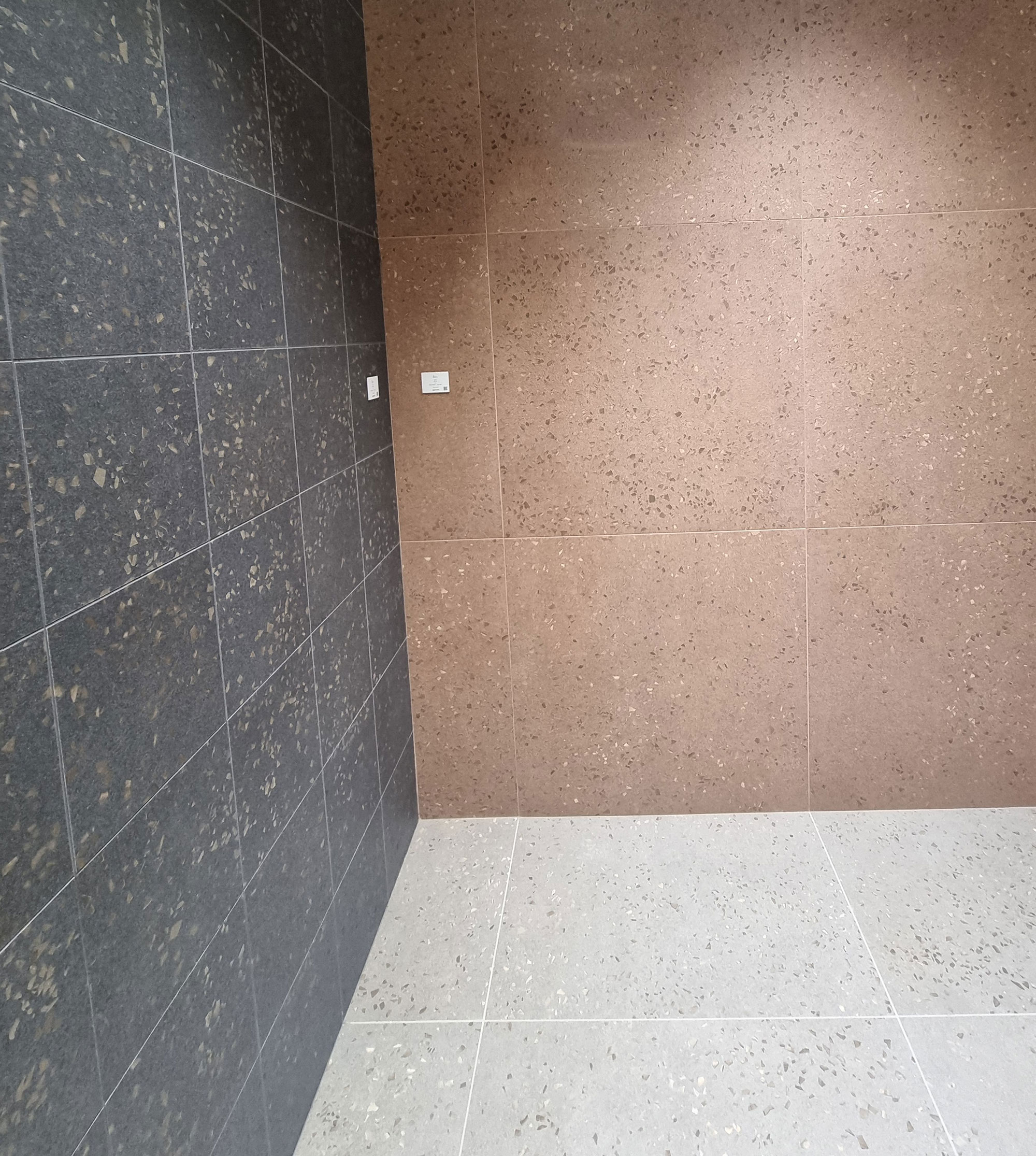
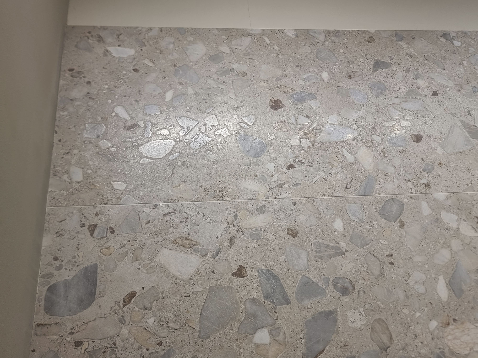
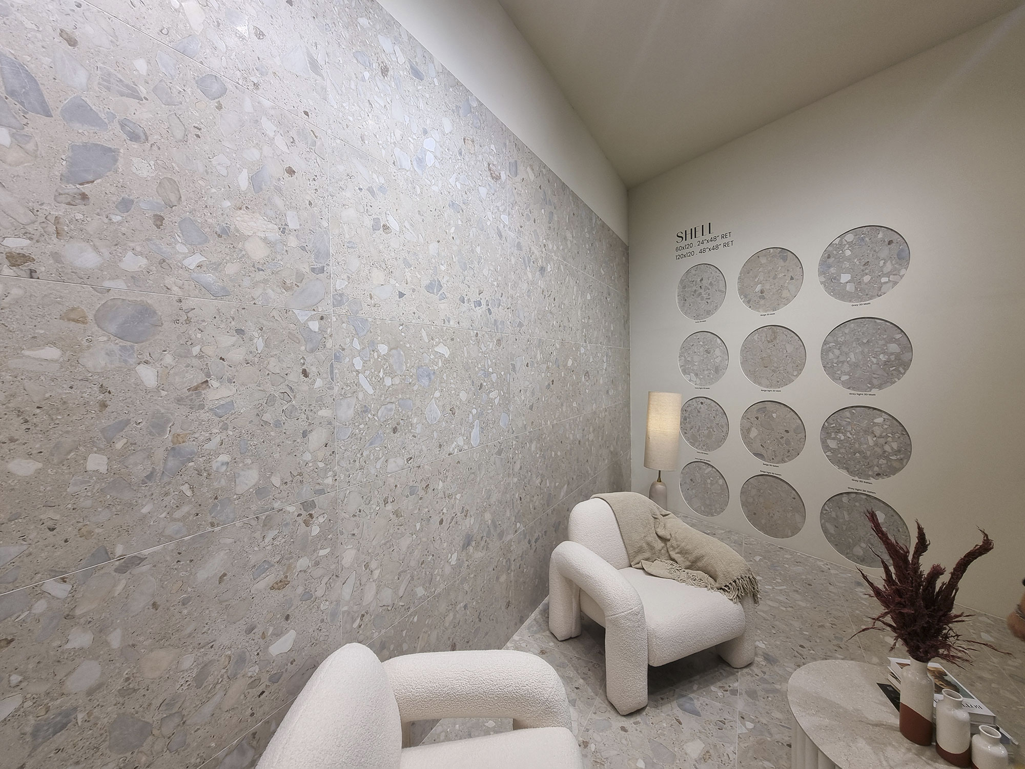
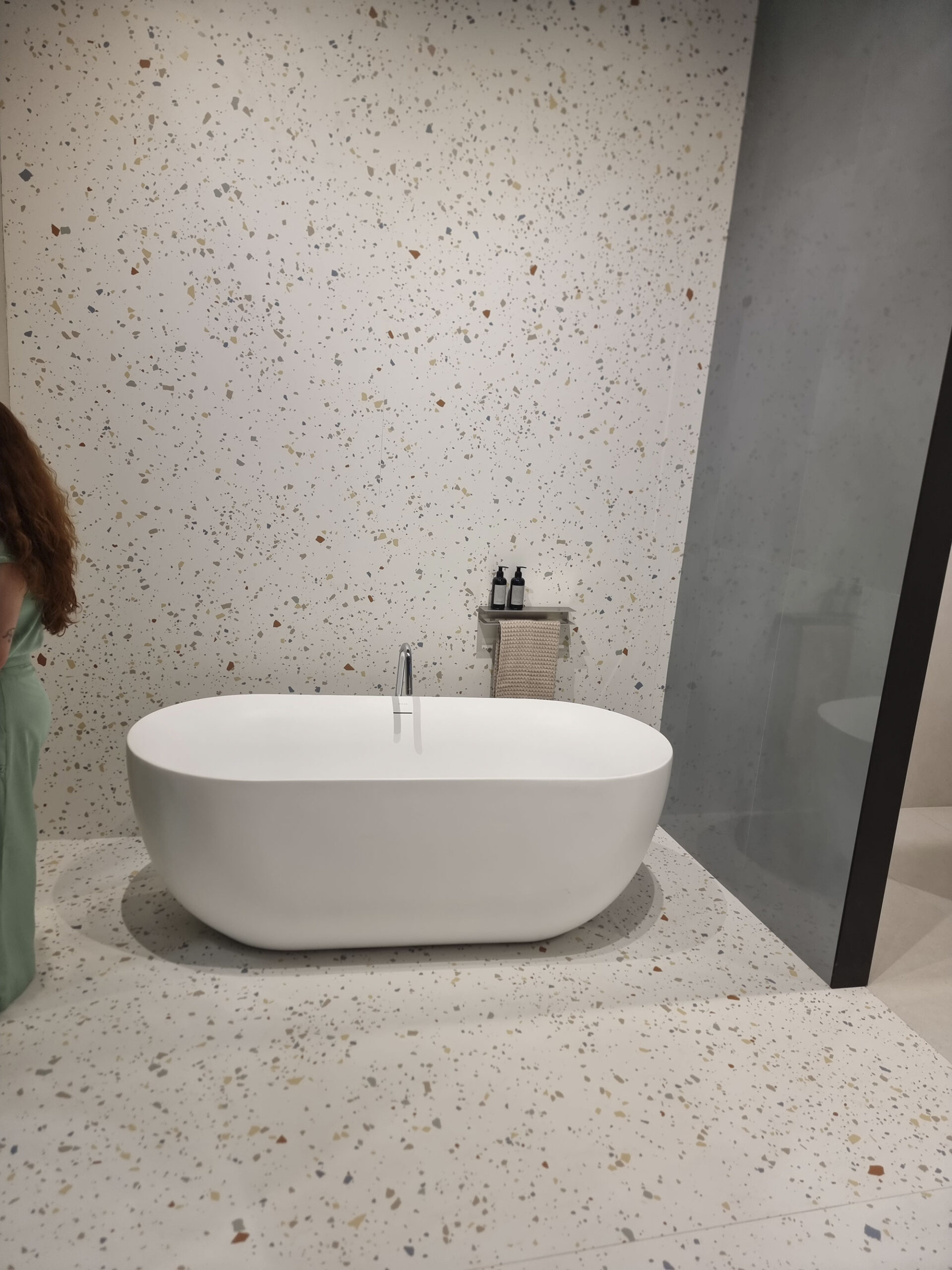
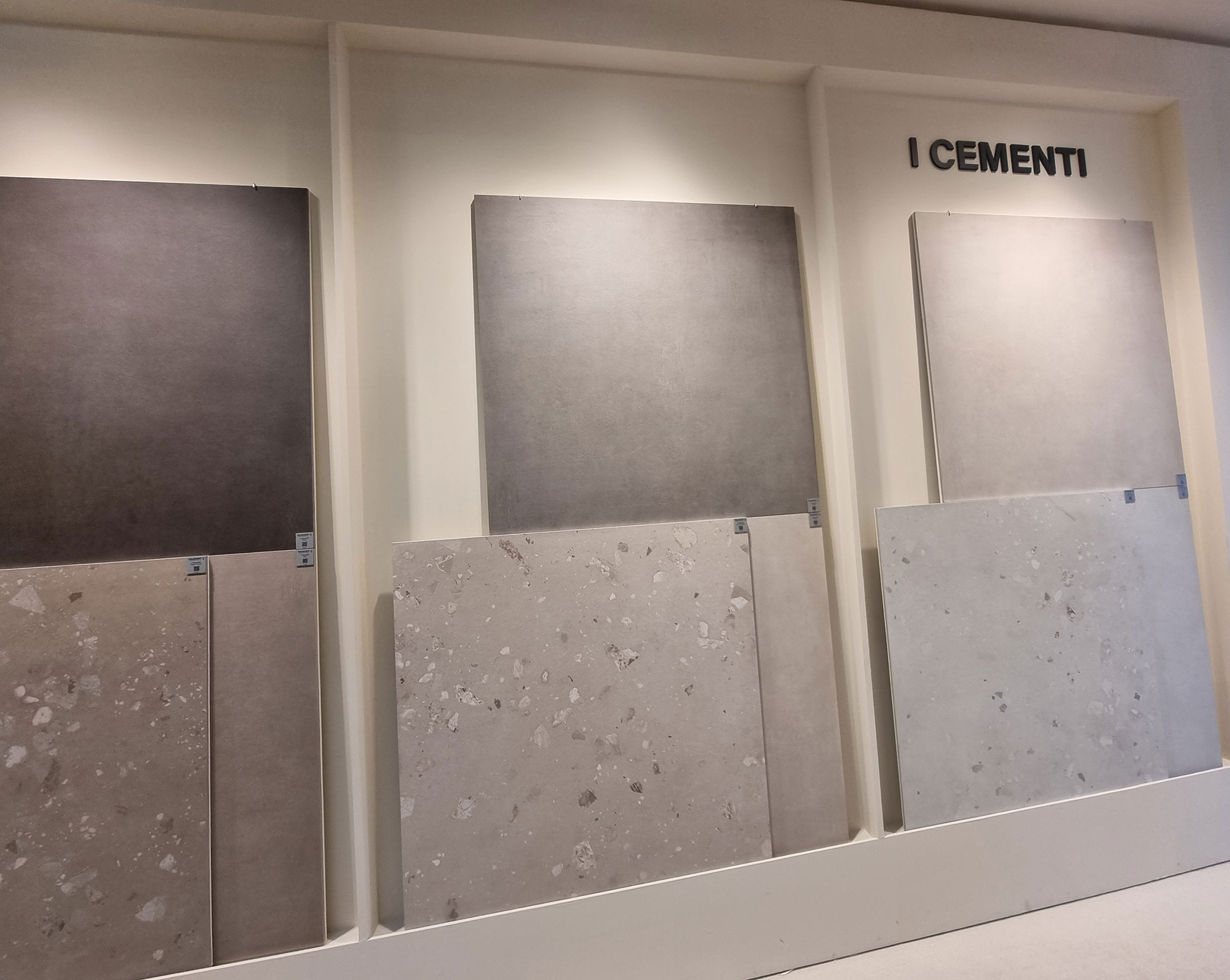
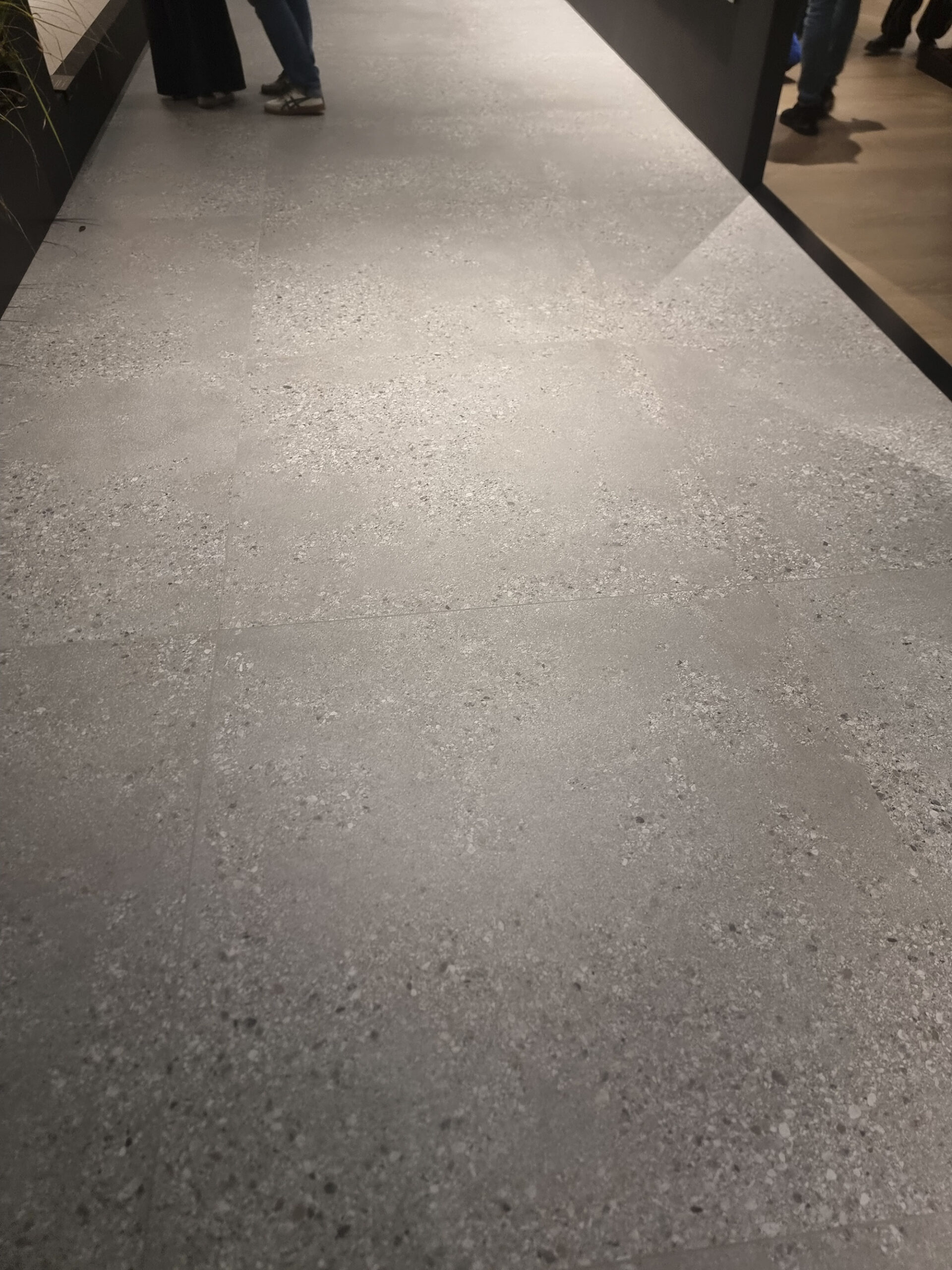
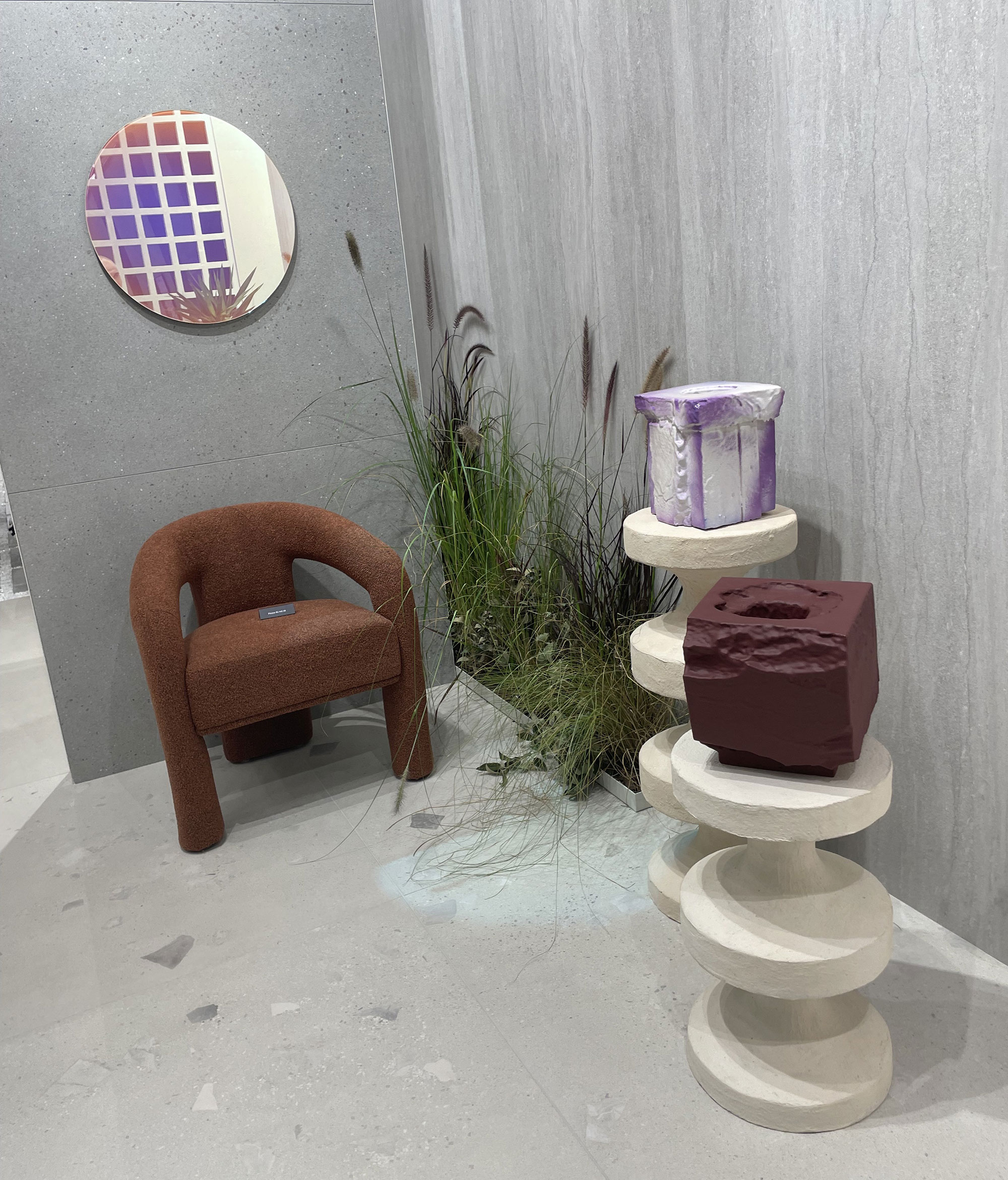
Pebbles, gravel, and terrazzo 2.0 form the great fil-greige of 2025.
The goal: synchronized reliefs that enhance glue-and-grit applications, upgrading commercial appeal.
There’s something for every taste—from ceppo-inspired stone to mini-monochrome chips, from sporadic terrazzo to chunky marble aggregates.
Fragmented patterns reappear from recent past seasons.
Many brands (coincidence?) introduced triptych or diptych ranges—progressive graphics from micro-textures to dense or maxi fragments.
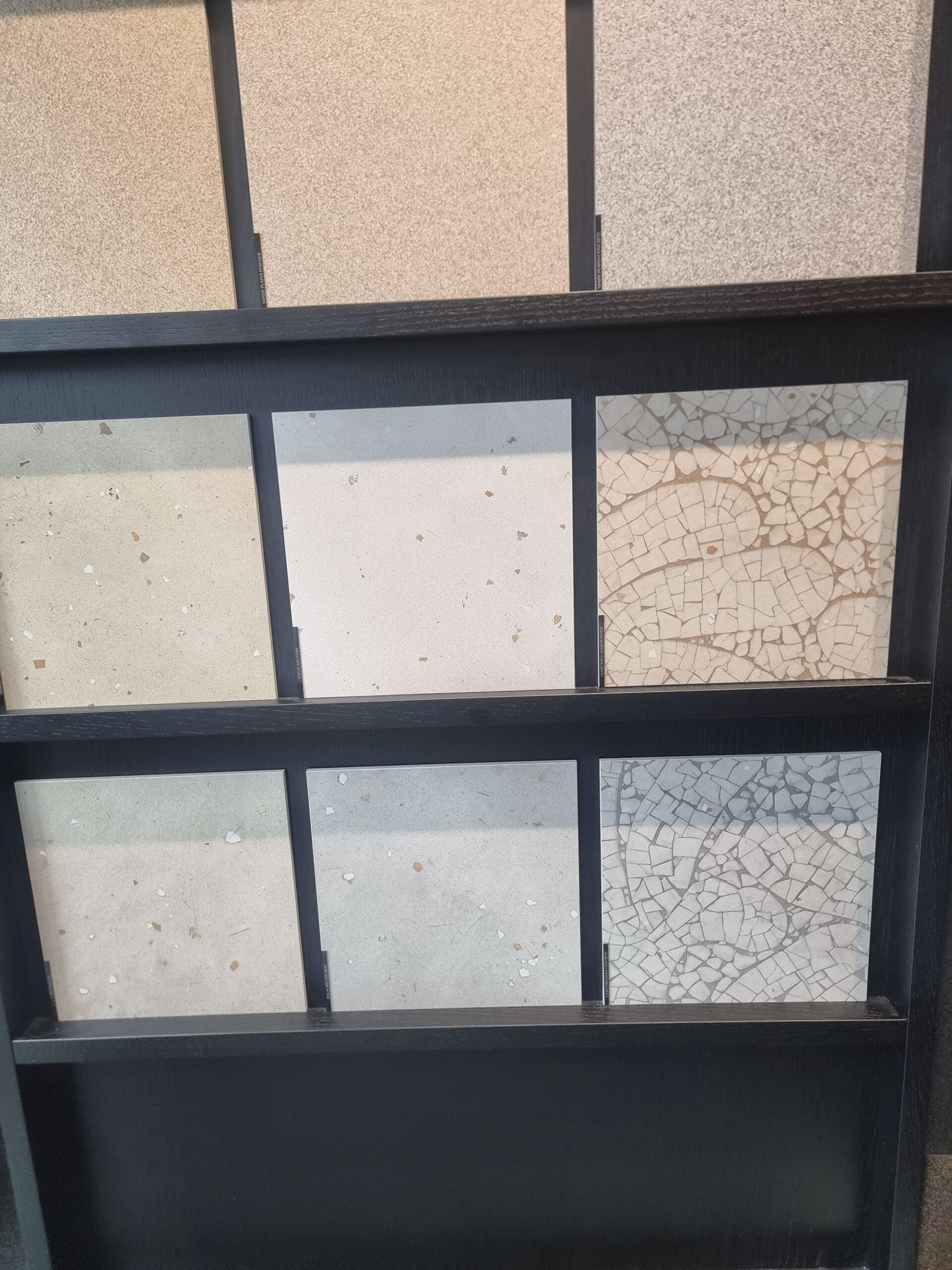
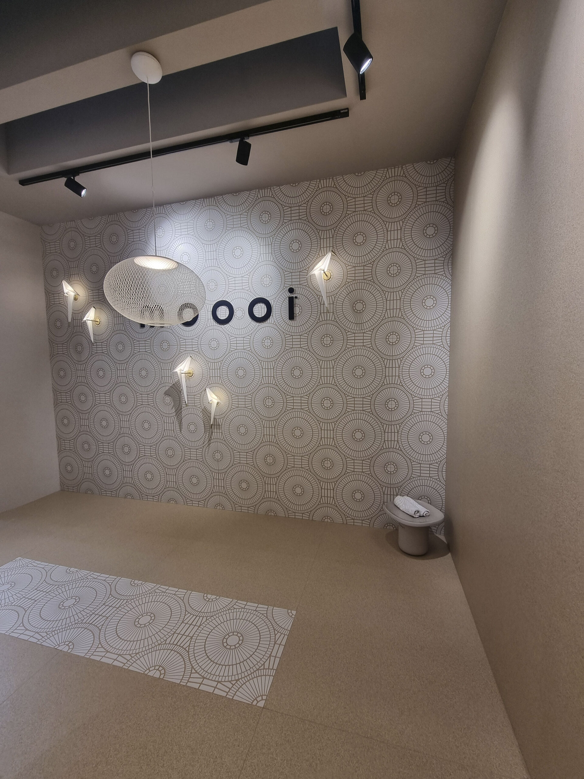
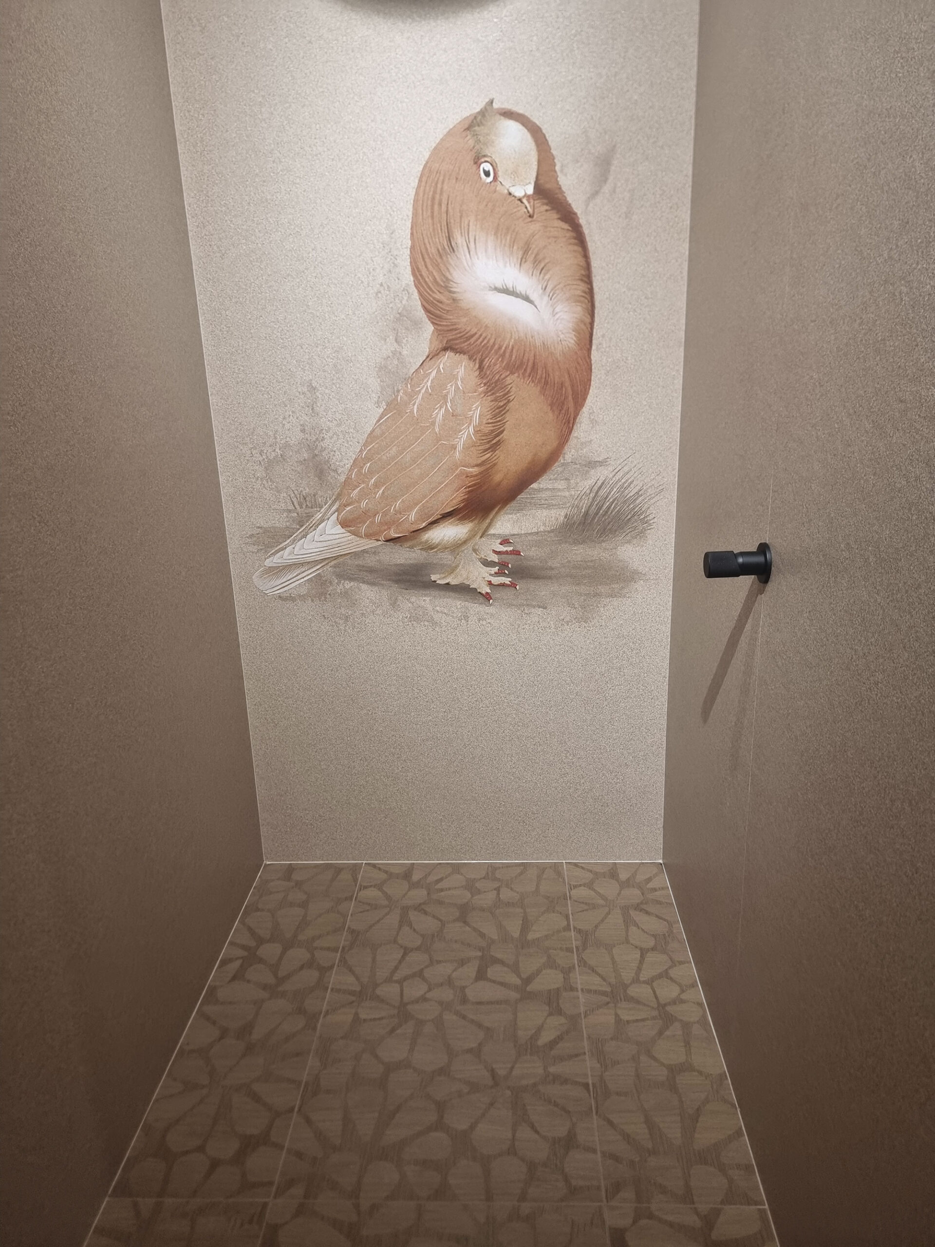
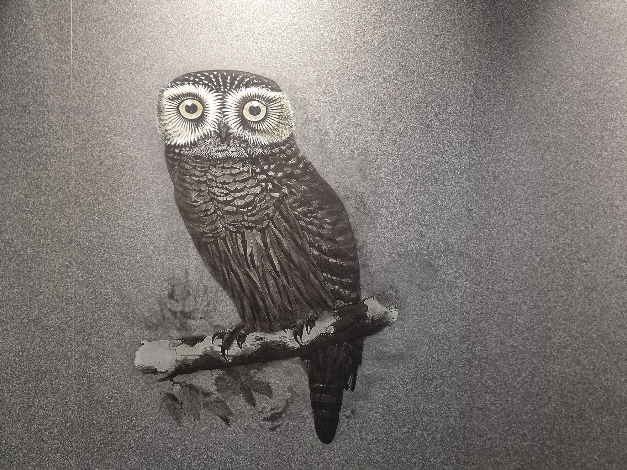
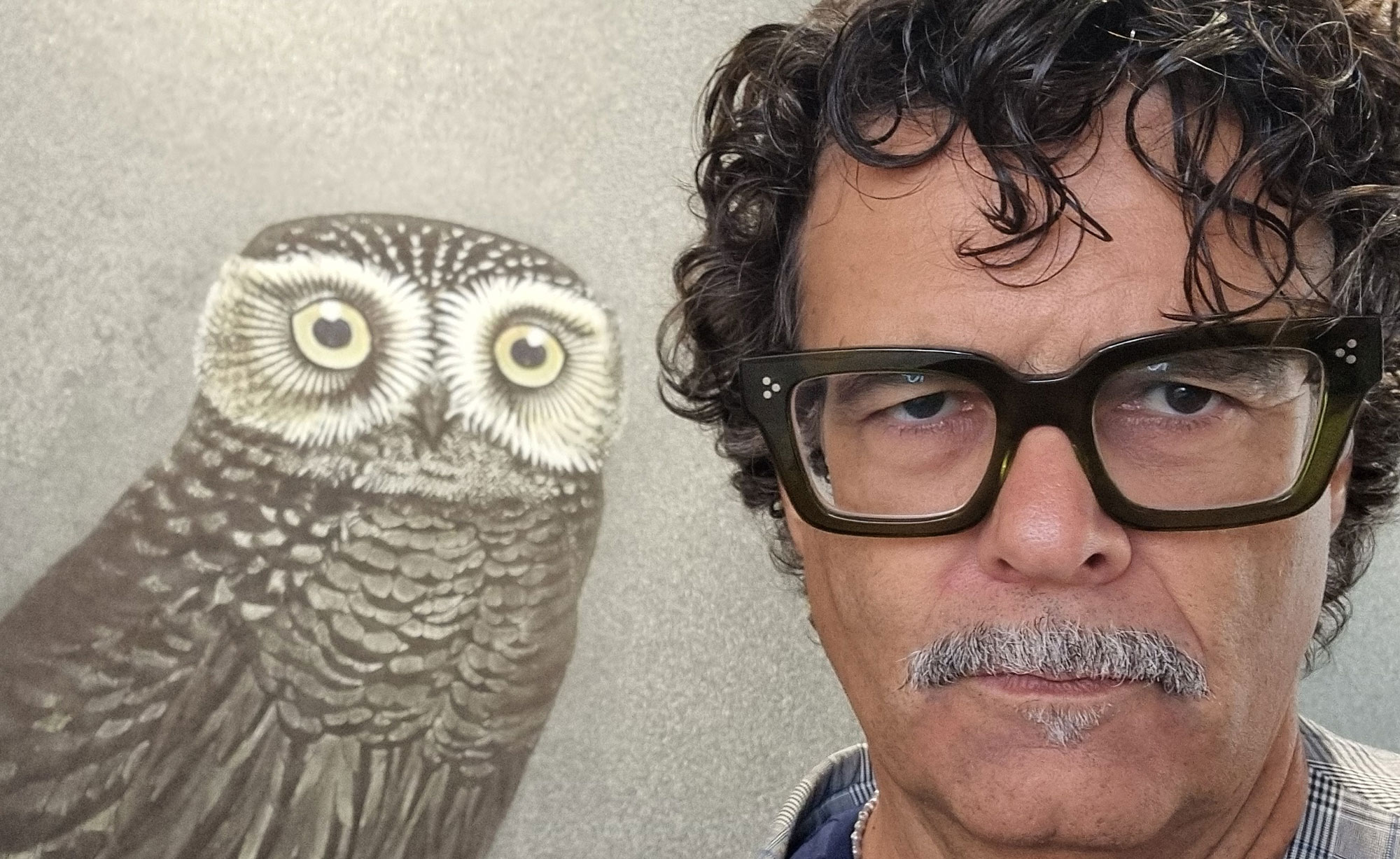
Delightfully ironic: the Moooi / ABK project featuring eggshell fragments and giant owl or partridge decors—part of an ornithological collection.
what came first—the chicken or the egg? Who knows. Either way, bravo.
Abitare-(6)
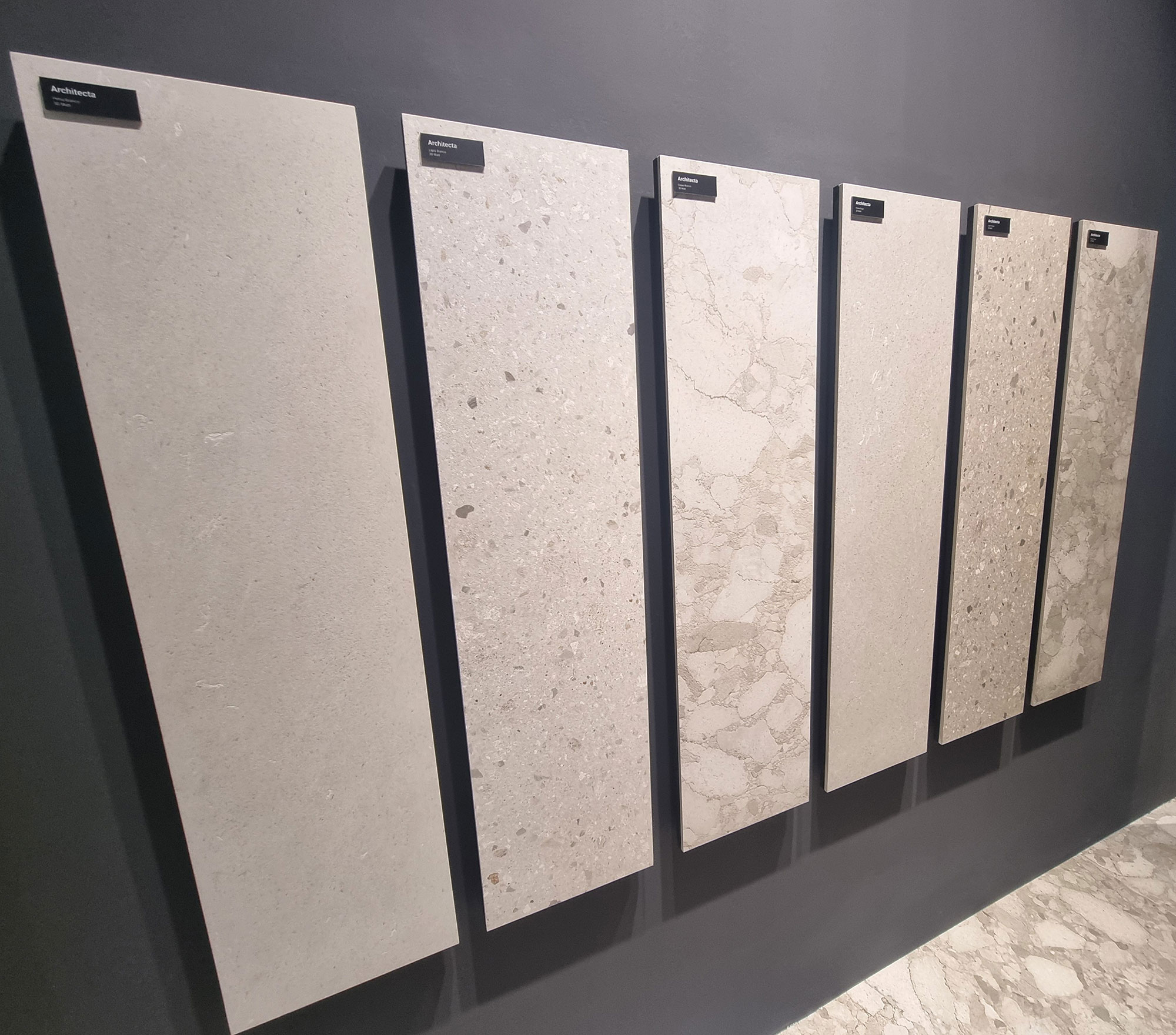
Ascot-Architecta-trittico
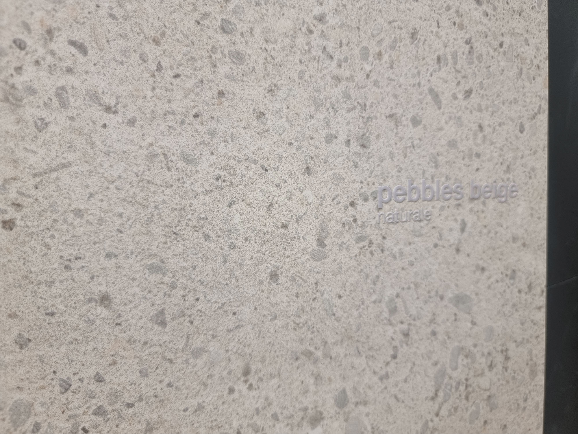
Casalgrande-padana-(9)
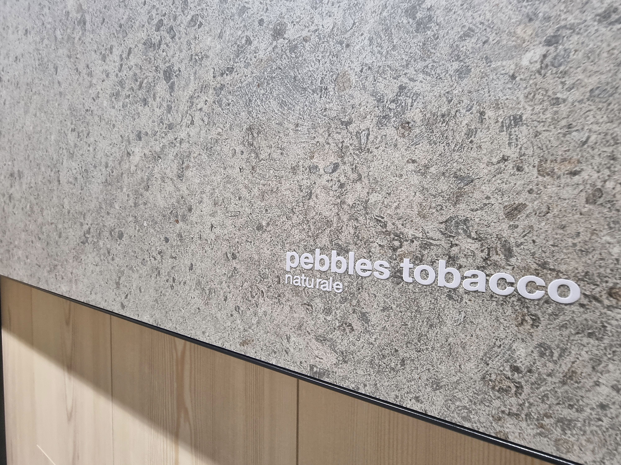
Casalgrande-padana-(14)
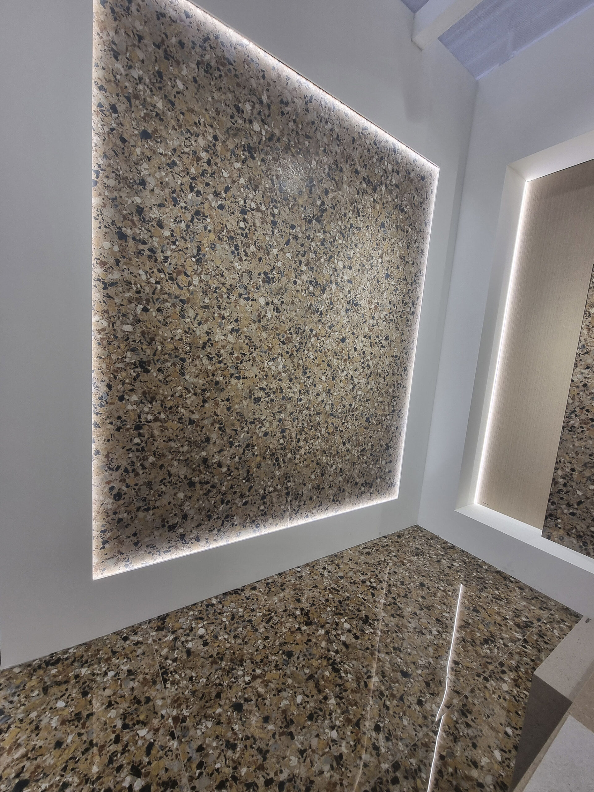
Cerdomus-(7)
Cerdomus-(8)
Coem-(10)

Del-Conca-(3)
Elios-(15)
Elios-(16)

Fap-Ceramiche-(9)
Fap-Ceramiche-(16)
Italgraniti-(12)

Laminam-(13)
Moooi-abk-(1)
Moooi-abk-(6)

Moooi-abk-(16)
Moooi-abk-(23)

Moooi-abk-(24)
Moooi-abk-(25)

Sant’Agostino-(2)
Sant’Agostino-(17)

Sant’Agostino-(18)
Vitra-(11)
STONE EVOLUTION: FROM IMITATION TO REINTERPRETATION
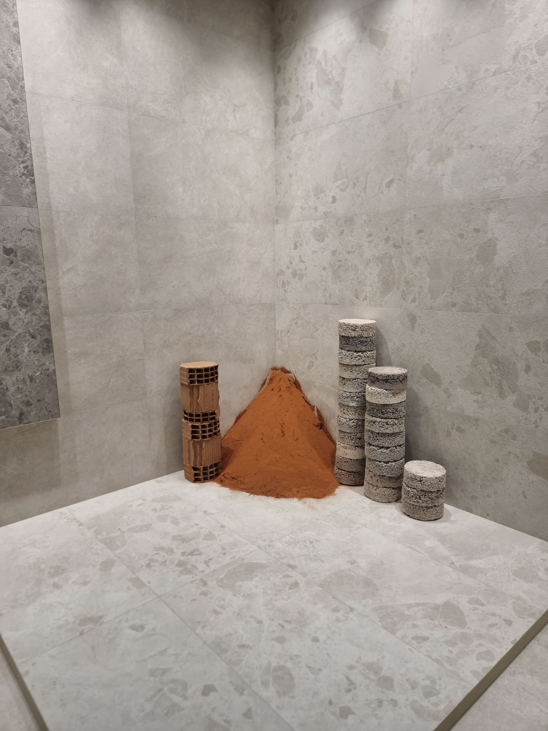
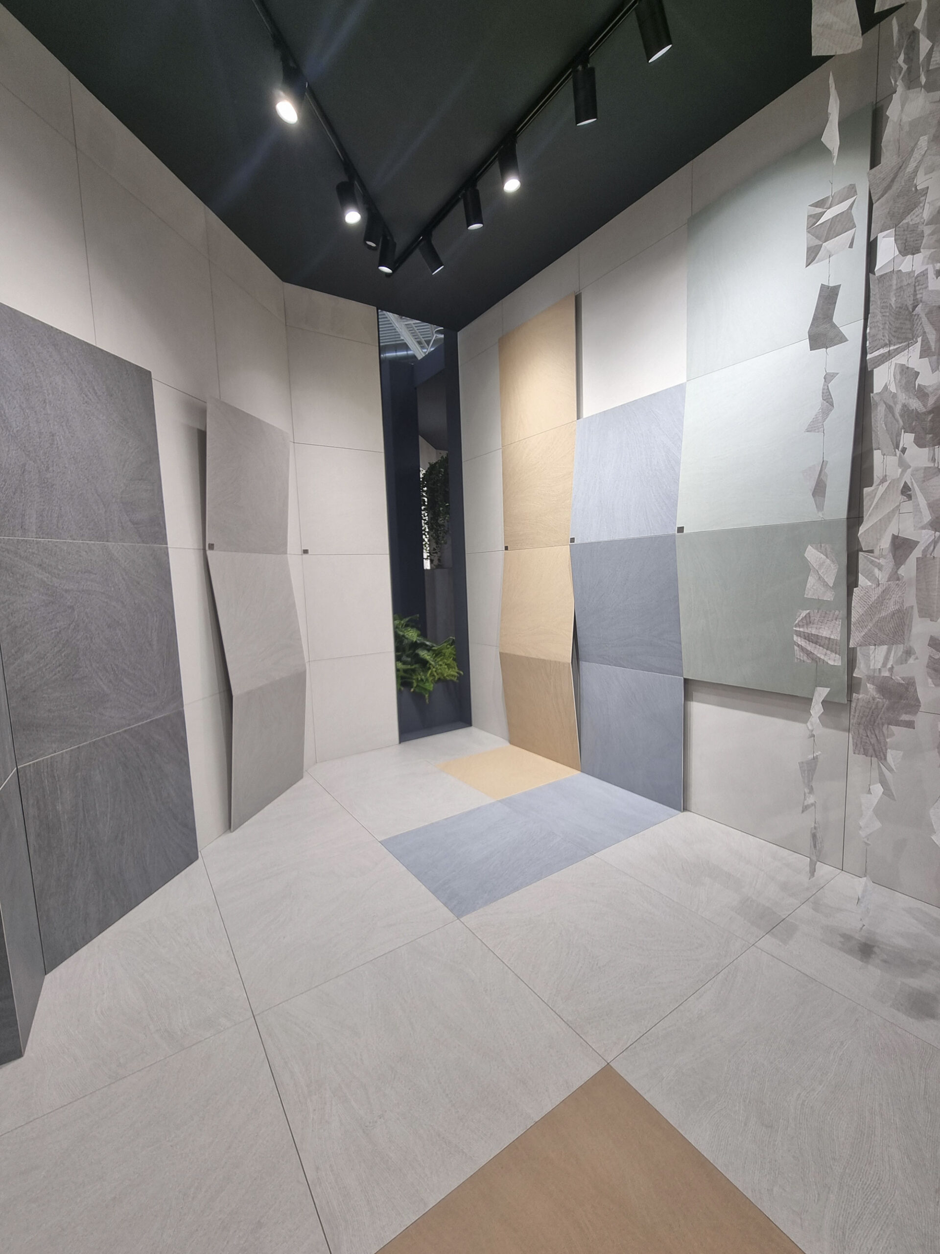
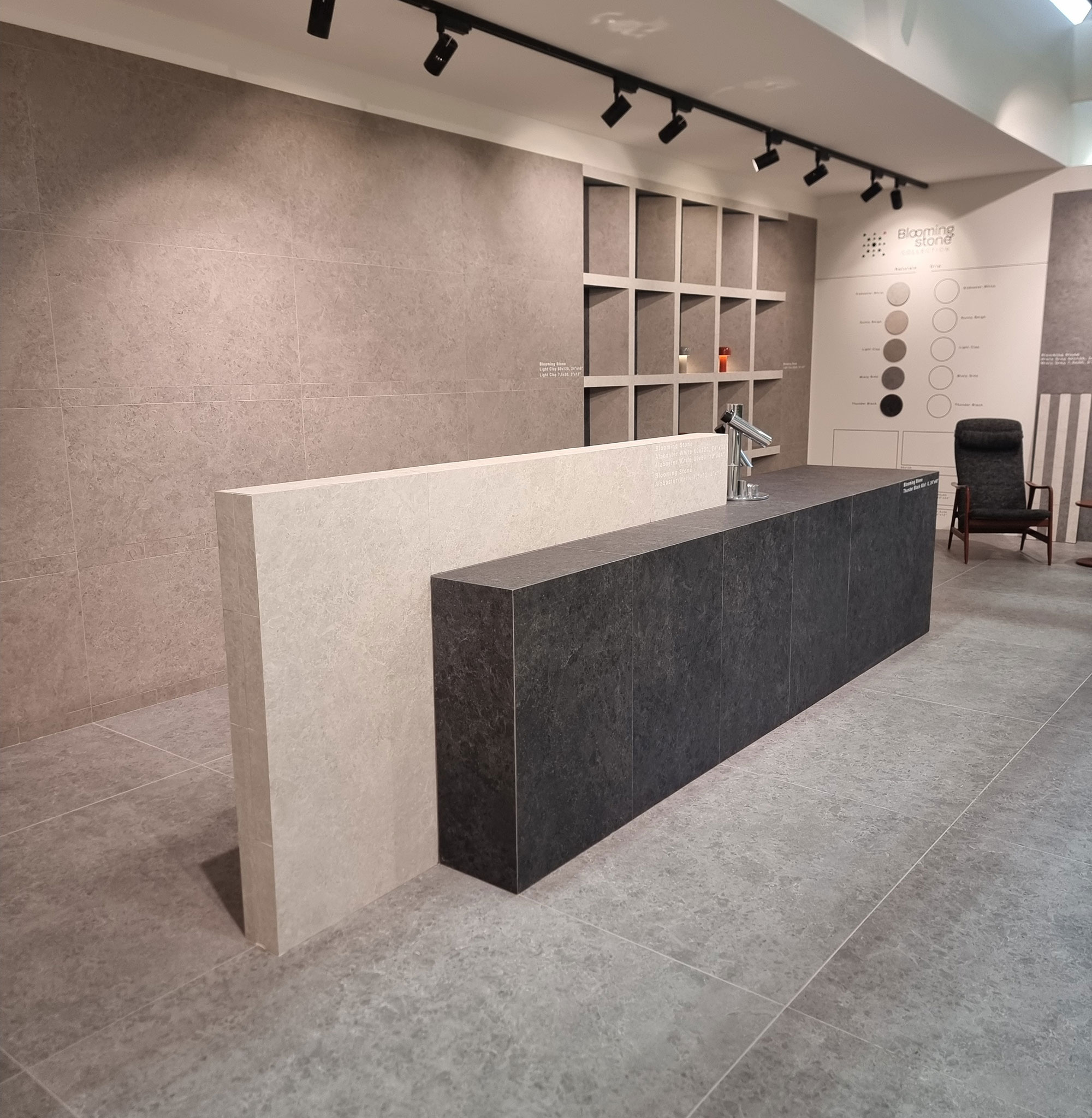
In the great river of stone effects, the approach (hallelujah) is shifting from hyper-faithful copies of real stones to creative reinterpretation—often simplifying patterns to make room for digital-matter enrichment.
Here too, we see a “crumble” trend—chipped graphics, even in smooth dry-freex versions.
The endless “faithful reproduction of the Vattelapesca stone” narrative is finally fading (and good relief to those geological tongue twisters).
The only exception: marble effects, where referencing real marbles remains essential—implying (alas) that value equals imitation.
Abitare-Gresmalt-(3)

Caesar-(10)

Caesar-(17)

Del-Conca-(9)

Italgraniti-(10)

Mirage-ReGea-(1)

Mirage-ReGea-(2)
Refin-(6)
Unicom-Starker-(3)
IS THERE LIFE BEYOND THE BIG FIVE?
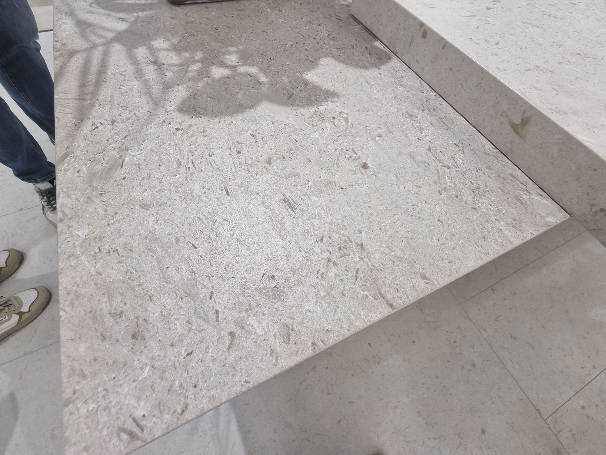
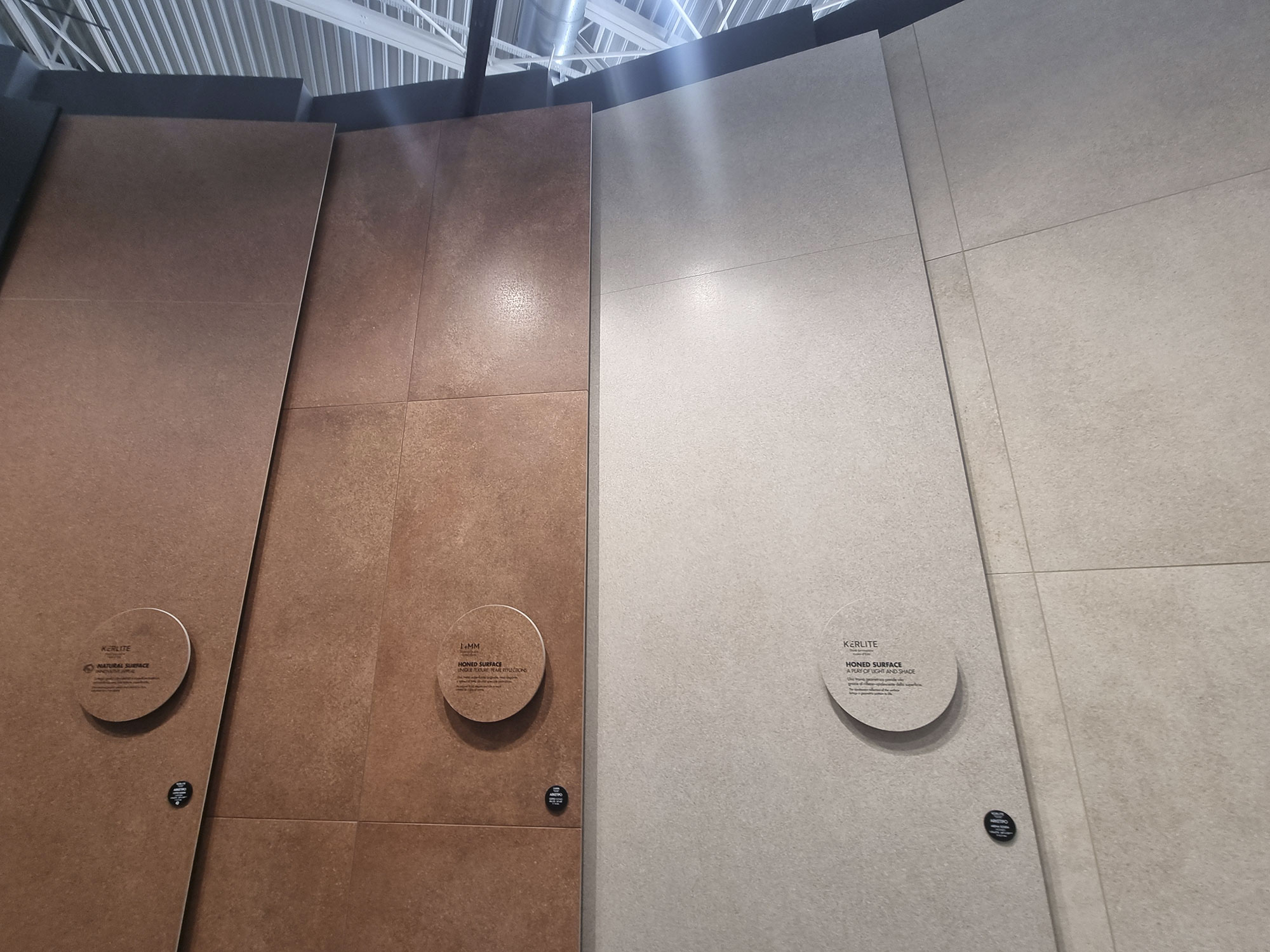
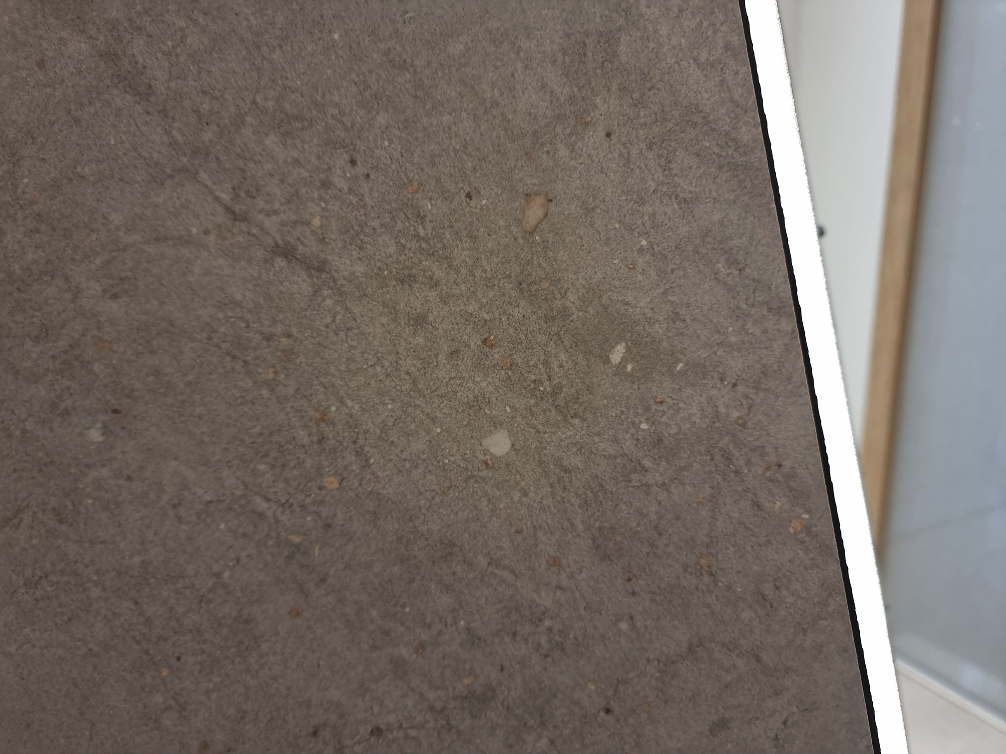
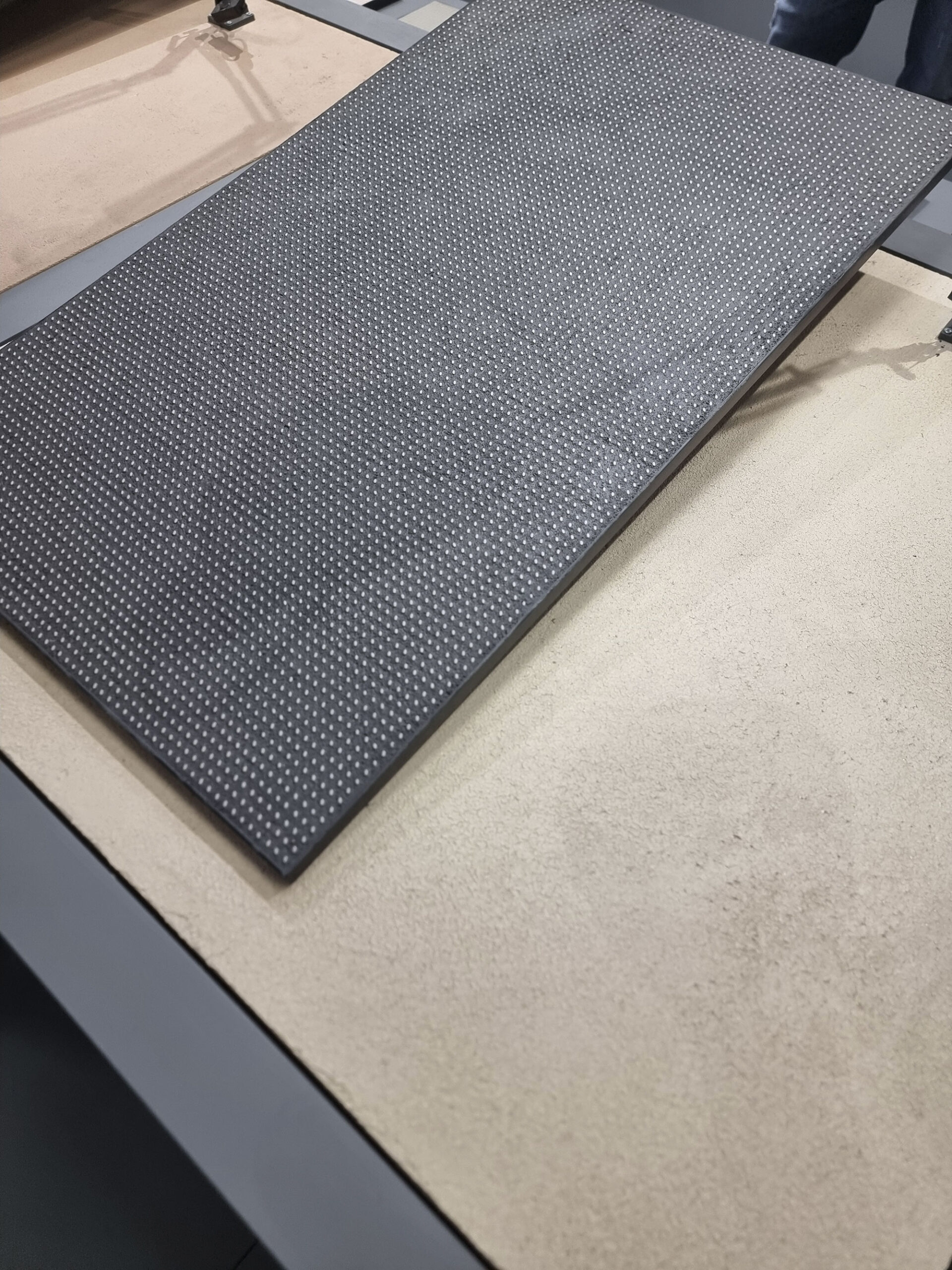
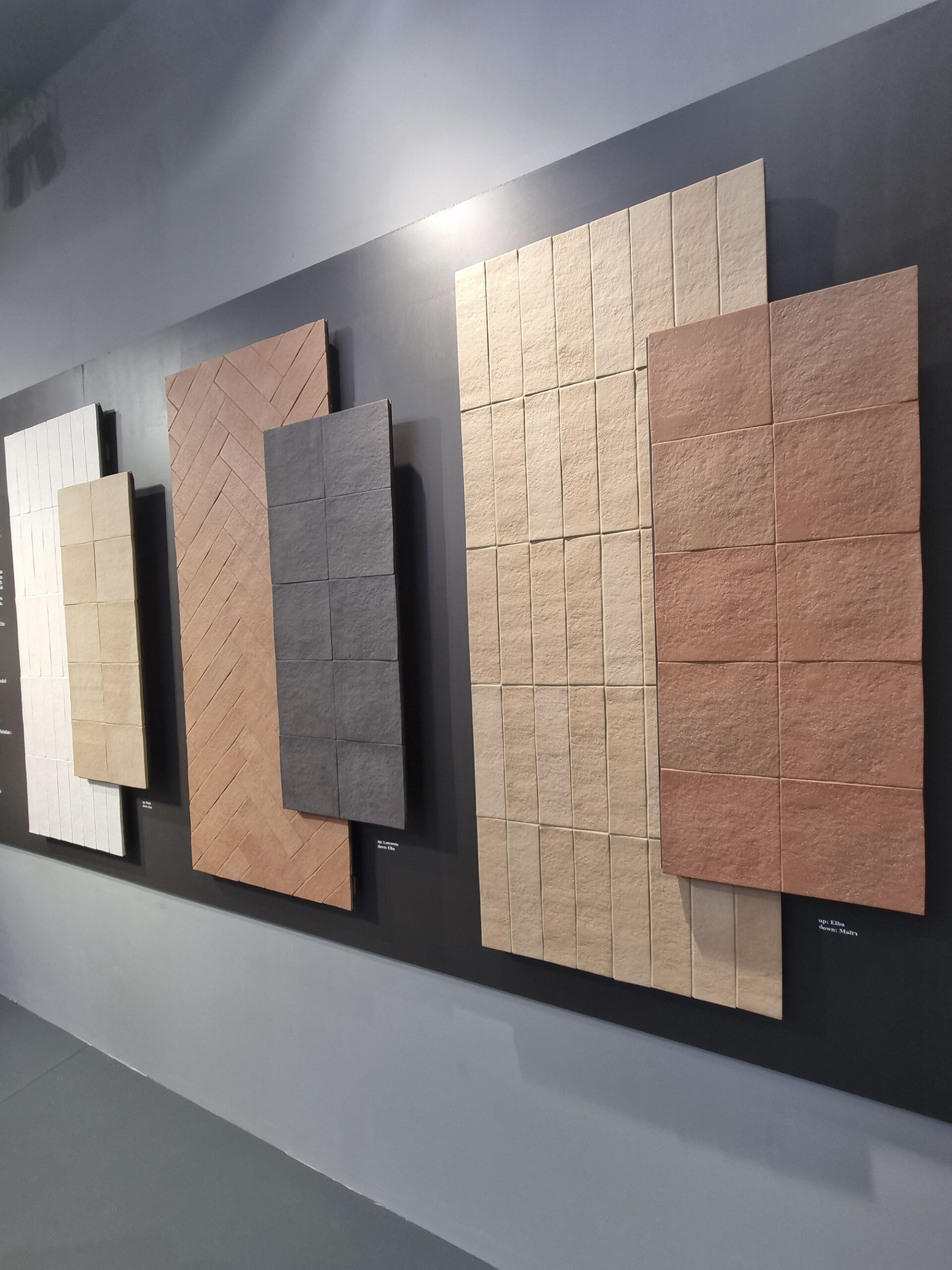
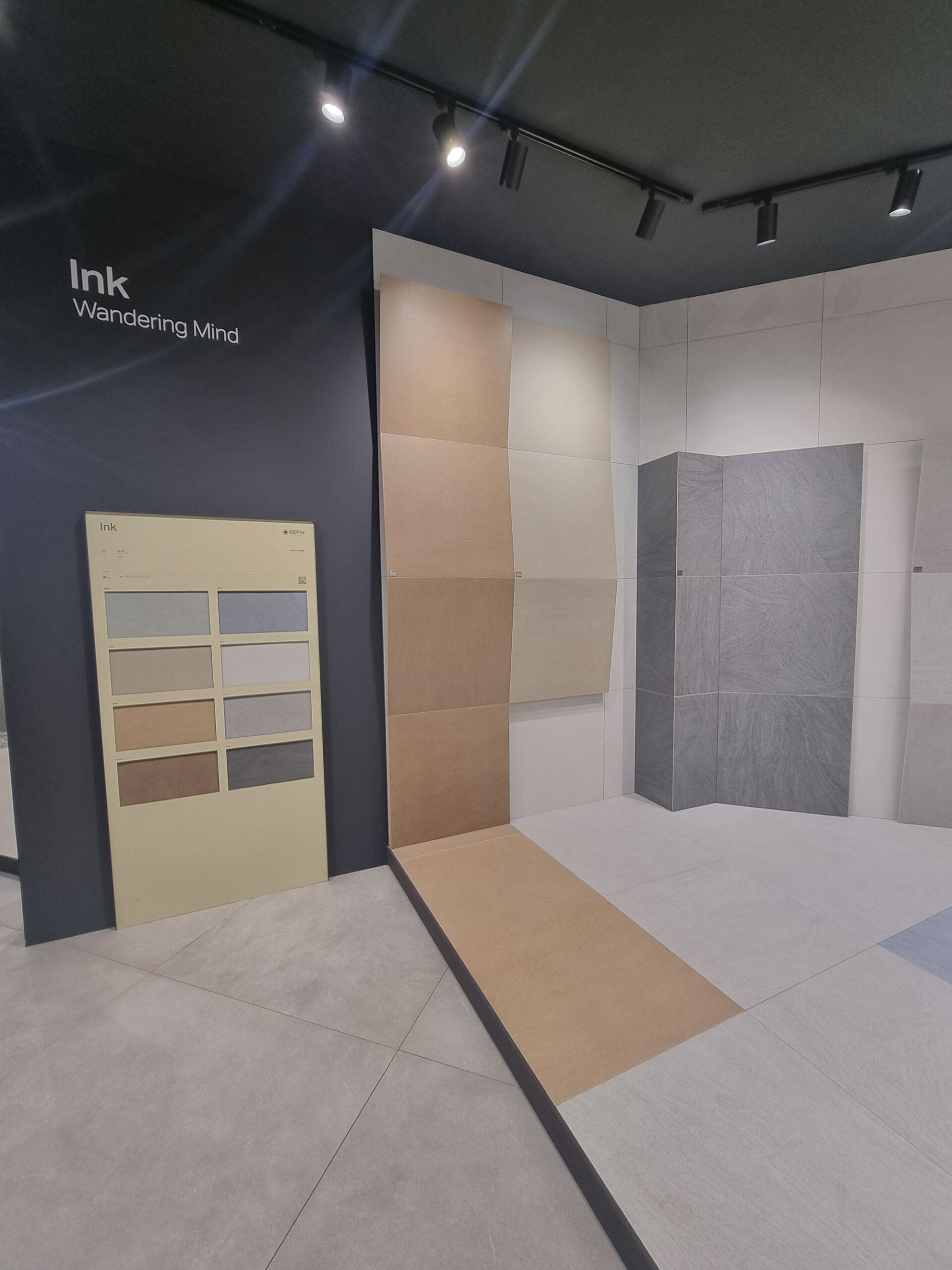
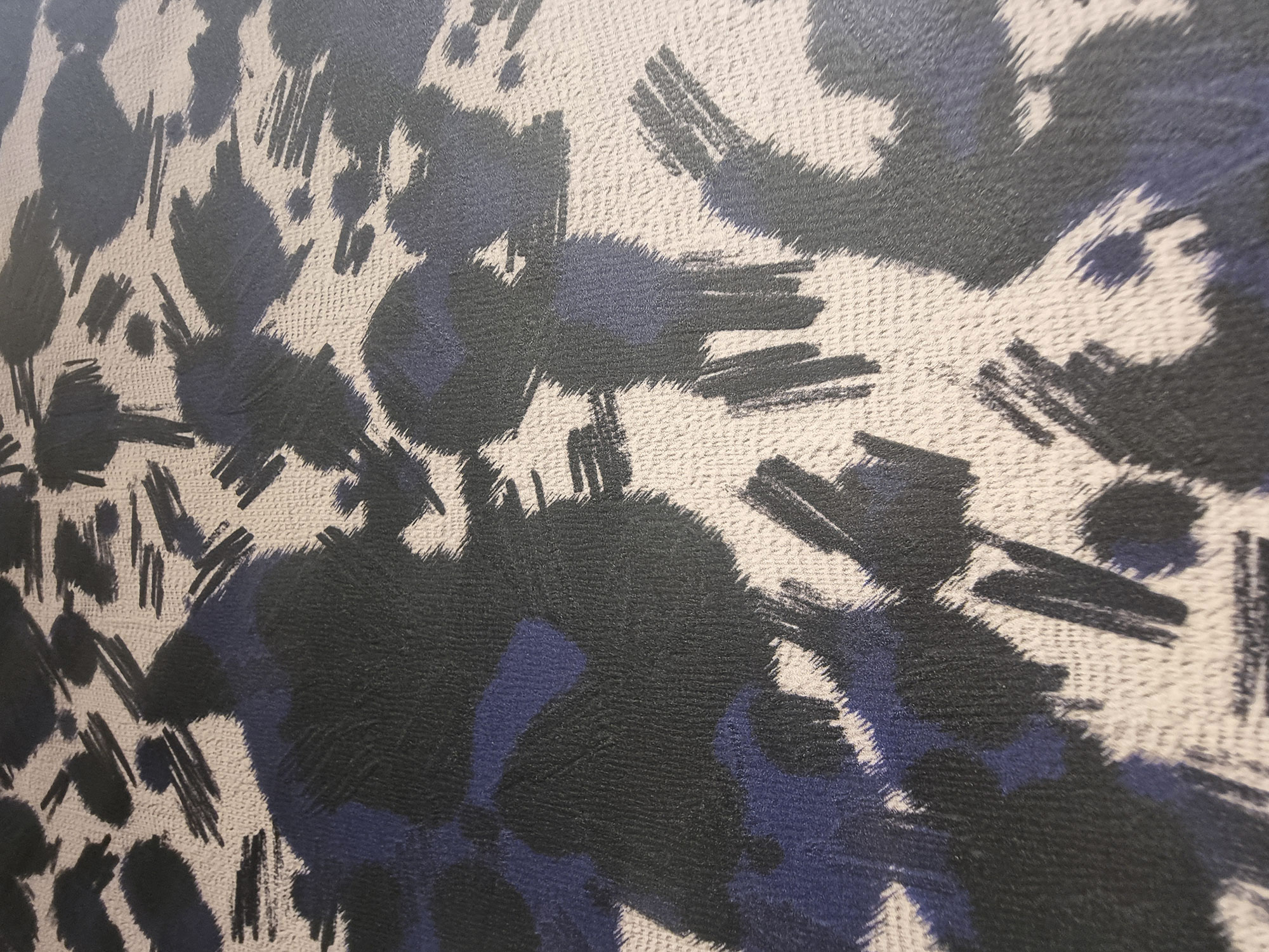
Looking beyond the usual five effects, we spotted surfaces that don’t mimic any specific material but evoke natural or handmade feels—often emphasizing touch.
Earthy or grainy handmade looks alternate with microtextures and pseudo-irregular geometries.
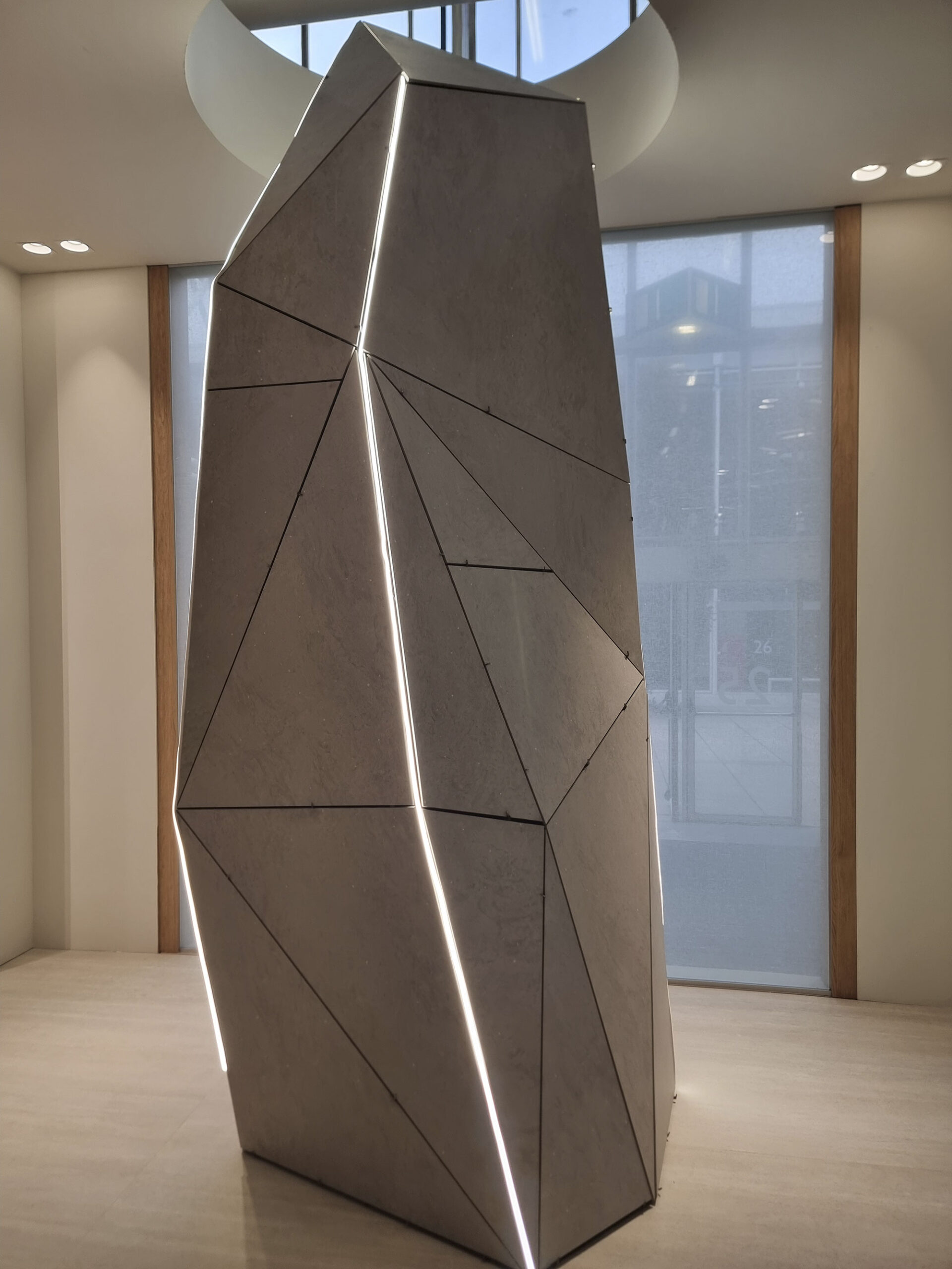
Sometimes they start from clay inspirations, other times from pure creativity (like Canve by NovaBell with D. Ramazzotti).
These exploit the latest technologies—sophisticated, tactile, and eye-catching—beloved by designers (great touchers).
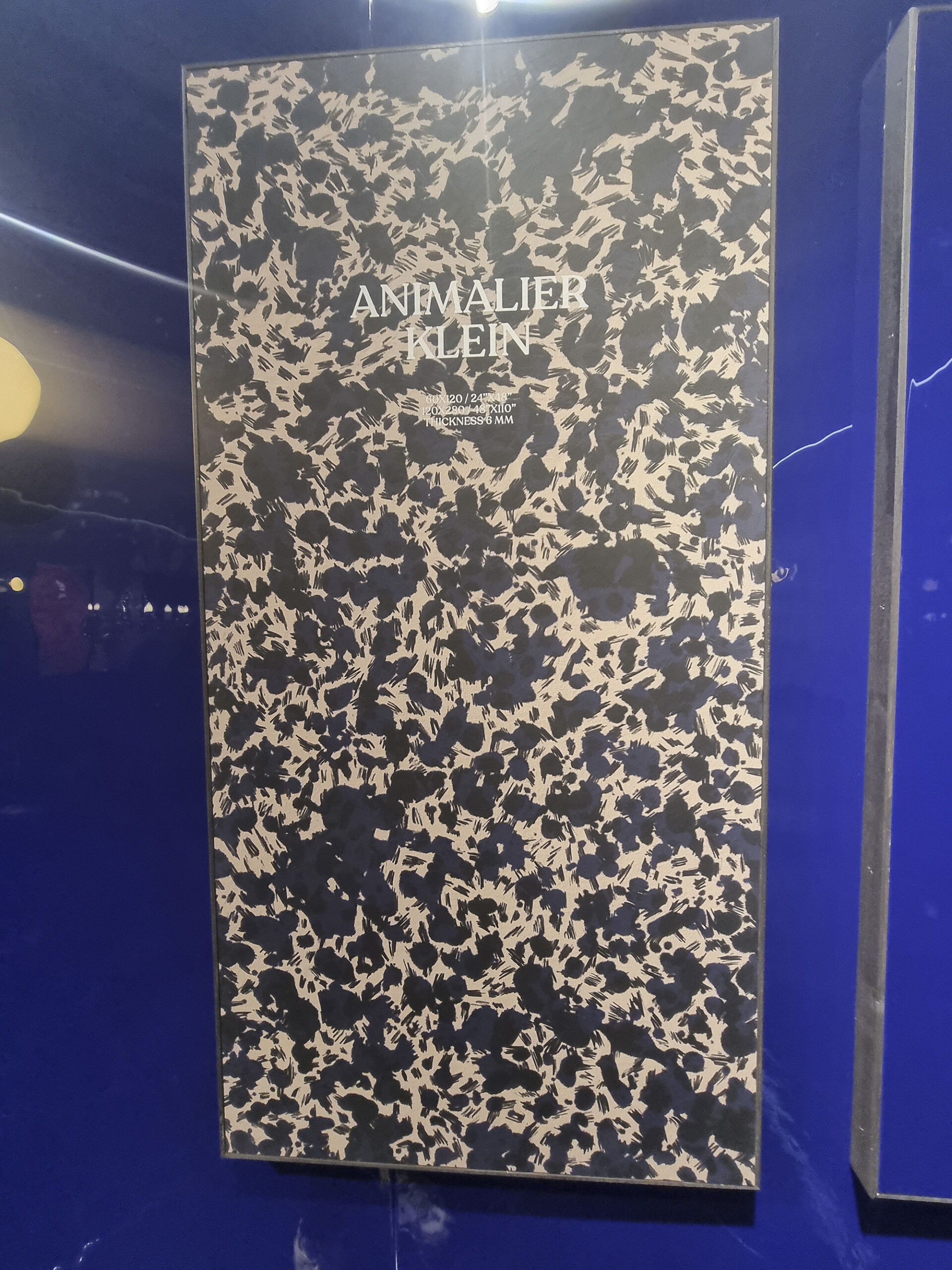
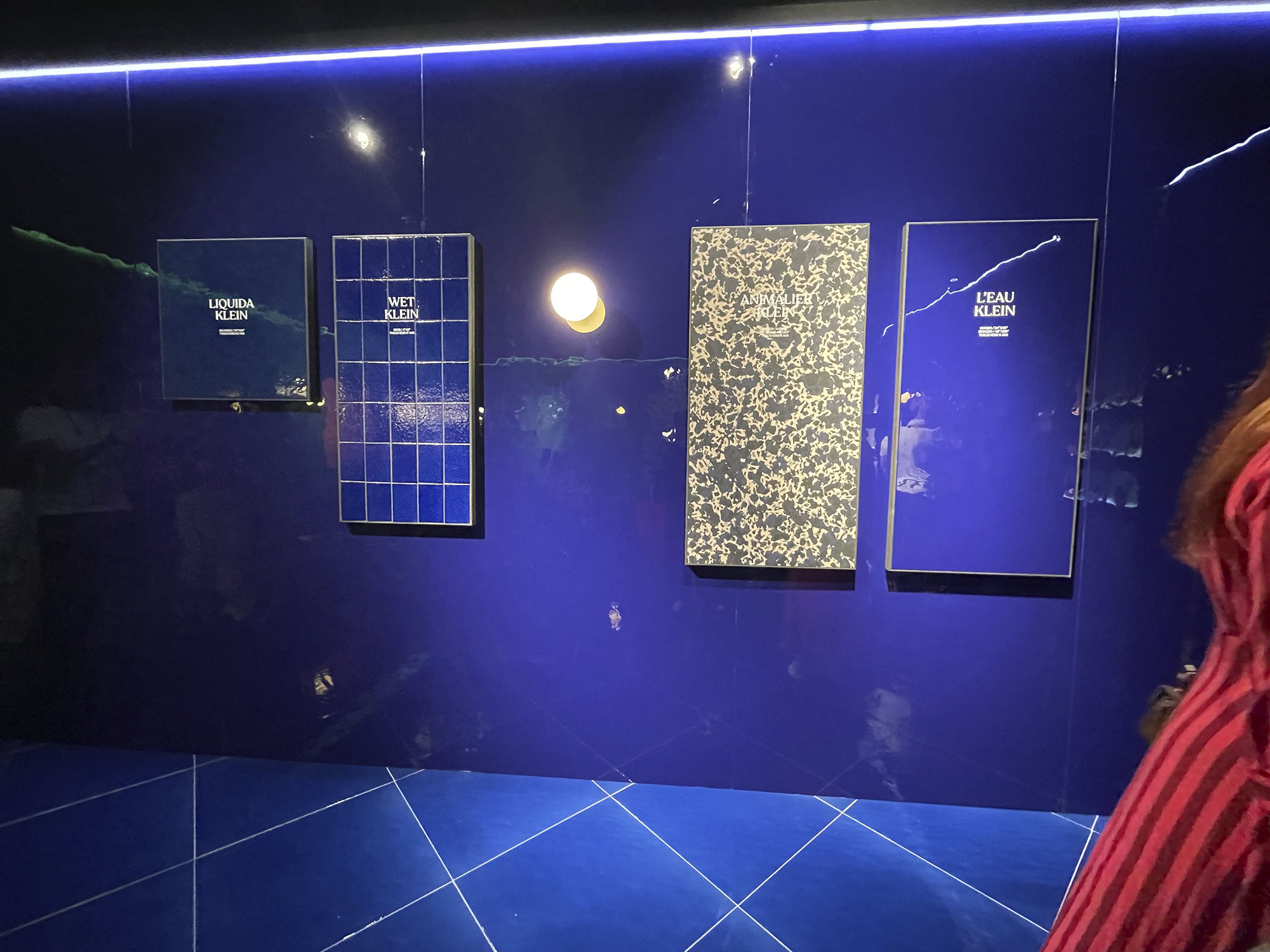
Outside the “Big Five,” there are still daring outsiders: cotto mantovano from ErmesAurelia (Vertigo), and animalier reinterpretations by 41zero42 & co., full of wild color play.
Cerdomus-(1)
Cerdomus-(18)
Cotto-d’este-(18)

Ermes-A-cotto-mantovano-(1)

Ermes-A-cotto-mantovano-(2)
NovaBell-Canve-

NovaBell-Canve-(1)
NovaBell-Canve-(2)
Opificio-(1)

Opificio-(5)
Opificio-(6)
Refin-(4)
Sodai-(1)
Sodai-(2)

Sodai-(14)
Sodai-(15)
Vitra-(9)
Vitra-(10)
VEIN CUT – CROSS CUT
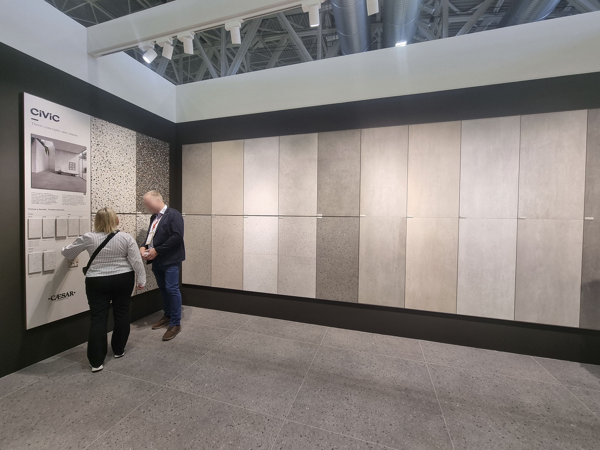
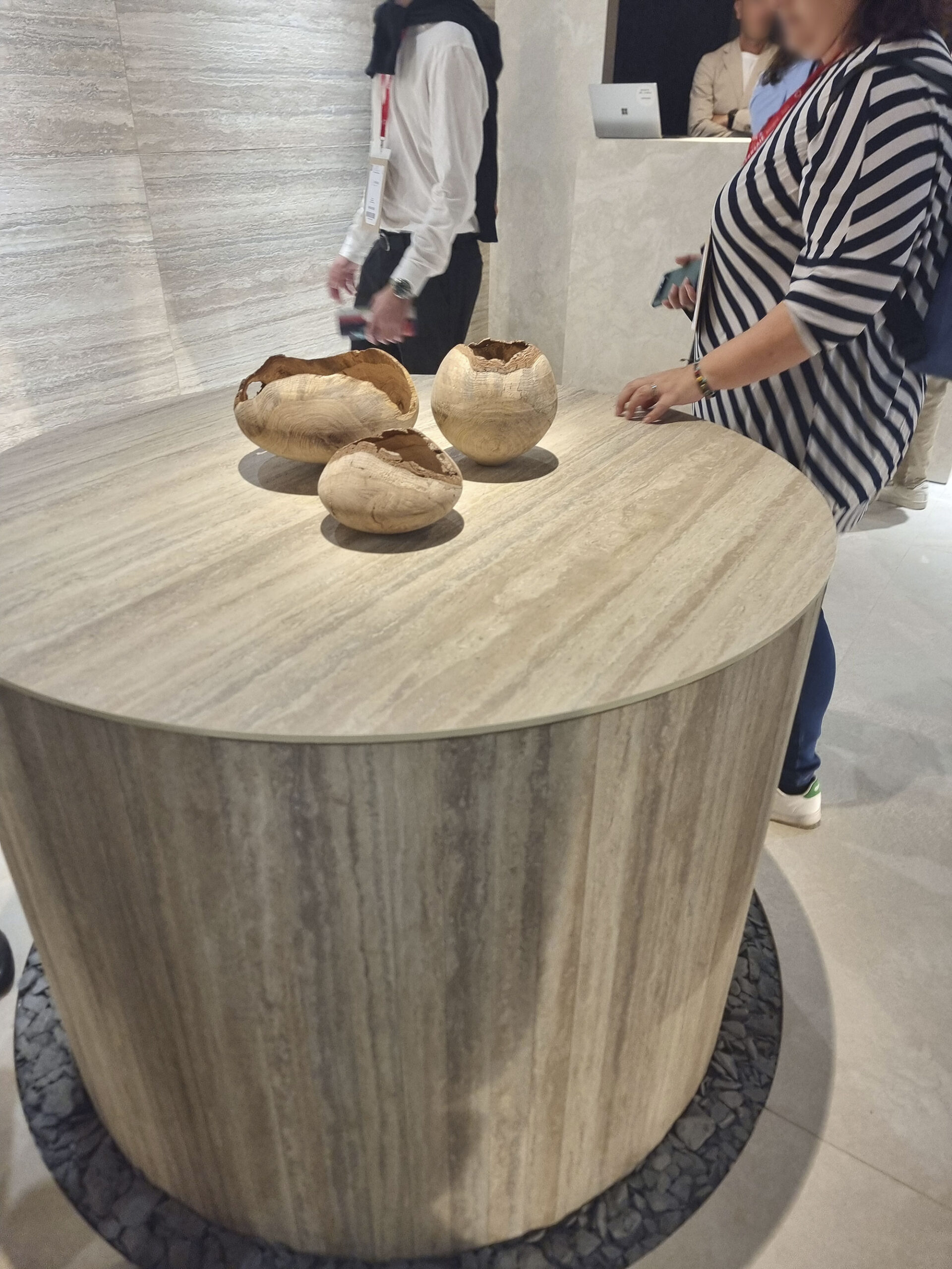
The endless wave of travertine keeps flowing—smooth, slabbed, vein-cut, or cross-cut, with both light and deep 3D finishes (del Conca).
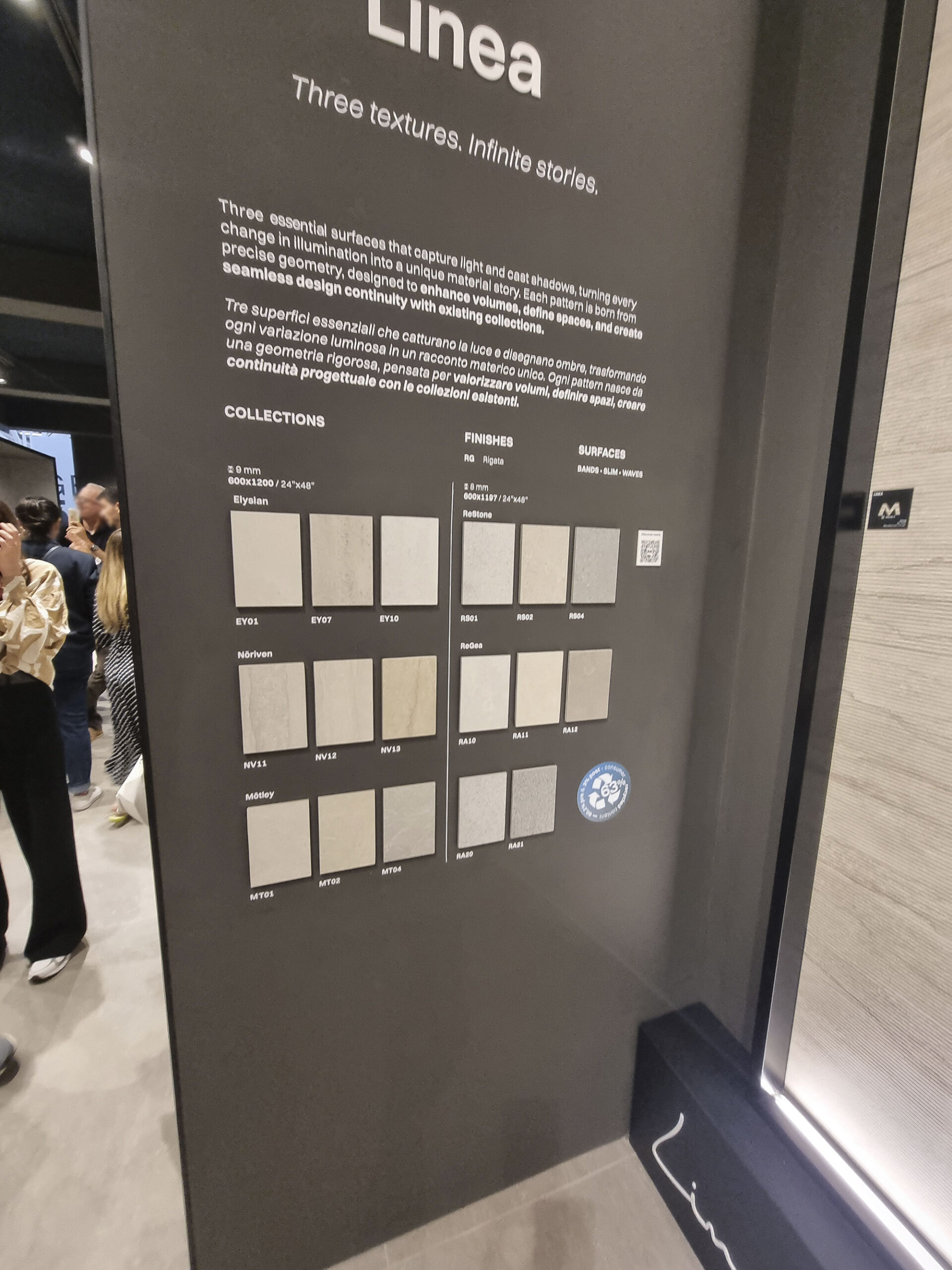
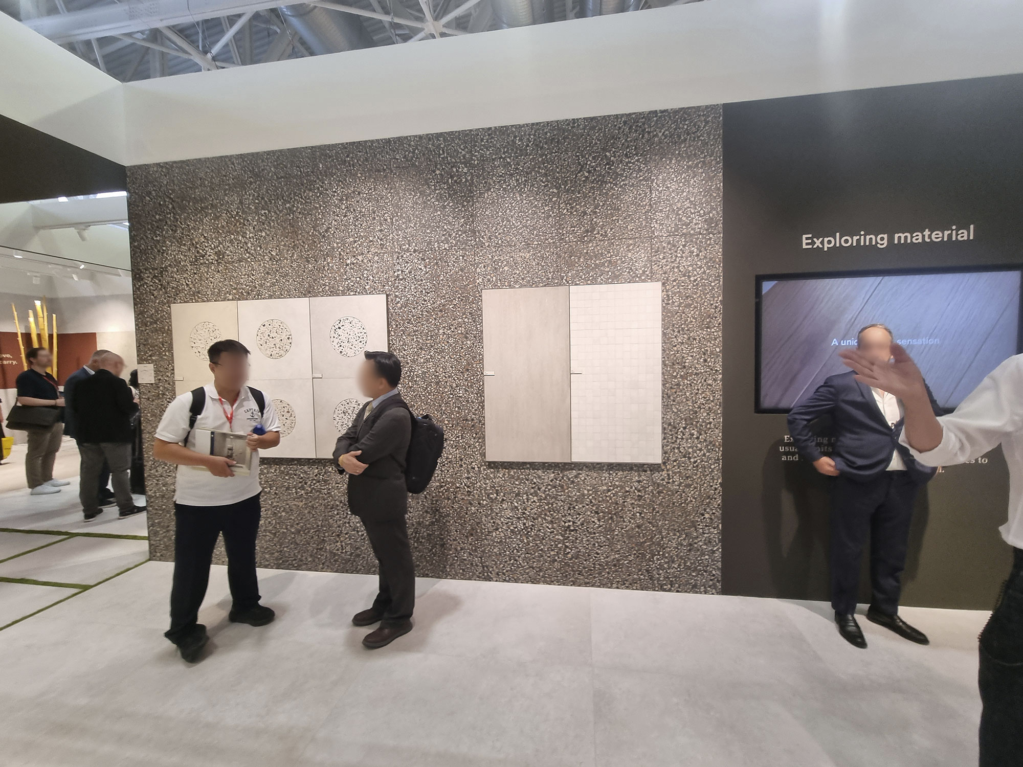
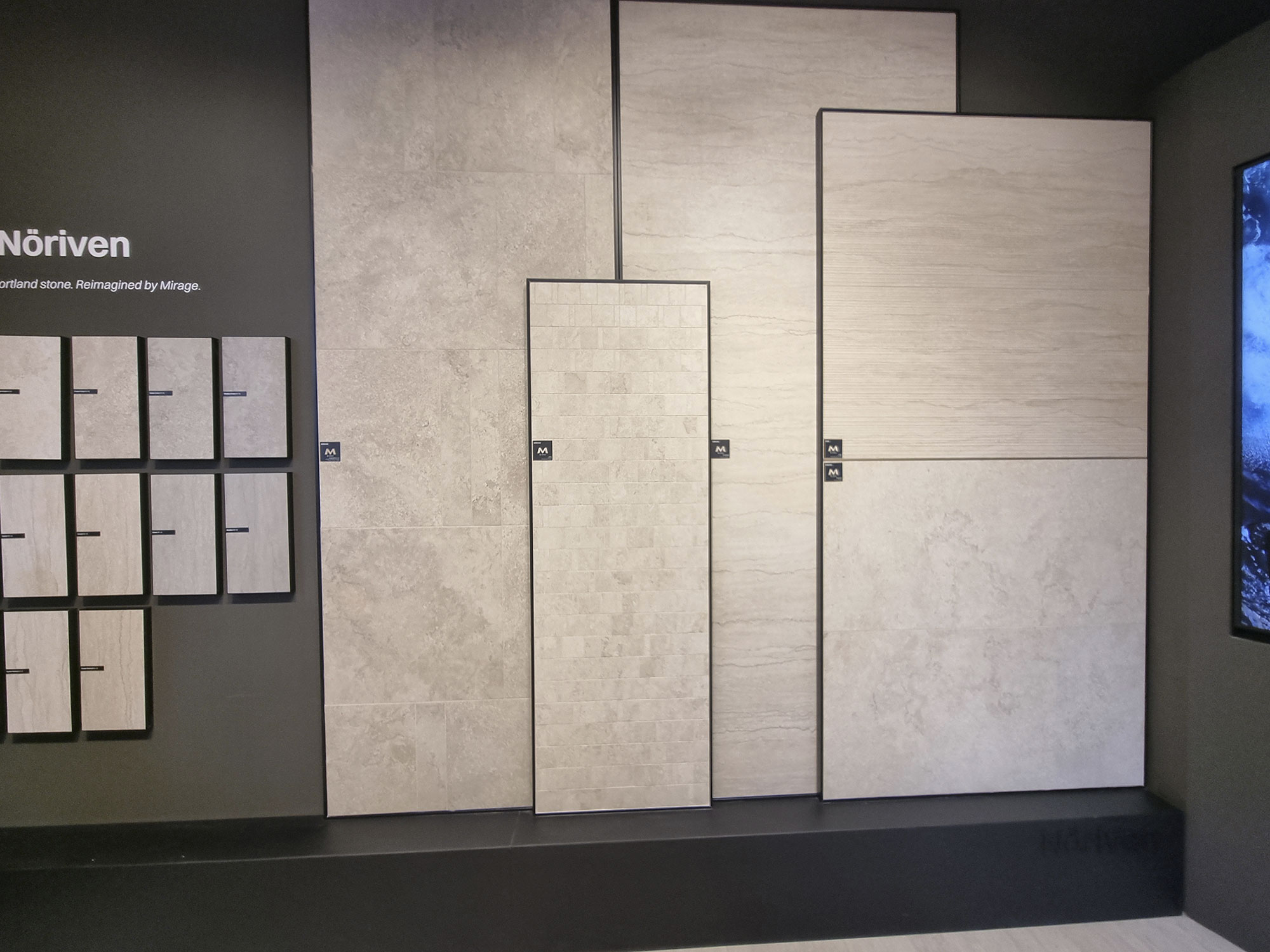
An intriguing evolution: the vein cut + cross cut scheme applied (in softer versions) to other stones—see Mirage Noriven or the even more stylized Caesar version, which adds a pebble twist.


Caesar-CiViC(19)
Caesar-CiViC(20)
Caesar-CiViC(21)
Faetano-Del-Conca-(12)

Marca-Corona-(6)

Mirage-Noriven-(1)
Mirage-Noriven-(2)

Mirage-Noriven-(3)
SOFT SLAB
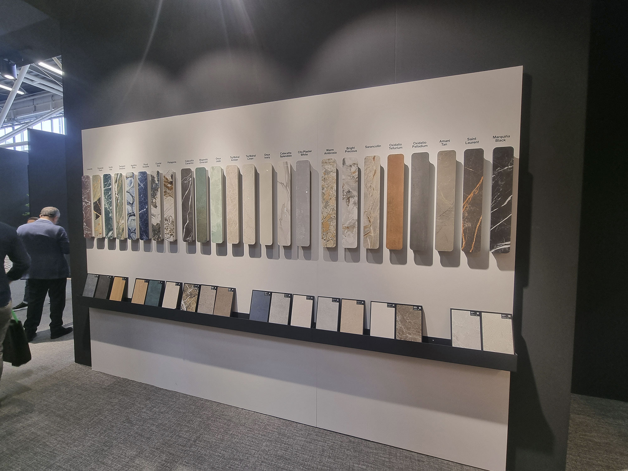
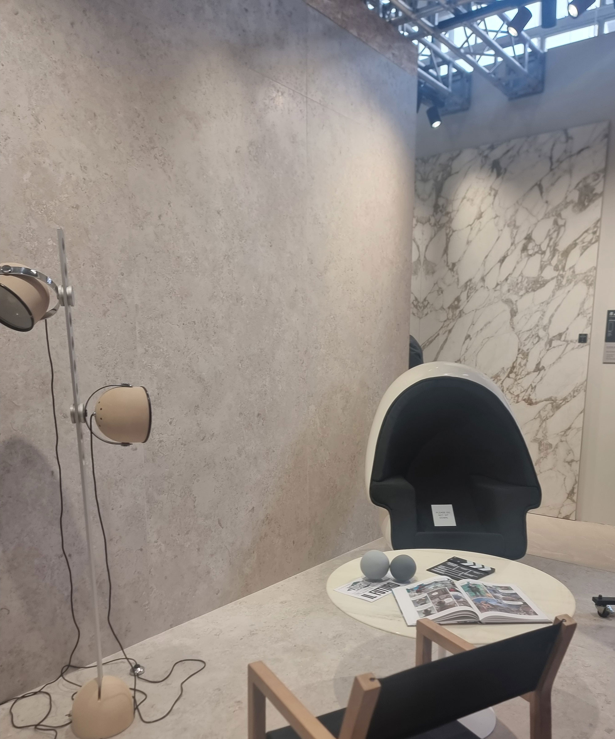
In the large-slab universe (everyone’s got them now), new directions support the inevitable marble mega-families: resins, terracotta, desaturated stones—often in multiple finishes and accompanied by compact formats.
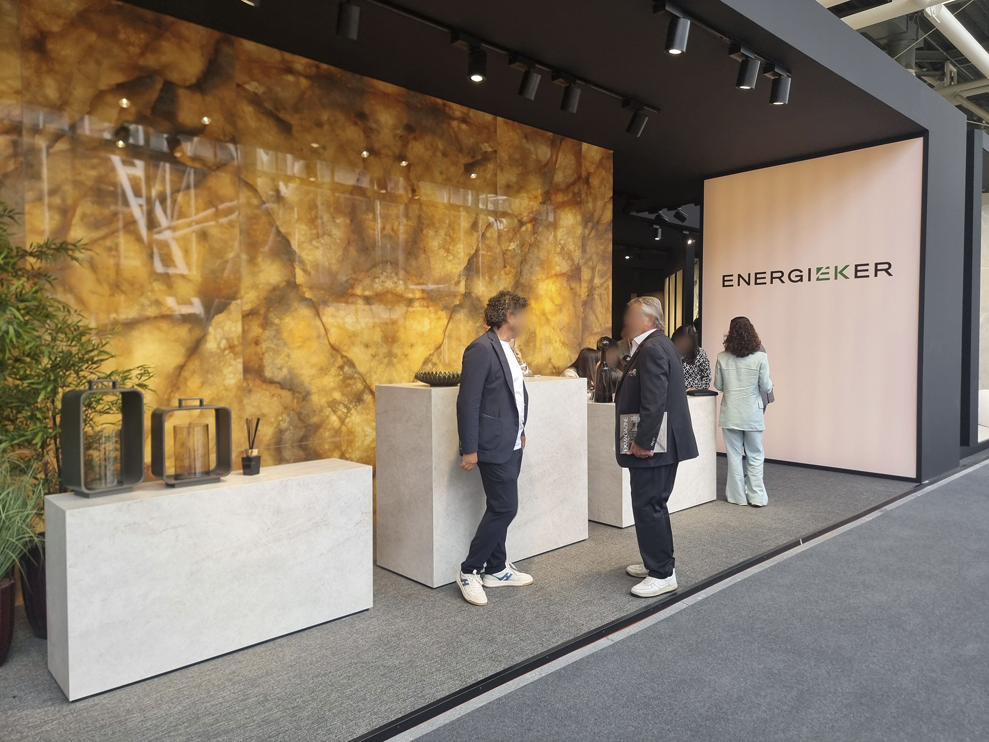
Onyx and flashy slabs are slowing down, though a few backlit or dramatic marbles still steal the scene at reception panels.
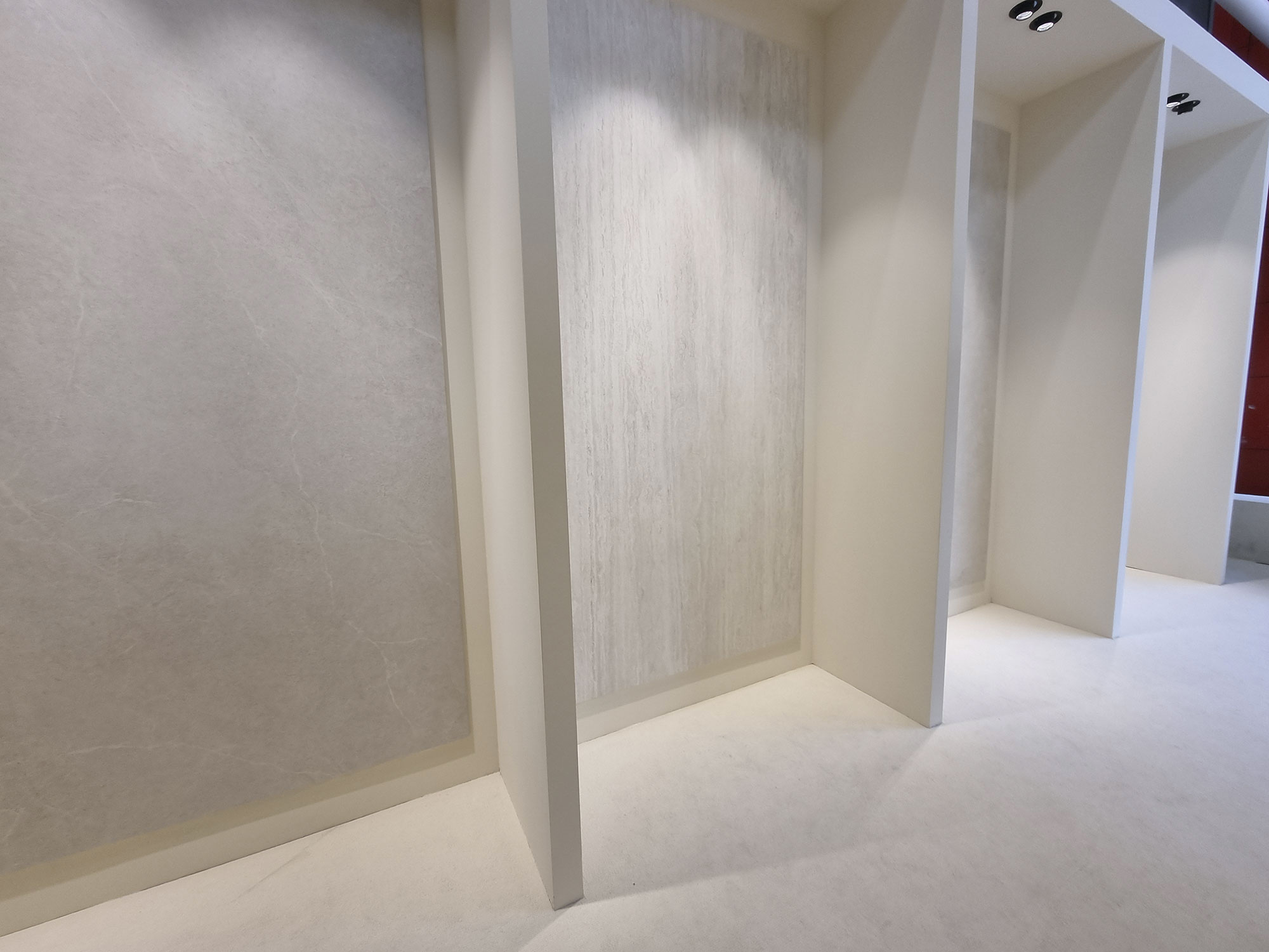
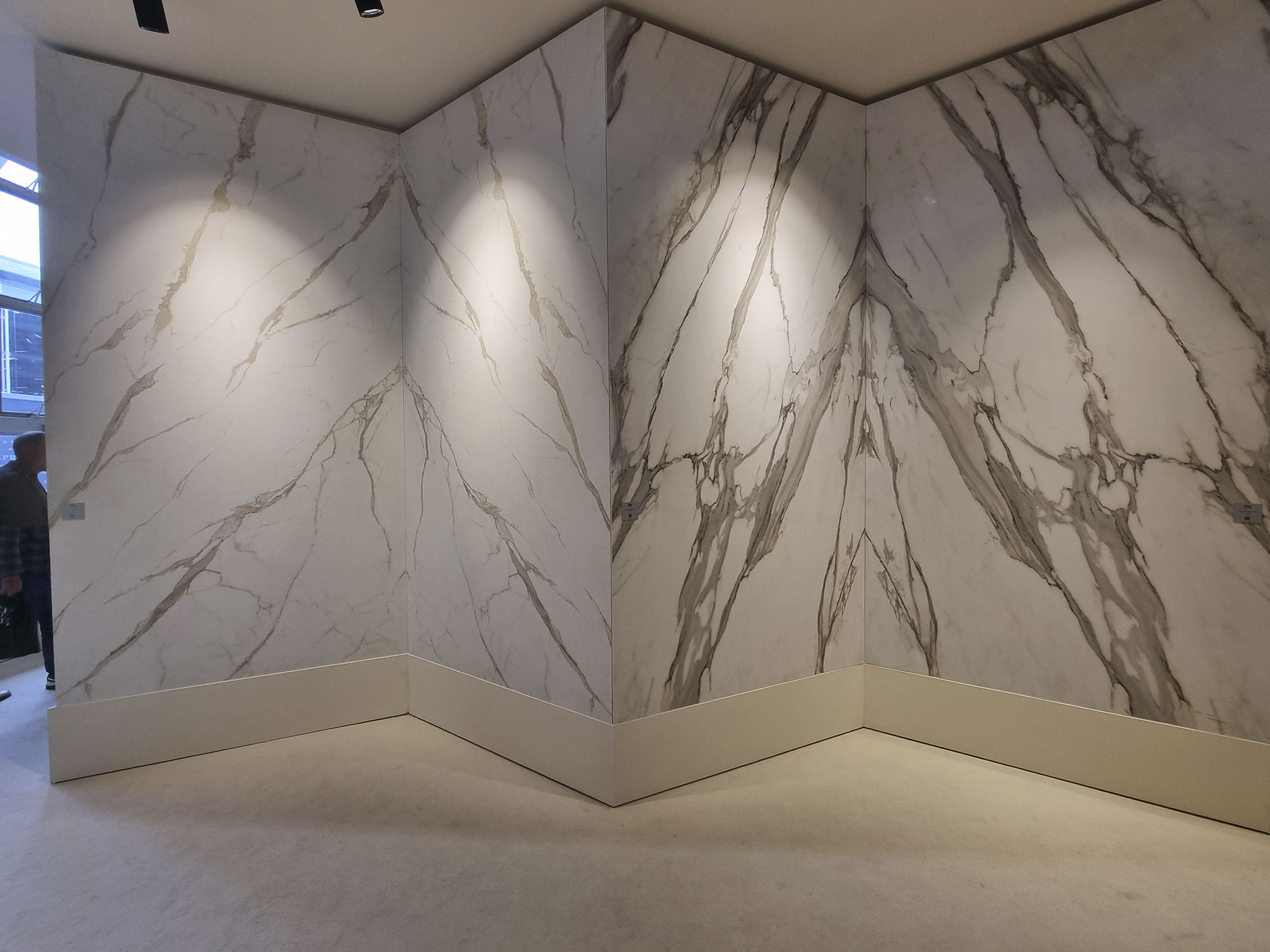
White marbles reclaim the stage—both timeless classics (Italgraniti) and new proposals (Iris Ceramica Group).


Cotto-d’este-(18)
EnergieKer-(1)

fondovalle-(7)

fondovalle-(9)

fondovalle-(11)
fondovalle-(14)

Iris-Ceramica-Group-(5)

Iris-Ceramica-Group-(12)

Iris-Ceramica-Group-(13)
Italgraniti-(4)
Italgraniti-(5)

Italgraniti-(8)

Italgraniti

La-Fabbrica-Ava-(35)

La-Fabbrica-Ava-(37)

Laminam-(8)

Laminam-(9)

Living-Ceramics-(1)

Living-Ceramics-(2)

NovaBell-(26)

Novabell-vena-reversibile

Panaria-Lea-(17)
EYE (AND FINGER) FOR DETAIL
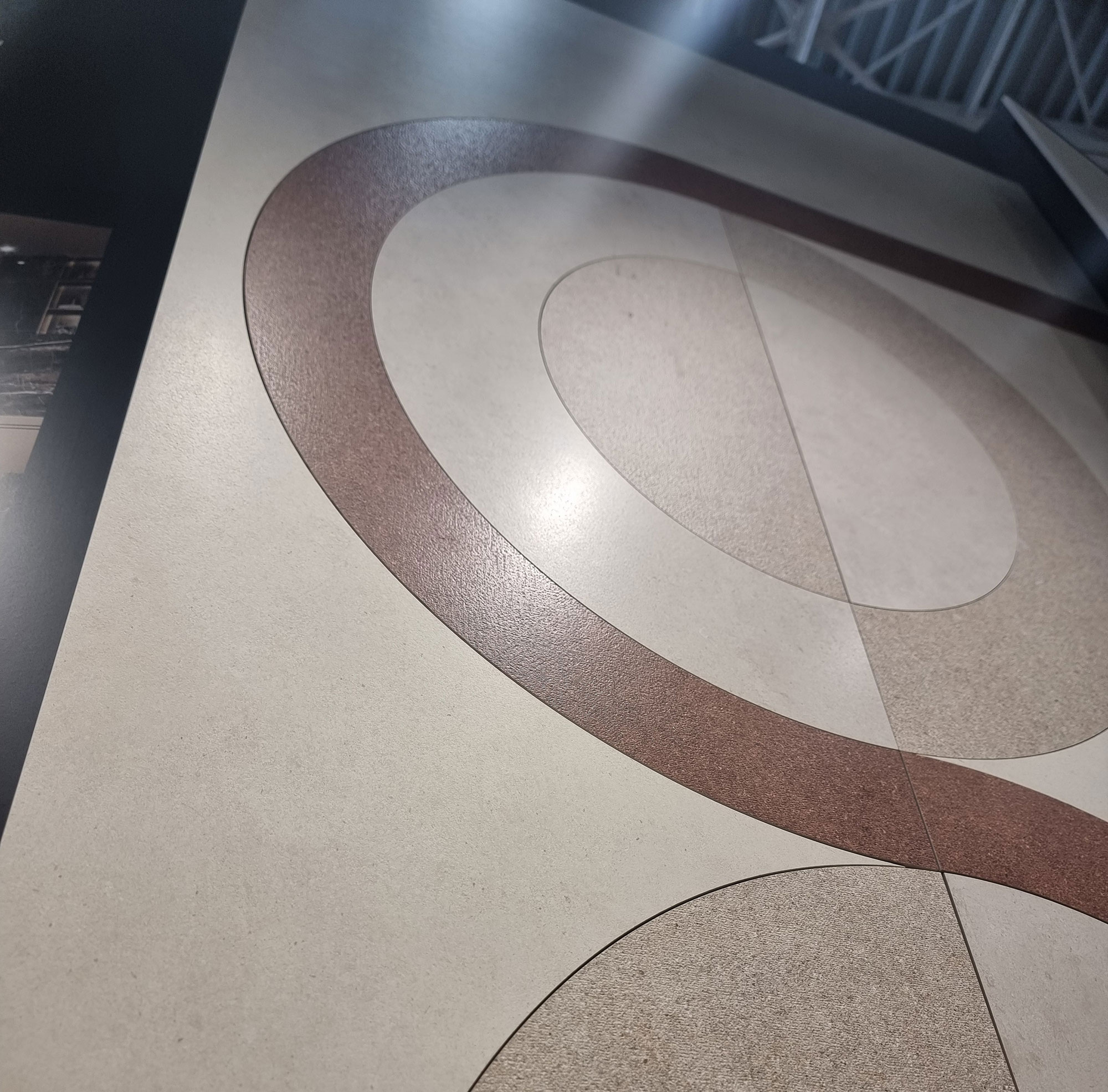
Digital-material applications define the A1-tier (top league) products.
Experts can tell the difference between simple and sophisticated executions (nobody’s dry-fess here).
After all, power is nothing without control—see the meticulous surface refinements and lapping work (Sant’Agostino, NovaBell, Lea).
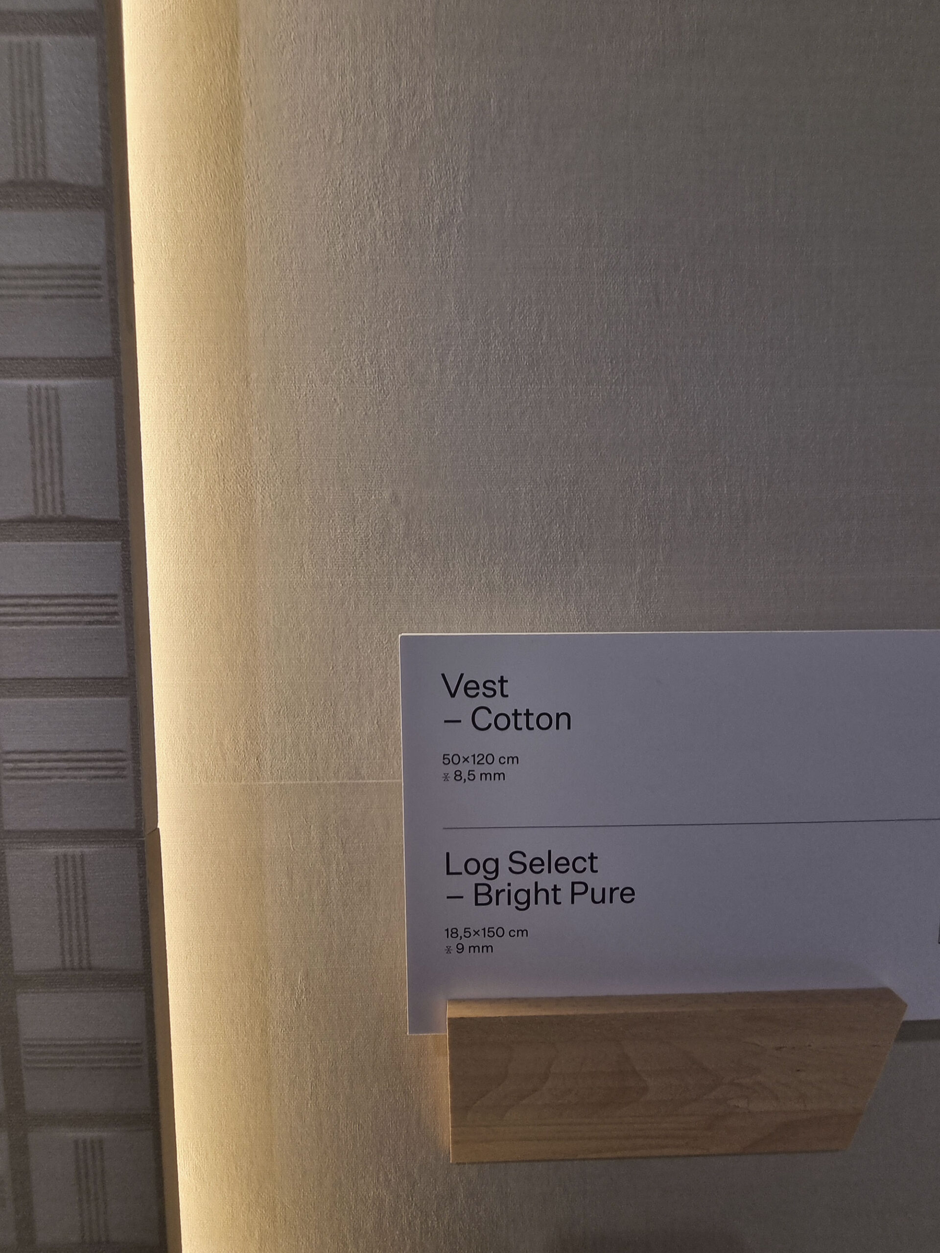
Lighting is key: a proper booth invites close-up viewing and touching.
For emergencies, the pro salesagent always keeps a flashlight in their pocket.
Quattro-occhi-è-meglio-di-2
Atlas-Concorde-(43)

Casalgrande-padana-(11)

Cerdomus-(11)

Cerdomus-(19)

Coem-(16)
Cotto-d’este-(6)

Cotto-d’este-(13)

Marca-Corona-(10)

Panaria-Lea-(20)

Panaria-Lea-(21)

Sant’Agostino-(11)

Sant’Agostino-(13)

Sant’Agostino-(28)
WOOD: UNKNOTTED AND SUBDUED
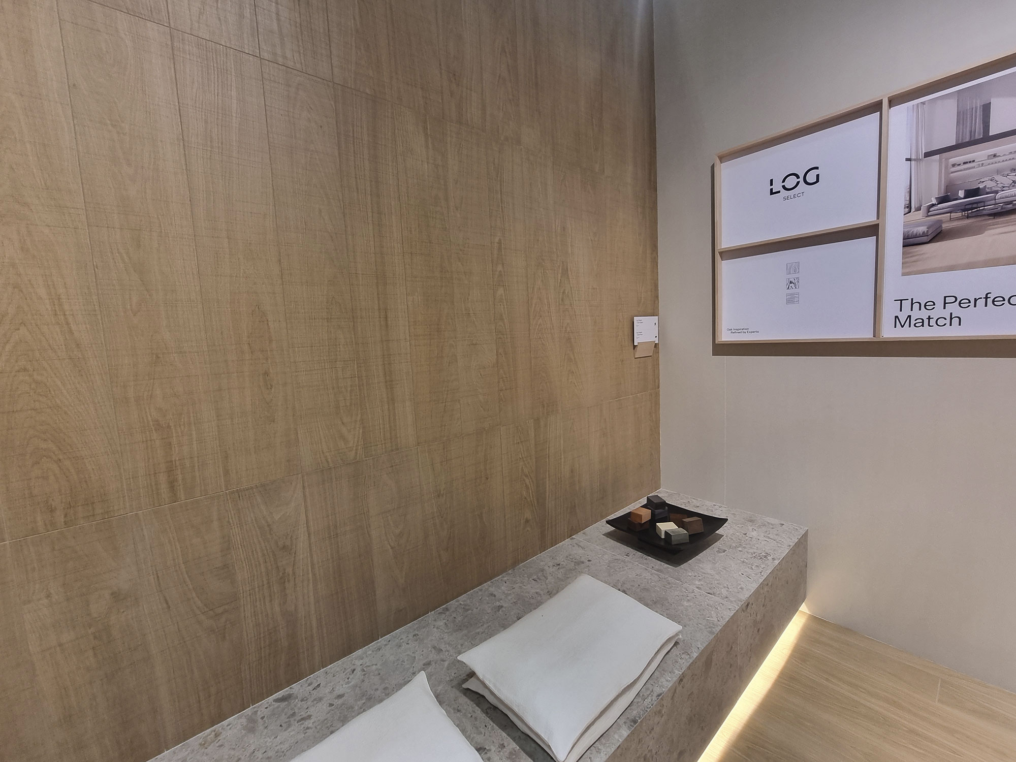
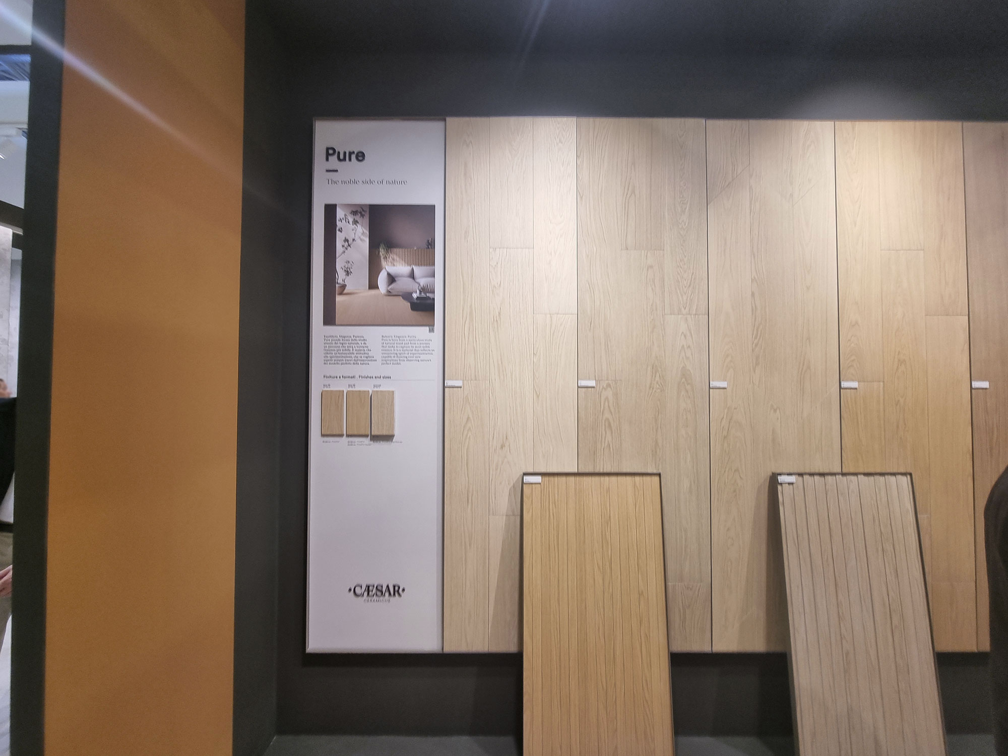
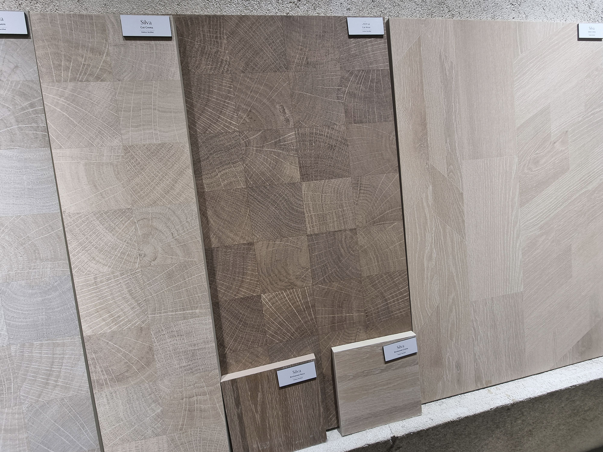
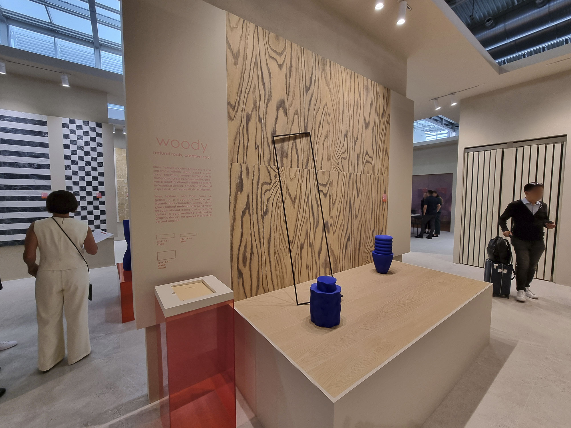
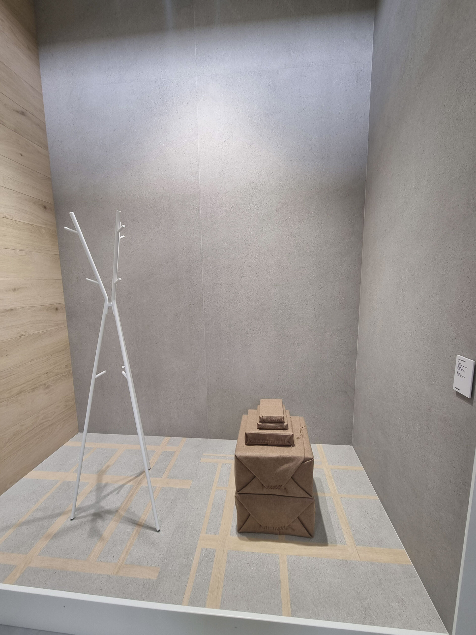
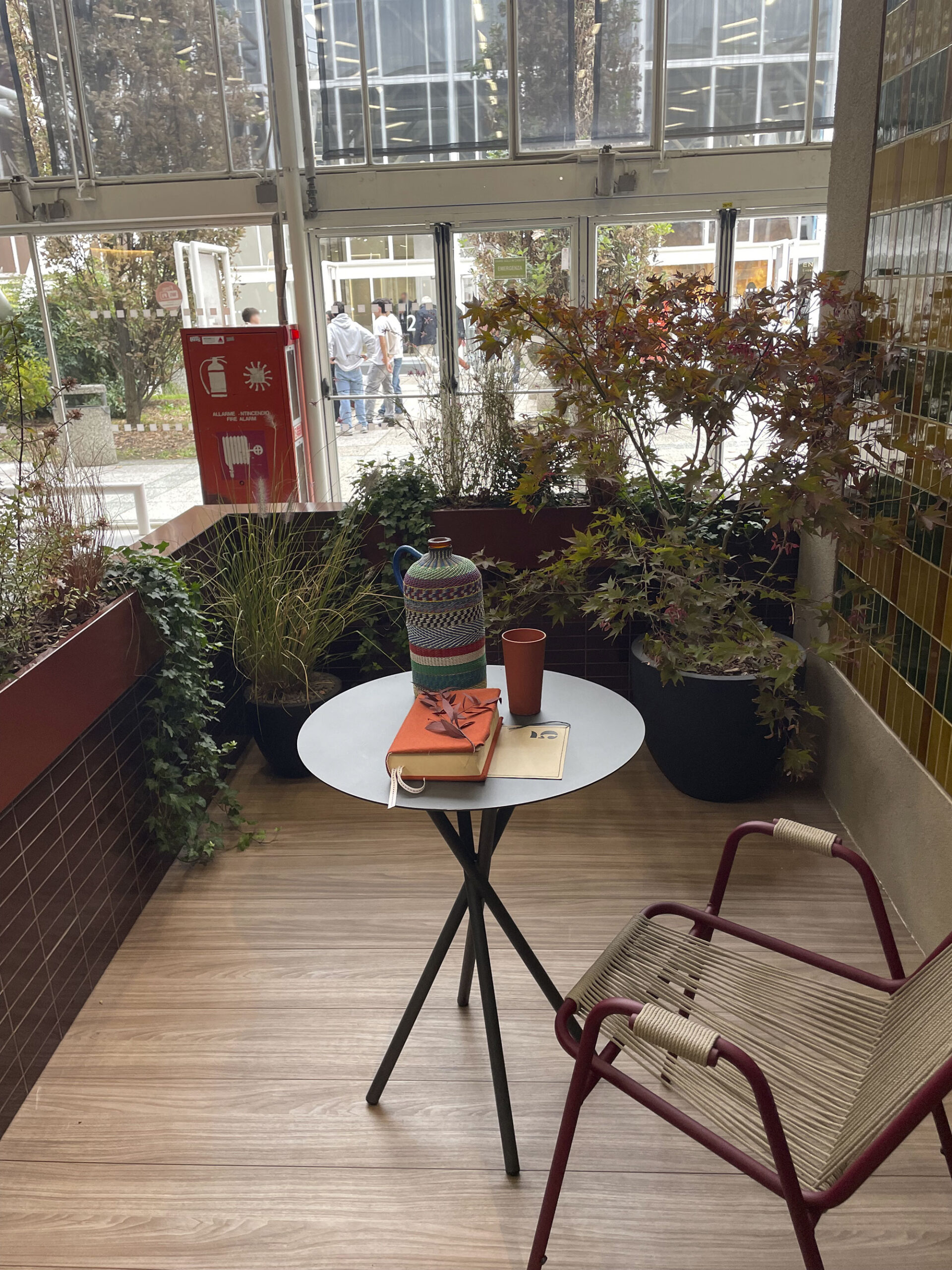
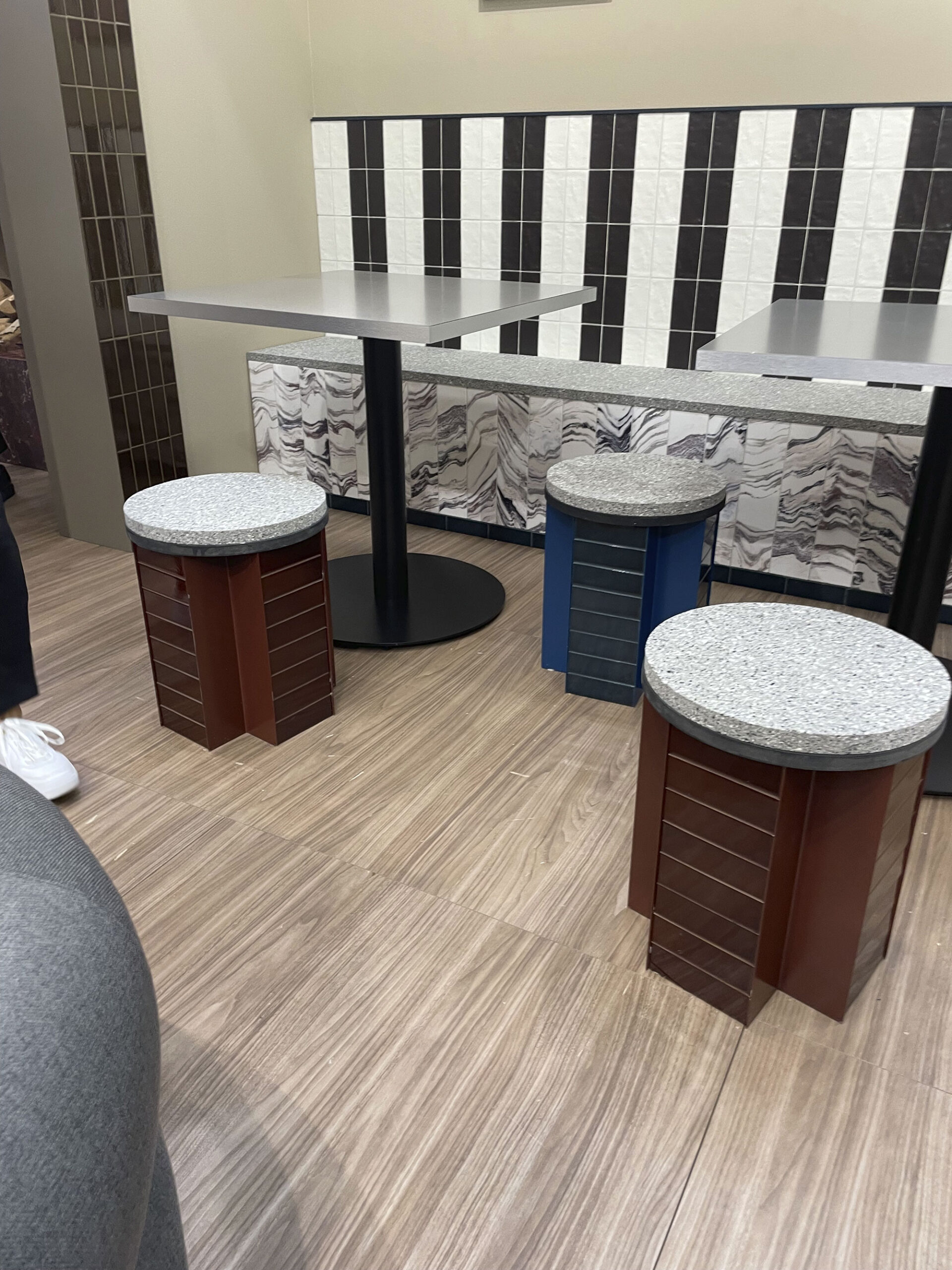
After 2024’s oak feast, wood-look proposals have calmed down.
This year we saw versions with softened grains, almost stylized, and virtually knot-free.
They’re even used for wall installations—a trend also spotted at Milan Design Week.
It’s the same logic applied to stone: tone down and lighten up.
Of course, there are still some rebels (Ermes Woody).
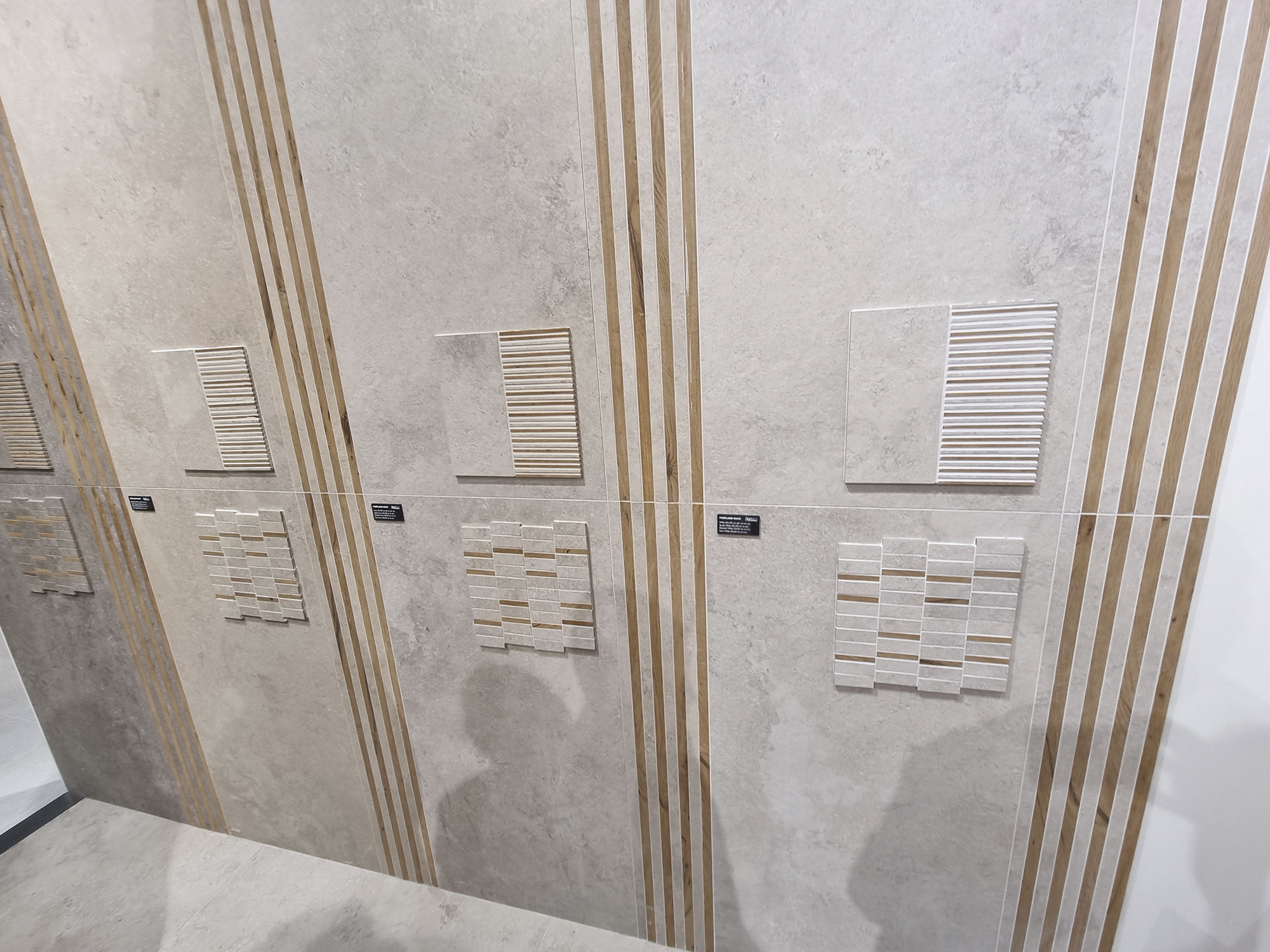
Decorations, mosaics, and mixed-effect combinations featuring wood remain popular.
Atlas-Concorde-(38)

Atlas-Concorde-(39)
Caesar-(8)

Casalgrande-padana-(16)
Coem-(17)
Ermes-Aurelia-(14)

Ermes-Aurelia-(16)
Faetano-Del-Conca-(9)

Gardenia-Abk-(5)
Quintessenza-(5)
Quintessenza-(12)

Refin-(13)
Rondine-(6)
BRICK & ROLL
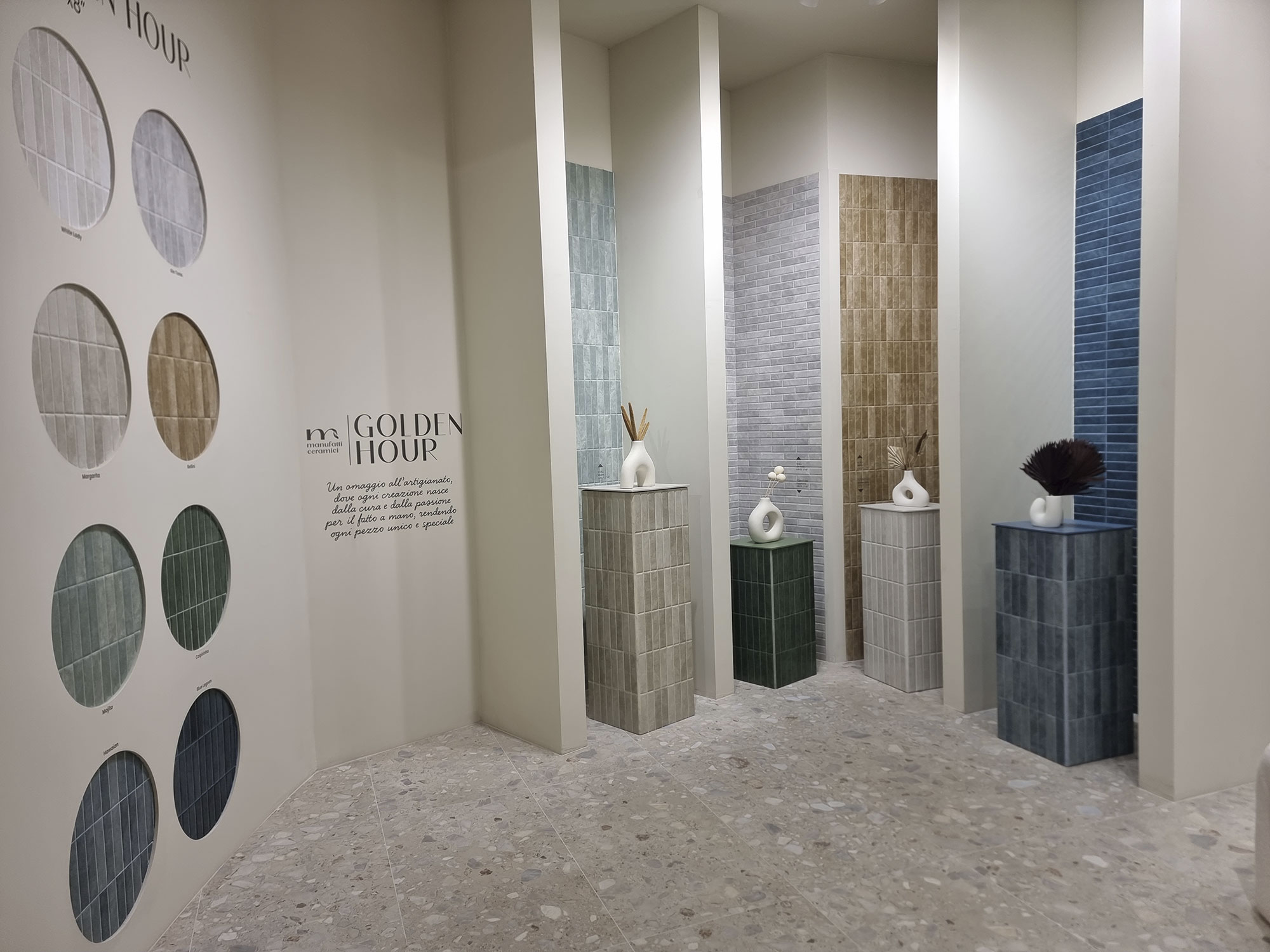
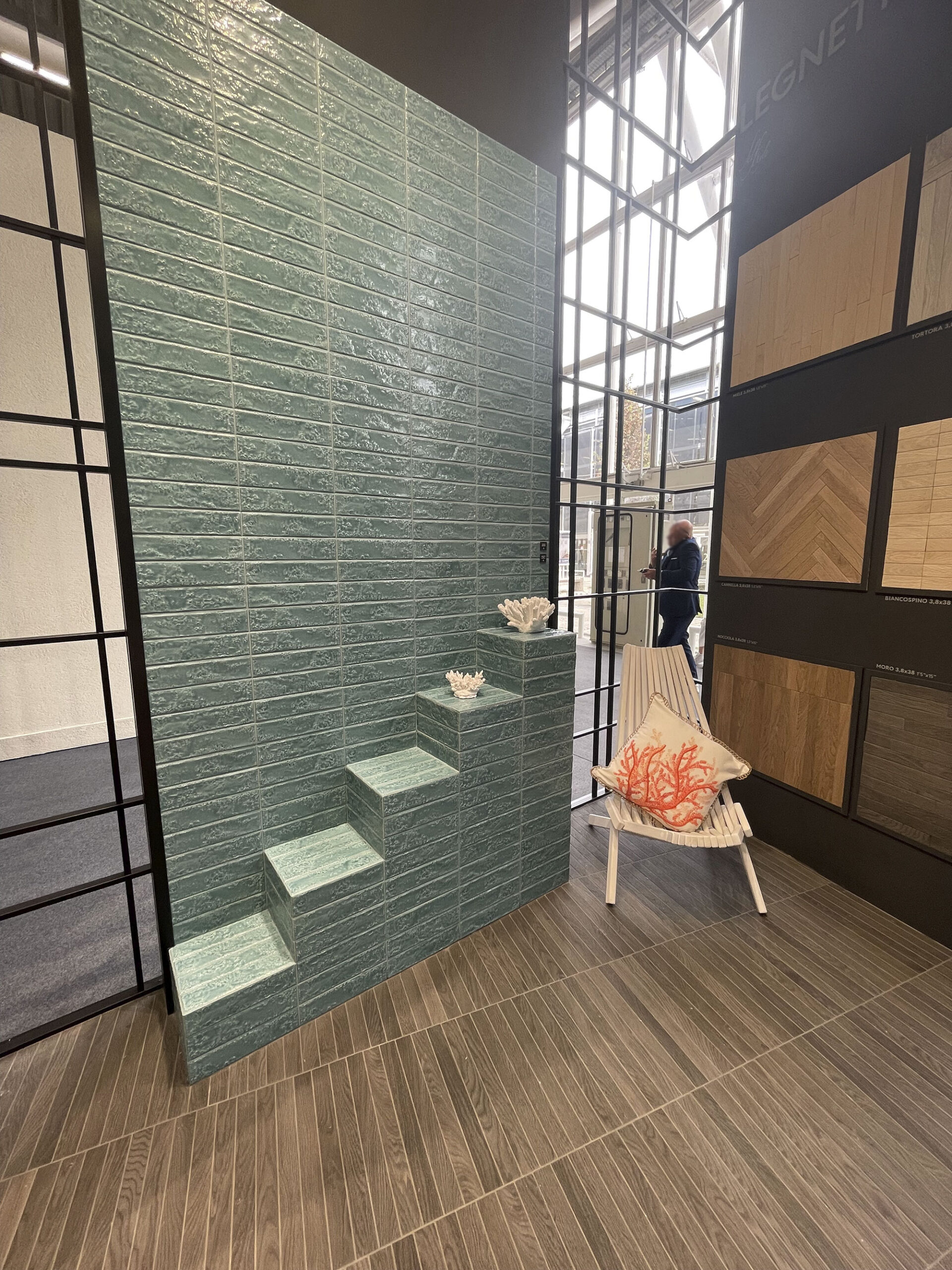
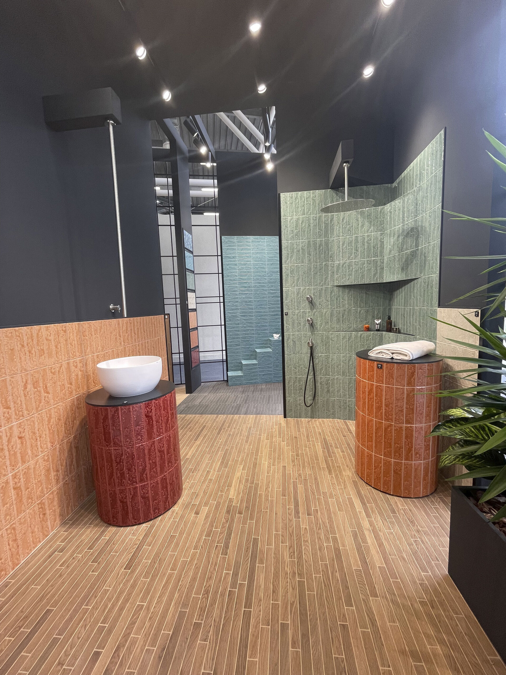
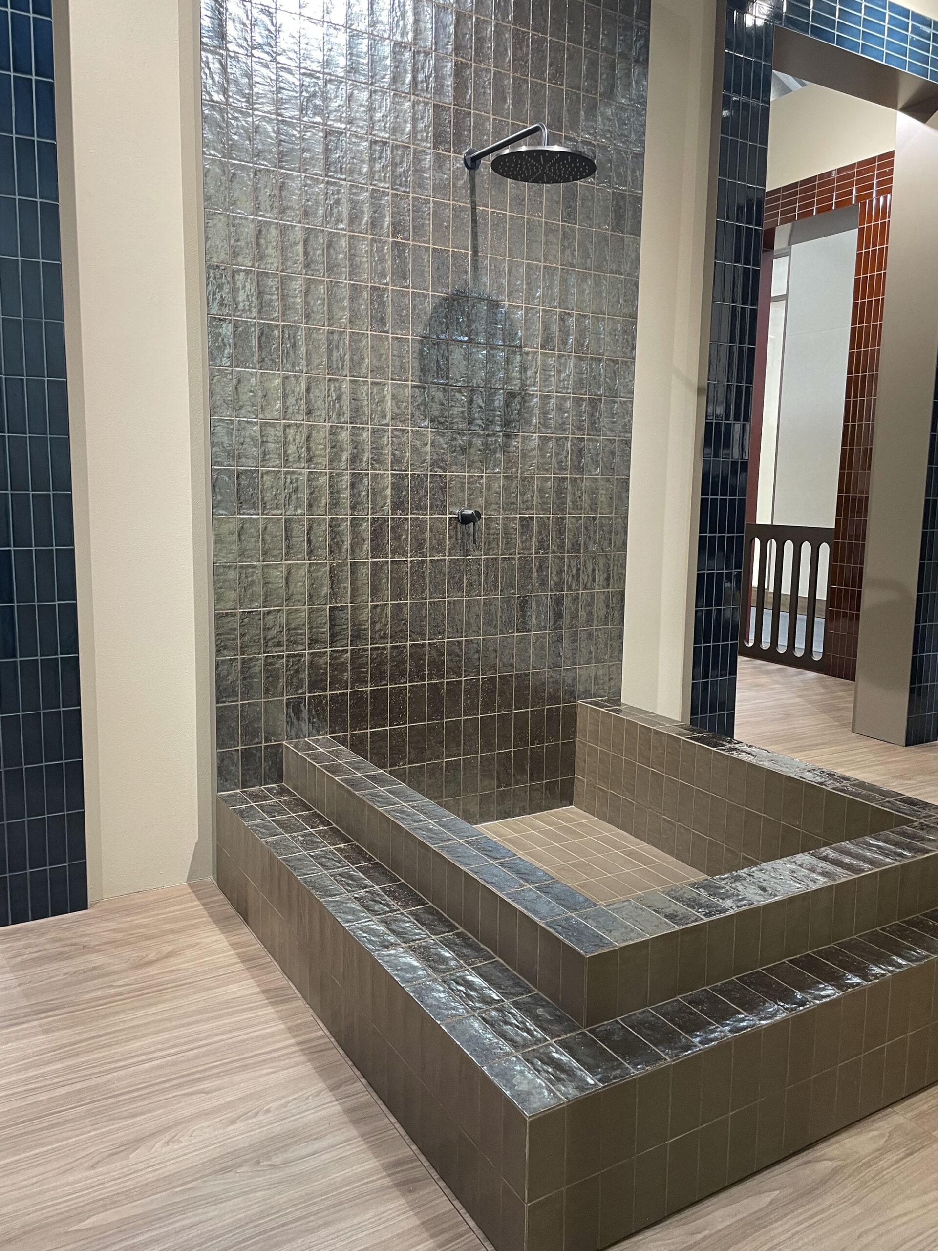
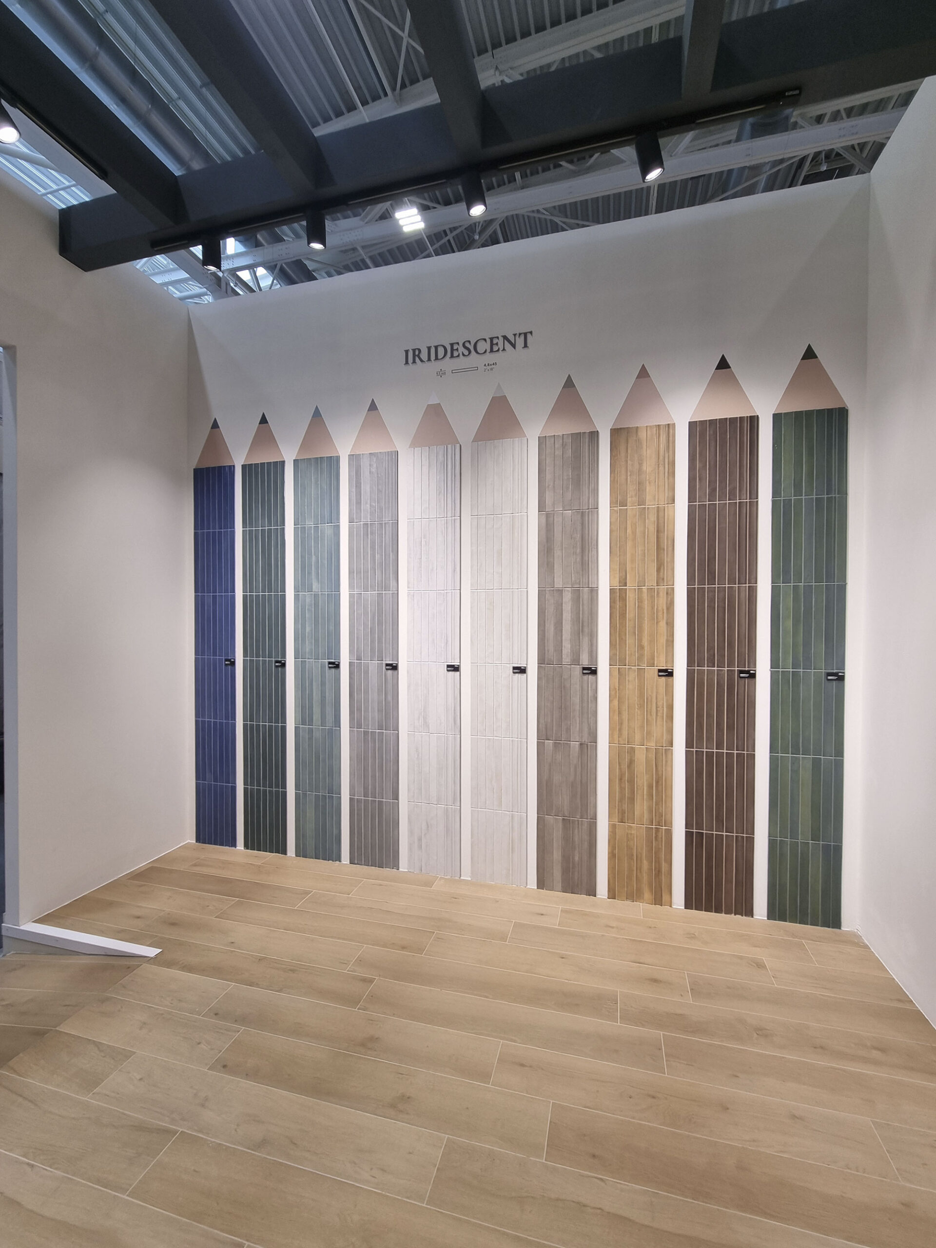
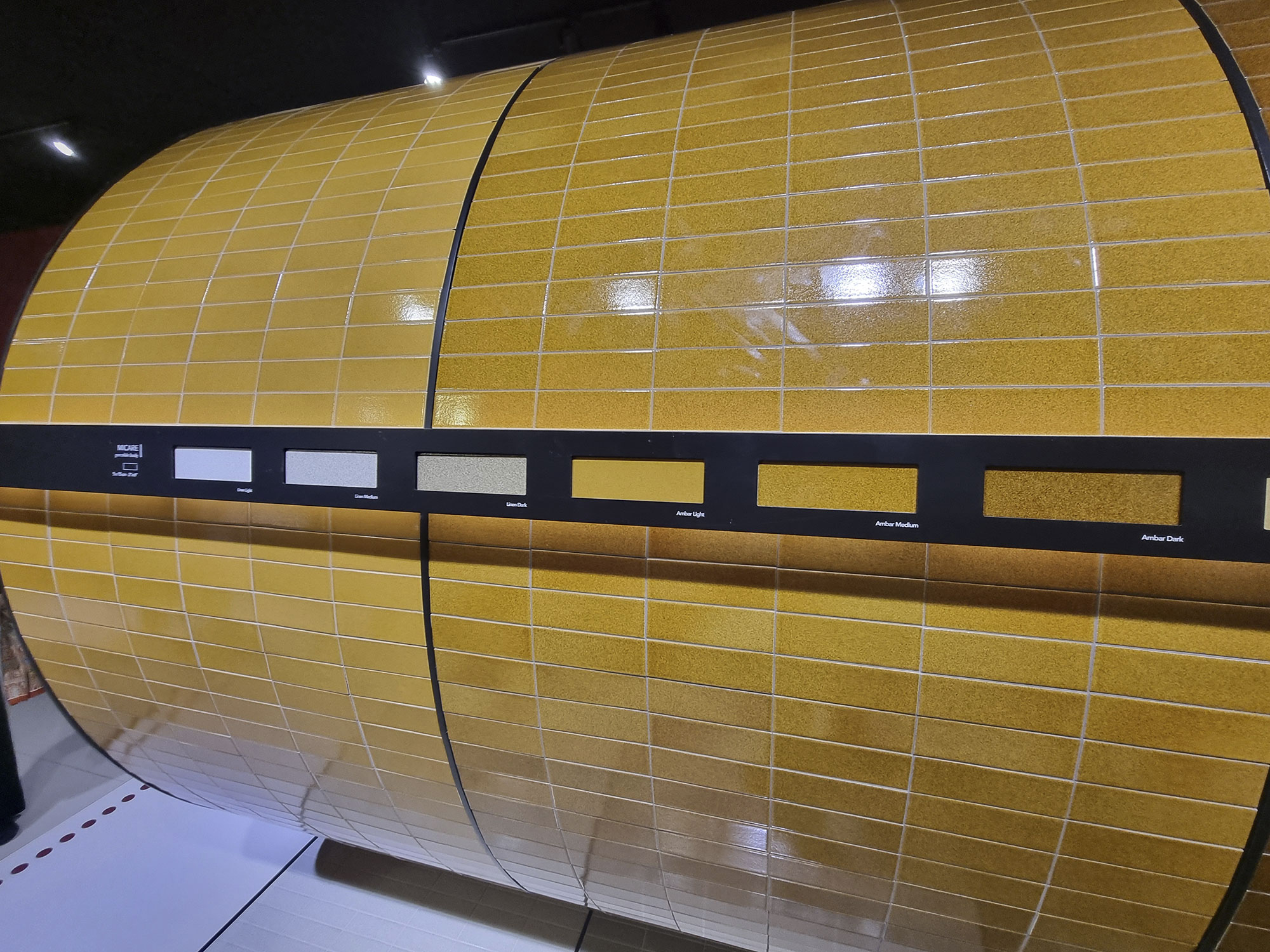
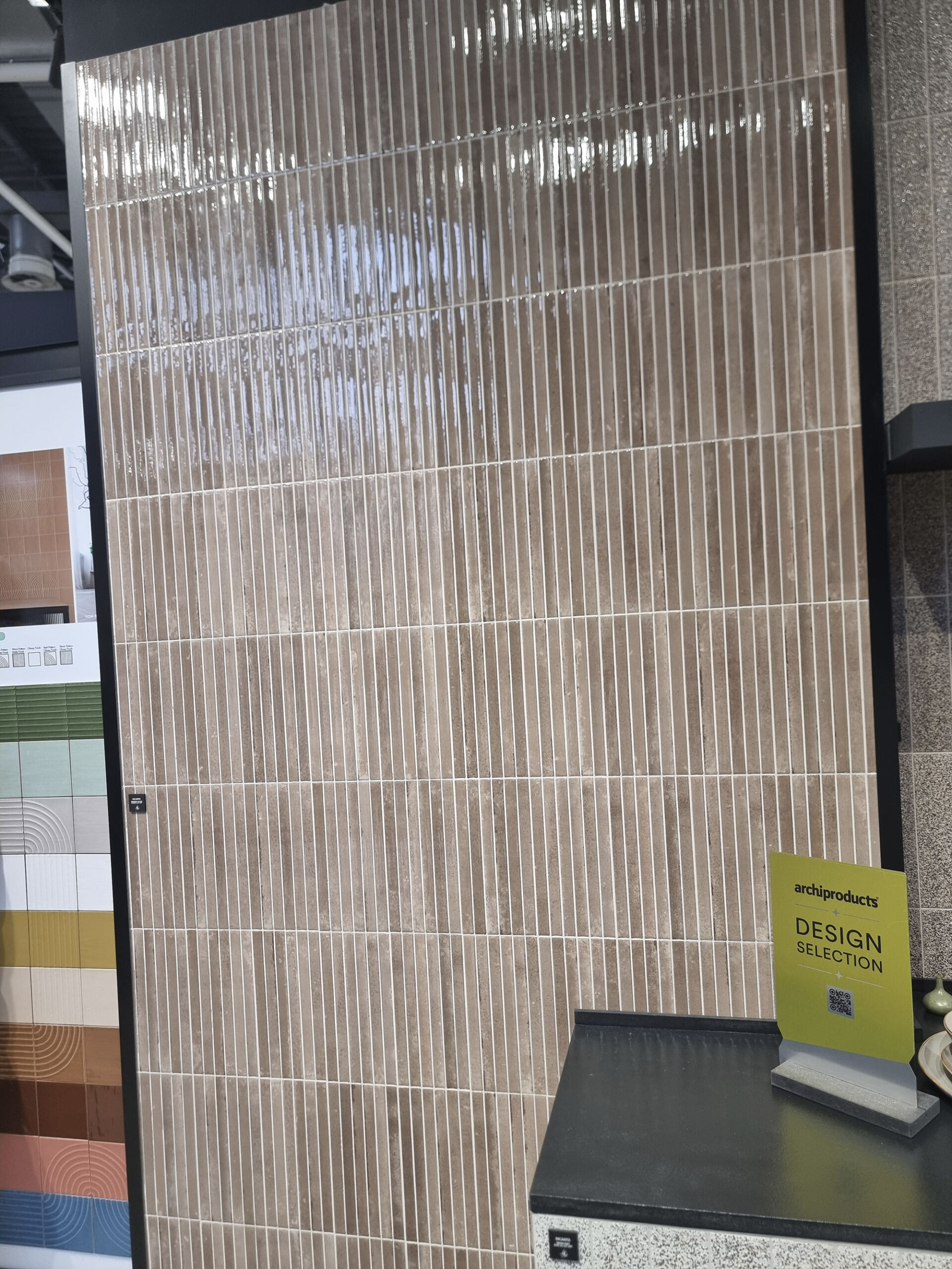
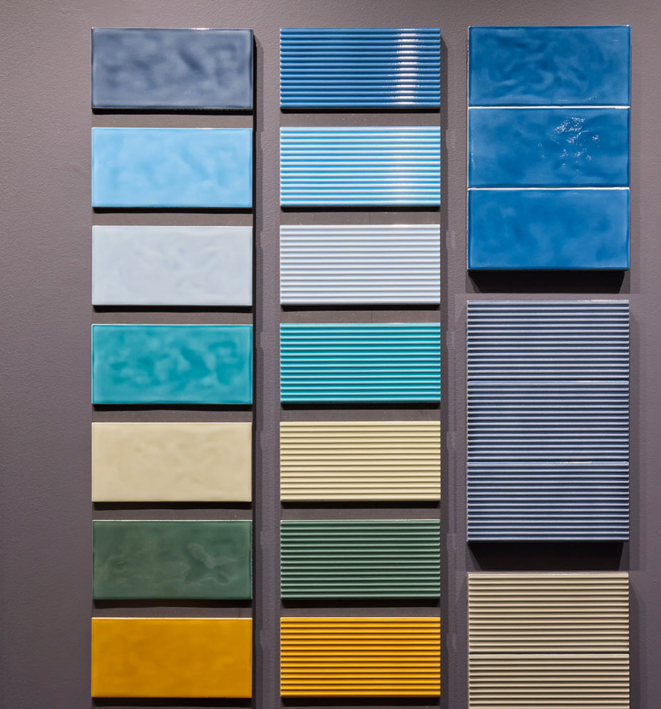
Brick tiles are no passing fad—they’ve become a lasting category thanks to their versatility and mix appeal: they pair with everything and fit everywhere.
The upgrades? Long, slim formats and wide chromatic ranges (vivid, pastel, natural) in both gloss and matt finishes—sometimes even speckled.
There’s a buzz around relief effects: convex bricks, decorative shapes, and even stone-textured structures.

Ascot-Dom-(1)

Ascot-Dom-(18)

Cifre-(17)

Coem-(5)
Elios-(6)
Keradom-(3)
Keradom-(4)

Keradom-(9)

Quintessenza-(13)
Quintessenza-(15)
Rondine-(40)

Rondine-(42)

Sodai-(5)
Wow-(7)
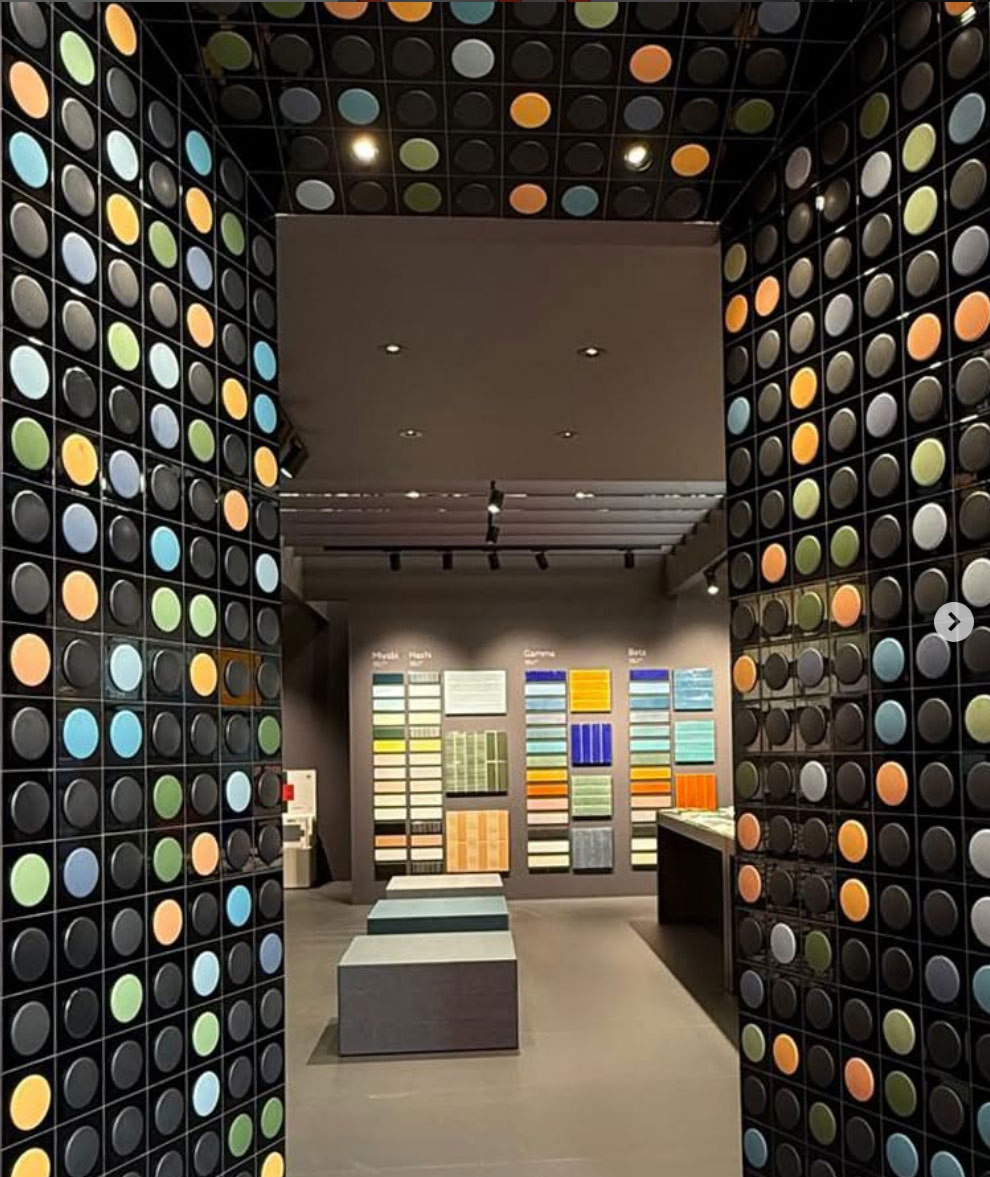
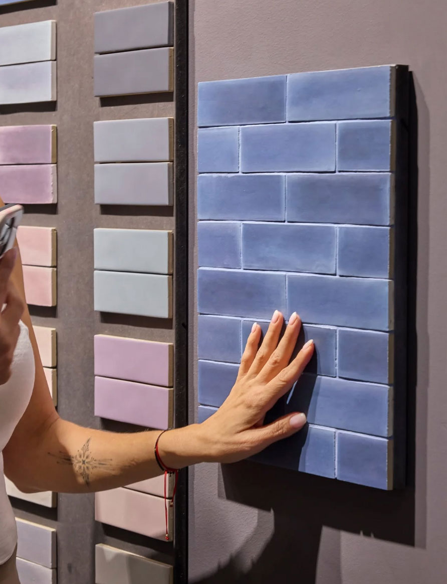
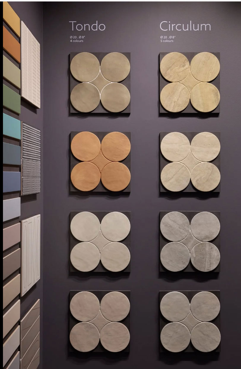
SMALL IS BEAUTIFUL (NOT JUST SQUARE)
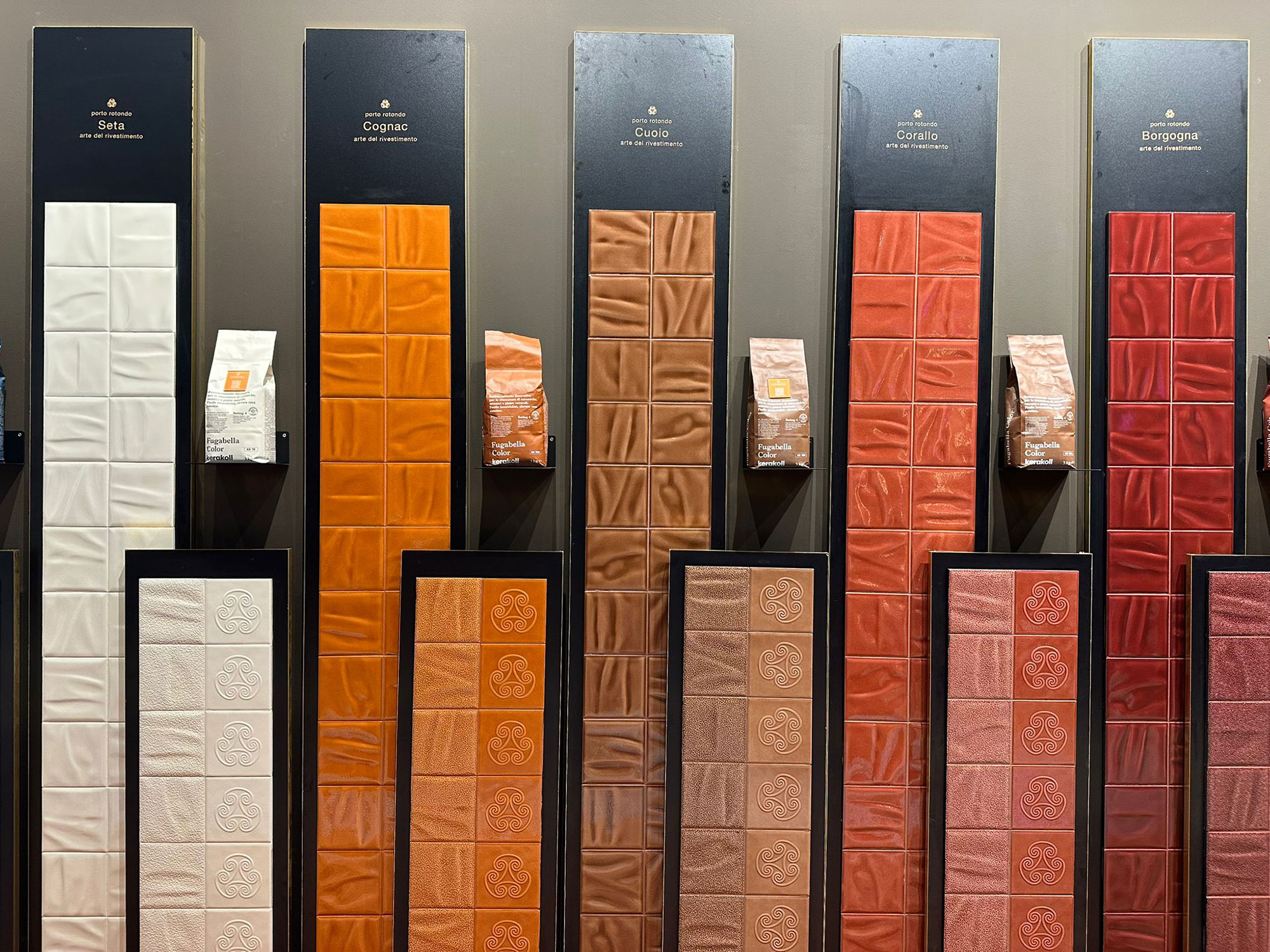
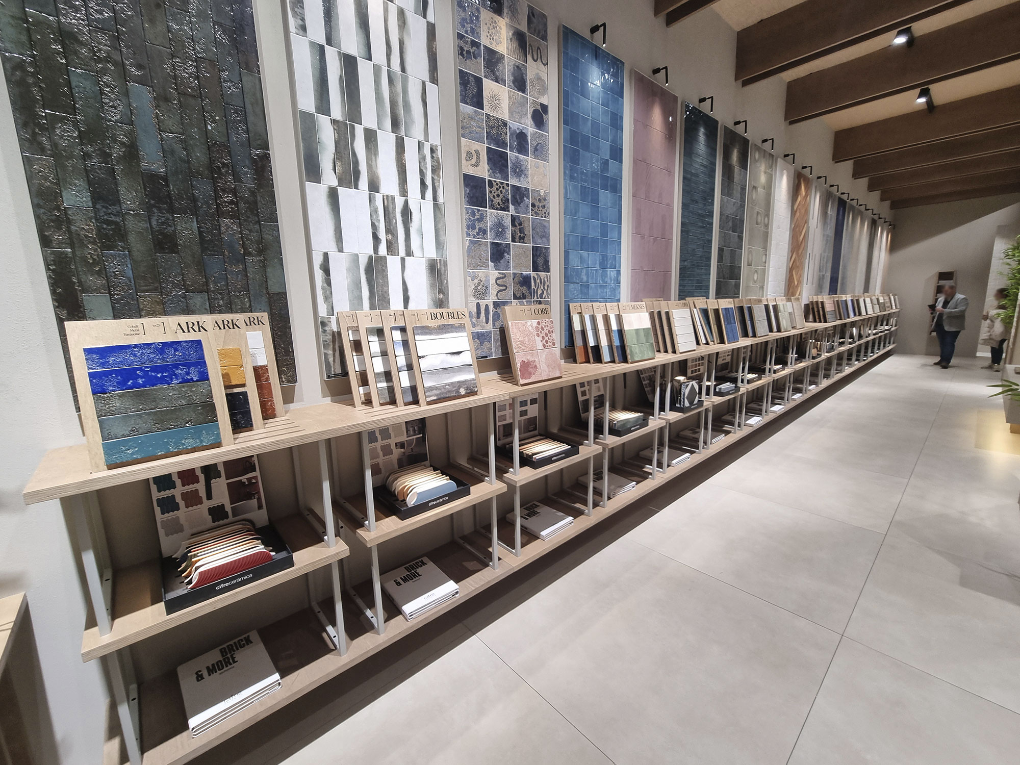
The spring bloom of small formats didn’t disappoint.
These collections proudly fly the “true ceramic” flag and bring energy to stands.
Alongside the usual squares and rectangles (in countless colors), we saw creative shapes—irregular, round, or embossed.

Cerasarda-G-Romani(3)

Cerasarda-G-Romani(4)

Cerasarda-G-Romani(5)
Cerasarda-M(1)

Cerasarda-M(5)
Cesi(2)

Cesi(3)
Cifre-(6)

Cifre-(7)

Cifre-(9)
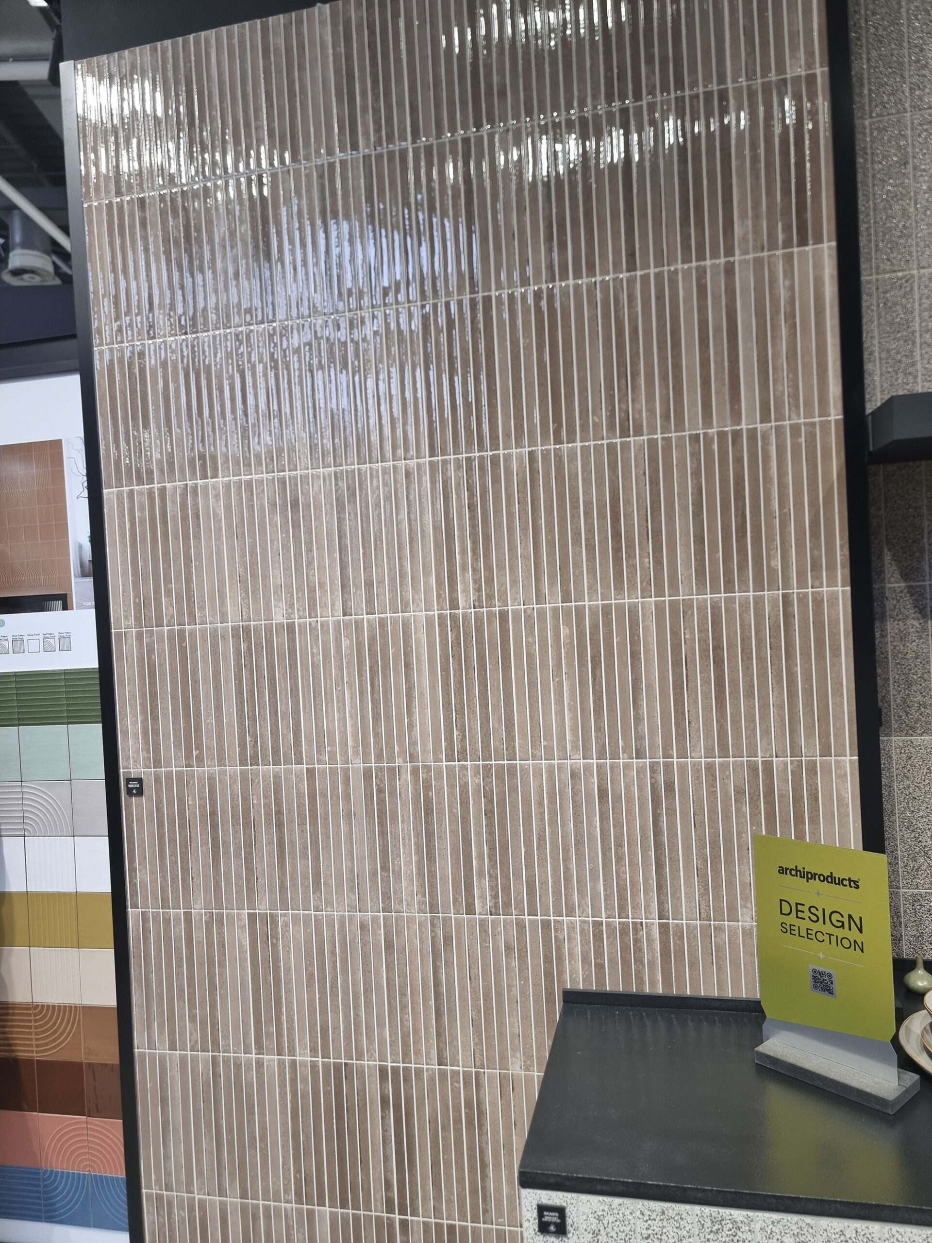
Keradom-(7)
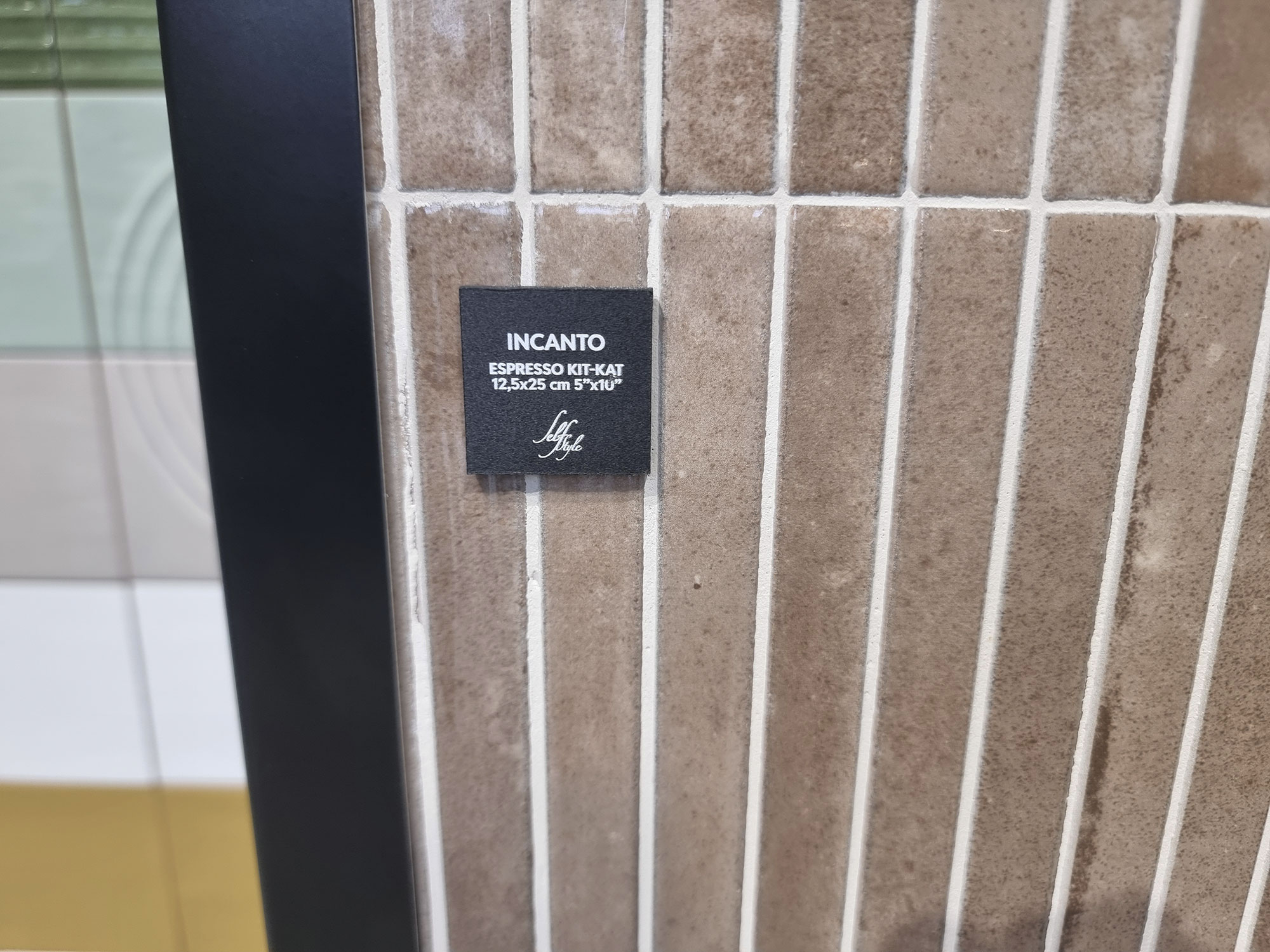
Keradom-(8)
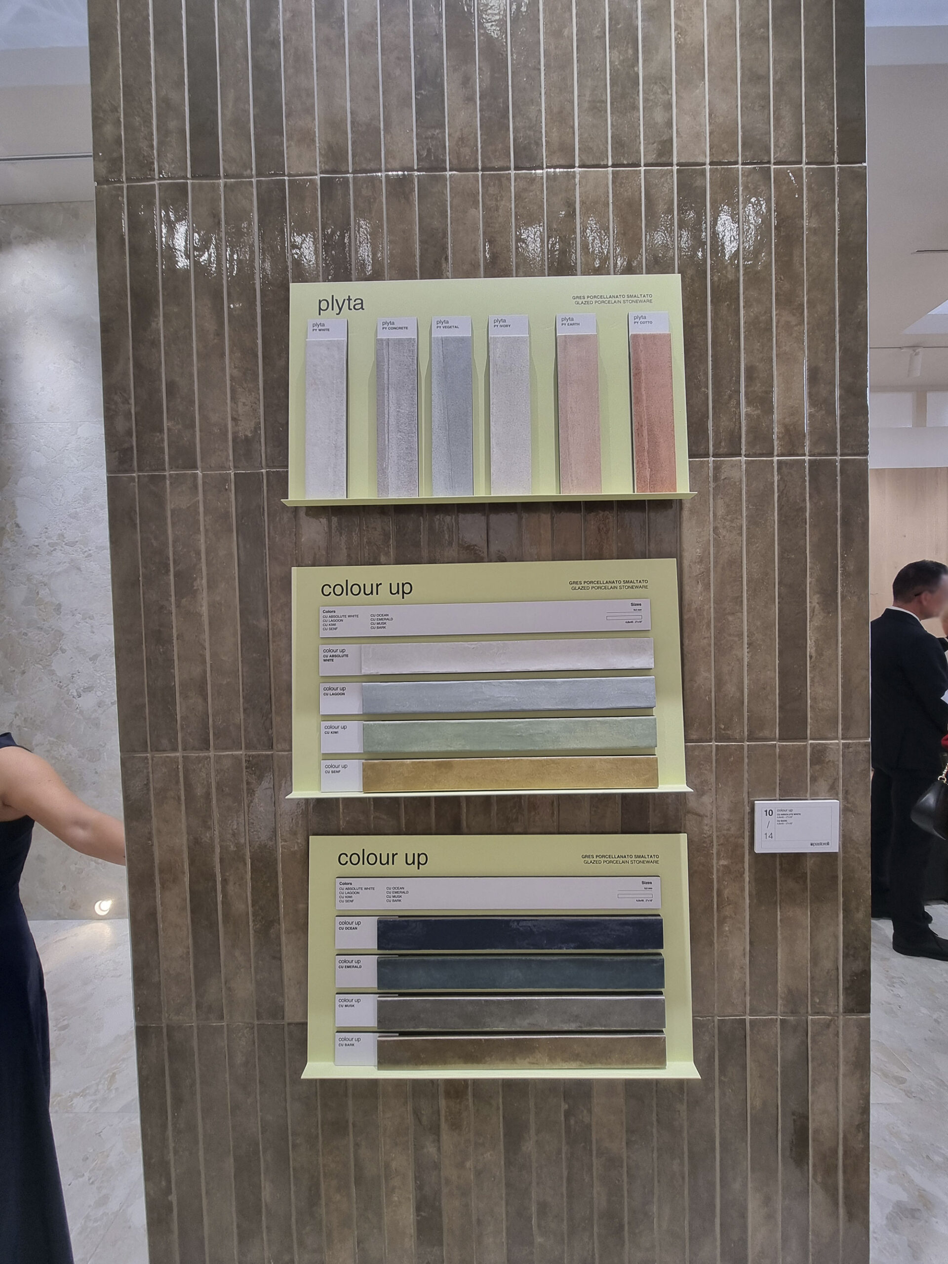
Pastorelli-(7)
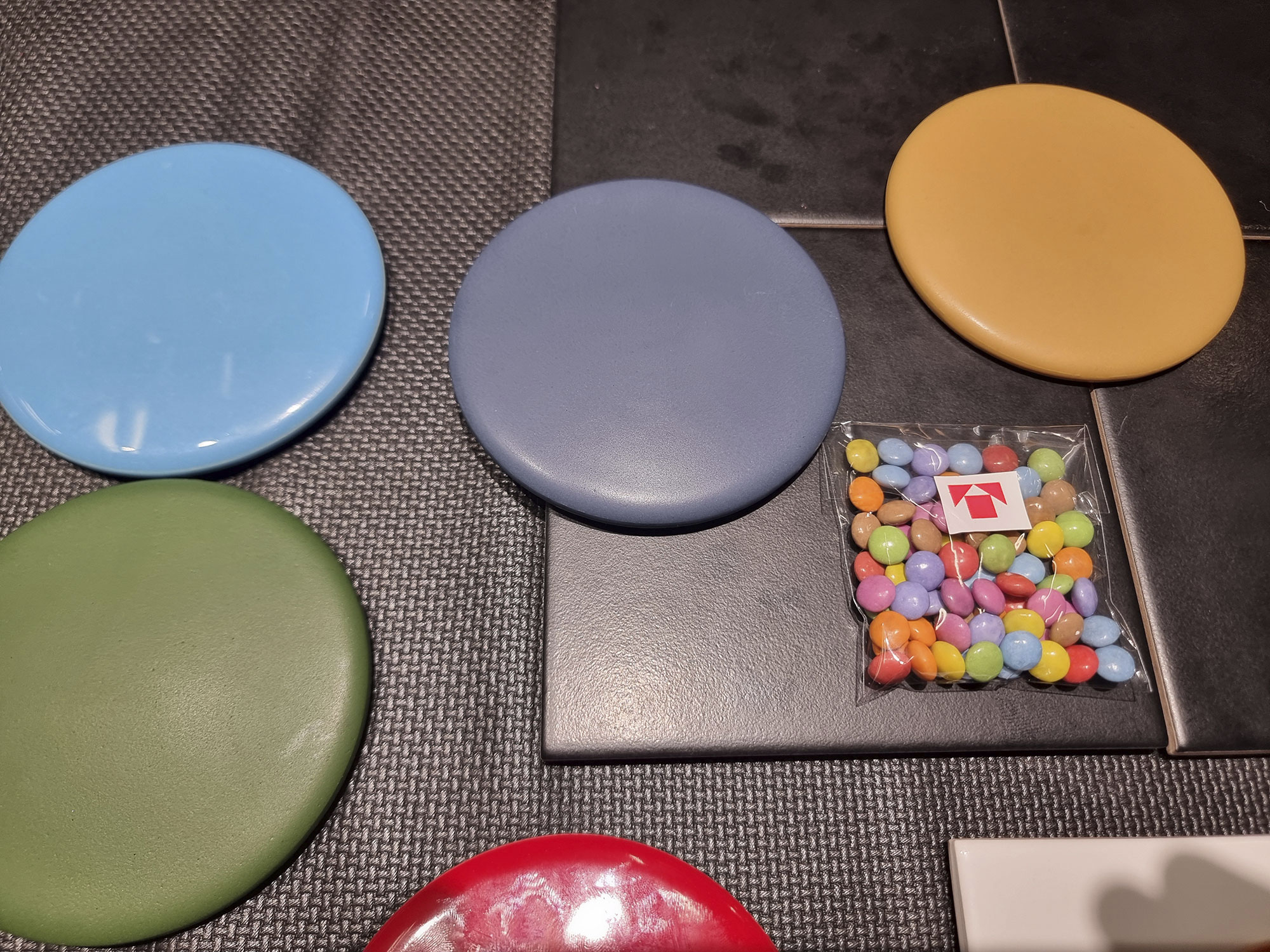
Tonalite–(2)
Tonalite-(1)
Tonalite-(3)

Tonalite-(5)
Tonalite-(6)

Wow-(8)
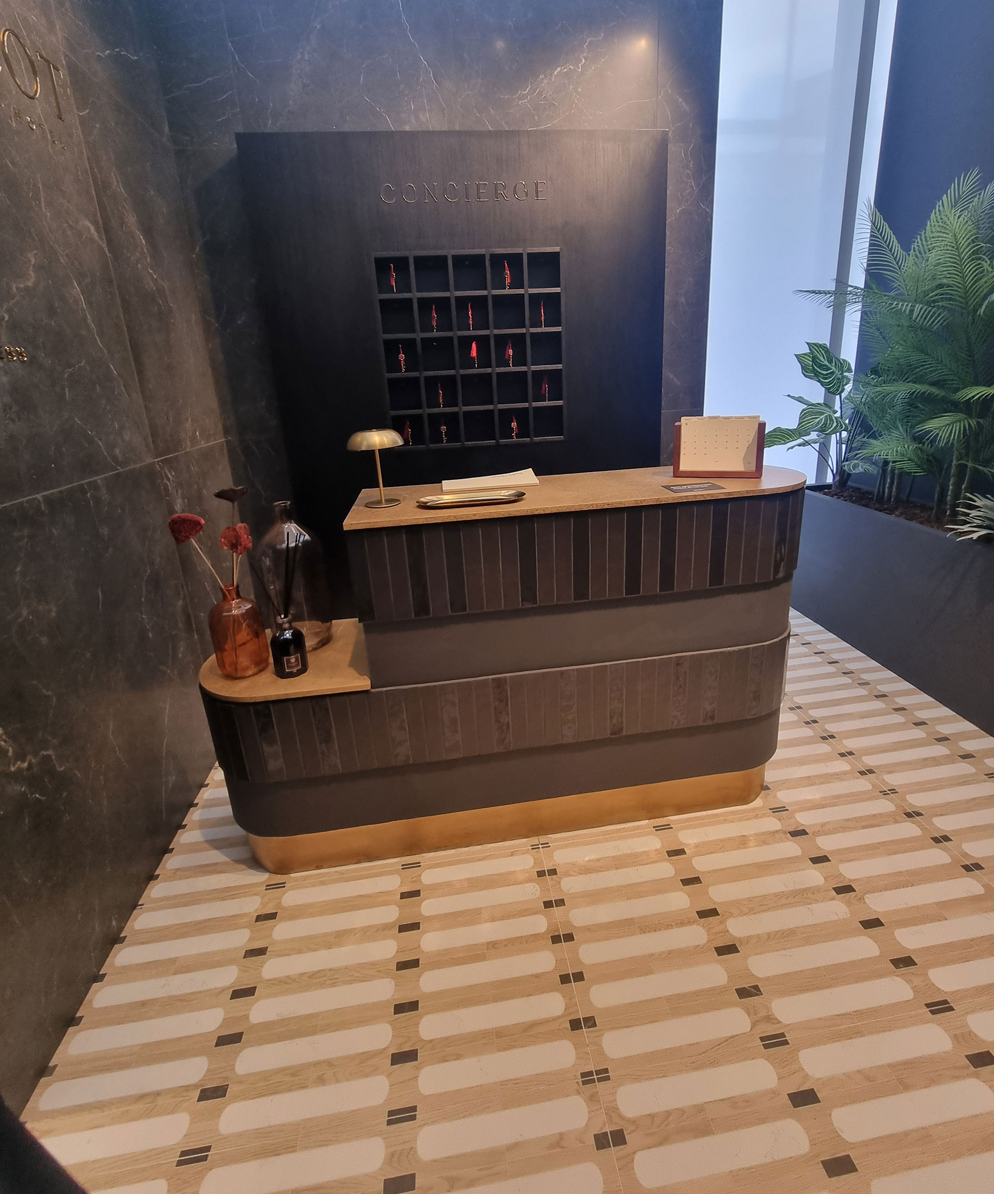
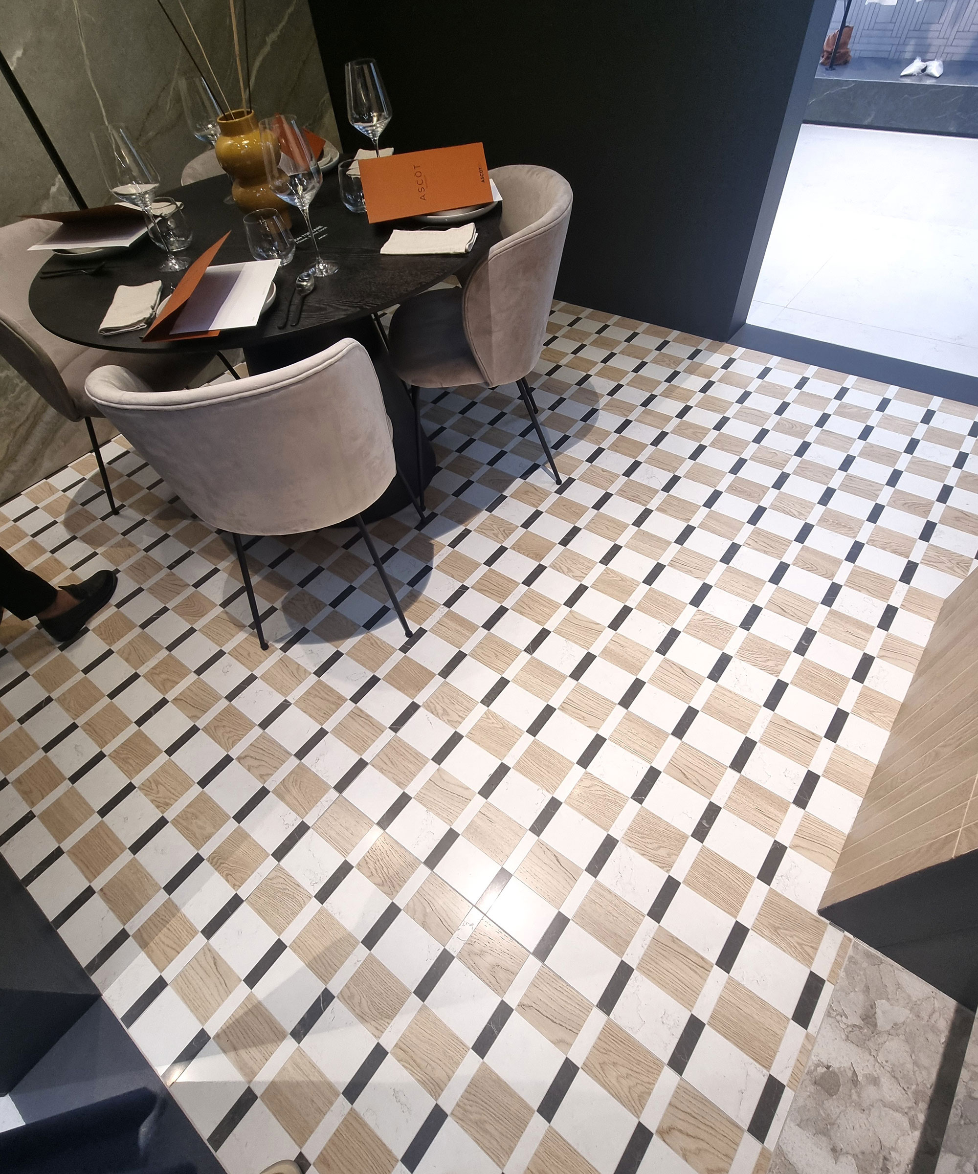
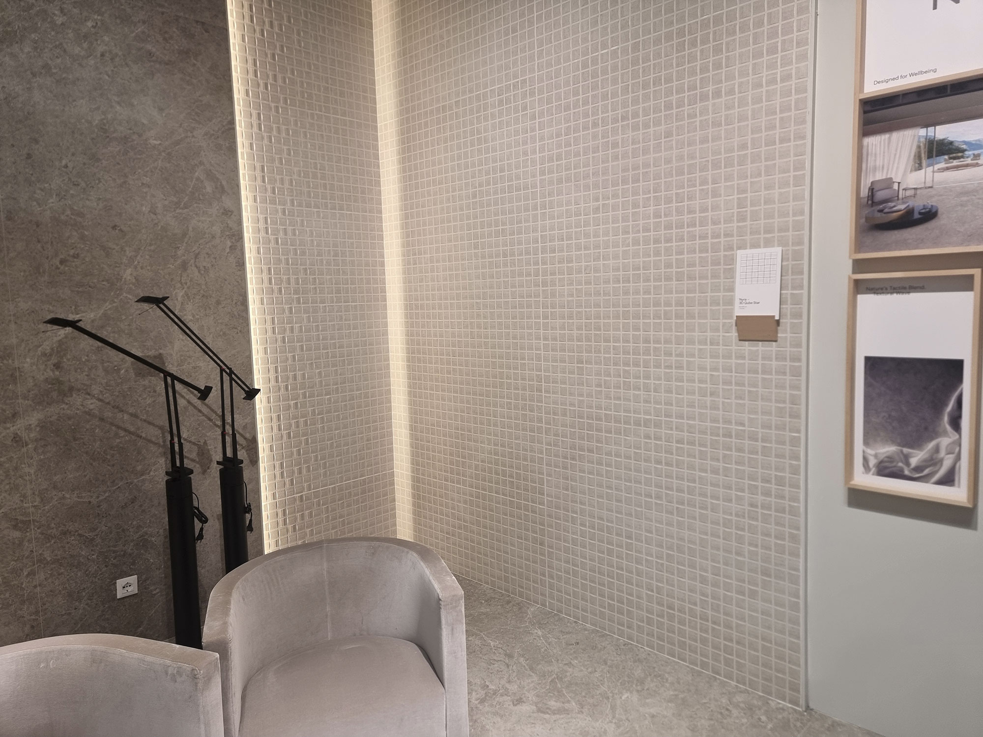
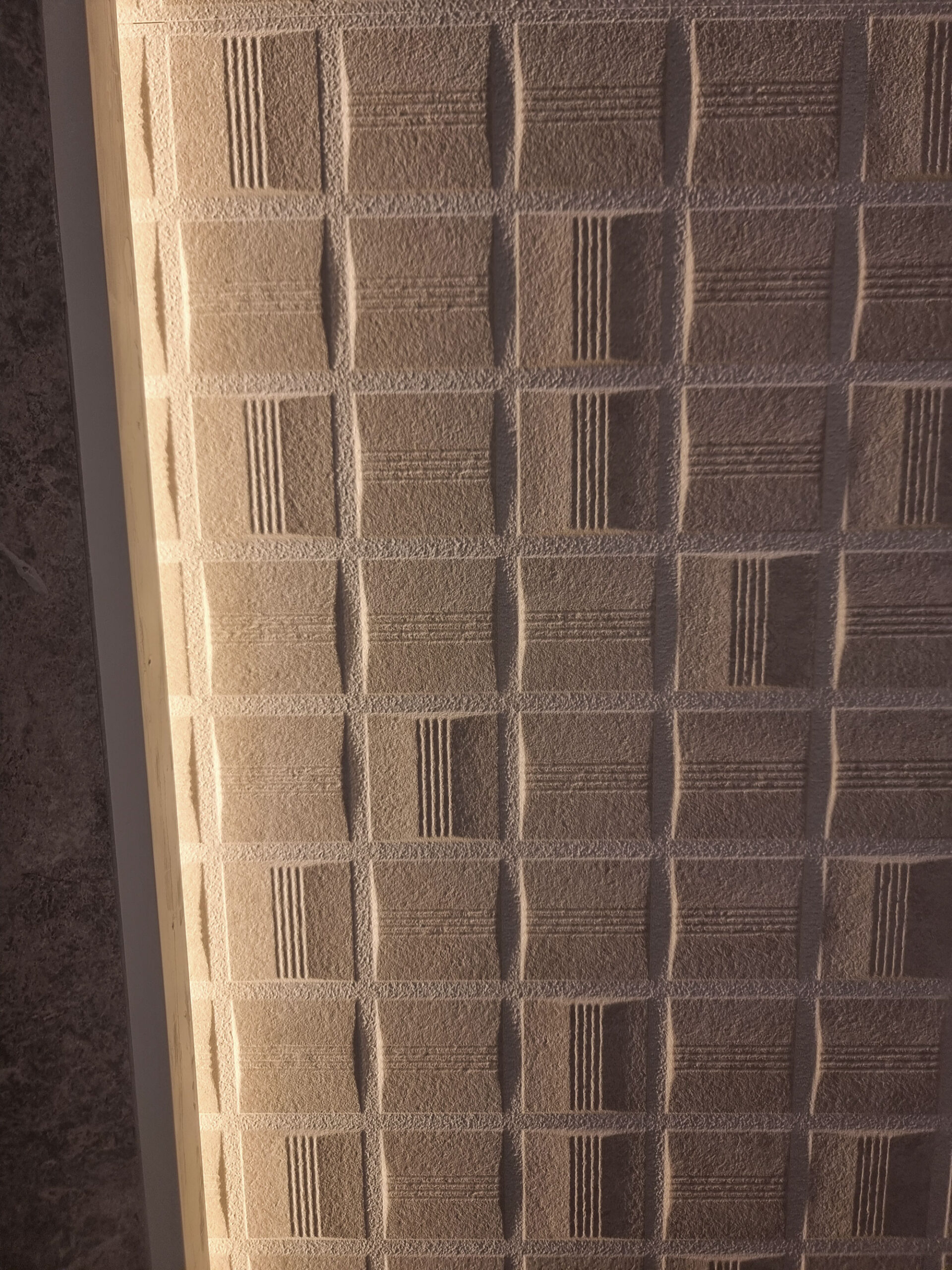
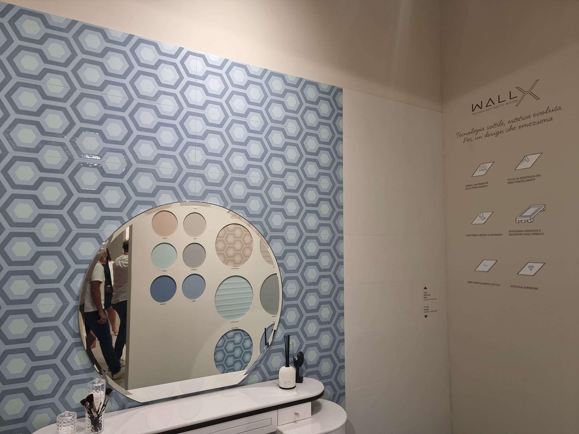
DECORATIVE GEOMETRIES
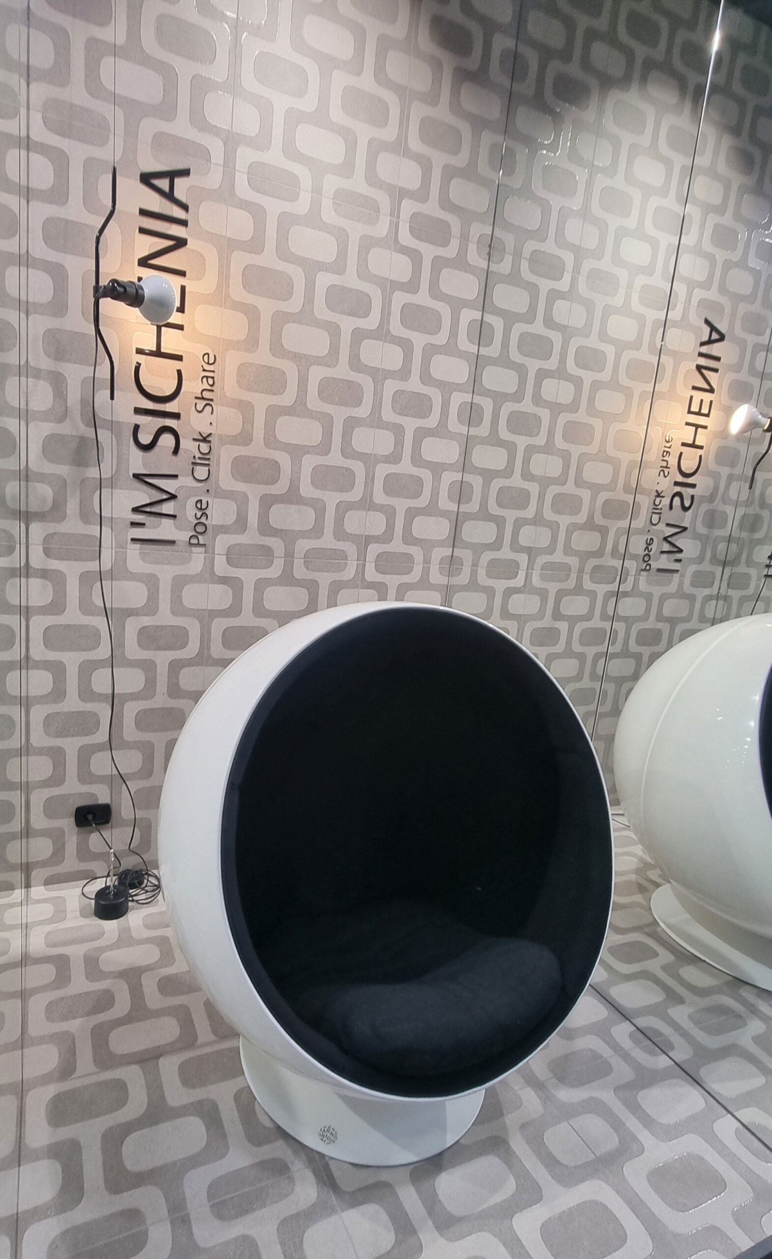
Whether marble effect, color, or mixed textures, geometric patterns in small formats provide an alternative to the endless calm surfaces dominating many stands.
They give spaces a radically different reading.
For wall coverings, geometric reliefs also appear in monochrome, with strong 3D effects (Atlas Concorde).
Elsewhere, wall coverings turn almost architectural, with volumes and sculptural forms achievable only through artisanal production (Skultura by Elios).
Requiem for wallpapers and florals—barely seen, maybe hidden in back rooms.
Jalousies (breeze blocks) were also less prominent, and they’re more architectural elements than coverings anyway.
Ascot-Dom-(4)
Ascot-Dom-(8)
Atlas-Concorde-(4)
Atlas-Concorde-(5)

Atlas-Concorde-(10)

Elios-(8)
Elios-(18)
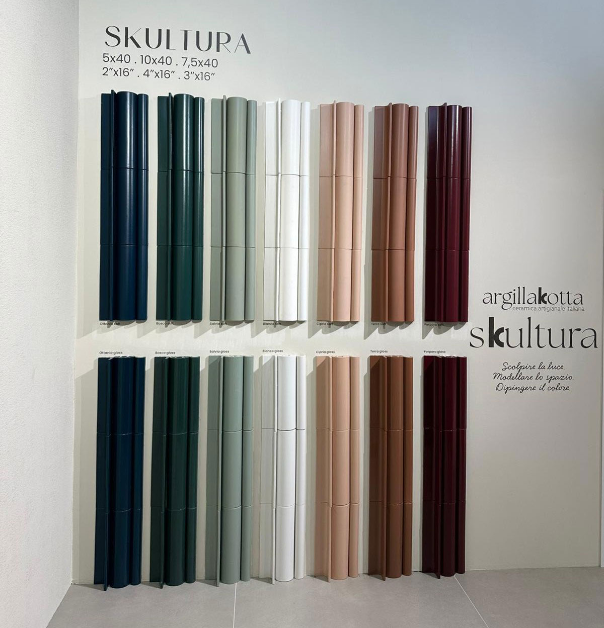
Elios-Skultura-(2)

Elios-Skultura-(3)

Elios-Skultura-(6)

Faetano—Del-Conca-(2)

Fap-Ceramiche-(10)
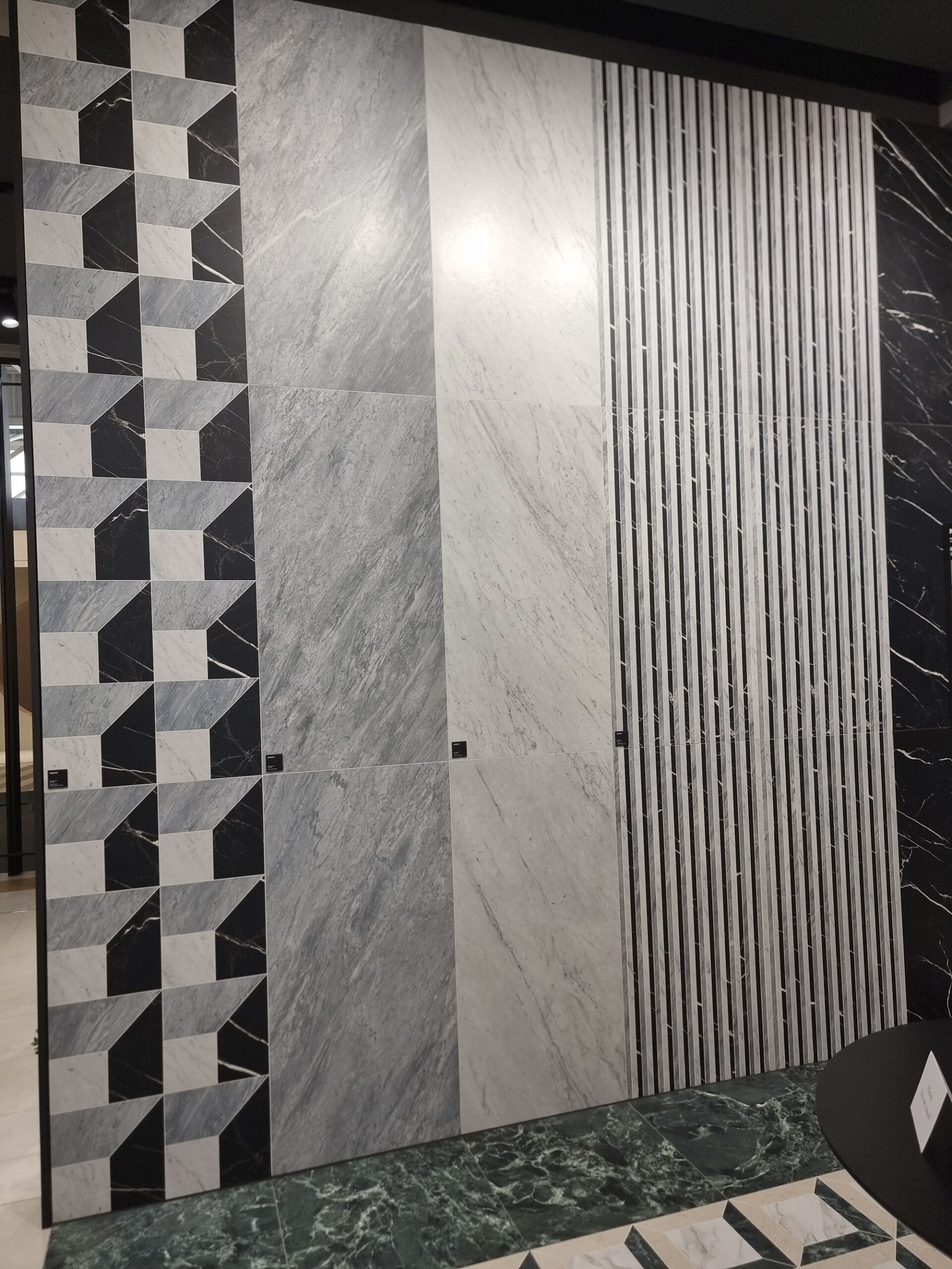
Fenice-(1)
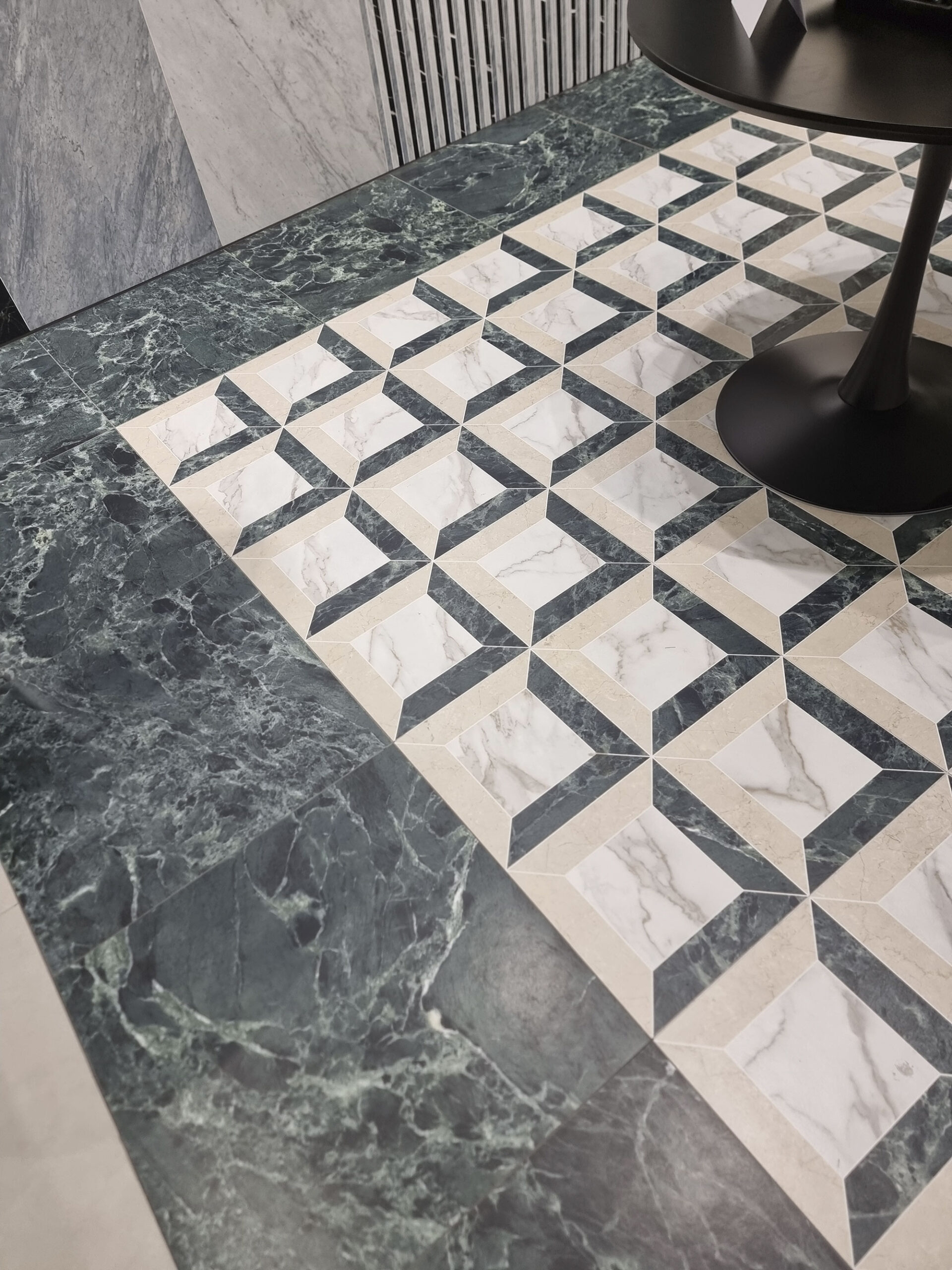
Fenice-(2)

Gardenia—Abk-(6)

Marca-Corona-(17)

Marca-Corona-Arteseta-(1)

Marca-Corona-Arteseta-(2)
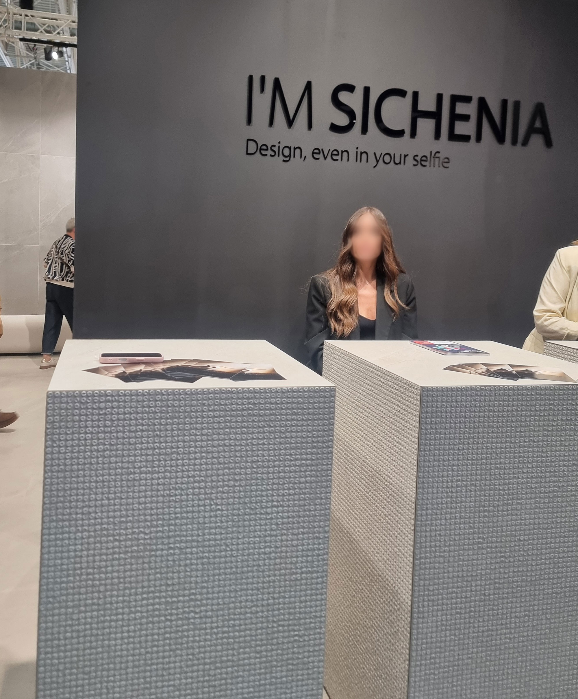
Sichenia-(2)
Sichenia
CANNA-BIS
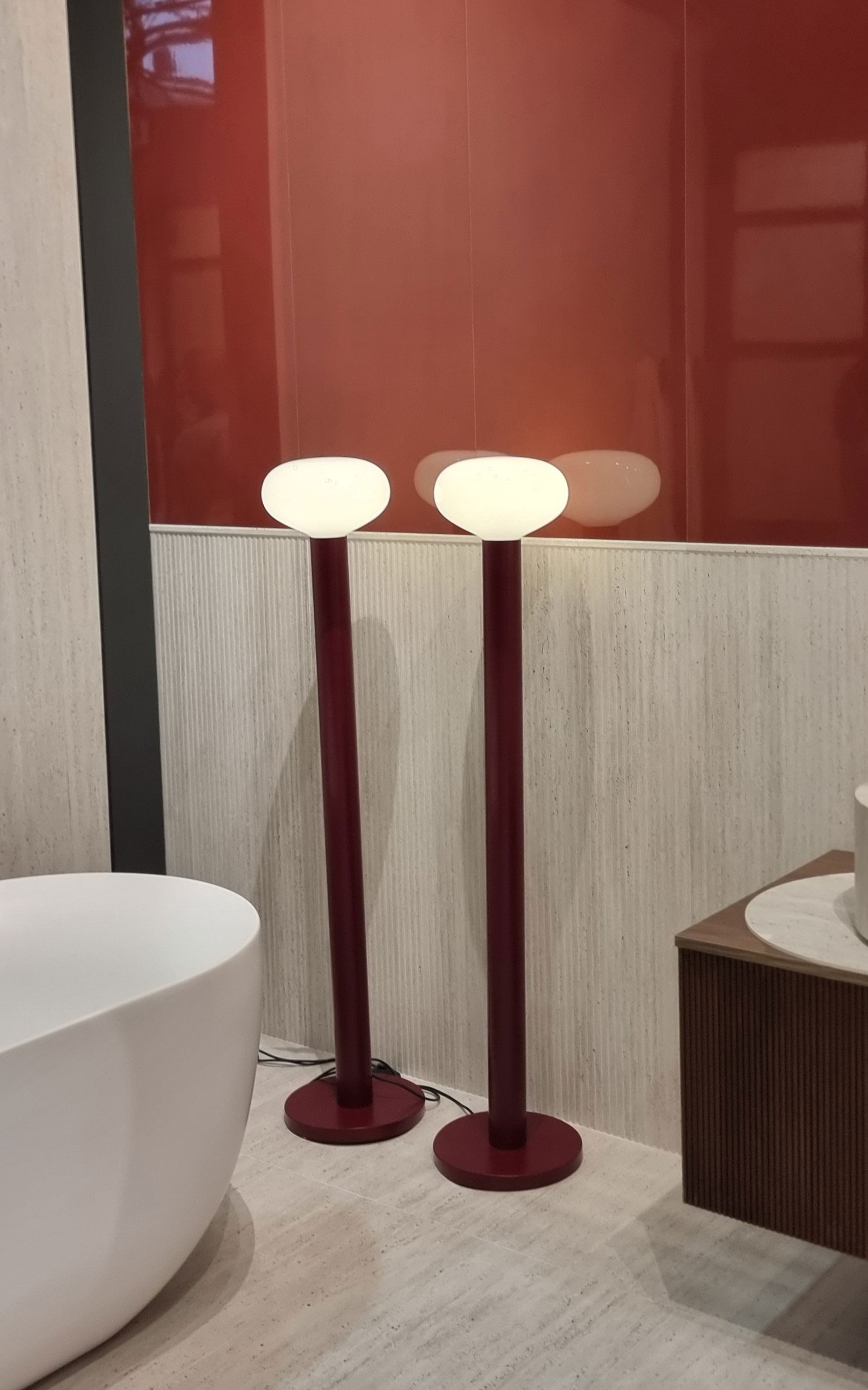
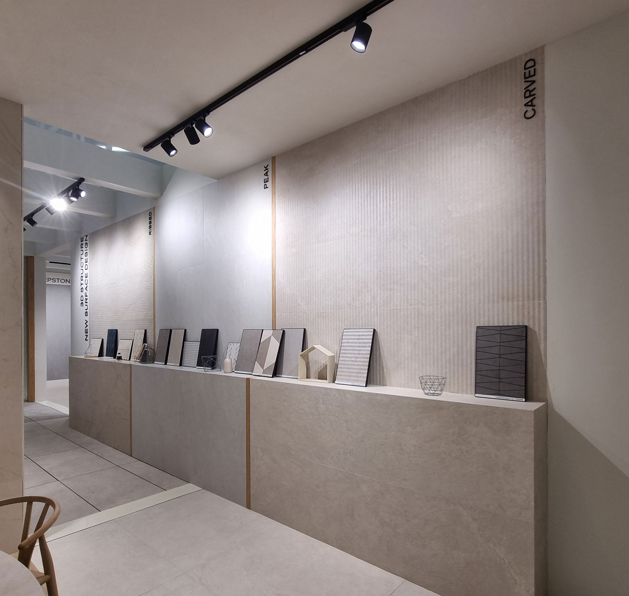
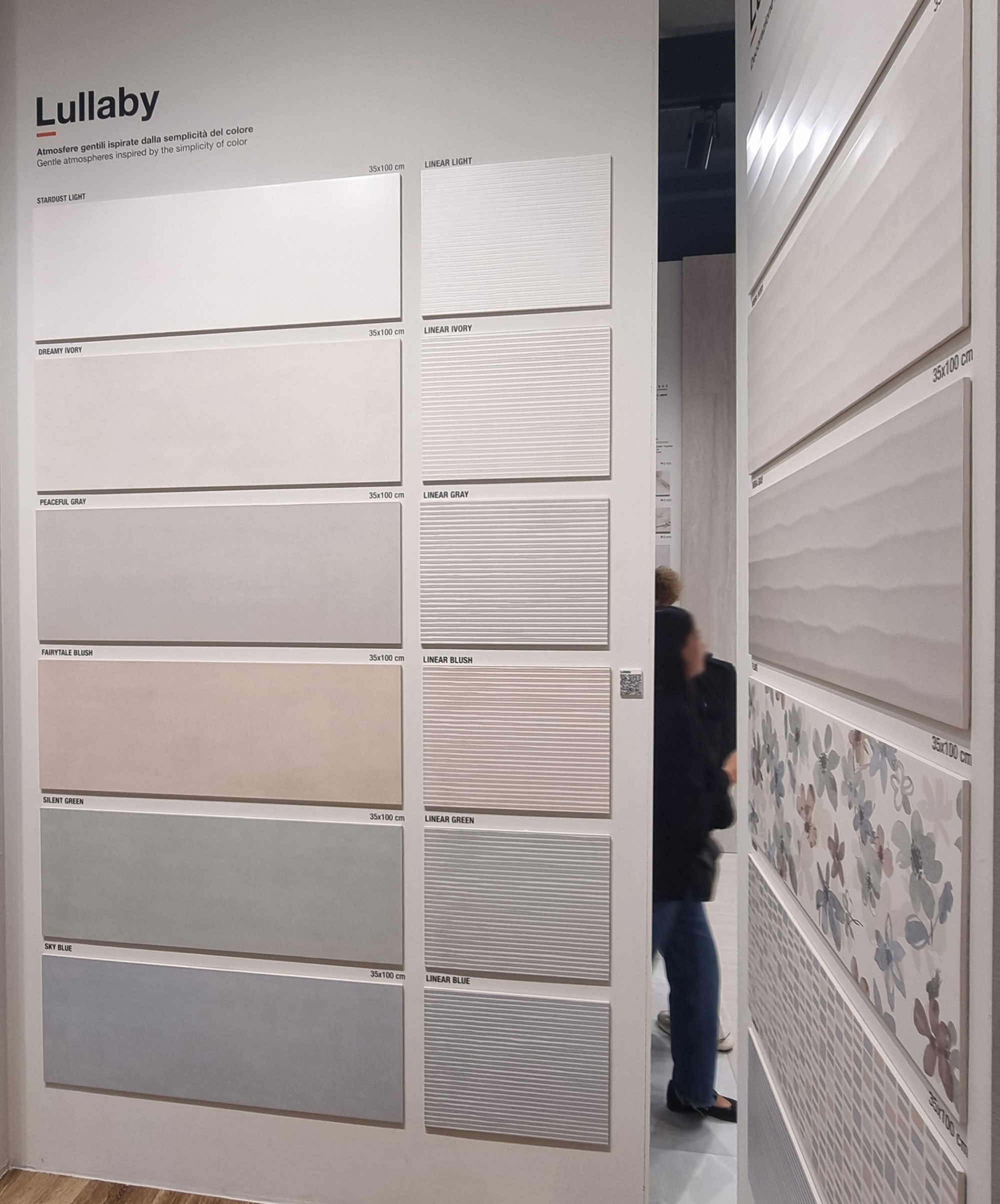
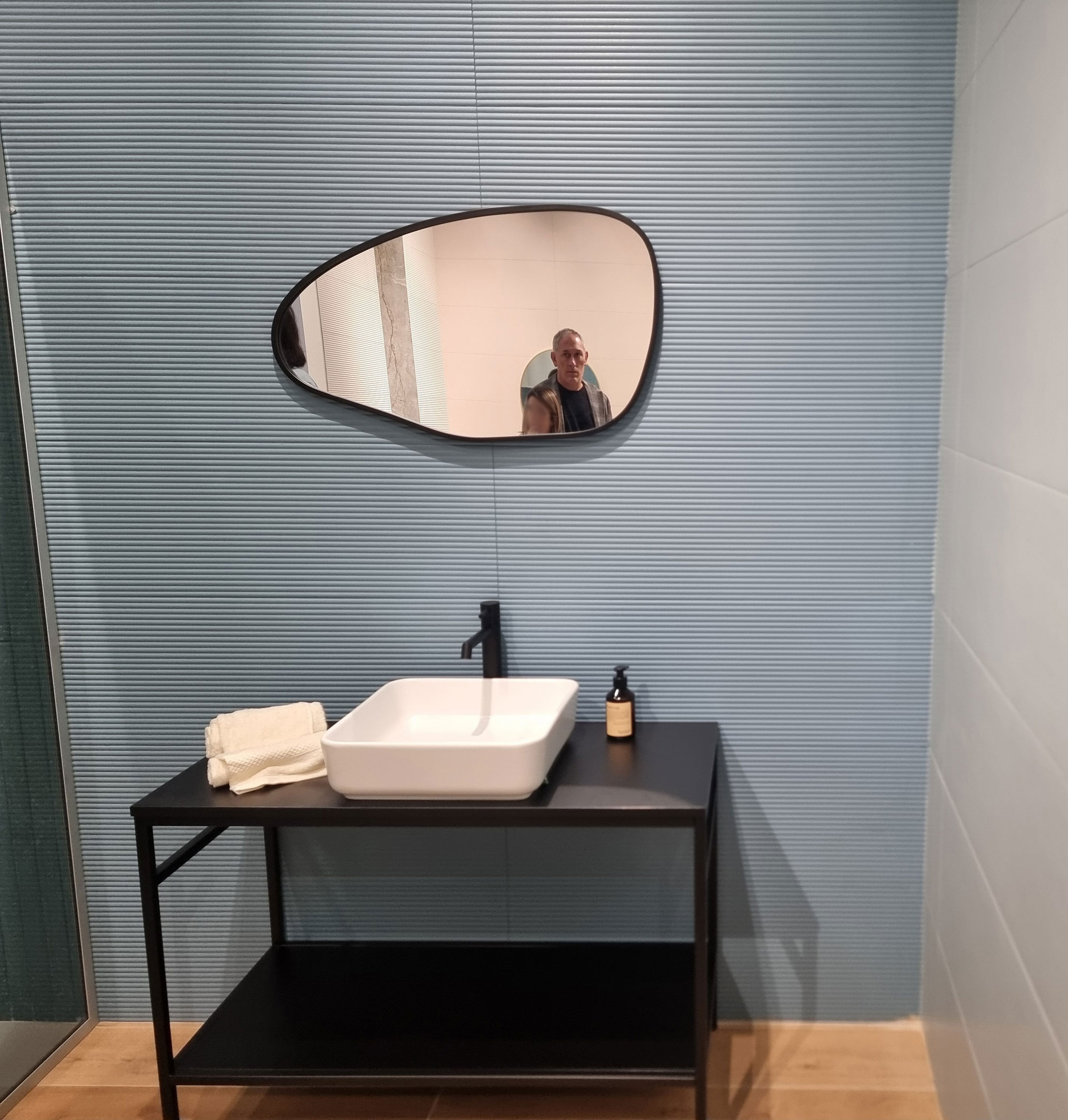
Among decorative relief modules, the fluted texture wins hands down—still a classic among high-end ranges.
Born horizontal, it now also appears vertically, as full-height wainscoting (h120) or as a base topped with glossy colored backgrounds.
Big flutes for wall tiles, mini-flutes for stoneware, and fine ribbing for stone effects.

Atlas-Concorde-(13)
Fap-Ceramiche-

La-Fabbrica-Ava-(21)
NovaBell-(21)

NovaBell-(27)
Panaria-Lea-(10)

Rondine-(28)
Rondine-(38)
Tonalite-(4)

Tuscania-(9)
Chapter 3
TAP TEN 2025
TAP TEN 2025
As tradition dictates, we wrap up with our Top Ten—half serious, half not.
1.PORK PARK
Upon arrival, the welcome gift: the multi-story parking fee now hits €24.
Rumor says it’s indexed to Wall Street’s gold price.
To compare: a full car wash (inside and out) costs €20–22—and here, you don’t even get a dusting.
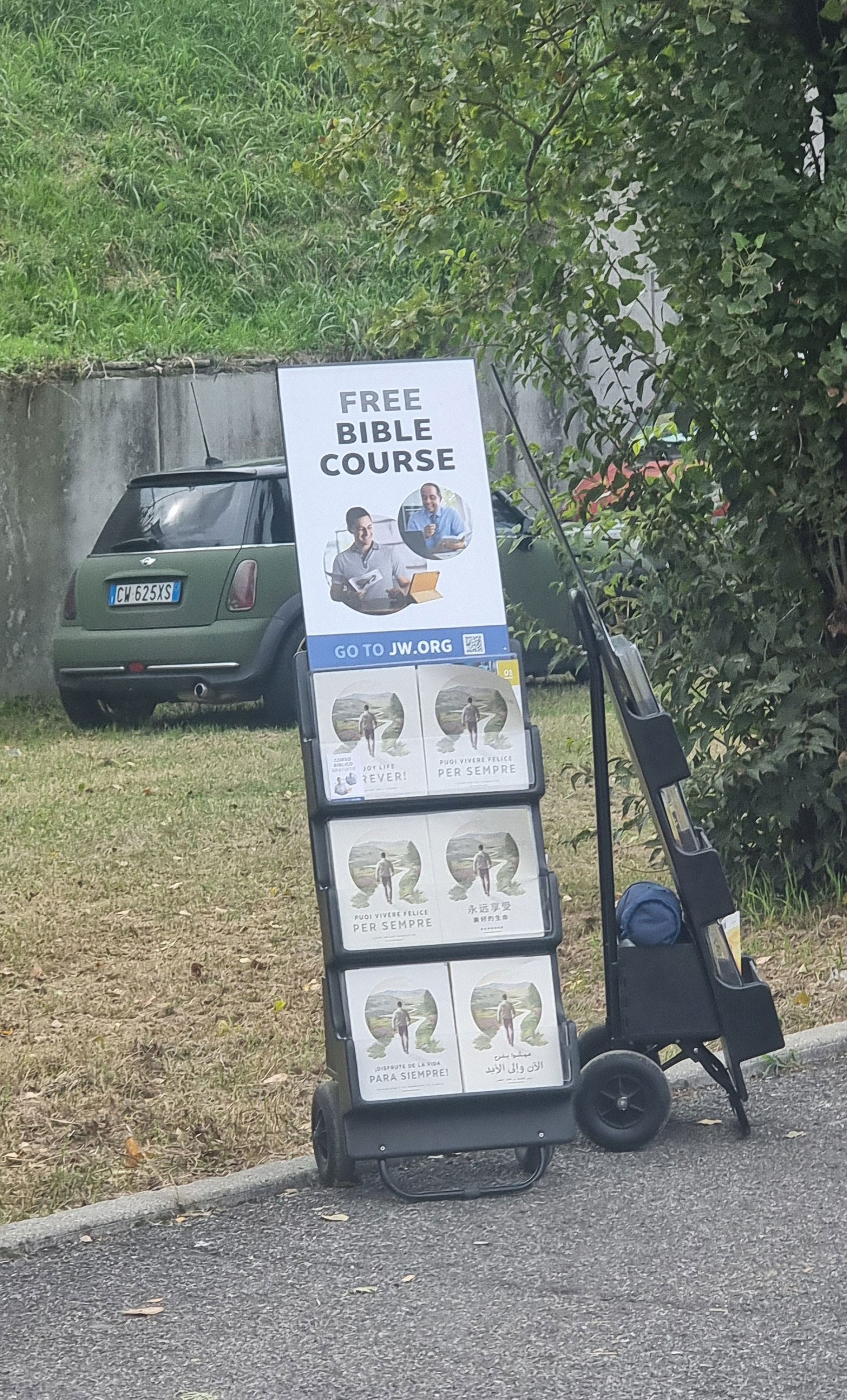
Maybe the increase helped enrollment in the Bible study course run by tireless evangelists at the parking exit, next to the porchetta truck and pomegranate juice stand.
To sweeten the pill (or the suppository), remember that Cersaie entry is free—unlike the Milan Furniture Fair, which keeps curiosity at bay with Coldplay-level ticket prices.
And rest assured: no kiss-cams here—what happens at the fair stays at the fair.

adeguamento-tariffe

Comitato-accoglienza-(1)
Comitato-accoglienza-(2)

Kiss-cam-Cersaie-
2. OUTFIT VENDORS
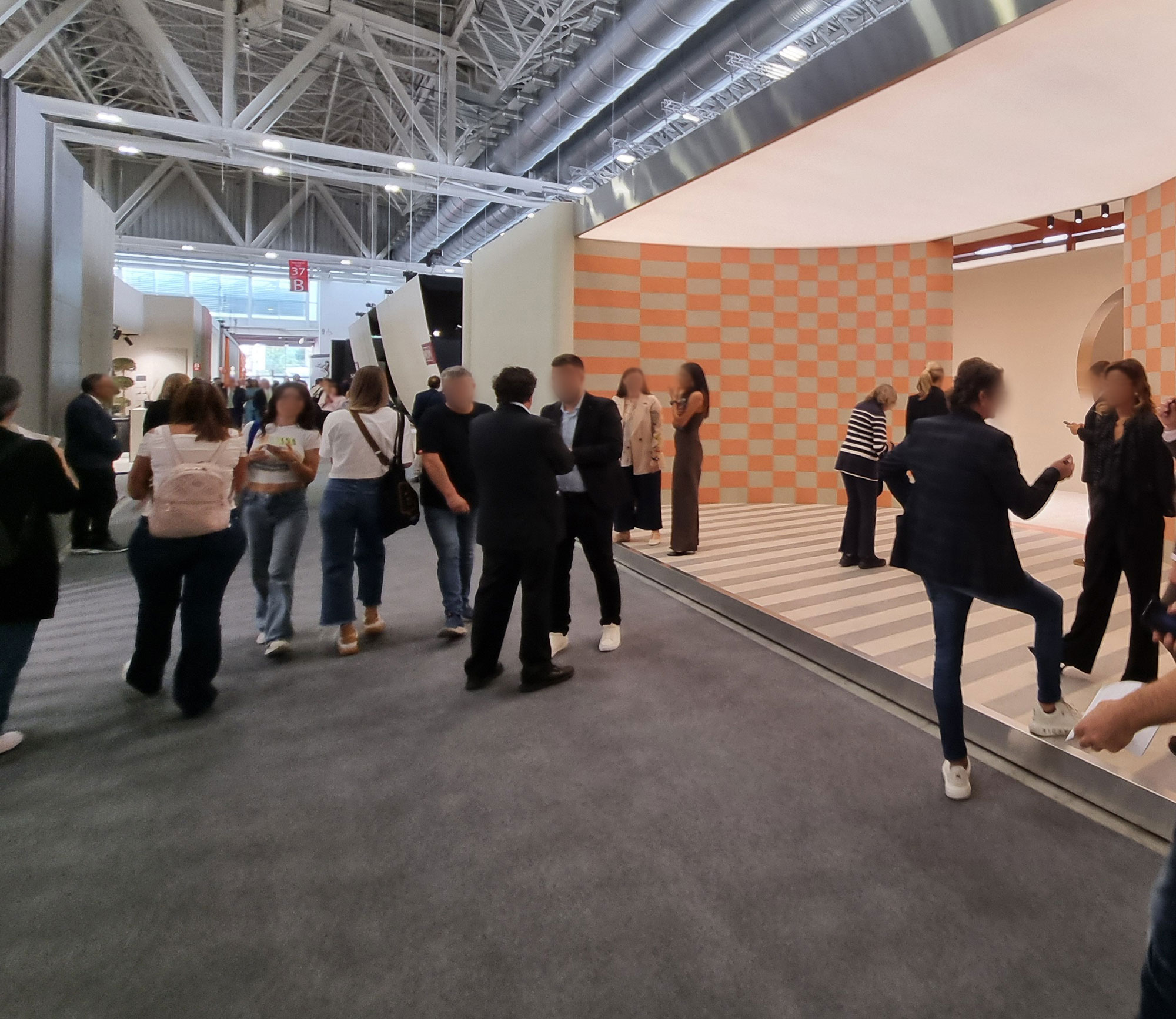
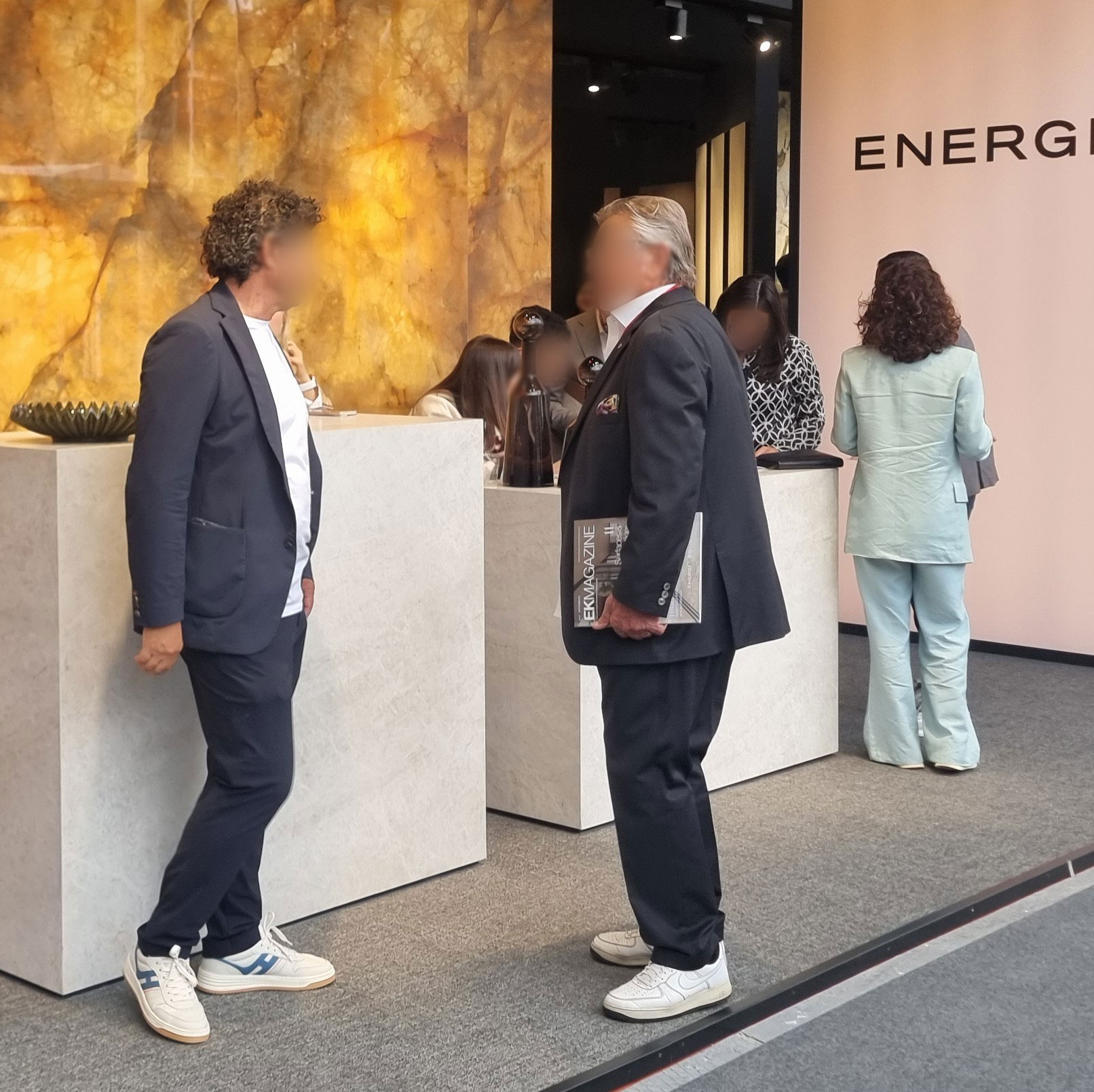
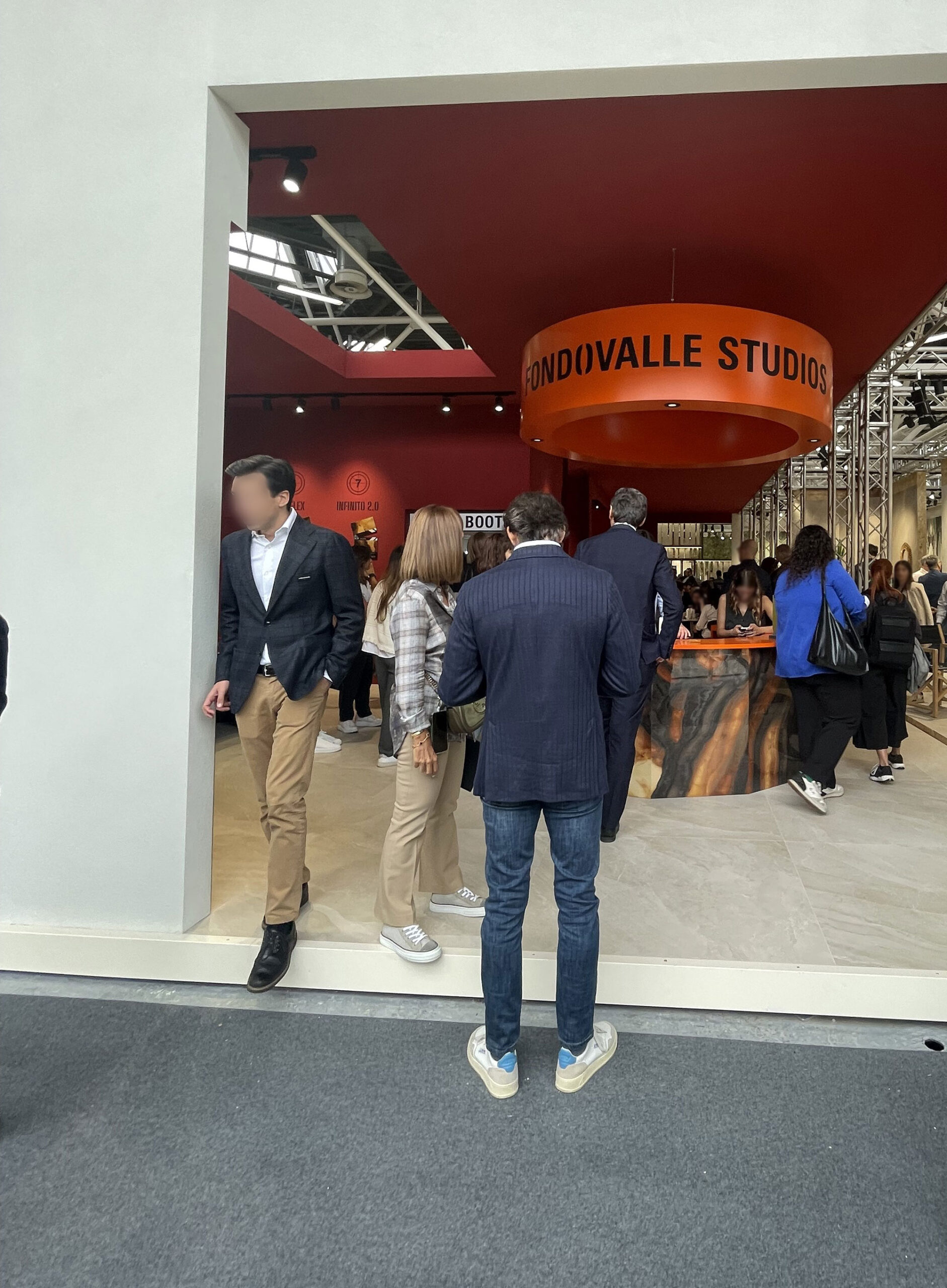
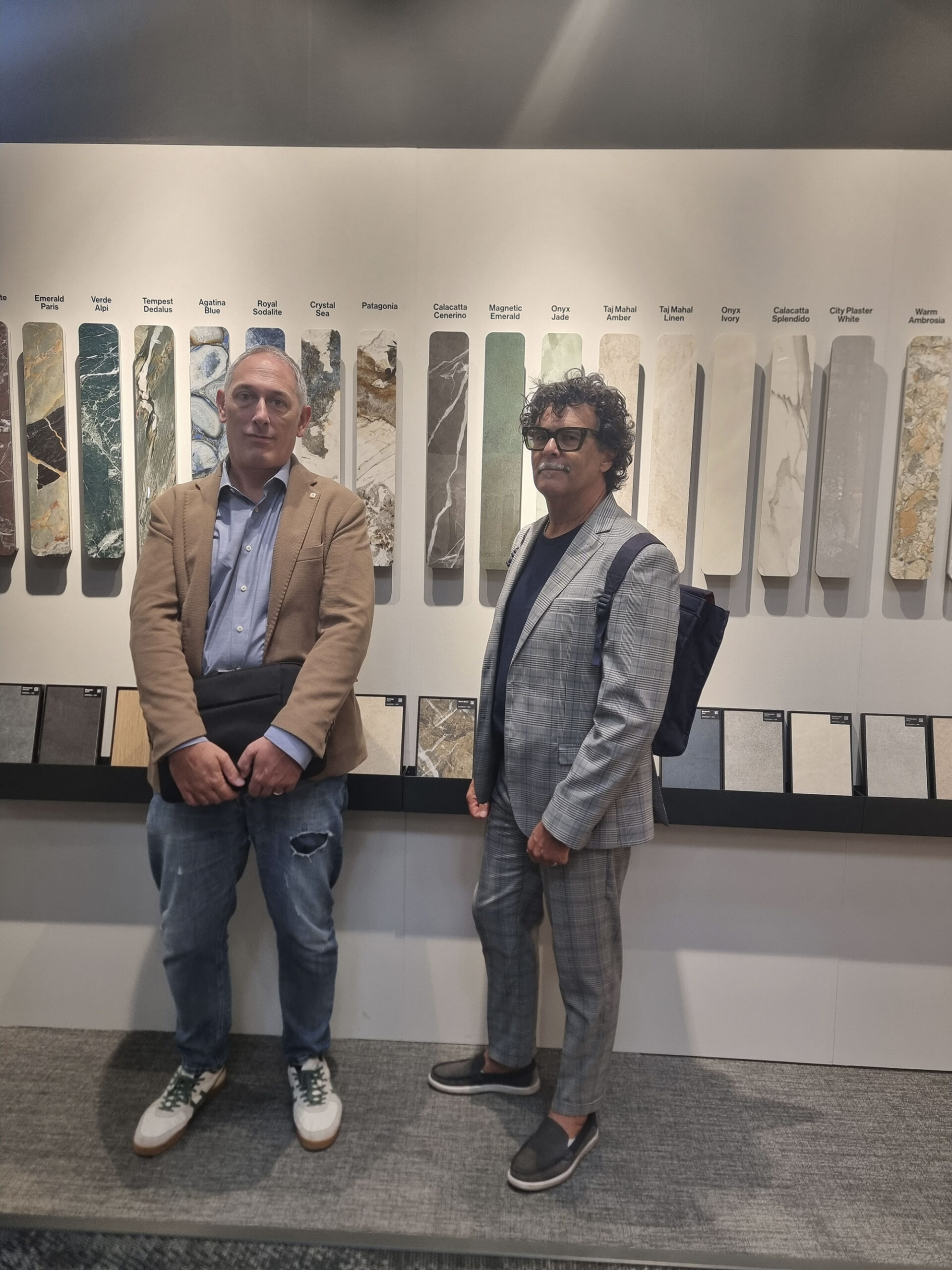
Among sales reps, there’s a clear shift from wedding-party looks (high sales performance) to smart-casual relaxation.
For him: blinding white sneakers, open shirt, blazer or full suit for the dandies (AirPods always on).
Anyone caught with dirty, worn sneakers is escorted out.
For her: semi-comfortable shoes, relaxed blazer, and wide pants (tighter for the ambitious fitness-addicted crowd).
Thankfully, there are still dinners and parties where the “good outfit” resurfaces—
for her, evening gowns and sequins with strategically placed tattoo reveals (neck, arm, ankle);
for him, barefoot loafers in skunk leather and trendy blazers with pocket squares and Bread Pitt-style T-shirts.
Cersaie-People–

Cersaie-people-(20)

Cersaie-people-(32)

Cersaie-People-(33)

Cersaie-people-(36)
Cersaie-People(1)
3. OUTFIT VISITORS
Visitors’ outfits are always a show inside the show.
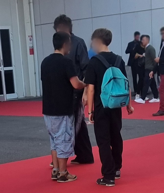
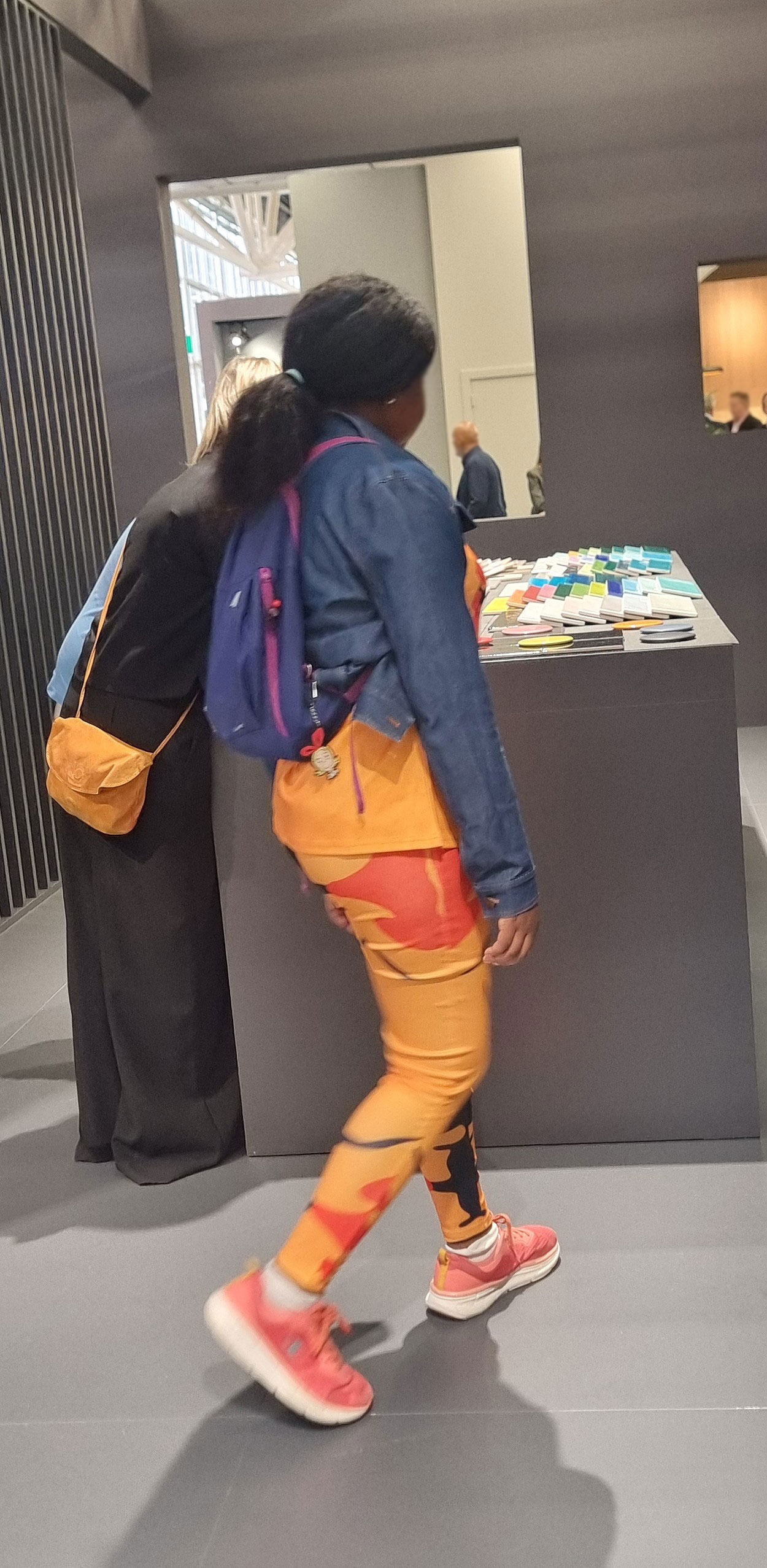
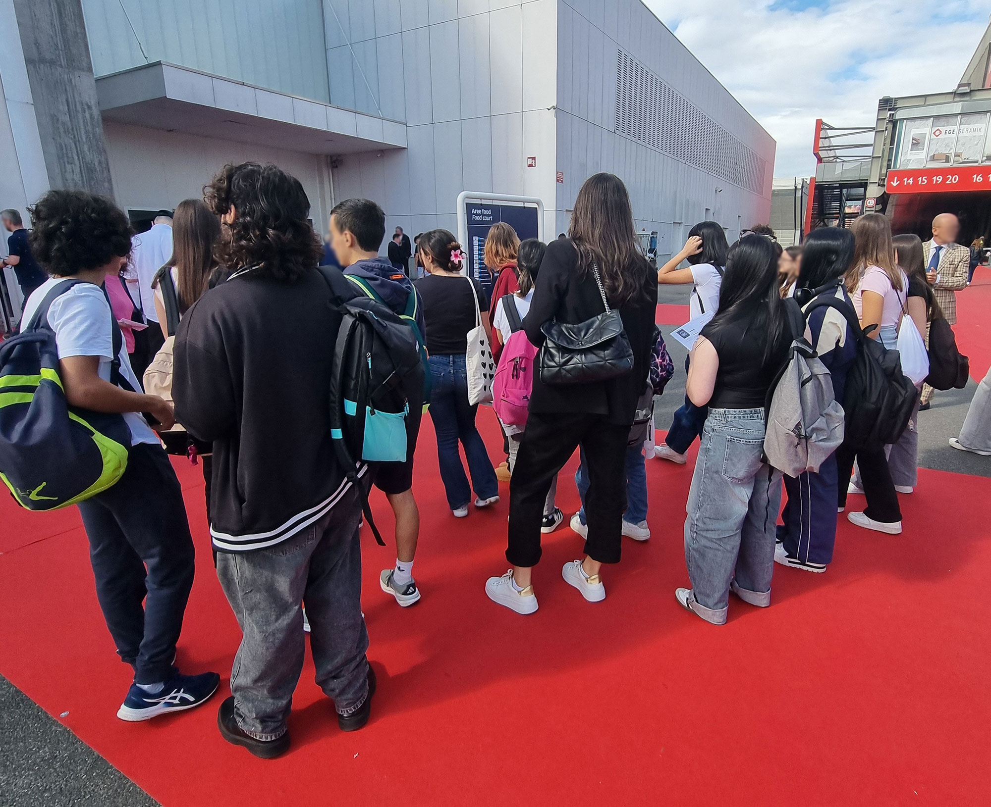
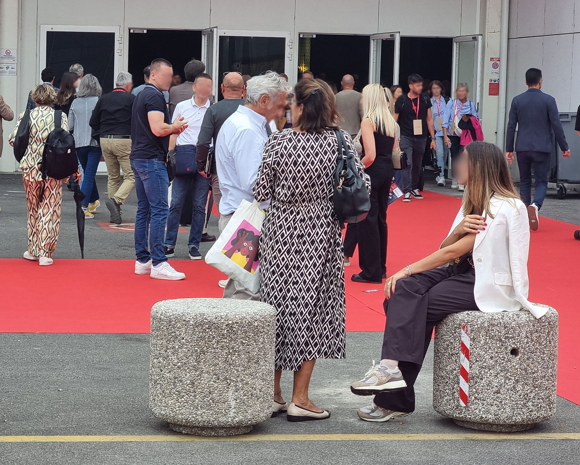
An uncountable variety: from summer pijamas to floral-Victorian age, from gangsta rap to tablecloth chic.
Important clients? Easy to spot: cruise-excursion style—camel trousers, beige knit, Hogan shoes, and a small designer backpack.
Lower-budget types go for inter-rail chic: cargo shorts or sweatpants, oversized T-shirt, trolley or giant backpack (with sleeping bag), and water bottles in side pockets.
New-gen Chinese scouts dress like yuppies, while Indian visitors are the only ones still formal (minus the tie).
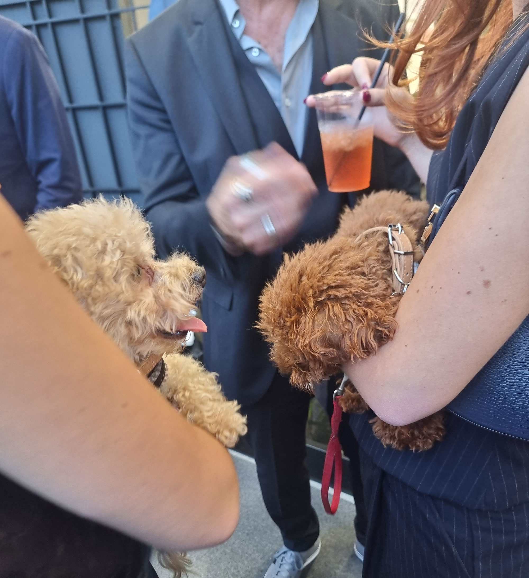
And a moment of silence for the poor dogs dragged across the marathon-length carpet—heroically absorbing every “production.”
aperi-cane
bermuda-oversize

canino-e-trasportino

Cersaie-people-(1)

Cersaie-People-(25)
Cersaie-people-(35)

Cersaie-people-(39)

Cersaie-people-(40)

Cersaie-people-(46)

gattara-in-trasferta
gita-scolastica
losanghe-coordinate

pigiama-estivo
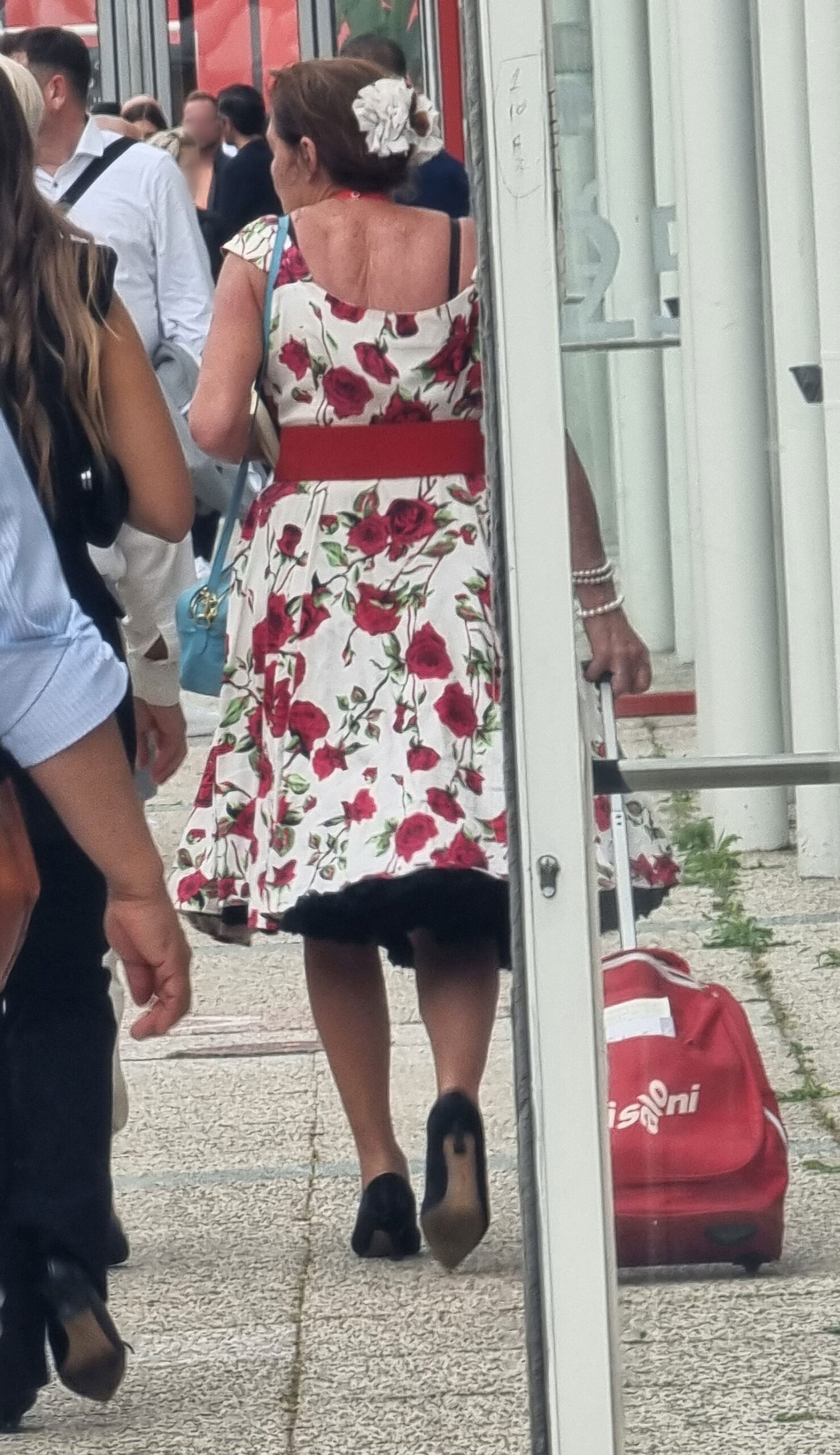
red-and-trolley
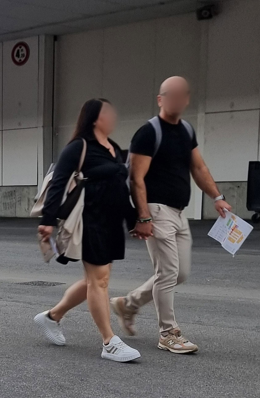
romantici

Visitor-from-Asia
4. TRICK OR TRUCK
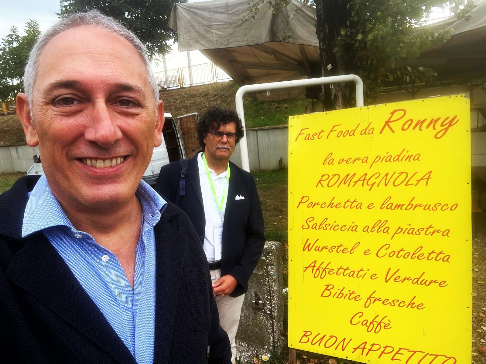
The numerous food trucks between halls solve world hunger (at least fair hunger) with offerings from Thai to pulled pork.
Pricing feels more Twiga Forte dei Marmi than Service station: fancy food for fancy money.
Creativity, however, is top-notch—marketing that’s half clever, half cringe.
Examples: Ape Cesare (Roman street food), The Fifth Quarter (Nigro family heirs), Porco Brado (pulled pork), and even Pulled Polp (macaronic English meets Octopus).
When in doubt—have a fried popsicle.

Food-Ape-Cesare

Food-ghiacciolo-fritto

Food-Porco-brado
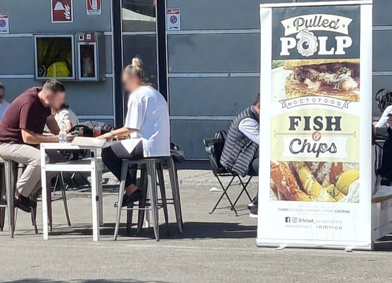
Food-Pulled-Polp
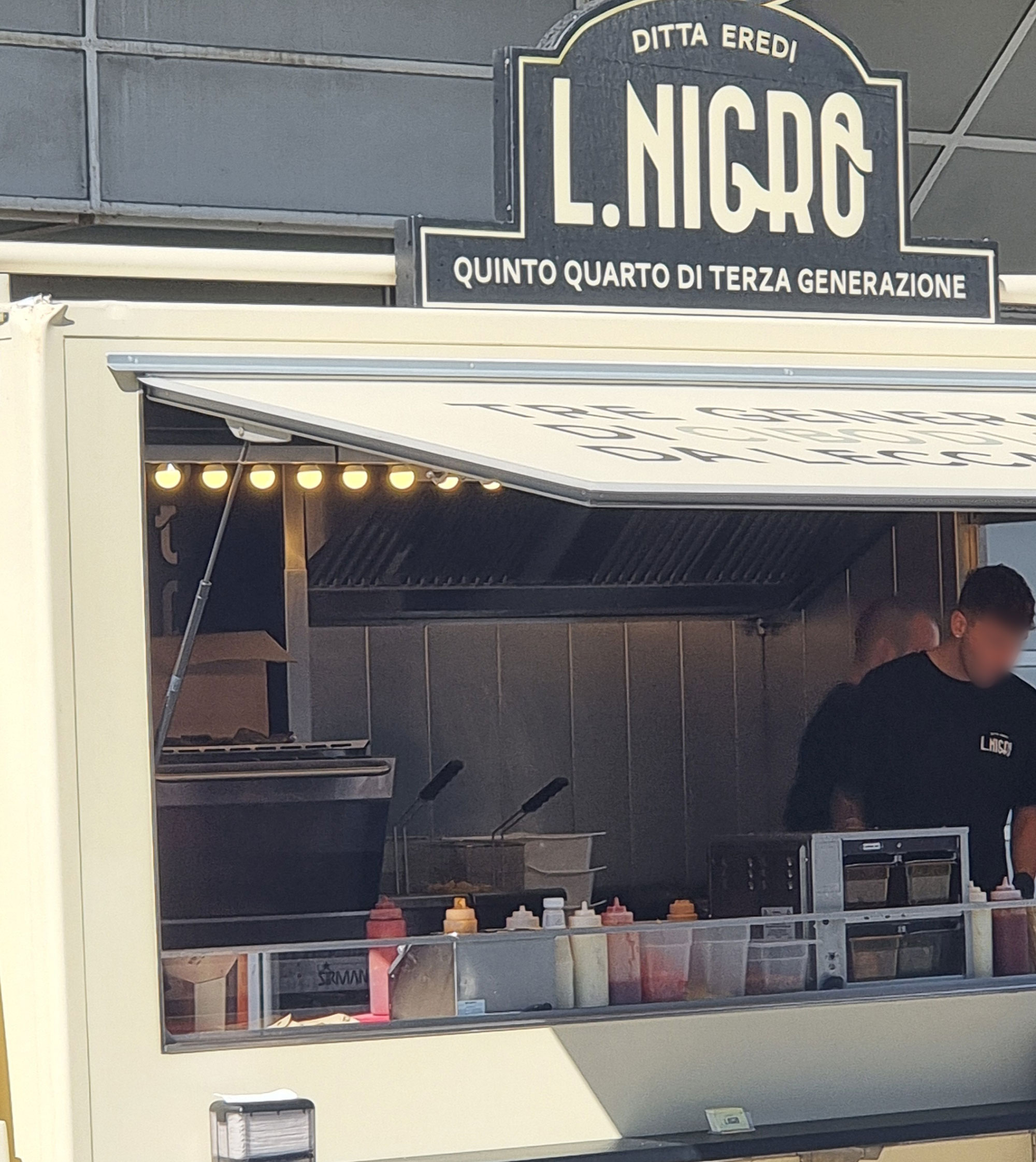
Food-Quinto-quarto

Food-truck
5. WHO CARES ABOUT AWARDS
Official awards for “best product” or “best booth” always divide opinions—except for the winners.
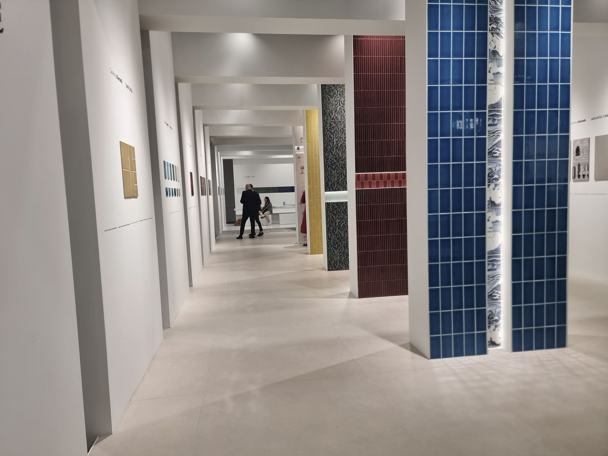
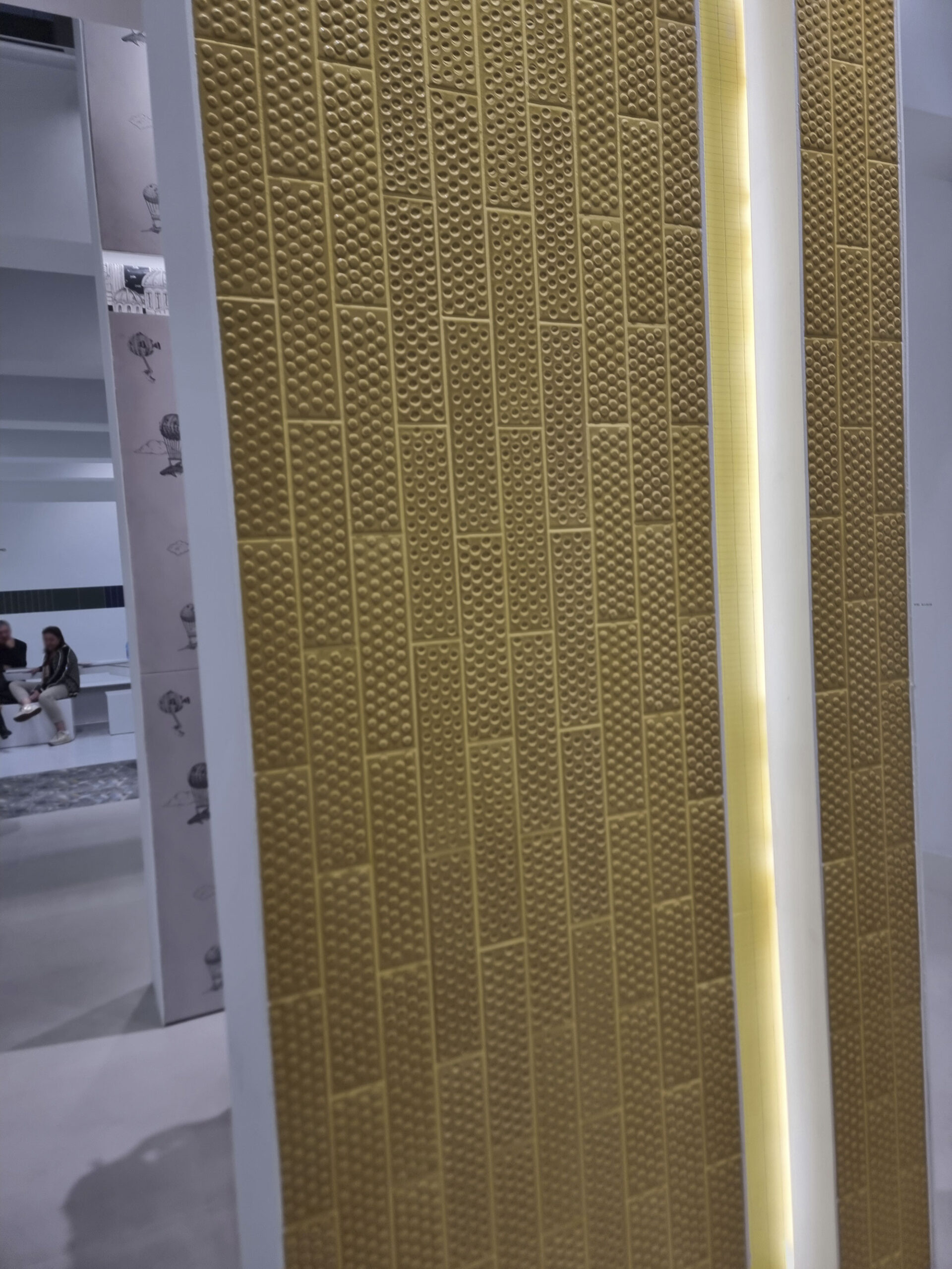
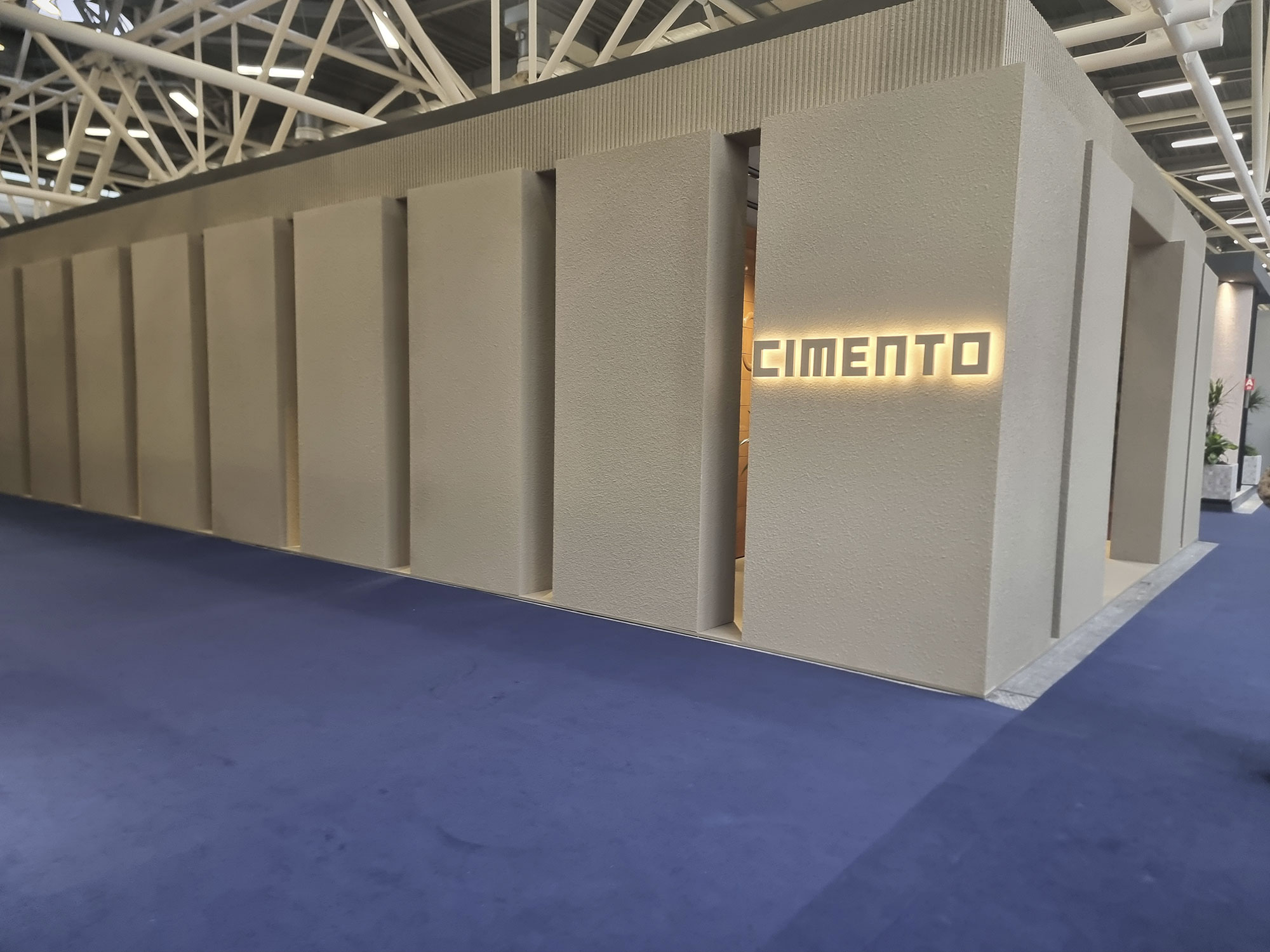
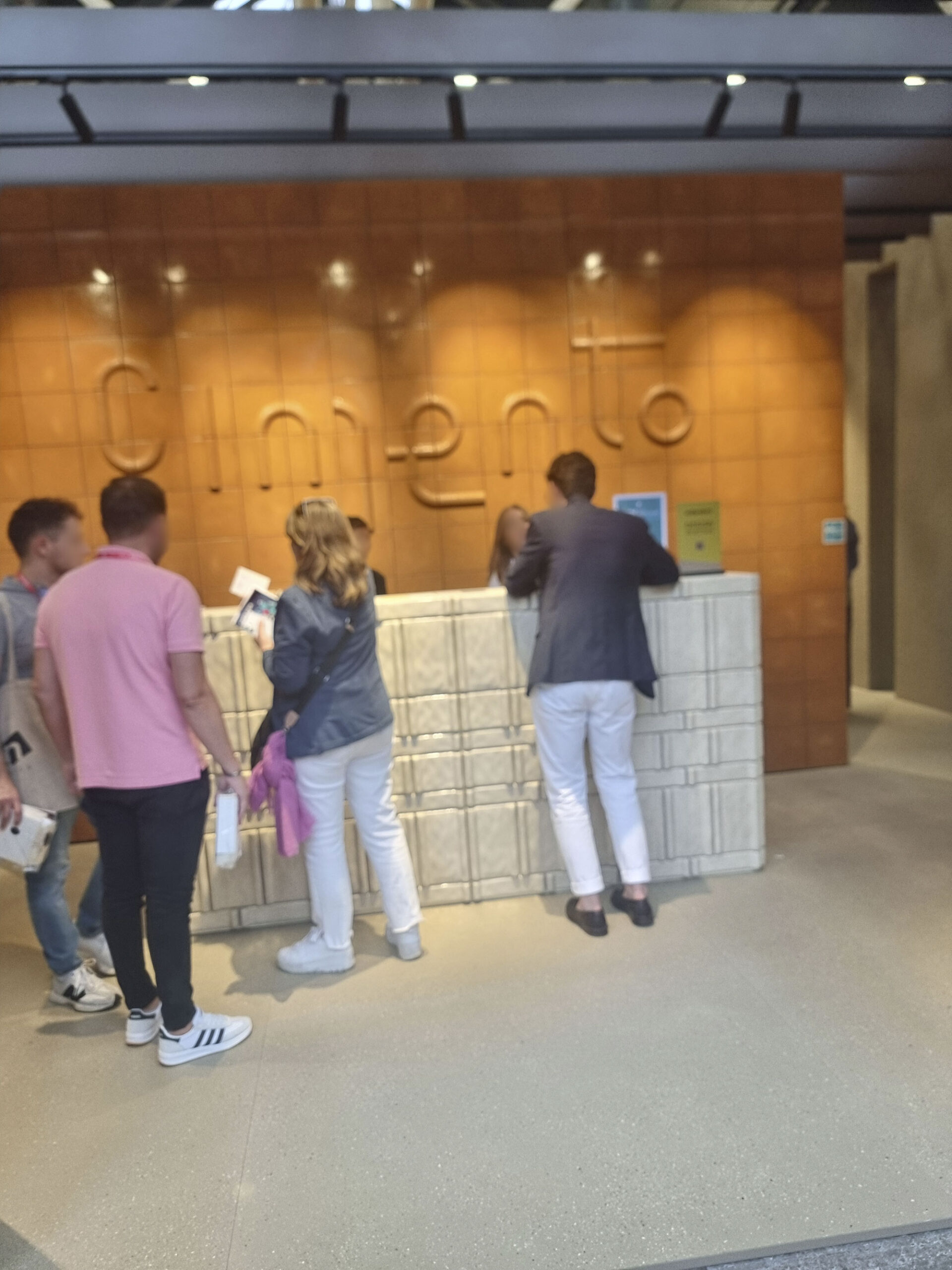
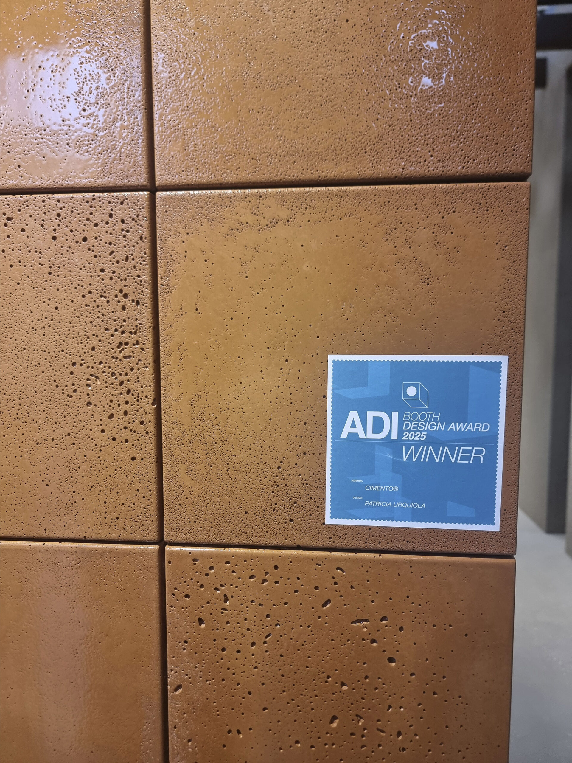
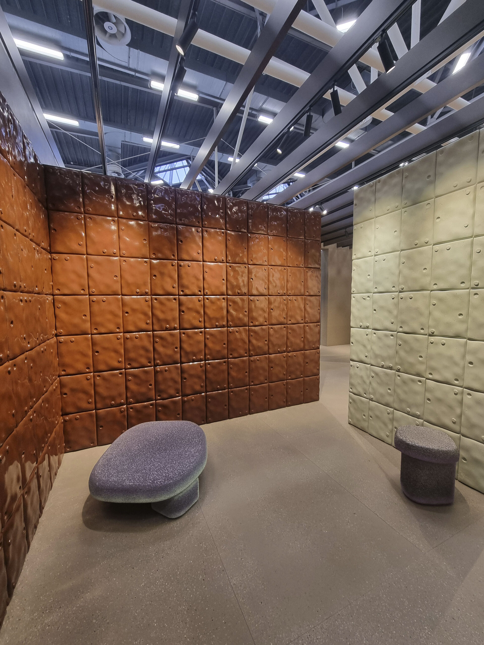
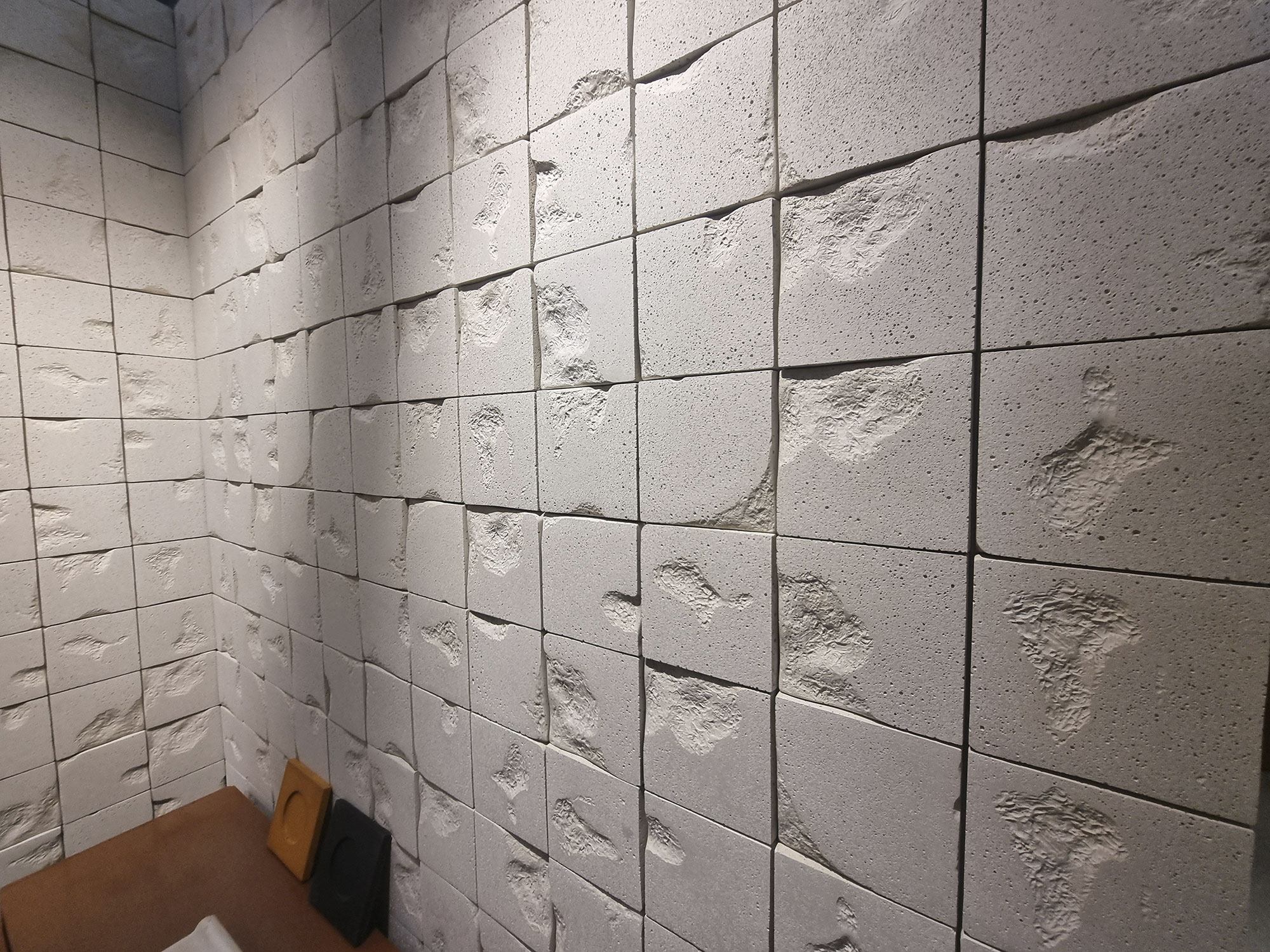
This year’s Booth Award with its three ex-aequo winners raised eyebrows but little bit of envy. We’re getting zen.
Among product awards, few disputed Milano Sublime by Coem, which revisits the Candoglia marble of Milan’s Duomo in a storytelling setup complete with ruins.
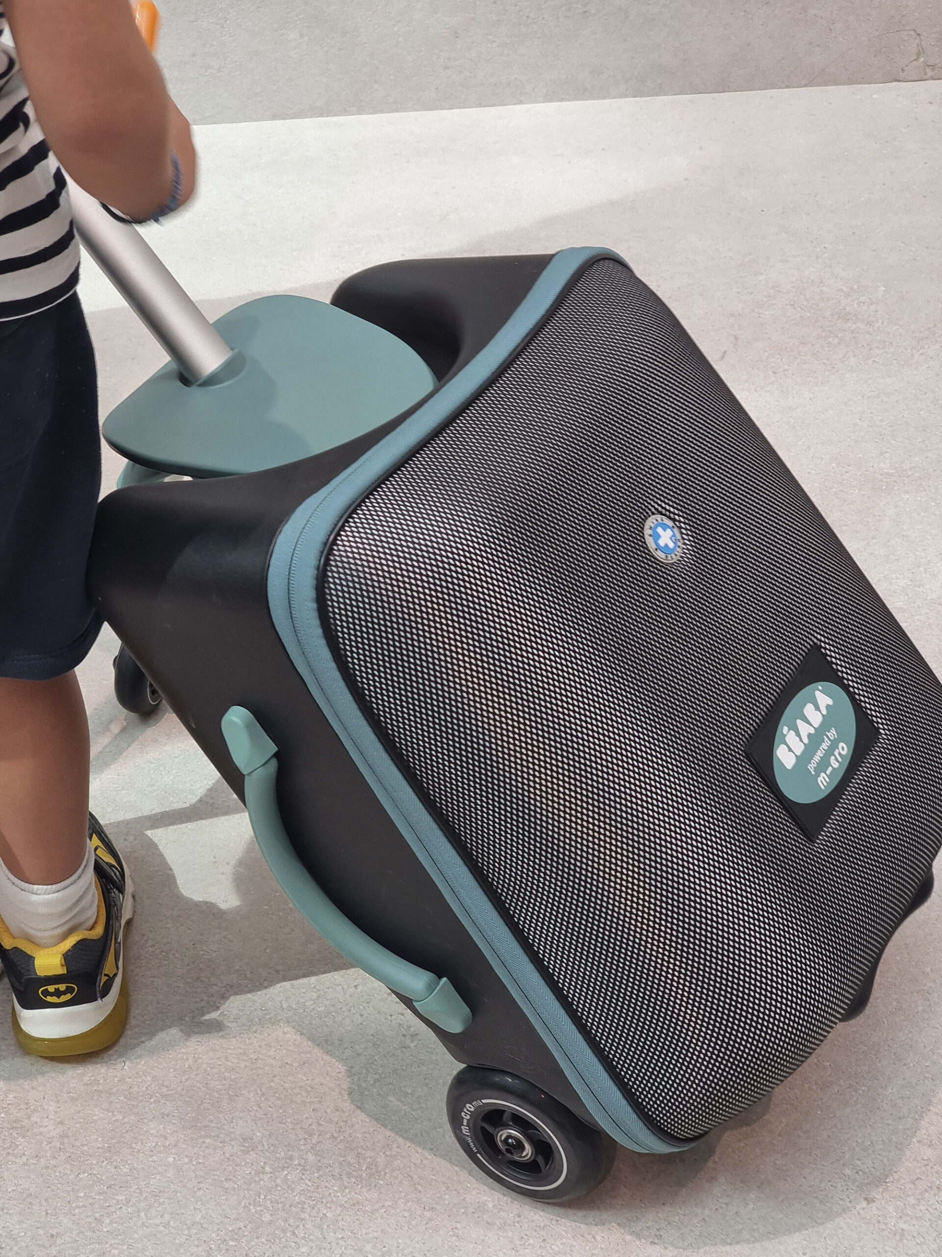
Our personal Best Gadget Award goes to the rolling-sitting suitcase.

41042—Sodai-(1)

41042—Sodai-(5)

41042—Sodai-(6)

Bardelli-(2)
Bardelli-(4)
Bardelli-(6)

Cersaie-2025-shots-(16)

Cersaie-2025-shots-(17)
Cimento-(1)
Cimento-(2)
Cimento-(3)
Cimento-(4)

Cimento-(16)

Cimento-(19)
Cimento-(22)

Coem-Milano-Sublime-

Coem-Milano-Sublime(1)

Coem-Milano-Sublime(2)

premio-Ufo-sgabel-trolley-(1)
premio-Ufo-sgabel-trolley-(2)
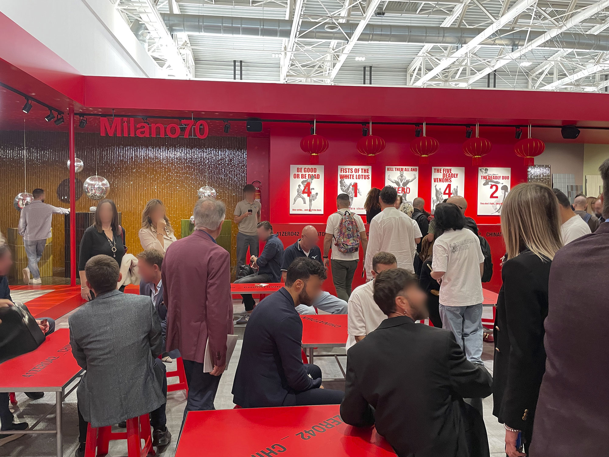
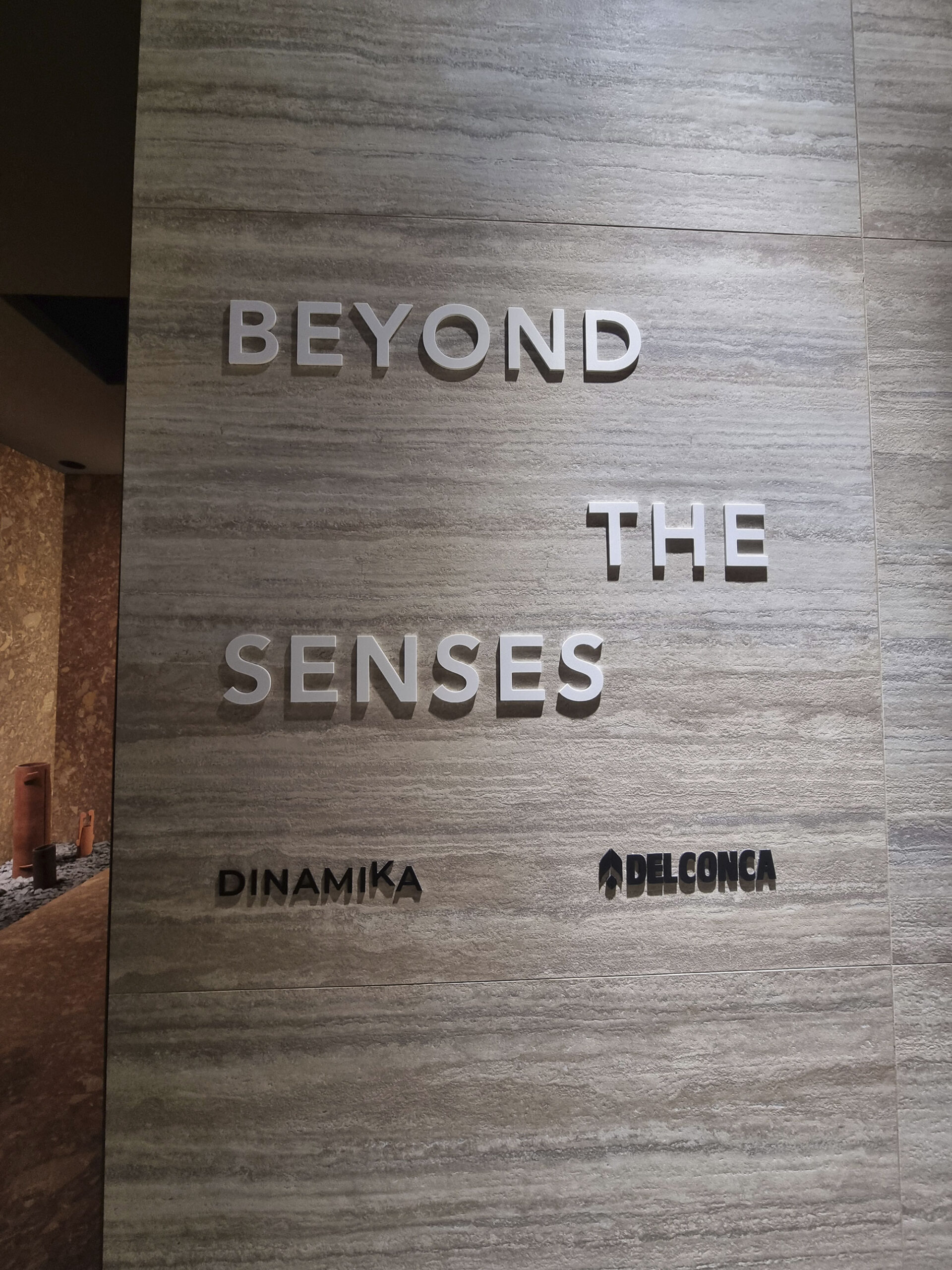
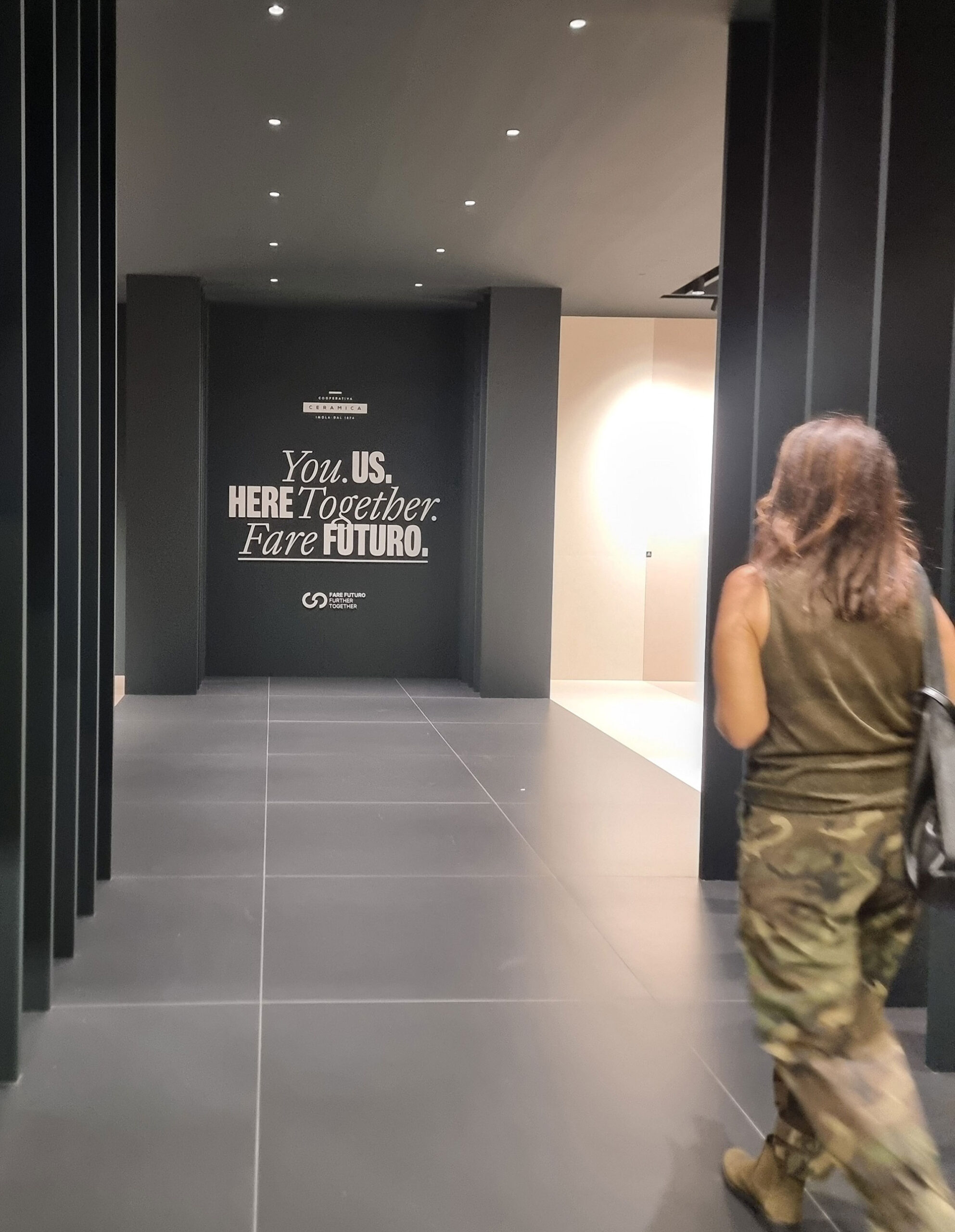
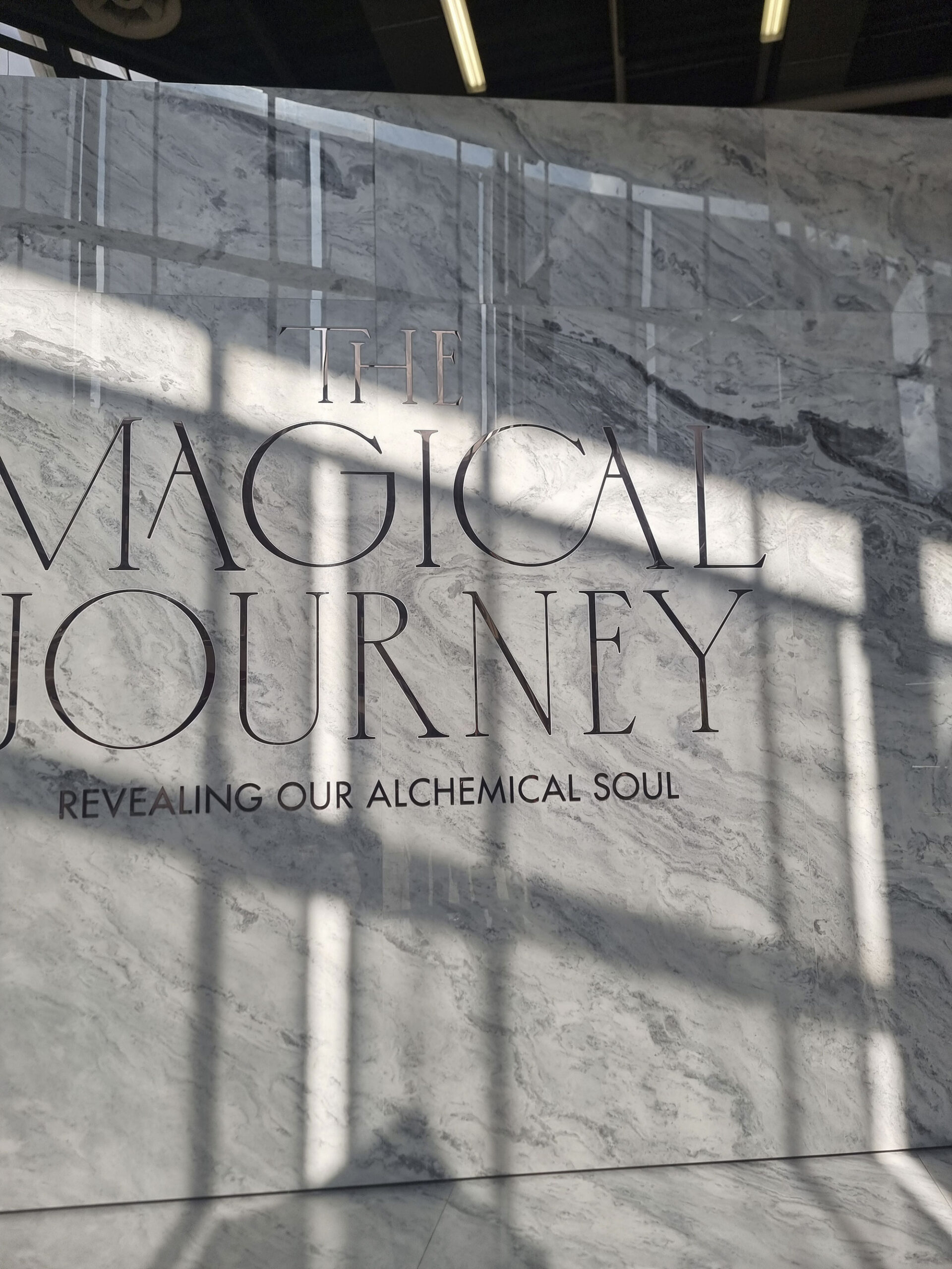
6. MESSAGE IN A BATTLE
It’s right and proper for each stand to have a meaning—a message.
Cersaie is no longer a merchant fair; it’s a place to build brand value.
Some messages came to life in the booth architecture, others were more spiritual.
Recurring themes: the senses, matter, form, feeling (what would Cersaie be without the word “matter”?).
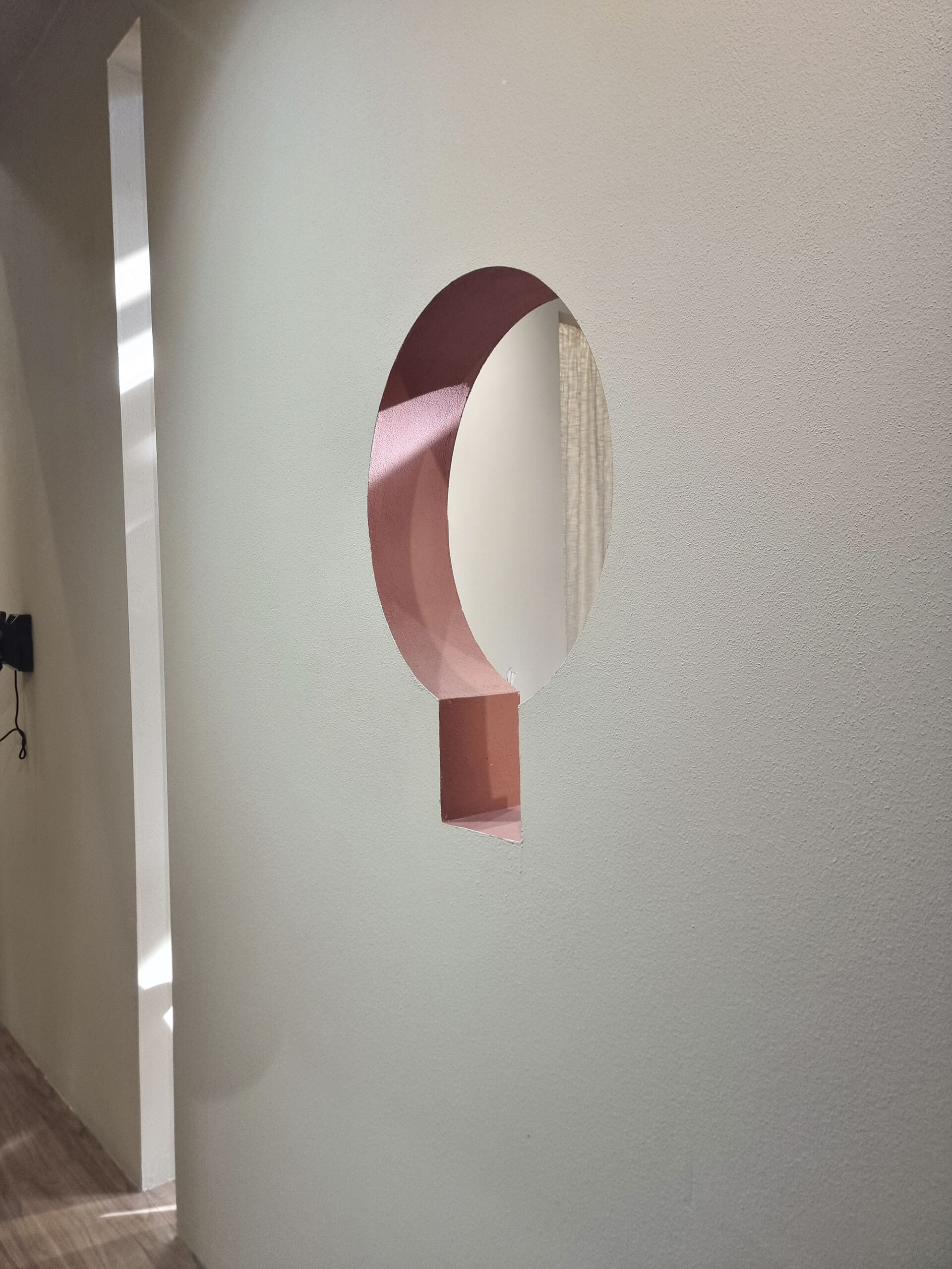
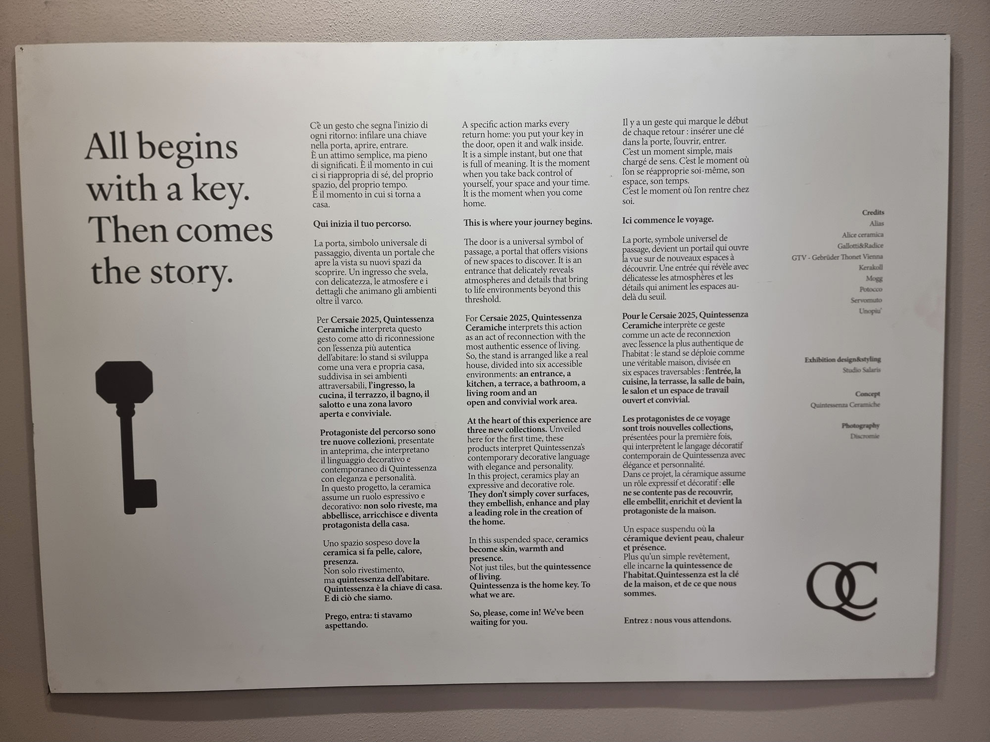
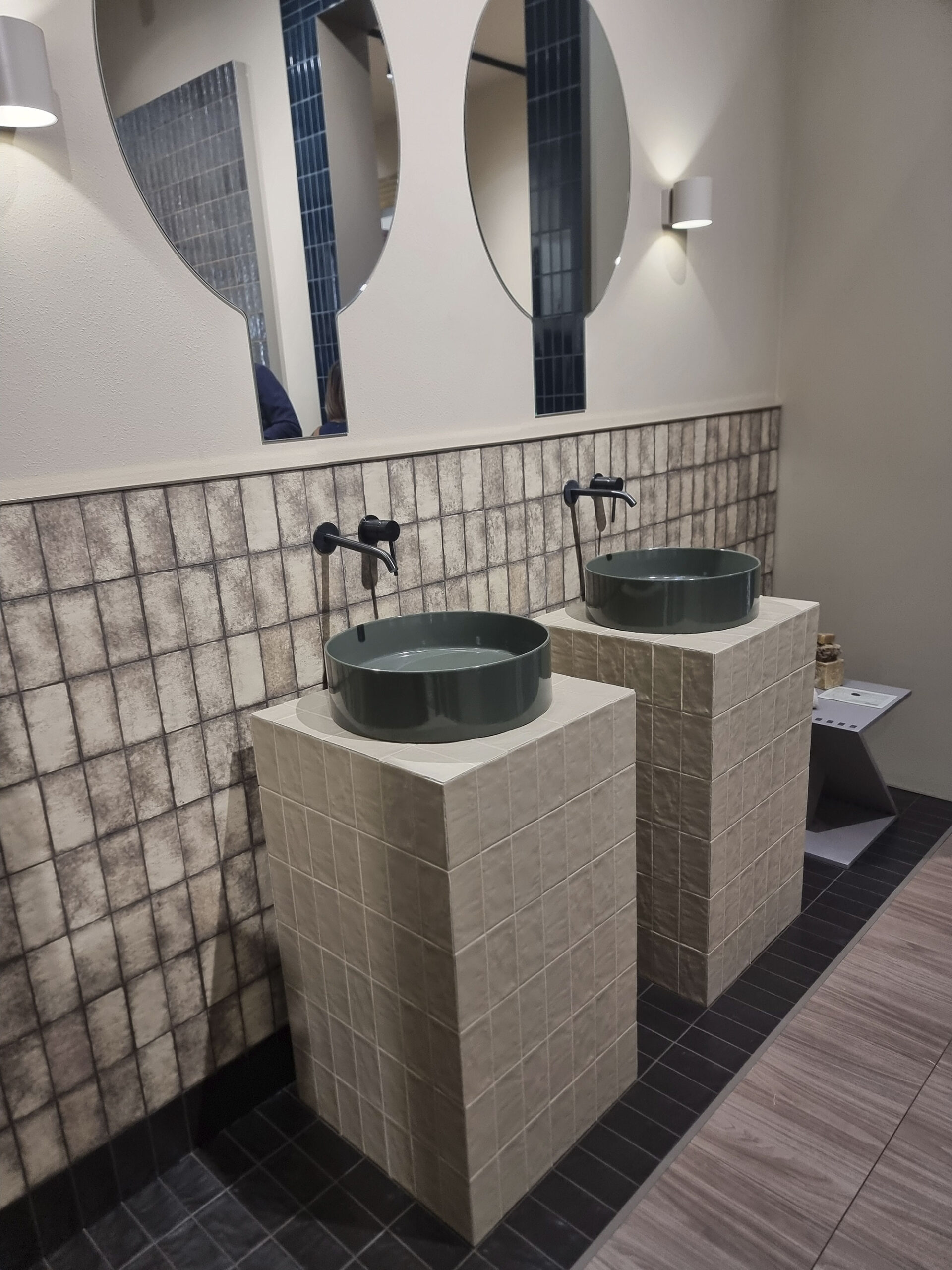
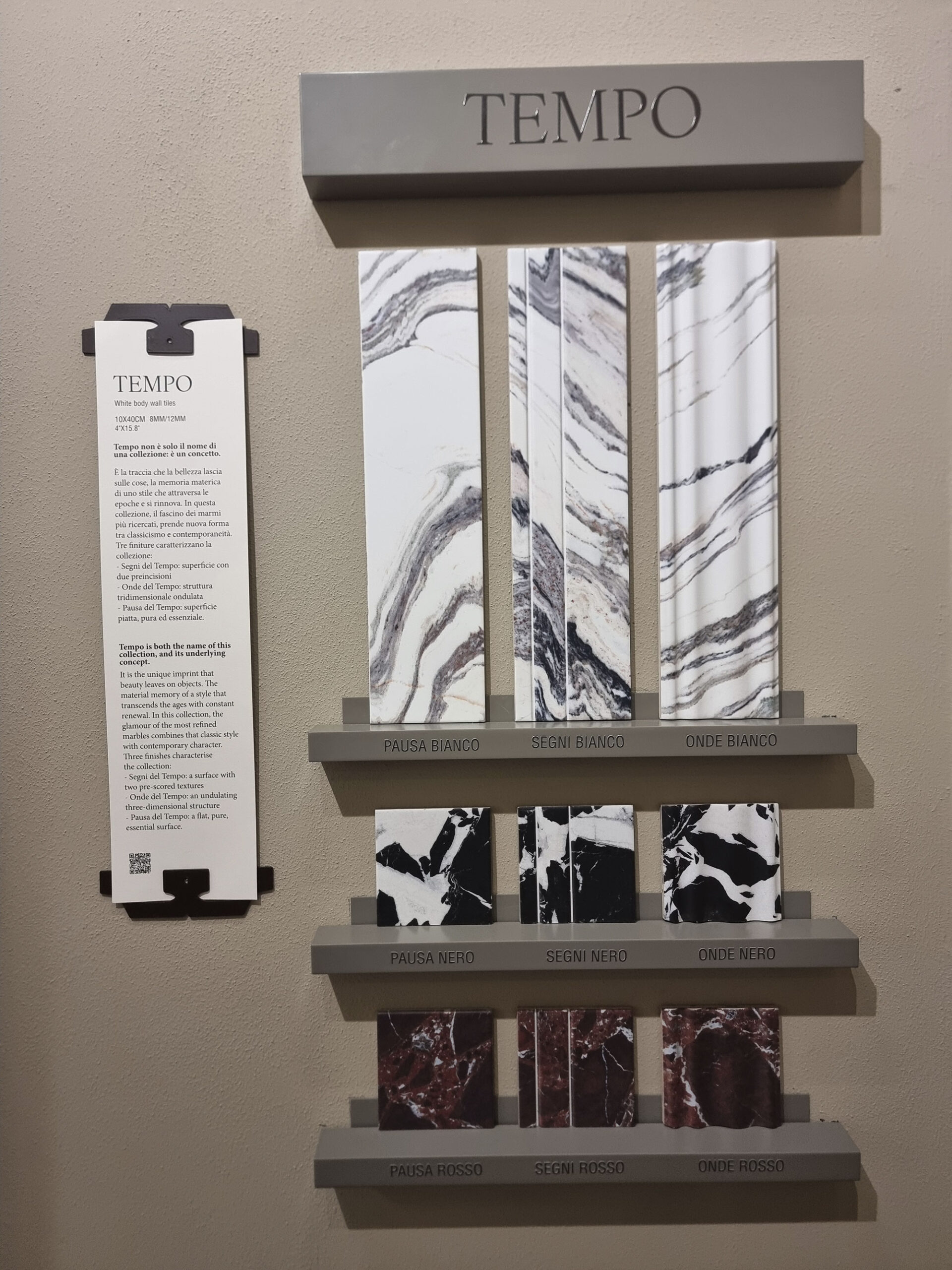
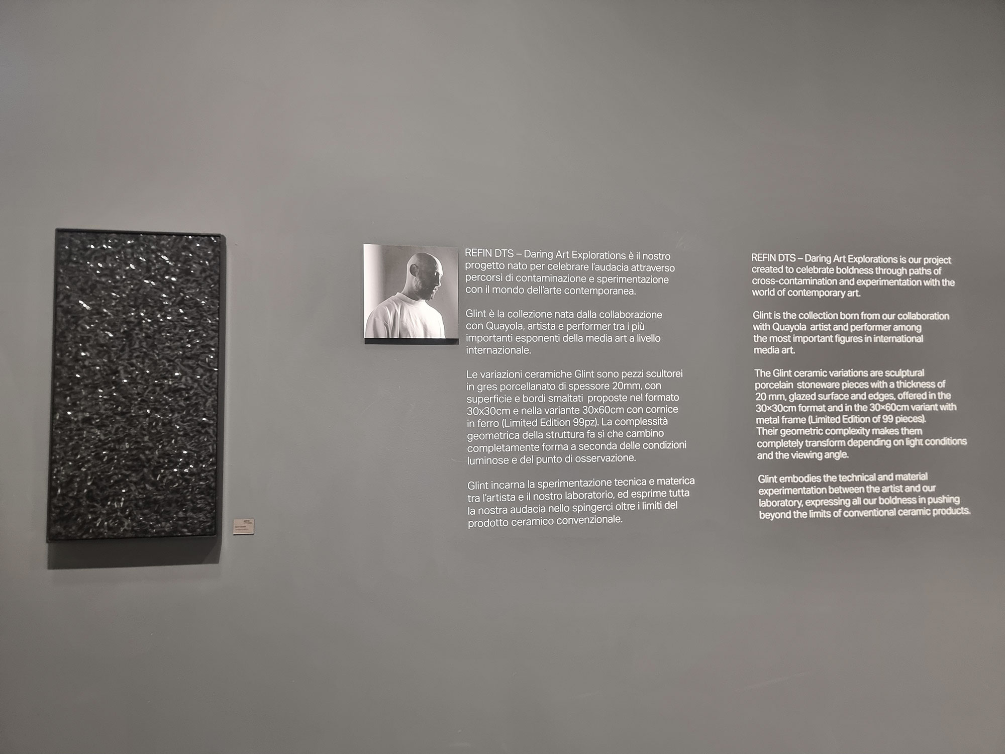
Among the turnkey concepts, the “key” theme by Quintessenza stood out, developed from teaser to booth shape.
Others impressed with humor (Sodai’s phone call).
As for slogans and captions, some were short and clear, others… more fluffy and ChatGPT-style—“help me please”.
41zero42-chinatown

Del-Conca-Beyond-the-senses-(1)
Del-Conca-Beyond-the-senses-(2)

Del-Conca-Beyond-the-senses-(3)

Fap-Ceramiche-Equilibri-di-materia-(1)

Fap-Ceramiche-Equilibri-di-materia-(2)

Fap-Ceramiche-Equilibri-di-materia-(3)
Imola-Ceramica
Iris-Ceramica-Group-the-magical-Journey
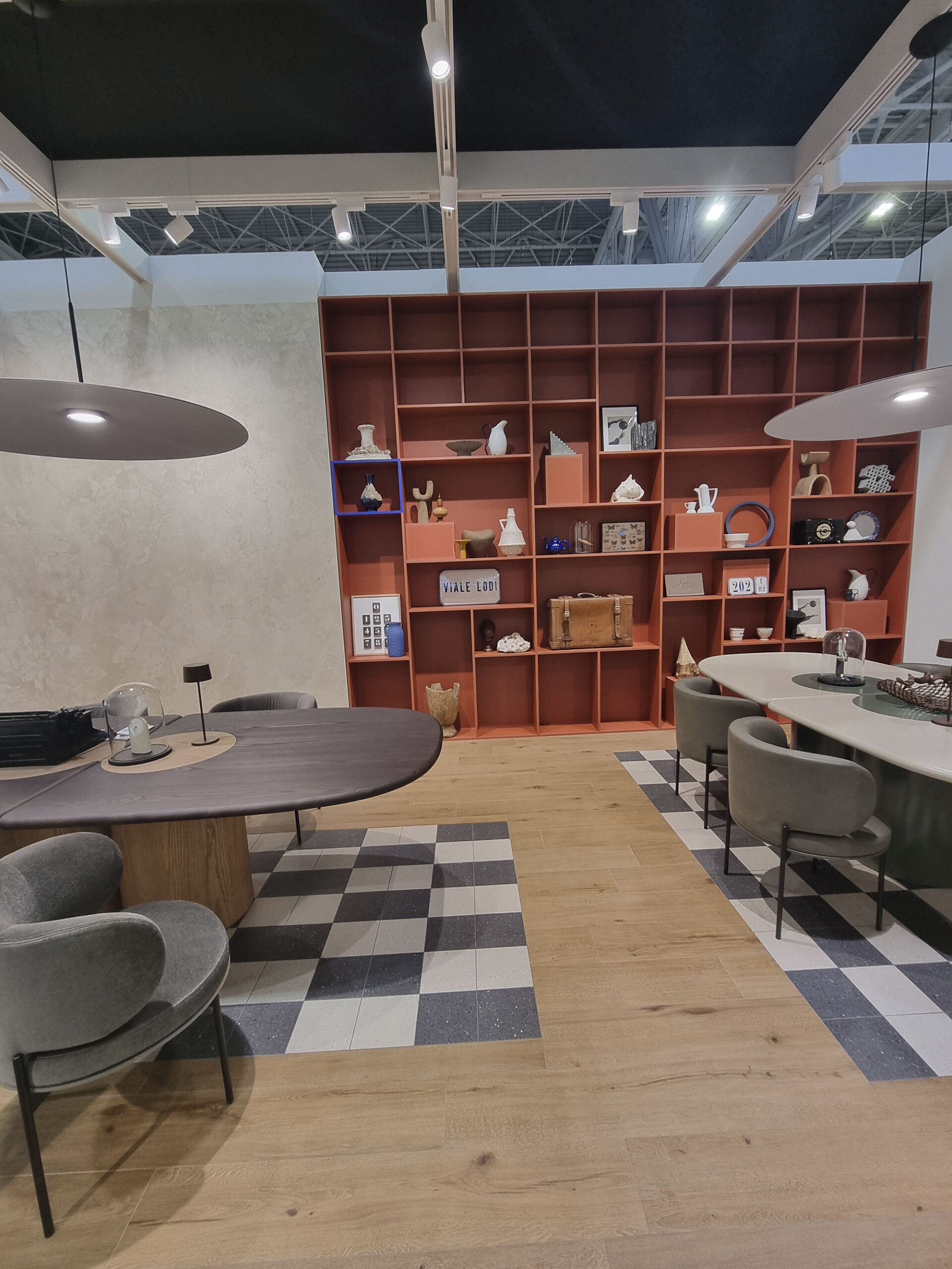
Marca-Corona-Exotic-Appeal-(1)
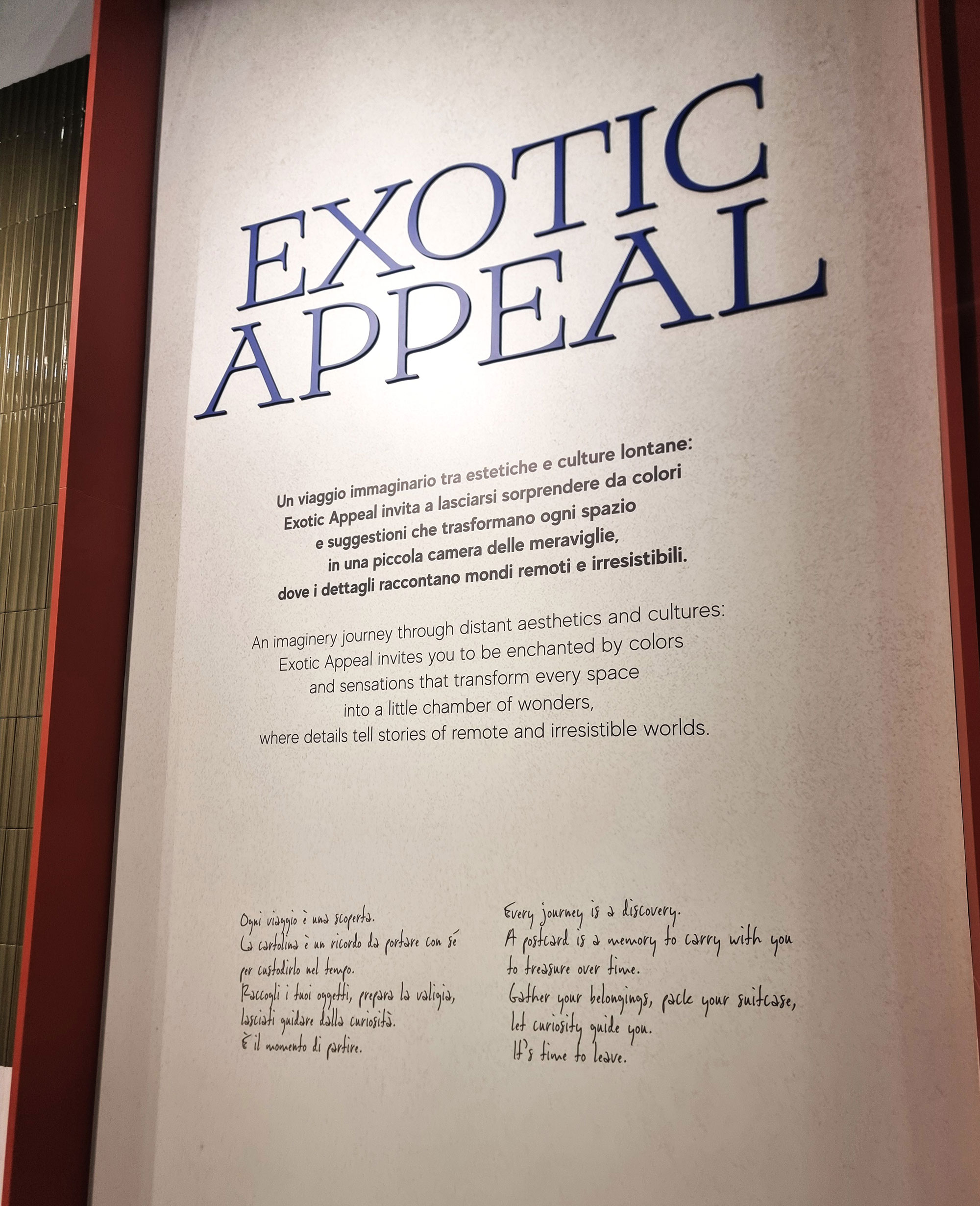
Marca-Corona-Exotic-Appeal-(2)
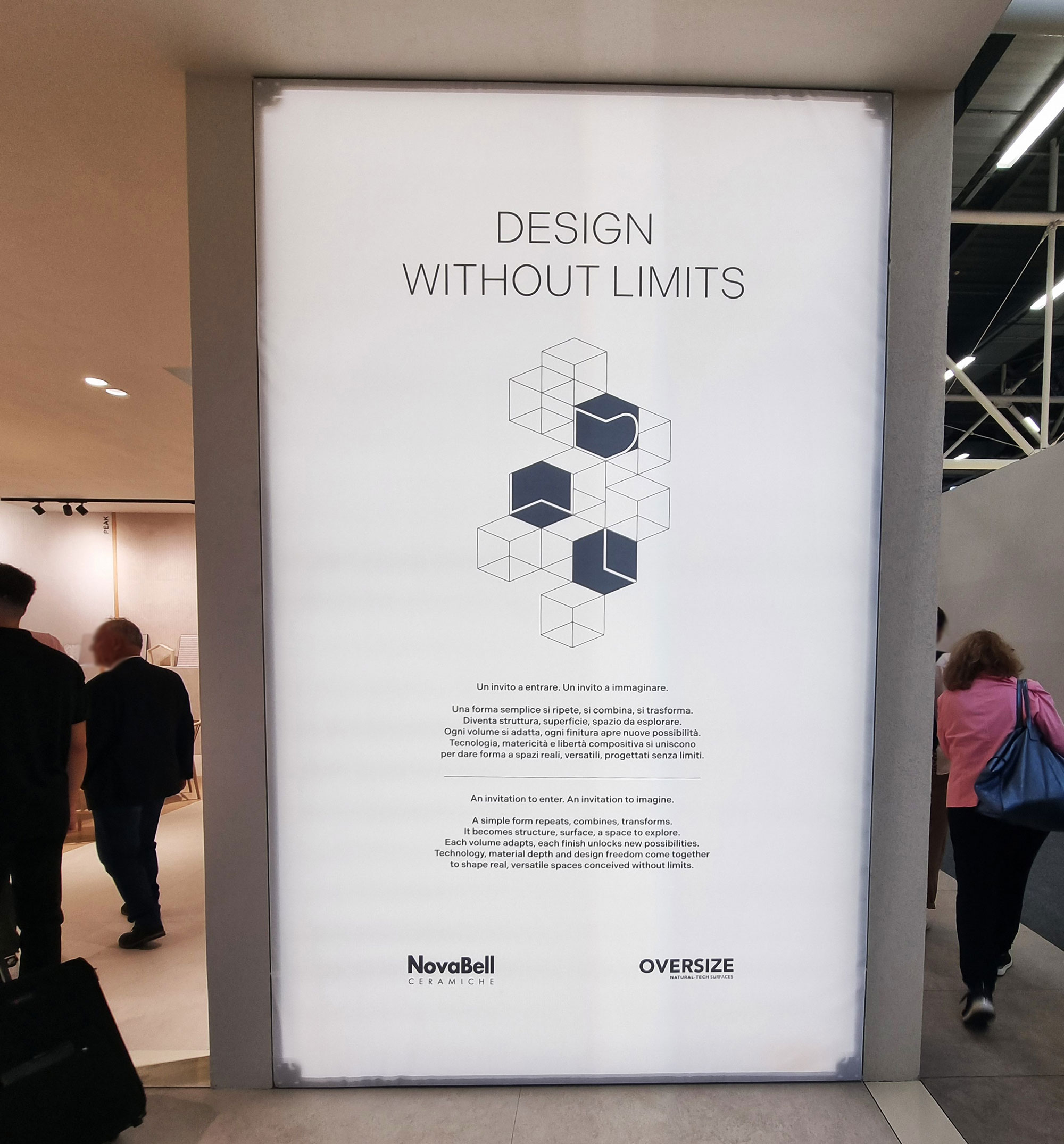
NovaBell-Design-without-limits
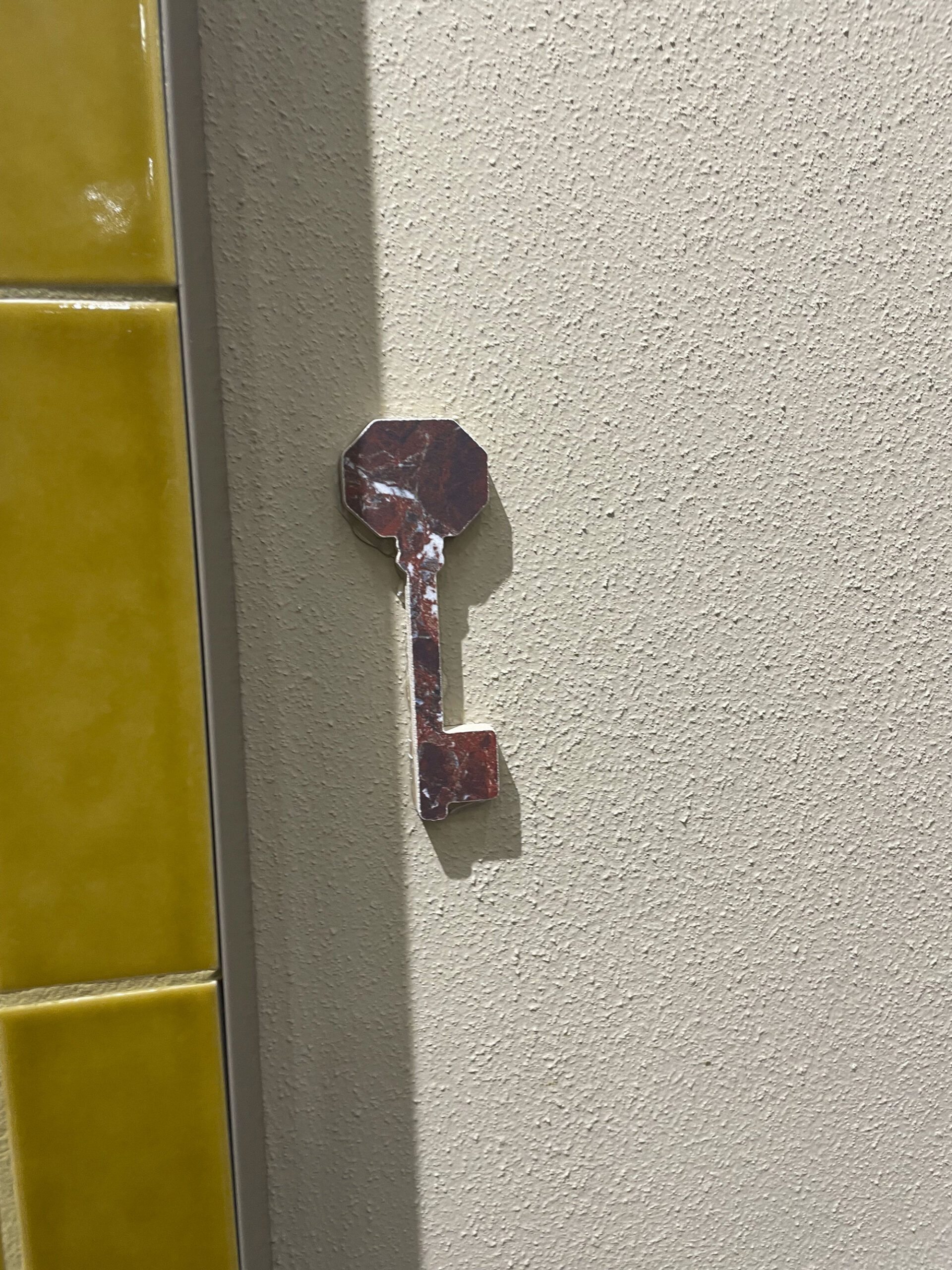
Quintessenza-(11)
Quintessenza-the-key-(1)
Quintessenza-the-key-(2)
Quintessenza-the-key-(3)
Quintessenza-the-key-(4)
Refin-The-shape-of-Unexpected-(1)
Refin-The-shape-of-Unexpected-(2)

Rondine-Discover-your-senses

Rondine-eat-me

Rondine-look-at-me

Sant’Agostino-(Everything-begins…
7. HAPPY HOUR
Some brands skipped their usual indoor aperi-parties, confirming a new sobriety trend.
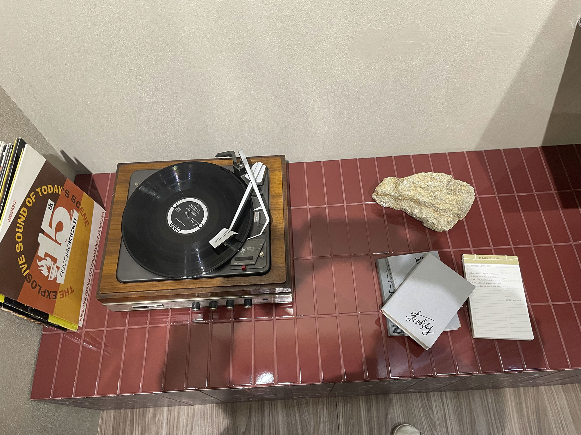
But 2025 saw Keradom and Quintessenza carrying the torch with a relaxed, tasteful third half—hope at the end of the tunnel!
Show-cookings were fewer (thankfully for everyone’s noses).
Cerarsarda impressed with a guided wine tasting in partnership with a Sardinian winery, featuring La Dama, a wine whose label mirrors the brand’s ceramic pattern.
(We swear—we just happened to walk by.)
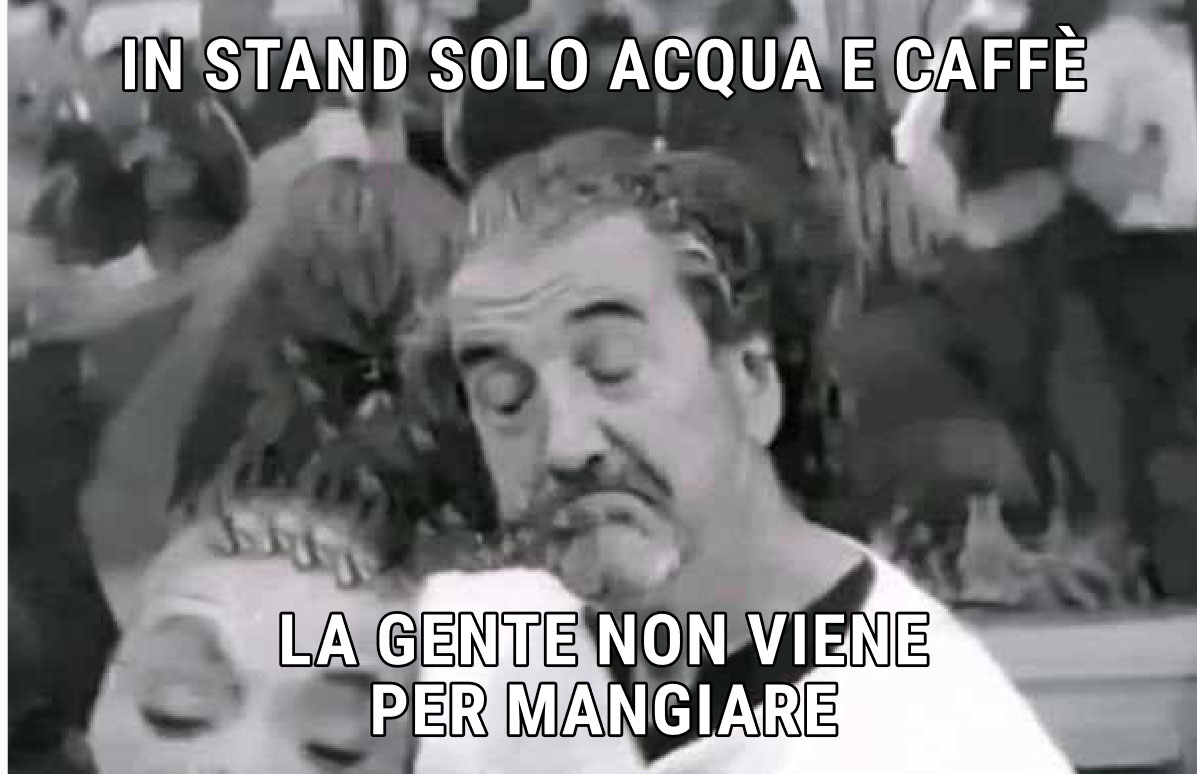
Elsewhere, a moderate but not too moderate approach: mini bites, lasagnette, and bubbles discreetly surfaced on demand for members and friends of members, while others went water & coffee only—health minimalism with branded mini-bottles.

Aperiparty

Cerasarda-degustazione-guidata-(1)

Cerasarda-degustazione-guidata-(2)
In-stand-solo-acqua-e-caffe
Quintessenza-(14)

Spadellescion
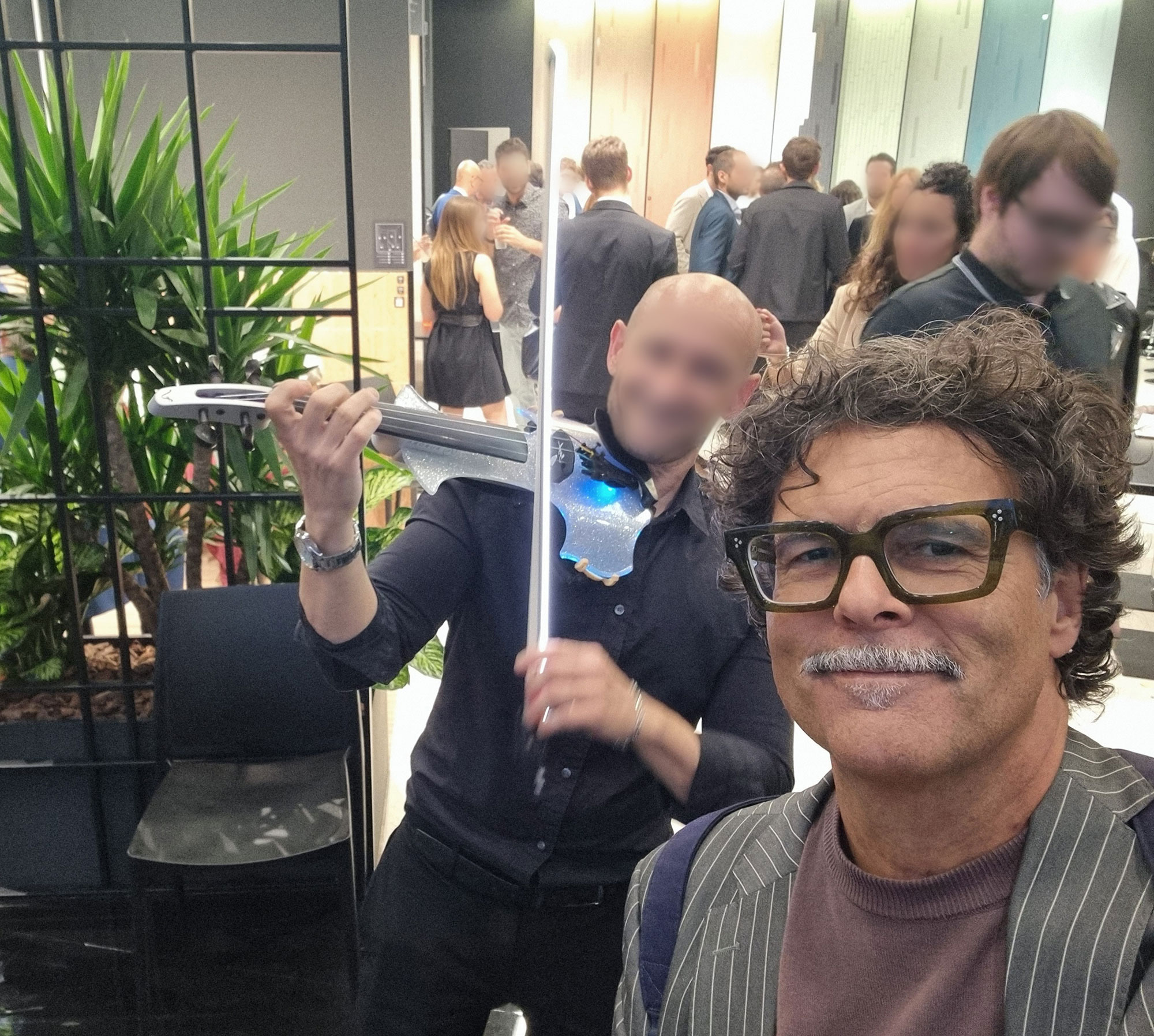
Violino-e-violoncello
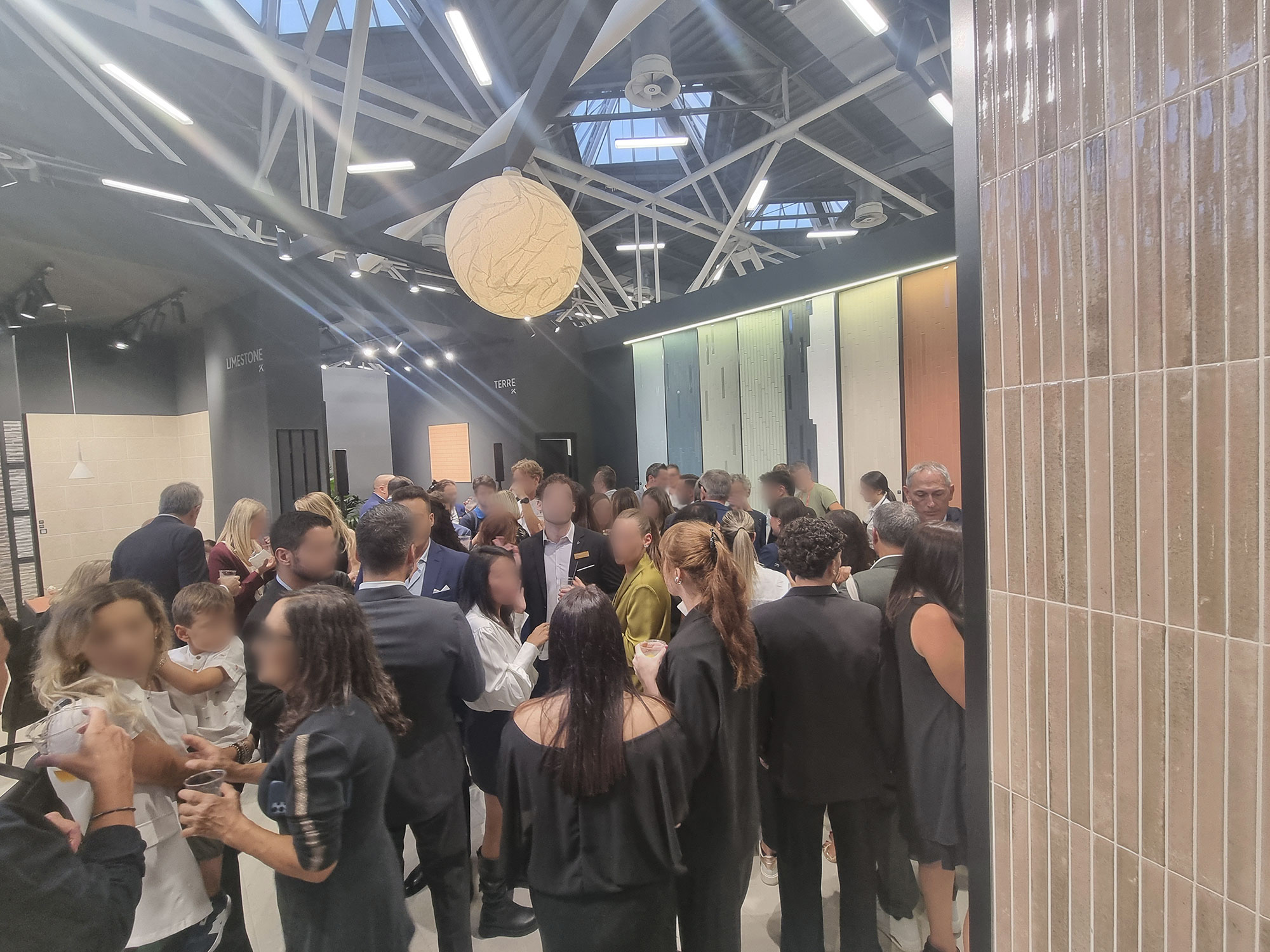
Where-is-Mirko
8. WHAT CAUGHT YOUR EYE
The Made in Italy offering stays consistently high-level—few peaks, but also few flops.
Year after year, companies inspire and challenge each other.
Two quotes overheard:
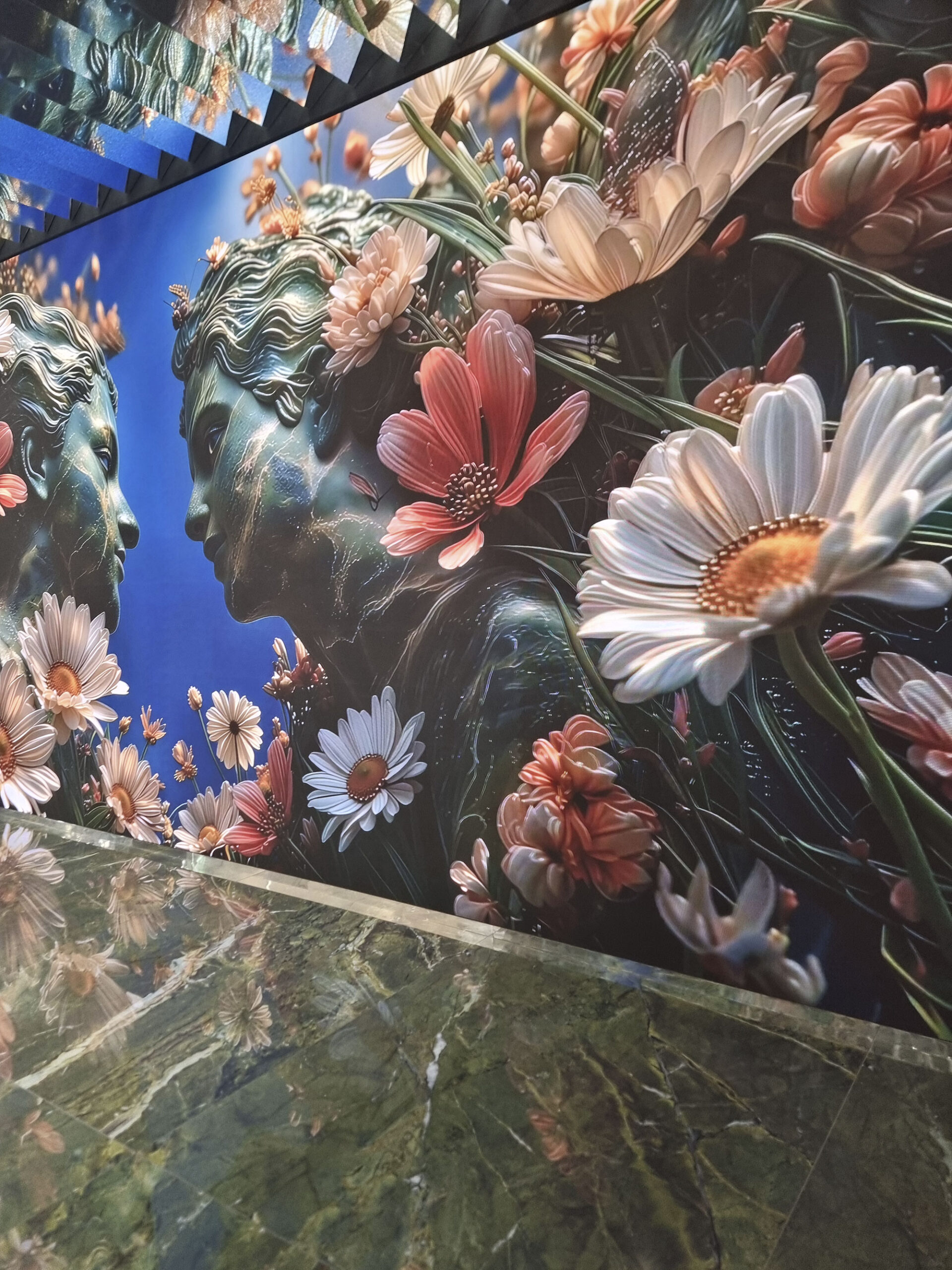
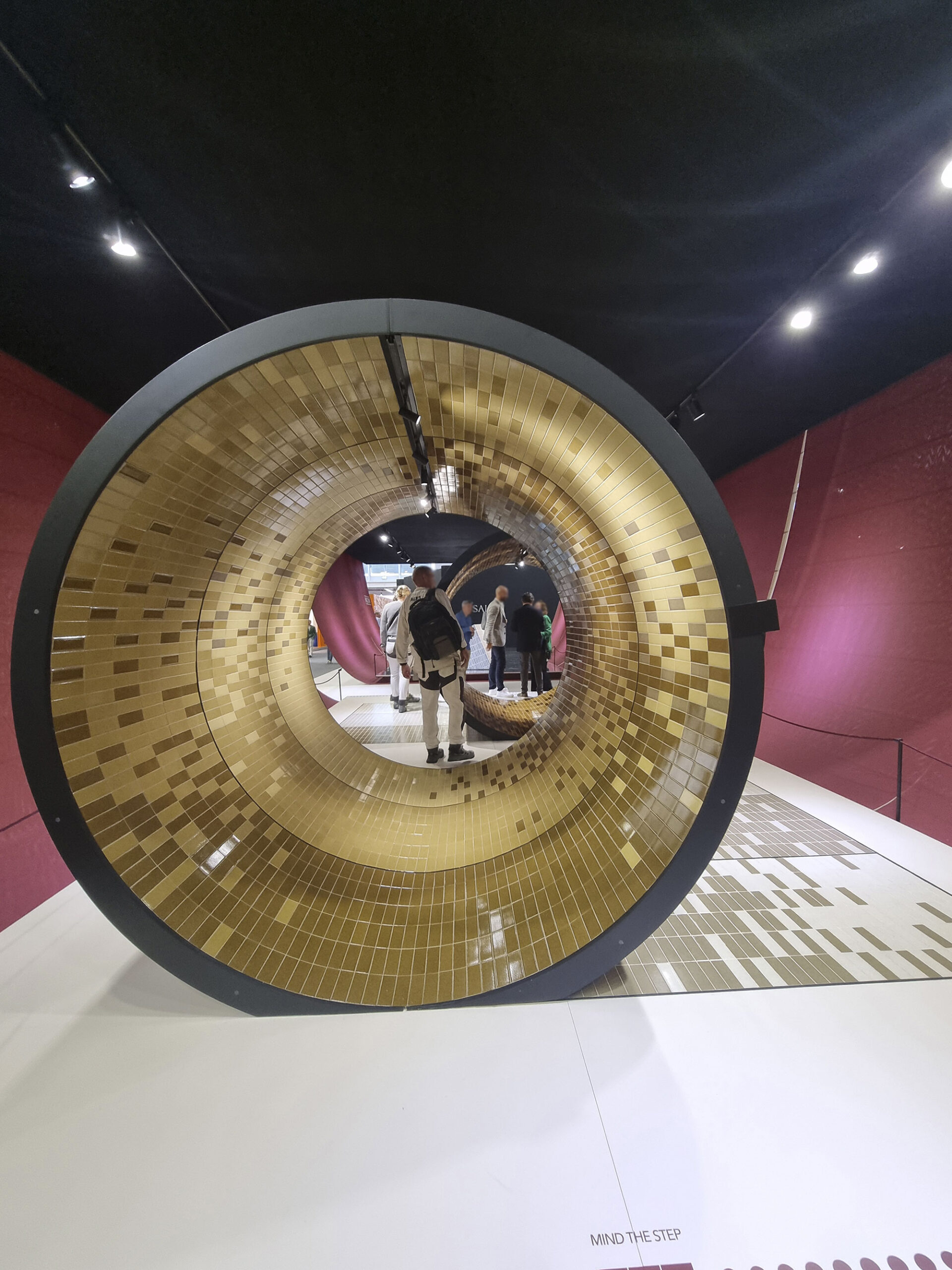
“Original WOW,” but the wow of wows goes to Iris Ceramica Group, which immersed visitors in fantasy atmospheres with massive visuals.
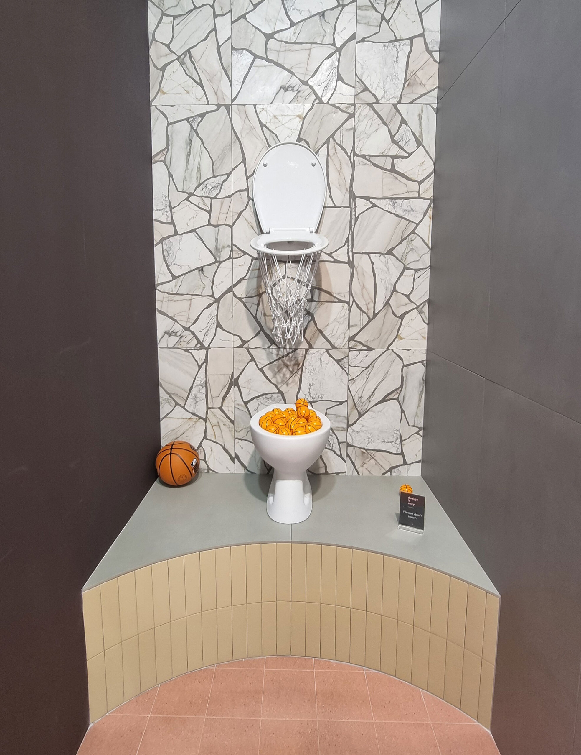
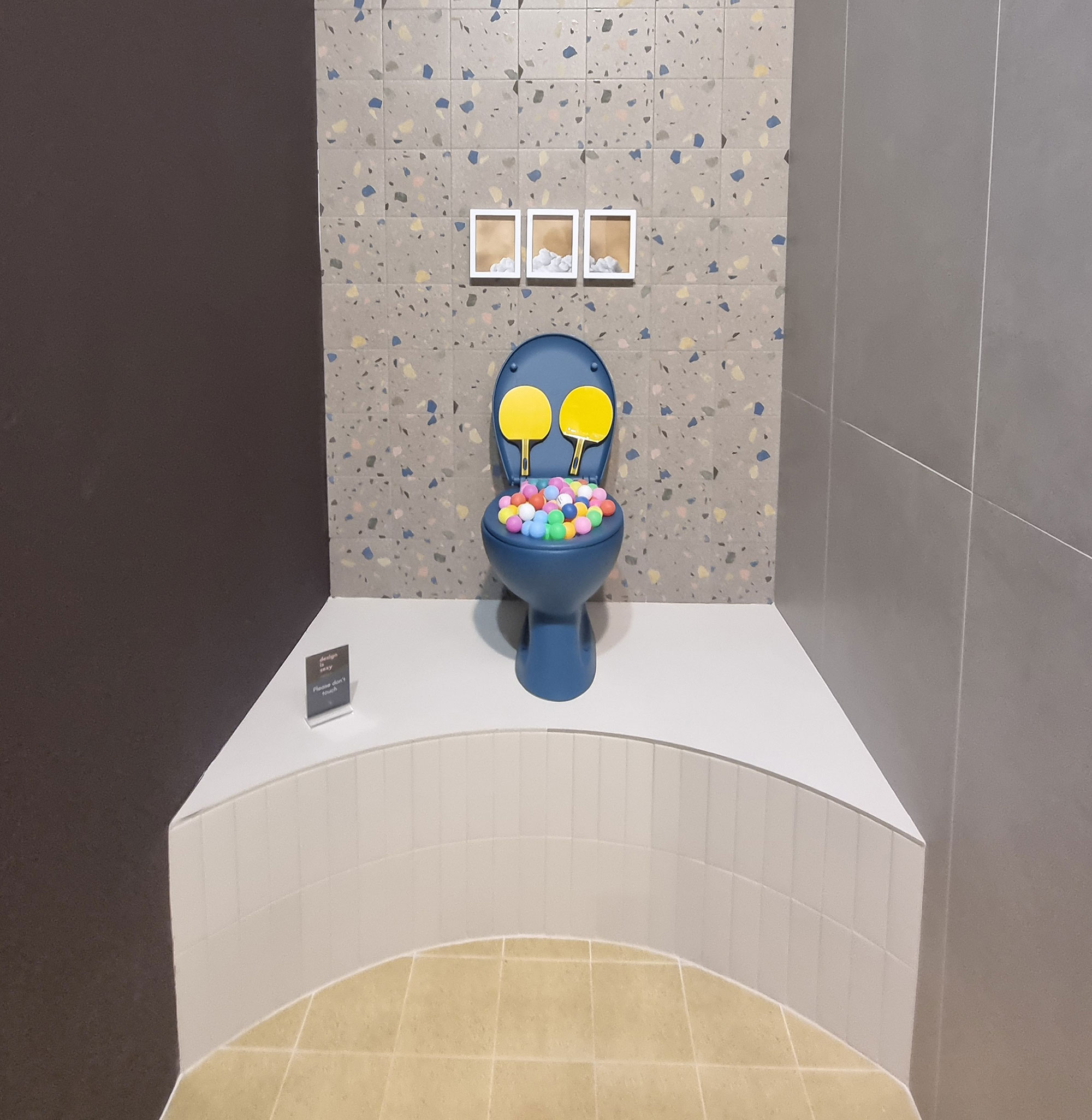
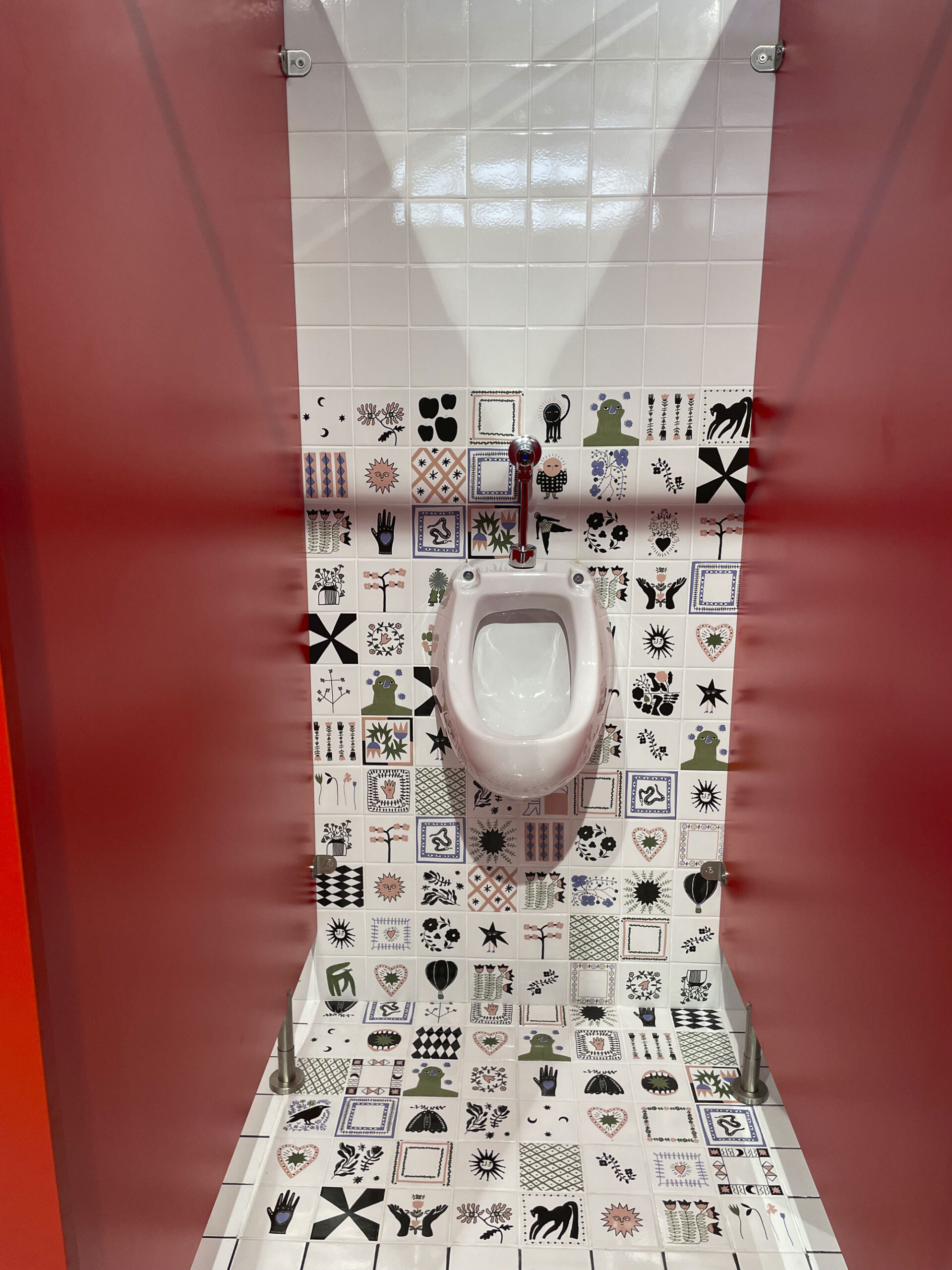
And kudos to brands using humor (a rare commodity): ErmesAurelia’s orange plastic, Serenissima-Cir’s self-obsessed bathroom installation, and 41zero42’s cheeky urinals.
As one visitor noted, Alessandro Michele–Valentino made even restrooms glamorous—so why not us? If they are roses, let them bloom, If they’re vases, let them vase.

Ermes-Aurelia-(2)

Ermes-Aurelia-(4)

Iris-Ceramica-Group-(3)
Iris-Ceramica-Group-(6)
Serenissima-Cir-G-Romani(15)
Serenissima-Cir-G-Romani(16)

Serenissima-Cir-G-Romani(18)

Serenissima-Cir-G-Romani(23)

Serenissima-Cir-G-Romani(24)

Serenissima-selfie-(2)

Sodai-(9)
Sodai-(10)

Sodai-(11)

Wow-(2)
Wow-(4)

Wow-(9)
9. ZENC YU EVERIBODI
If you’re reading this line—it means you made it this far.
Congrats! Your neurons are alive and well.
Thanks to everyone who welcomed, explained, refreshed, and proudly showcased their creations.
We’ll never forget that behind every booth lies an incredible amount of work (and fatigue).
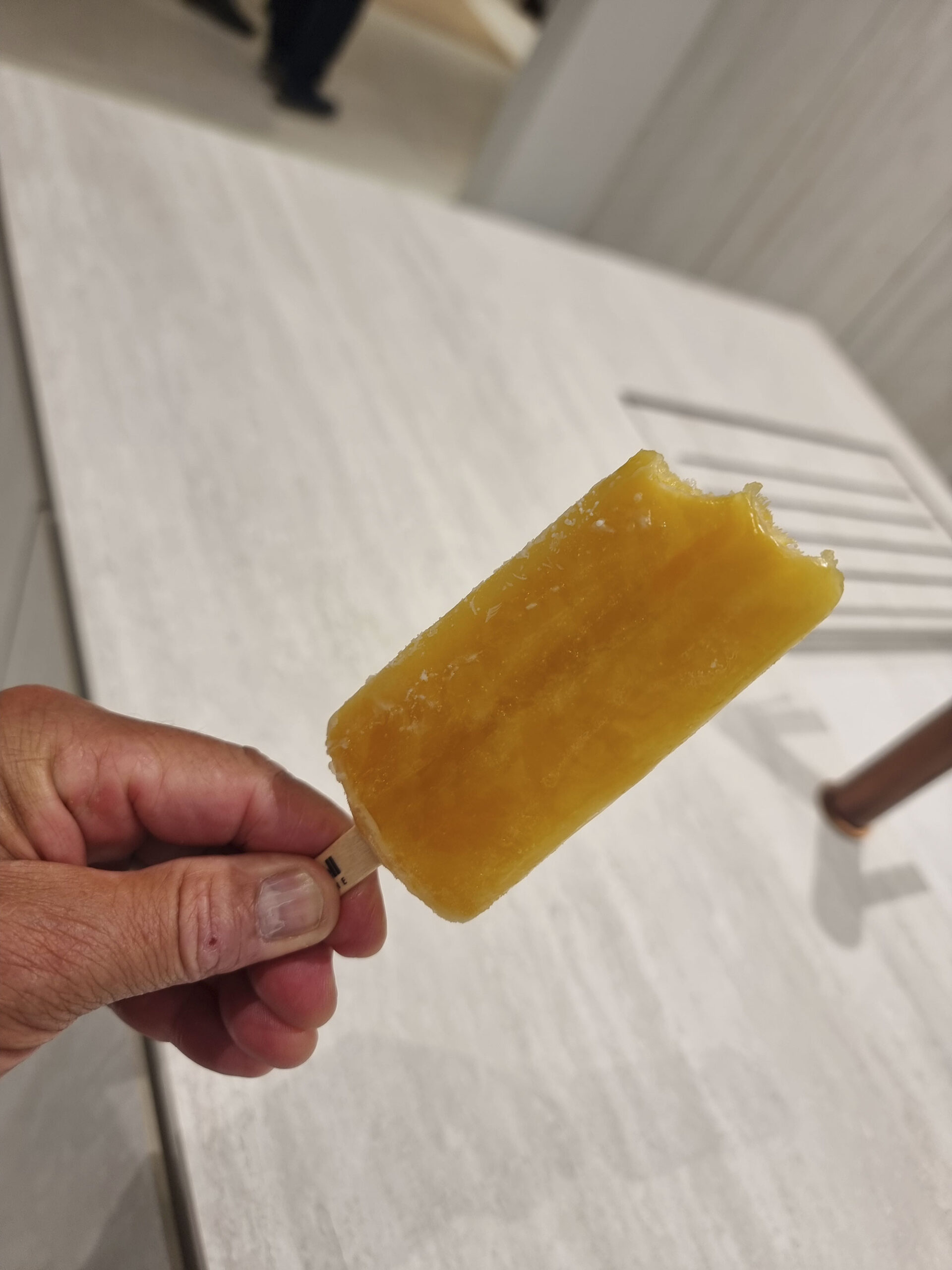
Three Michelin Stars (or Michelino, for the high-end parking) go to NovaBell’s popsicle—an intangible world heritage.
Heartfelt thanks to the Tonalite trio of directors for their saintly patience and hospitality.
And to those who recharged us with fine bubbles—thanks! We still don’t run on green hydrogen… but we’re working on it.
Bye-bye-cersaie-(2)
Bye-bye-Cersaie

Cersaie-people-(14)
Cersaie-People-(34)
Delegazione-Ufo.adv-(15)
NovaBell-ghiacciolo-gourmet

Recupero-post-fiera

Serenissima-Cir–G.-Romani-(5)
10. EXTRA TIME
In the weeks after the fair, we love to grab a coffee or a plate of pasta with fellow ceramic addicts to chat freely about impressions.
If you’d like to drop by—our doors (and freshly renovated HQ) are open.
Yes, we refurbished the place up just for you.


